Week 2 Dr Jenne Meyer OAD 30763 Statistics


 = Summation (Mu) = Population mean (Lowercase Sigma) = Standard")


 Used")


 f selling")

 Sample variation =var(…)")
 Sample variation =stdev(…)")


 A table of")


- Slides: 49
Week 2 Dr. Jenne Meyer OAD 30763 Statistics in Business and Economics
Visual Representations of Data
Histogram
Dot Plot In a Dot Plot, each observation is plotted as a point on a single, horizontal axis. The axis is scaled so that each of the data points can be located uniquely on the axis. When there is more than one observation with the same value the points are “stacked” on top of each other.
Pareto Diagram A Pareto Diagram is a bar chart in which the categories are plotted in order of decreasing relative frequency. In addition to the bars, the cumulative relative frequency of the categories is plotted on the same graph.
Pie Chart A Pie Chart represents data in the form of slices or sections of a circle. Each slice represents a category and the size of the slice is proportional to the relative frequency of the category.
Frequency Distribution A tabulation of n data values into k classes called bins, based on values of the data. The bin limits are cutoff points that define each bin. Bins must have equal widths and their limits cannot overlap.
Frequency curves Represents the proportion/percentage of the population that fall into a certain range. high slope = high frequency low slope = low frequency
Skew Mode < Median < Mean Positively skewed Skewed to the right Mean < Median < Mode Negatively skewed Skewed to the left
Line or Bar Charts
Scatterplot
Pictograms
Frequency Distribution A frequency distribution is a tabular summary of data showing the frequency (or number) of items in each of several non-overlapping classes. The objective is to provide insights about the data that cannot be quickly obtained by looking only at the original data.
Frequency Distribution Guests staying at Marada Inn were asked to rate the quality of their accommodations as being excellent, above average, below average, or poor. The ratings provided by a sample of 20 guests Below Average Above Average Above Average Below Average Poor Excellent Above Average Below Average Poor Above Average
Frequency Distribution Rating Poor Below Average Above Average Excellent Total 2 3 5 9 1 20
Relative Frequency and Percent Frequency Distributions Relative Rating Frequency. 10 Poor. 15 Below Average. 25 Average. 45 Above Average. 05 Excellent Total 1. 00 Percent Frequency 10 15 25. 10(100) = 10 45 5 100 1/20 =. 05
Crosstabulations and Scatter Diagrams Thus far we have focused on methods that are used to summarize the data for one variable at a time. Often a manager is interested in tabular and graphical methods that will help understand the relationship between two variables. Crosstabulation and a scatter diagram are two methods for summarizing the data for two variables simultaneously.
Crosstabulation The number of Finger Lakes homes sold for each style and price for the past two years is shown below. quantitative variable Price Range < $200, 000 > $200, 000 Total categorical variable Home Style Colonial Log 18 12 30 6 14 20 Split A-Frame 19 16 35 12 3 15 Total 55 45 100
Tabular and Graphical Methods Data Categorical Data Tabular Methods • Frequency Distribution • Rel. Freq. Dist. • Percent Freq. Distribution • Crosstabulation Graphical Methods • Bar Chart • Pie Chart Quantitative Data Tabular Methods • Frequency Distribution • Rel. Freq. Dist. • % Freq. Dist. • Cum. Rel. Freq. Distribution • Cum. % Freq. Distribution • Crosstabulation Graphical Methods • Dot Plot • Histogram • Ogive • Stem-and. Leaf Display • Scatter Diagram
Descriptive Statistics
Terminology Parameter A number that describes the characteristic of the population Statistic A number that describes the behavior of the sample Variable A measured characteristic or attribute that differs for different subjects or people
Terminology Symbols (Uppercase Sigma) = Summation (Mu) = Population mean (Lowercase Sigma) = Standard deviation (Pi) = Probability of success in a binomial trial (Epsilon) = Maximum allowable error 2 (Chi Square) = Nonparametric hypothesis test ! = Factorial H 0 = Null hypothesis H 1 = Alternate hypothesis
Measure of Central Tendency A single value that summarizes a set of data. It locates the center of the values Arithmetic mean Weighted mean Median Mode Geometric mean
ARITHMETIC MEAN Pop mean = sum of all the values in pop # of values in the pop µ = ∑X N
Properties of arithmetic mean Every set of interval data has a mean All values are included Mean is unique - only one Useful to compare two or more populations Sum of the deviations of each value from the mean will always be zero Disadvantage of arithmetic mean Mean may not be representative Can’t use for open-ended (range) data
Median The midpoint of the values (exactly half are below, half are above) Used when the mean is not representative due to high value outliers Unique number Not affected by extremely large or small values Can be used with open-ended range values Can be used for several measurement types
Mode The value that appears most frequently Can be used fir any measurement type Not affected by extremely large or small values Sometimes it doesn’t exist Sometimes it represents more than one value
Formulas in Excel
Skewness – Mean, Median, Mode
Median of grouped data Median = L + n/2 - CF (i) f selling prices of Whitner Pontiac Price # sold CF 12 – 15 8 8 15 – 18 23 31 18 – 21 17 48 21 – 24 18 66 24 – 27 8 74 27 – 30 4 78 30 – 33 2 80 Median = 18, 000 + 80/2 - 31 17 = 18, 000 + 1588 = 19, 588 (3000)
Measures of Dispersion Range Mean deviation Variance Standard deviation Range = highest value – lowest value Mean deviation – the arithmetic mean of the absolute values of the deviations from the mean The # deviates of average x amount from the mean Variance – the arithmetic mean of the squared deviations from the mean Compare the dispersion of two or more sets of data Standard deviation – the square root of the variance represents the spread or variability of the data, the average range from the center point
Variation Population variation =varp(…) Sample variation =var(…)
Standard Deviation Population variation =stdevp(…) Sample variation =stdev(…)
Sample Standard Deviation Sample standard deviation is most common use of statistics
Standard Deviation Example: Numbers Mean 100, 100, 100 90, 100, 110 100 Standard Deviation 0 10 Computing the standard deviation: find the mean (100) find the deviation/variance of each value form the mean (-10, 0, 10) square the deviations/variances (100, 0, 100) sum the squared deviations (100+0+100 = 400) divide the sum by the # of values minus 1 (# of values = 5 – 1 = 4, 400/4 = 100) take the square root of the variance (10) (Will be important in research when you are trying to determine the range of information. )
Coefficient of Variation To compare dispersion in data sets with dissimilar units of measurement (e. g. , kilograms and ounces) or dissimilar means (e. g. , home prices in two different cities) we define the coefficient of variation (CV), which is a unit-free measure of dispersion:
Frequency curves Normal distribution
Sample Variance, Standard Deviation, And Coefficient of Variation Variance Standard Deviation Coefficient of Variation the standard deviation is about 11% of the mean
Formulas in Excel
Central Limit Theorem Chebyshev’s Theorem If all samples of a particular size are selected from any population, the sampling distribution of the sample mean is approximately a normal distribution. This approximation improves with larger samples. (the larger the sample, the more it appears to be a normal standard distribution)
Central Limit Theorem Chebyshev’s Theorem
Central Limit Theorem Chebyshev’s Theorem
Standard Normal Distribution n n Z value – converts the actual distribution to a standard distribution. (It is the distance between the selected value (x) and the mean (µ) divided by the standard deviation (σ). It denotes the number of standard deviations a data value x is from the mean. Normal distributions can be transformed to standard normal distributions by the formula: A “Z” score always reflects the number of standard deviations above or below the mean a particular score is A person scored 60 on a test with a μ=50 and σ=10, then he scored 1 standard deviations above the mean. Converting the test score to a Z score, an X of 70 would be: Z=1=0. 3413
Standard Normal Distribution n Standard Normal Table (once z is computed) A table of probabilities for a Z random variable. 12/12/2021
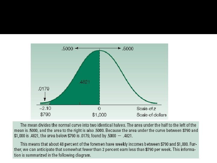
Example p 224/5, likelihood of finding a foreman w/ a salary between $1000 and $1100 is 34. 13%
Standard Normal Distribution p 227 12/12/2021
Normal Distribution Examples Chapter 3, p 107 problem 27 Problem 29, 30, 31
Discussion Key learnings? Next weeks assignments.