Web page design Web Site Design Principles Design

Web page design

Web Site Design Principles Design for the Medium • What is meant by Hyper Media? • Hypertext links

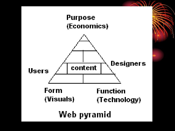
Design for the Whole Site Four primary aspects • Content • Technology • Visuals • Economics

Design for the User-centered design Usability • Definition: Usability is the extent to which a site can be used by a specified group of users to achieve specified goals with effectiveness, efficiency, and satisfaction in a specified context of use.

Consider each piece of the definition • We should limit the group of users. • Usability should be related to task. • Effectiveness describes whether or not the user is able to achieve their goals. • It is related to efficiency. If the user makes a great number of mistakes or has to do things in a roundabout way, the site isn’t terribly usable.

Five ideas determine the usability • Learnability • Rememberability • Efficiency of use • Reliability in use • User satisfaction

Planning the Site • • • Short goal statement Detailed goal discussion Audience discussion Use scenario discussion Content requirements Technical requirements. Visual requirements Delivery requirements Site structure diagram Staffing Time line Budget

Logical site organization models • Linear • Grid • Hierarchy • Web • A combination of two of them

Site navigation Navigation is only a means to an end result

Navigation No-No’s • Back button hijacking • Pop-up windows • Unique Navigation • Heavily Branded buttons • Reliance on back button • Making users work too hard

Conventions used for navigation • Upper left-hand logo signals home page. • Text links are repeated at the bottom of the page • Back to top link used on long pages • Special print forms used for heavily printed pages • Clickable items are blue and underlined • Secondary navigation elements such as site map or search are presented separately from sectional navigation.

TLB, or top-left-down TLB designs are so common, that users already know it. From usability point of view major compliant is left hand navigation takes lot of real estate meant for content. When using TLB design consider limiting the right margin.

Is white space good or bad? • White space makes a page much more readable • About 40 -60 percent white space is suggested for web pages.

Number of fonts to use Consider three fonts per page: • one for page labels and headlines • one for body text • one for navigation.

How type can be used to improve the organization of a page greatly • Heading • Subheading • body text

Images • Images makes the site look more beautiful • Large images takes time to download and hence it should be avoided • Use animated gif files instead of animations
- Slides: 17