Web Development Basics Lecture 5 CSS 3 Introduction

Web Development Basics Lecture 5 – CSS 3
Introduction § Early draft of CSS 3 started in 1999 at the W 3 C just after the CSS 2 recommendation. § CSS 3 is divided into modules. § Each module get a separate specification. § Adds new capability or extends features defined in CSS 2 and try to preserve backward compatibility. § Around 50 modules are published. § 4 modules (Color, Selectors, Media Queries and Namespaces) are already Recommendations. § 14 modules (such as Background and Borders, Multicolumn, Marquee, etc. ) are Candidate Recommendation and consider “safe” to use.
Media Queries § Enhancement of the @media rules of CSS and the media attribute in HTML. § Adds parameters such as size (width, height) of display, color depth and aspect-ratio. § Attributes: § Types can be print, screen, (aural), braille, handheld, projection, tty, tv, embossed, speech and special all. § width, height (min-, max-) of the targeted display area. § device-width, device-height (min-, max-) of the rendering surface. § orientation (portrait, landscape).
Media Queries § Attributes (continued) § aspect-ratio, device-aspect-ratio the value of the (device-)width to the value of the (device-)height. § color, color-index, monochrome (min-, max-). § resolution of the output device (the density of the pixels). § scan (progressive, interlace) describes the scanning process of "tv". § grid query whether the output device is grid or bitmap.
Media Queries § Examples § In HTML <link rel="stylesheet" media="print and (color)" href="color-print. css"> <link rel="stylesheet" media="print and (monochrome)" href="black-white-print. css"> § In CSS @media screen and (orientation: portrait) { h 1 { width: 20 em; } } @media screen and (min-device-width: 800 px) { h 1 { width: 600 px; } }
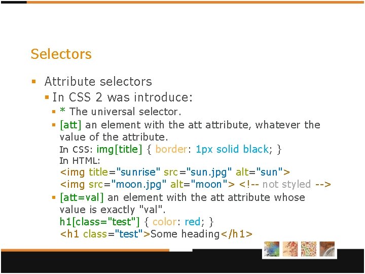
Selectors § Attribute selectors § In CSS 2 was introduce: § * The universal selector. § [att] an element with the attribute, whatever the value of the attribute. In CSS: img[title] { border: 1 px solid black; } In HTML: <img title="sunrise" src="sun. jpg" alt="sun"> <img src="moon. jpg" alt="moon"> <!-- not styled --> § [att=val] an element with the attribute whose value is exactly "val". h 1[class="test"] { color: red; } <h 1 class="test">Some heading</h 1>
![Selectors § CSS 2 (continued): § [att~=val] an element with the attribute whose value Selectors § CSS 2 (continued): § [att~=val] an element with the attribute whose value](http://slidetodoc.com/presentation_image_h2/5eee7c5a99b76ebafa680d880c652994/image-7.jpg)
Selectors § CSS 2 (continued): § [att~=val] an element with the attribute whose value is a whitespace-separated list of words, one of which is exactly "val". img[title~="copy"] { border: 5 px dashed green; } <img title="the copy of Picaso" src="pic. gif" alt="pic"> § [att|=val] an element with the attribute, its value either being exactly "val" or beginning with "val" immediately followed by "-". a[hreflang|="en"] { color: yellow; } <a href="test. html" hreflang="en-US">test</a>
![Selectors § CSS 3 introduce: § [att^=val] an element with the attribute whose value Selectors § CSS 3 introduce: § [att^=val] an element with the attribute whose value](http://slidetodoc.com/presentation_image_h2/5eee7c5a99b76ebafa680d880c652994/image-8.jpg)
Selectors § CSS 3 introduce: § [att^=val] an element with the attribute whose value begins with the prefix "val". img[src^="image/"] { border: 1 px solid blue; } <img src="image/pic. jpg" alt="pic"> § [att$=val] an element with the attribute whose value ends with the suffix "val". a[href$=". com"] { font-size: 1. 4 em; } <a href="www. google. com">search</a> § [att*=val] an element with the attribute whose value contains at least one instance of the substring "val". p[title*="llo"] { color: red; } <p title="hello world">Some test. . . </p>
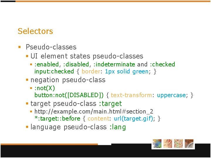
Selectors § Pseudo-classes § UI element states pseudo-classes § : enabled, : disabled, : indeterminate and : checked input: checked { border: 1 px solid green; } § negation pseudo-class § : not(X) button: not([DISABLED]) { text-transform: uppercase; } § target pseudo-class : target § http: //example. com/main. html#section_2 *: target: : before { content: url(target. gif); } § language pseudo-class : lang
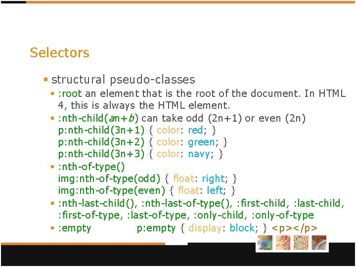
Selectors § structural pseudo-classes § : root an element that is the root of the document. In HTML 4, this is always the HTML element. § : nth-child( a n+ b ) can take odd (2 n+1) or even (2 n) p: nth-child(3 n+1) { color: red; } p: nth-child(3 n+2) { color: green; } p: nth-child(3 n+3) { color: navy; } § : nth-of-type() img: nth-of-type(odd) { float: right; } img: nth-of-type(even) { float: left; } § : nth-last-child(), : nth-last-of-type(), : first-child, : last-child, : first-of-type, : last-of-type, : only-child, : only-of-type § : empty p: empty { display: block; } <p></p>
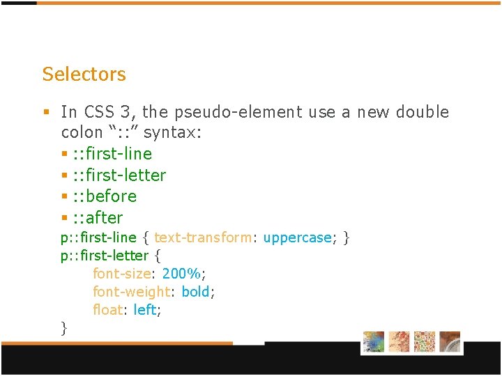
Selectors § In CSS 3, the pseudo-element use a new double colon “: : ” syntax: § : : first-line § : : first-letter § : : before § : : after p: : first-line { text-transform: uppercase; } p: : first-letter { font-size: 200%; font-weight: bold; float: left; }
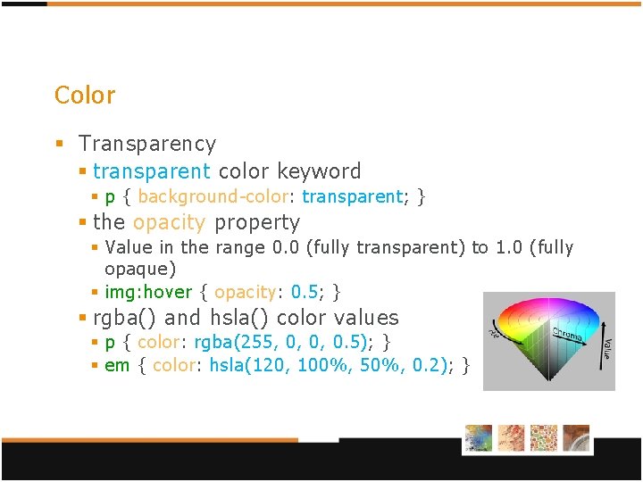
Color § Transparency § transparent color keyword § p { background-color: transparent; } § the opacity property § Value in the range 0. 0 (fully transparent) to 1. 0 (fully opaque) § img: hover { opacity: 0. 5; } § rgba() and hsla() color values § p { color: rgba(255, 0, 0, 0. 5); } § em { color: hsla(120, 100%, 50%, 0. 2); }
Backgrounds and Borders § Background properties § background-size § length, percentage, auto, cover, contain § background-origin, background-clip § content-box, padding-box, border-box § Multiple background images body{ background-image: url(sun. png), url(ball. png), url(grass. png); background-position: top right, 80% 50%, bottom; background-origin: content-box, border-box; background-repeat: no-repeat, repeat-x; }
Backgrounds and Borders § Border image § § § border-image-source border-image-slice border-image-width border-image-outset border-image-repeat (stretch, repeat, round) border-image § ! Experimental in Opera (not in IE)! § -webkit-border-image (Safari <= 5), -o-border-image p { border-image: url(img/border. png) 30 30 stretch; }
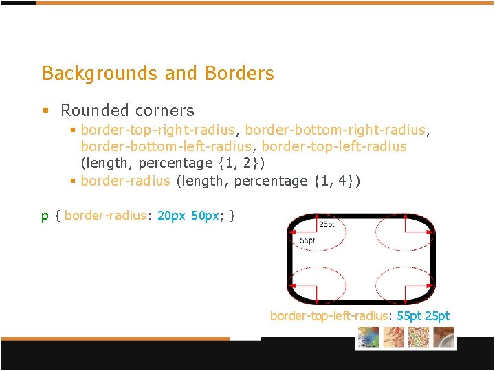
Backgrounds and Borders § Rounded corners § border-top-right-radius, border-bottom-left-radius, border-top-left-radius (length, percentage {1, 2}) § border-radius (length, percentage {1, 4}) p { border-radius: 20 px 50 px; } border-top-left-radius: 55 pt 25 pt
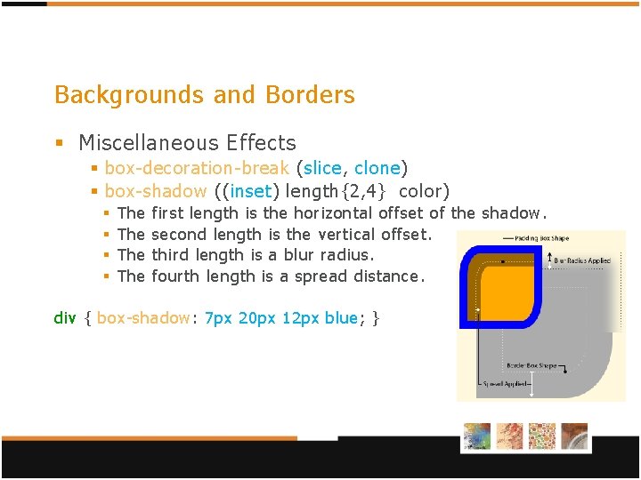
Backgrounds and Borders § Miscellaneous Effects § box-decoration-break (slice, clone) § box-shadow ((inset) length{2, 4} color) § § The The first length is the horizontal offset of the shadow. second length is the vertical offset. third length is a blur radius. fourth length is a spread distance. div { box-shadow: 7 px 20 px 12 px blue; }
Multi-column § Allow flexible multi-column layout § ! Experimental in -webkit- and -moz- ! Work in Opera and in IE (>=10 (not in IE <=9)). column-width describes the width of columns. column-count the number of columns short for setting column-width and -count. column-gap sets the distance between columns. column-rule, column-rule-color, column-rule-style, column-rule-width sets the separator between columns. § break-before, break-after, break-inside (auto, always, avoid, left, right, page, column, avoid-page, avoidcolumn) describe page/column break behavior before/after/inside the generated box. § § §
Multi-column § column-fill (auto, balance) minimize the variation in column length. § column-span (none, all) makes it possible for an element to span across several columns. div { column-count: 3; column-gap: 2 em; column-rule: 3 px dashed black; } h 2 { column-span: all; }
Marquee § Make the text moving. § Candidate Recommendation; but experimental in -webkit- and not supported by any other browser! § overflow-style (auto, marquee-line, marquee-block) specifies the scrolling method. § marquee-style (scroll, slide, alternate) § marquee-play-count (number, infinite) § marquee-direction (forward, reverse) § marquee-speed (slow, normal, fast)
2 D (and 3 D) Transforms § Working draft (will not validate)! BUT 2 D in Firefox, IE and Opera, experimental in : -webkit and -ms- (IE 9) and 3 D not in Opera. § transform (2 D, 3 D) this property contains a list of “transform functions”. § transform-origin (2 D, 3 D) property establishes the origin of transformation. I. E. first translating the element by the negated value of the property, then applying the transform, then translating back. § transform-style (3 D) flat, preserve-3 d. § backface-visibility (3 D) visible, hidden. § perspective (3 D) § perspective-origin (3 D)
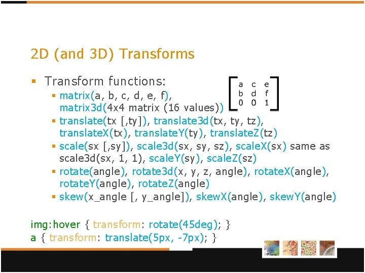
2 D (and 3 D) Transforms § Transform functions: § matrix(a, b, c, d, e, f), matrix 3 d(4 x 4 matrix (16 values)) § translate(tx [, ty]), translate 3 d(tx, ty, tz), translate. X(tx), translate. Y(ty), translate. Z(tz) § scale(sx [, sy]), scale 3 d(sx, sy, sz), scale. X(sx) same as scale 3 d(sx, 1, 1), scale. Y(sy), scale. Z(sz) § rotate(angle), rotate 3 d(x, y, z, angle), rotate. X(angle), rotate. Y(angle), rotate. Z(angle) § skew(x_angle [, y_angle]), skew. X(angle), skew. Y(angle) img: hover { transform: rotate(45 deg); } a { transform: translate(5 px, -7 px); }
Transitions § Animate properties changes smoothly from the old state to the new state over time. § Working draft! In Firefox, Opera Chrome, IE, experimental in -webkit- (Safari), not in IE<=9. § transition-property specifies the name of the CSS property to which the transition is applied. § transition-duration defines the length of time that a transition takes. § transition-timing-function (ease, linear, ease-in, easeout, ease-in-out, cubic-bezier(x 1, y 1, x 2, y 2), stepstart, step-end, steps(<integer>[, [ start | end ] ]? )) § transition-delay defines when the transition will start. § transition (property, duration, timing-function, delay).
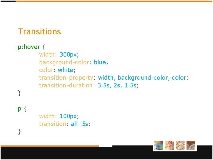
Transitions p: hover { width: 300 px; background-color: blue; color: white; transition-property: width, background-color, color; transition-duration: 3. 5 s, 2 s, 1. 5 s; } p { width: 100 px; transition: all. 5 s; }
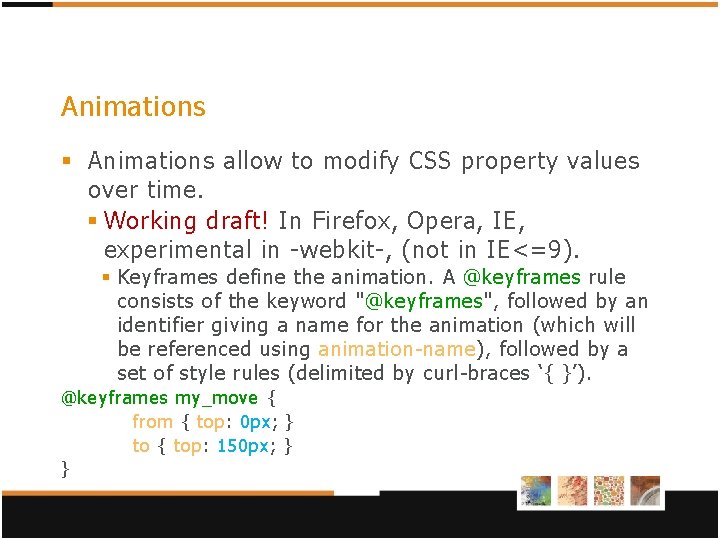
Animations § Animations allow to modify CSS property values over time. § Working draft! In Firefox, Opera, IE, experimental in -webkit-, (not in IE<=9). § Keyframes define the animation. A @keyframes rule consists of the keyword "@keyframes", followed by an identifier giving a name for the animation (which will be referenced using animation-name), followed by a set of style rules (delimited by curl-braces ‘{ }’). @keyframes my_move { from { top: 0 px; } to { top: 150 px; } }
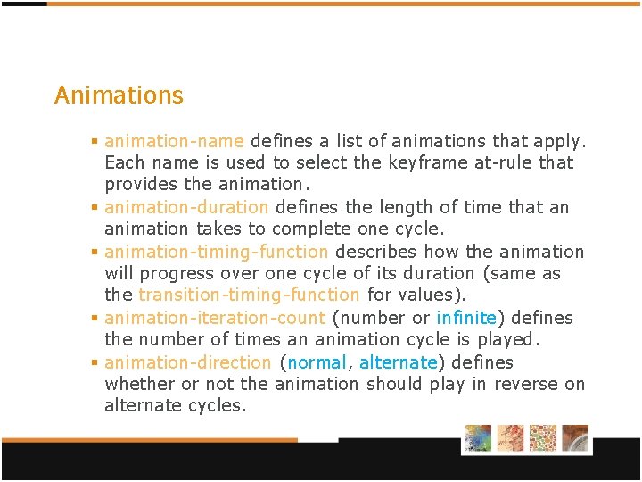
Animations § animation-name defines a list of animations that apply. Each name is used to select the keyframe at-rule that provides the animation. § animation-duration defines the length of time that an animation takes to complete one cycle. § animation-timing-function describes how the animation will progress over one cycle of its duration (same as the transition-timing-function for values). § animation-iteration-count (number or infinite) defines the number of times an animation cycle is played. § animation-direction (normal, alternate) defines whether or not the animation should play in reverse on alternate cycles.
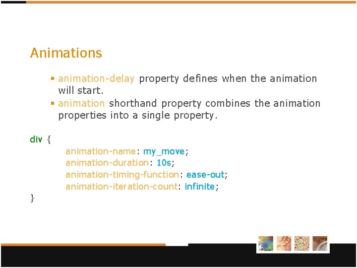
Animations § animation-delay property defines when the animation will start. § animation shorthand property combines the animation properties into a single property. div { animation-name: my_move; animation-duration: 10 s; animation-timing-function: ease-out; animation-iteration-count: infinite; }
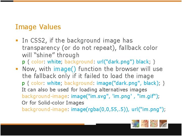
Image Values § In CSS 2, if the background image has transparency (or do not repeat), fallback color will “shine” through p { color: white; background: url("dark. png") black; } § Now, with image() function the browser will use the fallback only if it failed to load the image p { color: white; background: image("dark. png", black); } It can also be used for loading alternatives images background-image: image("im. svg", 'im. png' , "im. gif"); Or for Solid-color Images background-image: image(rgba(0, 0, 55, . 5)), url("im. png");
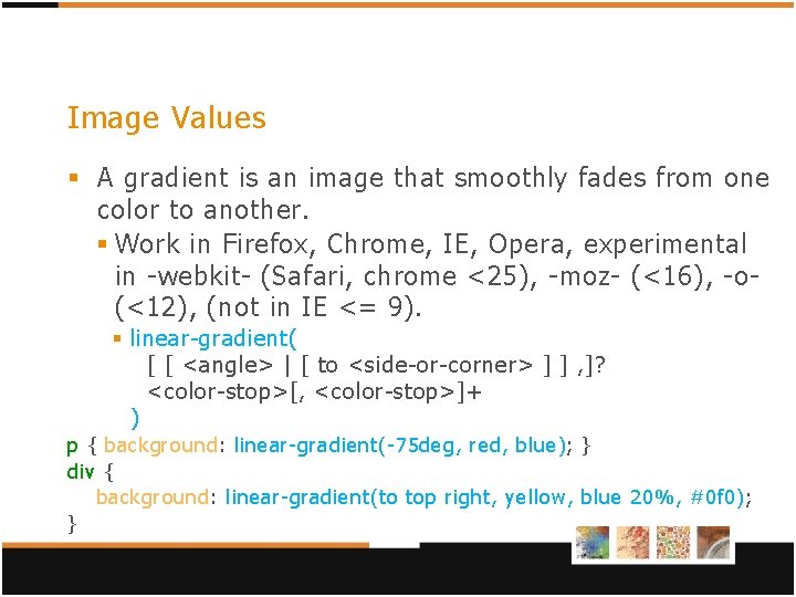
Image Values § A gradient is an image that smoothly fades from one color to another. § Work in Firefox, Chrome, IE, Opera, experimental in -webkit- (Safari, chrome <25), -moz- (<16), -o(<12), (not in IE <= 9). § linear-gradient( [ [ <angle> | [ to <side-or-corner> ] ] , ]? <color-stop>[, <color-stop>]+ ) p { background: linear-gradient(-75 deg, red, blue); } div { background: linear-gradient(to top right, yellow, blue 20%, #0 f 0); }
![Image Values § radial-gradient( [ [ <shape> || <size> ] [ at <position> ]? Image Values § radial-gradient( [ [ <shape> || <size> ] [ at <position> ]?](http://slidetodoc.com/presentation_image_h2/5eee7c5a99b76ebafa680d880c652994/image-29.jpg)
Image Values § radial-gradient( [ [ <shape> || <size> ] [ at <position> ]? , | at <position>, ]? <color-stop> [ , <color-stop> ]+ ) div { background: radial-gradient(circle, yellow, green); } p { background: radial-gradient(20 px 30 px at 20 px, yellow 110 px, red 20%, blue); }
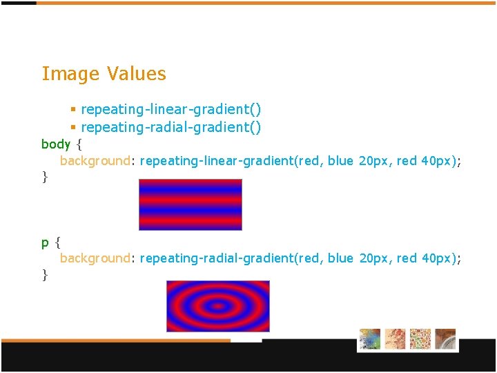
Image Values § repeating-linear-gradient() § repeating-radial-gradient() body { background: repeating-linear-gradient(red, blue 20 px, red 40 px); } p { background: repeating-radial-gradient(red, blue 20 px, red 40 px); }
And many more § CSS 3 Font § reintroduce “web font” § CSS 3 Text § text-shadow, word-wrap, text-justify, etc. § CSS 3 User Interface § box-sizing, resize, icon, nav-index, etc. § CSS 3 Speech § Makes the browser talk (Opera, some by Voice. Over in Safari). § etc. Be curious
Sources http: //www. w 3. org/Style/CSS/current-work http: //www. w 3. org/Style/CSS/specs http: //meiert. com/en/indices/css-properties/ http: //en. wikipedia. org/wiki/Css_3#CSS_3 http: //en. wikipedia. org/wiki/Comparison_of_layo ut_engines_%28 CSS%29 § http: //w 3 schools. com/css 3/default. asp § § §
- Slides: 32