Weather its all around us and its always


 • Axes (X, Y and Z)")


- Slides: 24
Weather - it’s all around us and it’s always changing. This makes it a great resource for gathering and organizing data with graphs.
Graphs help us organize information and data in an understandable way. In today’s “New Times” we are surrounded by data, from sports statistics to politics to numbers presented in science textbooks. Graphs “are the visual representations that focus on the relations between the ‘objects’ of representation in terms of a part-whole structure. ” Koulaidis (p. 1998)
What are we trying to teach our students? 1. Collect and organize appropriate data 2. Represent the data graphically, by selecting the appropriate graph 3. Read and interpret graphs 4. Evaluate and analyze information presented in graphs that are found in textbooks, newspapers, digital media, etc. Look for intent behind the graphic representation of the data.
When students make graphs from data they collect, graph interpretation is easier and more interesting because it is based on actual experience with the numbers involved. The experience of interpreting their own graphs gives students the skills to interpret graphs made by others.
Children begin by • recording data, • computing the range of data (the difference between • two sets of data to give a sense of how “spread out” they are), and • finding the central tendency (mean) to get an idea of a typical value. Day Outside Temp (ºF) Inside Difference Temp (ºF) (Out minus In) (ºF) 1 80ºF 72ºF 8ºF sunny 2 71ºF 0ºF cloudy & rain 3 86ºF 73ºF 13ºF windy 4 89ºF 70ºF 19ºF sunny 5 79ºF 69ºF 10ºF cloudy 6 95ºF 80ºF 15ºF broken a/c Notes
How do we help students decide which type of graph is best for the data? In the same way that educators use concept maps or graphic organizers, chapter outlines, webbing, and structured overviews to help students navigate text, so can graphs and charts be used as tools to organize and present data. • • Circle map Double bubble Tree map Flow map
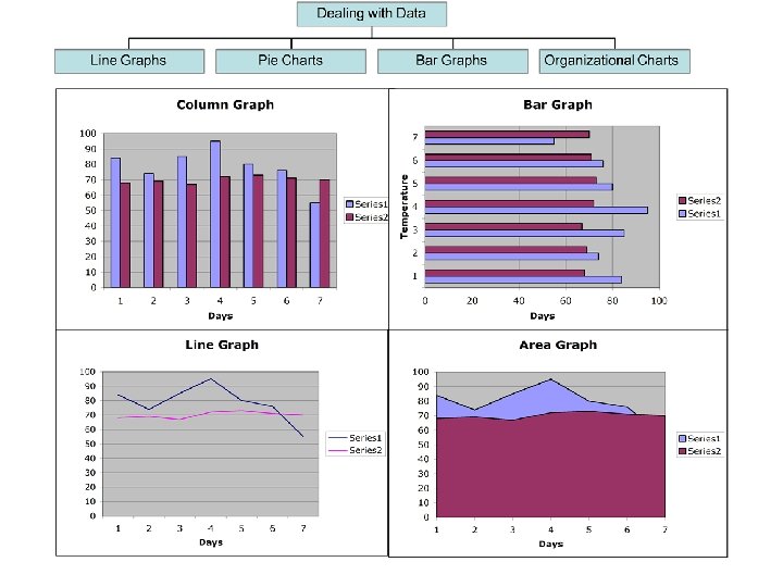
Vocabulary Needed for Decoding Graphs • Key/legend (symbols) • Axes (X, Y and Z) • Gridlines • Scale • Data Labels • Data Table • 2 Dimension • Variables and their relationships to each other
Does the scale make a difference in how you react to the data? Do the graphs below show the same information? Do the pictures suggest the same idea? Is one graph misleading? Does the line graph tell you anything about the temperatures in between the times the readings were taken?
Where in the World is All the Water? Students were asked to guess what part of the total amount of water on Earth (unchanged since when the Earth was formed) is in the oceans, ice, groundwater, atmosphere (clouds) and lakes & rivers.
The students then graphed their predictions against the actual amounts, dramatically illustrating their misconceptions about Earth’s water sources.
Pie Charts 1 = Oceans 3 = Groundwater 2 = Ice water 4 =Atmospheric water 5 = Lakes & River
Back to temperature… From simple to…. .
… complex! Note: a example of nominalization used in the context of analyzing this type of data is “rate of change of temperature”
Clues that something is “fishy” about a graph: 1. The axis should begin with zero so that the measurement scale is shown whole. 2. If one of the axes is not labeled, you do not really know what is being displayed. 3. The numbers are identified by their units. 4. The X to Y axis scaling is not fair, i. e. one axis has been stretched out.
Proportion of Page comprised of Images versus Words High Image. Low Word Elementary School High Image. Moderate Word Middle School Moderate Image. High Word High School Low Image Low Word High Word
Juggling 2 variables at once
What does this graph tell us? Do you believe the data? Who collected the data? Where and how were the temperatures taken?
Predicting the Future
Importance of titles and captions • Human activities are changing the environment. Global temperatures have risen by 0. 6 degrees Celsius in the last 200 years. Does scale make a difference in this graph? • This graph shows carbon dioxide emissions increasing the last 130 years. What kind of impact does the image have on the reader?
Reader Beware! 1. Graphs have more impact than the raw data because they are visual. 2. Graphs represent interpretations of data. If the data has been specially selected, then the interpretation is only of the selected data. 3. Data can be plotted to create an impression of (or hide) a dramatic trend when in fact the data does not support such an apparent change. 4. The creator of the graph can influence the impact of the information and therefore influence the viewer.
“What is the social cost of “innumeracy” and illiteracy? The inability to deal rationally with large numbers, or with the probabilities [and their graphic representations] associated with them, results in misinformed government policies, confused personal decisions, and an increased susceptibility to pseudo -sciences of all kinds. ” Paulos (1988)
There “are cases where there is no dishonesty involved, but where people are tricked into false results by a lack of understanding about what human beings can do to themselves in the way of being led astray by subjective efforts, wishful thinking or threshold interactions. ” Cromer (1993)
Why do we care about visual literacy? If our students do not understand get meaning from visual information, they will be excluded, their point of view not considered, or they may even manipulated into believing something not in their best interest.