WarmUp 1 Unit 6 324 even 327 odd

- Slides: 18

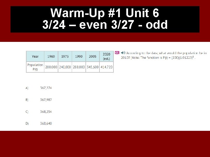
Warm-Up #1 Unit 6 3/24 – even 3/27 - odd

DON’T FORGET YOUR WEEK 1 USA TEST PREP IS DUE TODAY!!! ü 10 ASSIGNMENTS

GSE Algebra I UNIT QUESTION: How can I represent, compare, and interpret sets of data? Standard: MCC 9 -12. S. ID. 1 -3, 5 -9, SP. 5 Today’s Question: How do I graphically represent data? Standard: MCC 9 -12. S. ID. 1

Unit 6 Day 1 Vocabulary Standards MCC 6. SP. 5 c, MCC 9 -12. S. ID. 1, MCC 9 -12. S. 1 D. 2 and MCC 9 -12. S. ID. 3

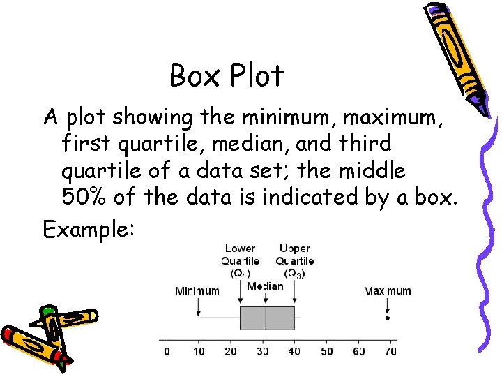
Box Plot A plot showing the minimum, maximum, first quartile, median, and third quartile of a data set; the middle 50% of the data is indicated by a box. Example:

Pros and Cons Advantages: • Shows 5 -point summary and outliers • Easily compares two or more data sets • Handles extremely large data sets easily Disadvantages: • Not as visually appealing as other graphs • Exact values not retained

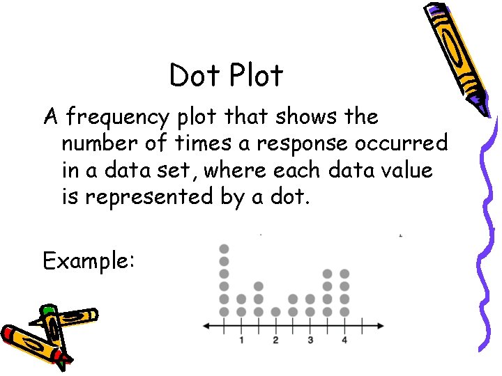
Dot Plot A frequency plot that shows the number of times a response occurred in a data set, where each data value is represented by a dot. Example:

Pros and Cons Advantages: • Simple to make • Shows each individual data point Disadvantages: • Can be time consuming with lots of data points to make • Have to count to get exact total. Fractions of units are hard to display.

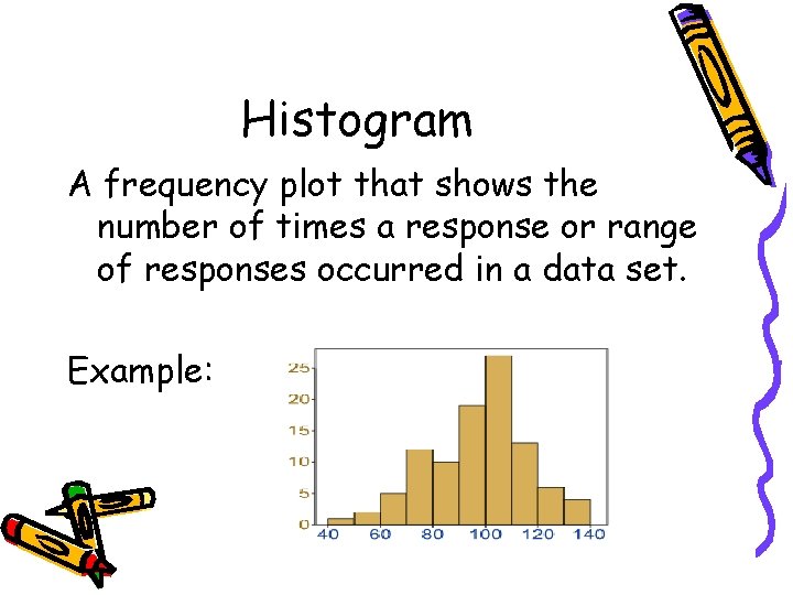
Histogram A frequency plot that shows the number of times a response or range of responses occurred in a data set. Example:

Pros and Cons Advantages: • Visually strong • Good for determining the shape of the data Disadvantages: • Cannot read exact values because data is grouped into categories • More difficult to compare two data sets

Mean The average value of a data set, found by summing all values and dividing by the number of data points Example: 5 + 4 + 2 + 6 + 3 = 20 The Mean is 4

Median The middle-most value of a data set; 50% of the data is less than this value, and 50% is greater than it Example:

First Quartile The value that identifies the lower 25% of the data; the median of the lower half of the data set; written as Example:

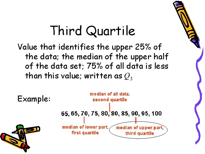
Third Quartile Value that identifies the upper 25% of the data; the median of the upper half of the data set; 75% of all data is less than this value; written as Example:

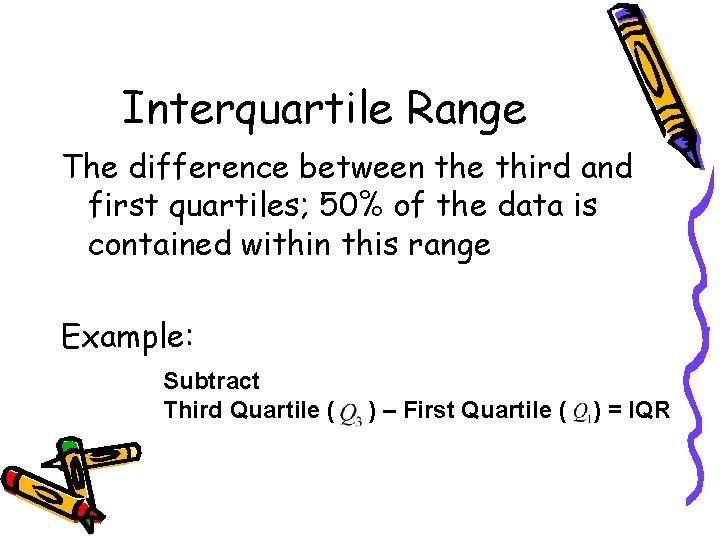
Interquartile Range The difference between the third and first quartiles; 50% of the data is contained within this range Example: Subtract Third Quartile ( ) – First Quartile ( ) = IQR

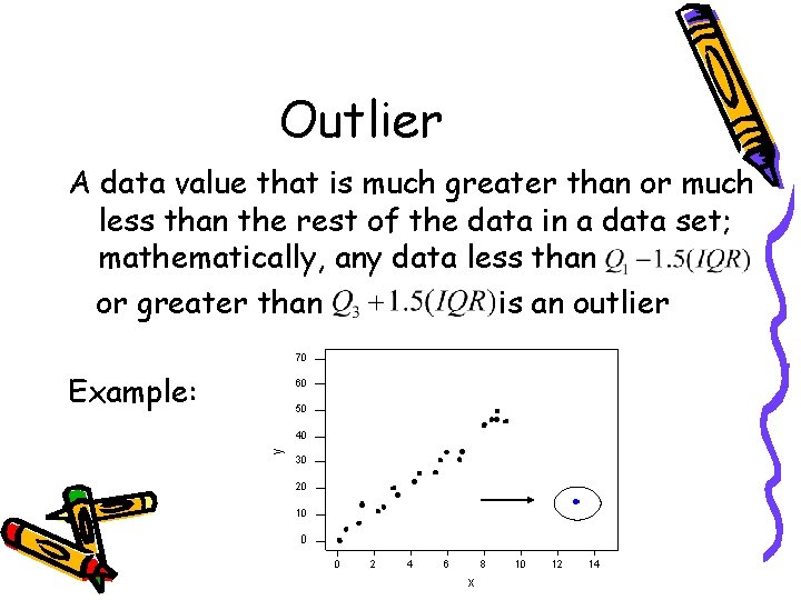
Outlier A data value that is much greater than or much less than the rest of the data in a data set; mathematically, any data less than or greater than is an outlier Example:

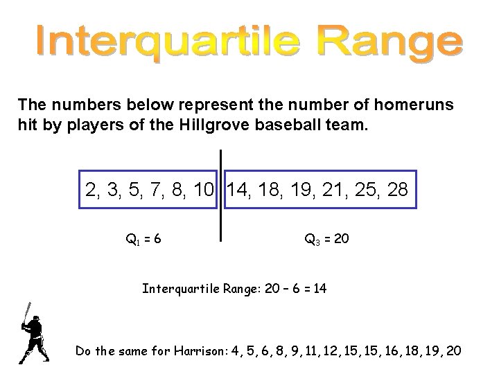
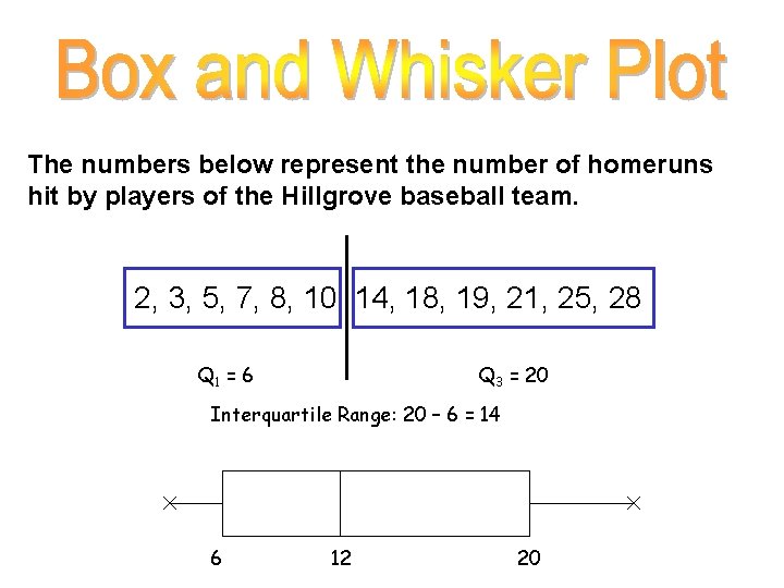
The numbers below represent the number of homeruns hit by players of the Hillgrove baseball team. 2, 3, 5, 7, 8, 10, 14, 18, 19, 21, 25, 28 Q 1 = 6 Q 3 = 20 Interquartile Range: 20 – 6 = 14 Do the same for Harrison: 4, 5, 6, 8, 9, 11, 12, 15, 16, 18, 19, 20

The numbers below represent the number of homeruns hit by players of the Hillgrove baseball team. 2, 3, 5, 7, 8, 10, 14, 18, 19, 21, 25, 28 Q 1 = 6 Q 3 = 20 Interquartile Range: 20 – 6 = 14 6 12 20