Warmup 1 Find the marginal distribution for age
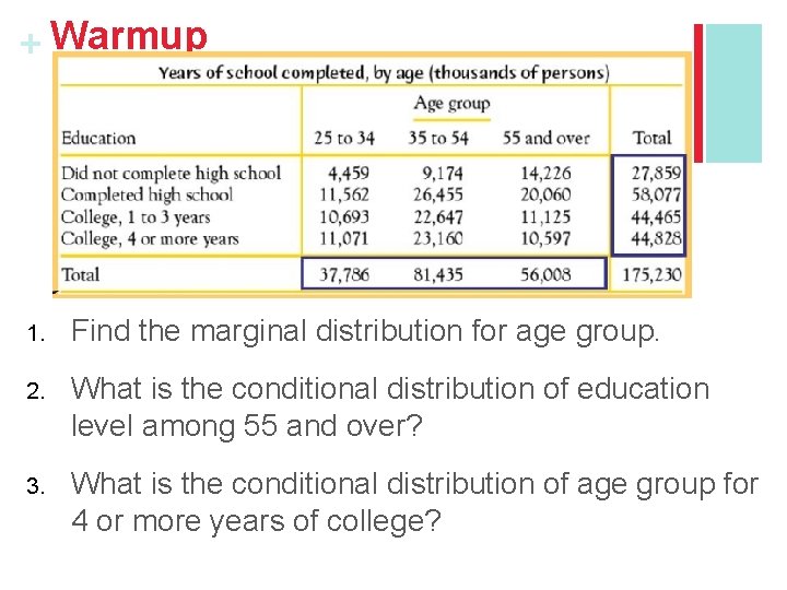
+ Warmup 1. Find the marginal distribution for age group. 2. What is the conditional distribution of education level among 55 and over? 3. What is the conditional distribution of age group for 4 or more years of college?
+ Section 1. 2 Displaying Quantitative Data with Graphs Learning Objectives After this section, you should be able to… ü CONSTRUCT and INTERPRET dotplots, stemplots, and histograms ü DESCRIBE the shape of a distribution ü COMPARE distributions ü USE histograms wisely
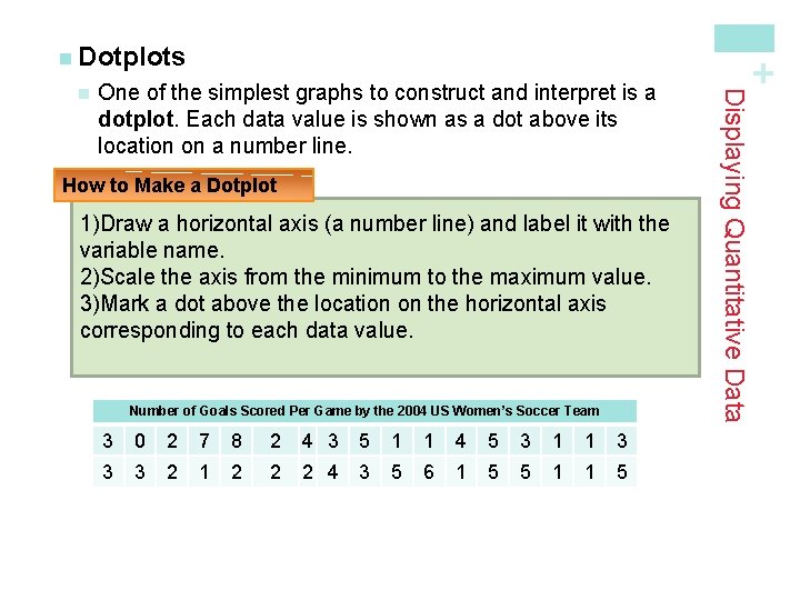
One of the simplest graphs to construct and interpret is a dotplot. Each data value is shown as a dot above its location on a number line. How to Make a Dotplot 1)Draw a horizontal axis (a number line) and label it with the variable name. 2)Scale the axis from the minimum to the maximum value. 3)Mark a dot above the location on the horizontal axis corresponding to each data value. Number of Goals Scored Per Game by the 2004 US Women’s Soccer Team 3 0 2 7 8 2 4 3 5 1 1 4 5 3 1 1 3 3 3 2 1 2 2 2 4 3 5 6 1 5 5 1 1 5 Displaying Quantitative Data n + n Dotplots
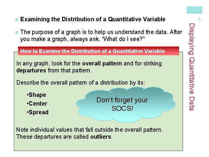
n The purpose of a graph is to help us understand the data. After you make a graph, always ask, “What do I see? ” How to Examine the Distribution of a Quantitative Variable In any graph, look for the overall pattern and for striking departures from that pattern. Describe the overall pattern of a distribution by its: • Shape • Center • Spread Don’t forget your SOCS! Note individual values that fall outside the overall pattern. These departures are called outliers. + Examining the Distribution of a Quantitative Variable Displaying Quantitative Data n
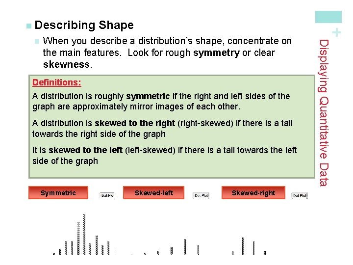
When you describe a distribution’s shape, concentrate on the main features. Look for rough symmetry or clear skewness. Definitions: A distribution is roughly symmetric if the right and left sides of the graph are approximately mirror images of each other. A distribution is skewed to the right (right-skewed) if there is a tail towards the right side of the graph It is skewed to the left (left-skewed) if there is a tail towards the left side of the graph Symmetric Skewed-left Skewed-right Displaying Quantitative Data n Shape + n Describing
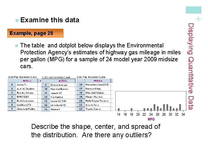
Example, page 28 n The table and dotplot below displays the Environmental Protection Agency’s estimates of highway gas mileage in miles per gallon (MPG) for a sample of 24 model year 2009 midsize cars. Describe the shape, center, and spread of the distribution. Are there any outliers? + this data Displaying Quantitative Data n Examine
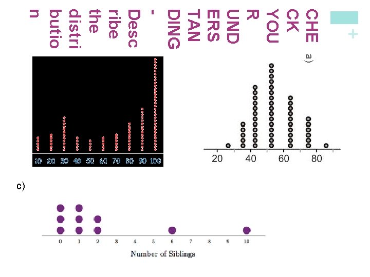
+ CHE a) b) CK YOU R UND ERS TAN DING Desc ribe the distri butio n c)
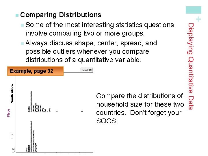
U. K Place South Africa Example, page 32 Compare the distributions of household size for these two countries. Don’t forget your SOCS! Displaying Quantitative Data Distributions n Some of the most interesting statistics questions involve comparing two or more groups. n Always discuss shape, center, spread, and possible outliers whenever you compare distributions of a quantitative variable. + n Comparing
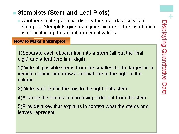
Another simple graphical display for small data sets is a stemplot. Stemplots give us a quick picture of the distribution while including the actual numerical values. How to Make a Stemplot 1)Separate each observation into a stem (all but the final digit) and a leaf (the final digit). 2)Write all possible stems from the smallest to the largest in a vertical column and draw a vertical line to the right of the column. 3)Write each leaf in the row to the right of its stem. 4)Arrange the leaves in increasing order out from the stem. 5)Provide a key that explains in context what the stems and leaves represent. Displaying Quantitative Data n (Stem-and-Leaf Plots) + n Stemplots
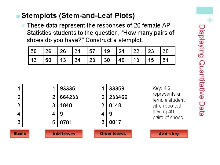
These data represent the responses of 20 female AP Statistics students to the question, “How many pairs of shoes do you have? ” Construct a stemplot. 50 26 26 31 57 19 24 22 23 38 13 50 13 34 23 30 49 13 15 51 1 1 93335 1 33359 2 2 664233 2 233466 3 3 1840 3 0148 4 4 9 5 5 0701 5 0017 Stems Add leaves Order leaves Key: 4|9 represents a female student who reported having 49 pairs of shoes. Add a key Displaying Quantitative Data n (Stem-and-Leaf Plots) + n Stemplots
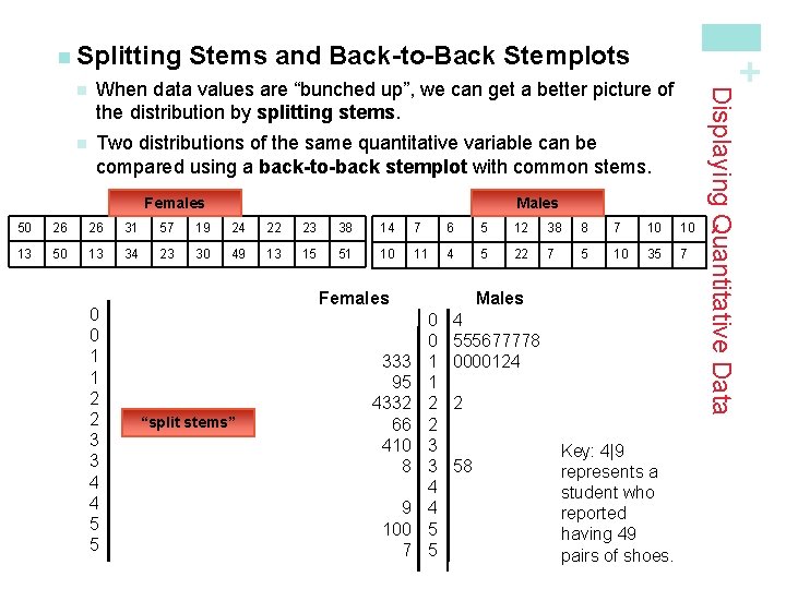
Stems and Back-to-Back Stemplots When data values are “bunched up”, we can get a better picture of the distribution by splitting stems. n Two distributions of the same quantitative variable can be compared using a back-to-back stemplot with common stems. Females Males 50 26 26 31 57 19 24 22 23 38 14 7 6 5 12 38 8 7 10 10 13 50 13 34 23 30 49 13 15 51 10 11 4 5 22 7 5 10 35 7 0 0 1 1 2 2 3 3 4 4 5 5 Females “split stems” 333 95 4332 66 410 8 9 100 7 Males 0 0 1 1 2 2 3 3 4 4 5 5 4 555677778 0000124 2 58 Key: 4|9 represents a student who reported having 49 pairs of shoes. Displaying Quantitative Data n + n Splitting
- Slides: 11