VV 064 PRESENTATION BASICS VV 064 Mgr Antonn

VV 064: PRESENTATION BASICS VV 064 Mgr. Antonín Zita, M. A.

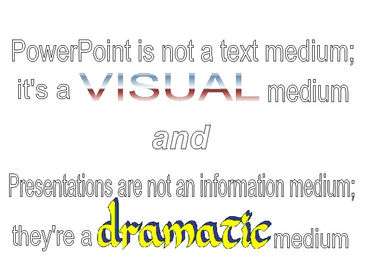
Avoid Using As a Script Although your visual aids are a useful memory aid for you, you need to consider your audience’s needs when you are designing them. Don’t use Power. Point as a script! This often results in slides being overloaded by text, which is too dense and too small for the audience to easily read. Ideally font size should be 24 points and above. The audience can read faster than you can speak so, if you are reading directly from your slides, they’ll be ahead of you and wondering why you didn’t just e-mail them a copy of your slides! As you are preparing your Power. Point presentation think about how it relates to what you are saying and what you intend the audience to learn from each slide. As you are presenting draw their attention to the relevant information on the slide.

Bad vs. Good Visuals Impact of Malpractice Reforms Direct reforms had a larger effect on the supply of nongroup vs group physicians, on the supply of most (but not all) specialties with high malpractice insurance premiums, on states with high levels of managed care, and on supply through retirements and entries than through the propensity of physicians to move between the states. Impact of Malpractice Reforms Larger effect on: � Nongroup vs group physicians � Most specialties � Managed care � Retirement & entries

Bad vs. Good Visuals Too much text in slides is detrimental Animations are very useful Control the amount of information that the audience sees at a given moment. Audience will pay attention to the content of your speech

Text Formatting Don’t use ugly/complicated fonts Don’t use annoying or difficult to see colors � Don’t change colors between the points
 Don’t use distracting/difficult to read from backgrounds Be consistent in")
Text Formatting (cont. ) Don’t use distracting/difficult to read from backgrounds Be consistent in the use of backgrounds
 • Don’t make your visuals too bland")
Text Formatting (cont. ) • Don’t make your visuals too bland

Visuals Avoid bad or irrelevant visuals Should be related to the topic

Introducing the next material Now, let’s look at / let’s have a look at / I’d like you to look at … Now, I’ll show you / let me show you. . . Let’s move on and look at the figures for … If we now turn to … For … the situation is very different.

General explanatory phrases The next slide shows … Referring to the diagram, let me … As you/we can see from/in the chart … If you look at the screen, you’ll see. . . As the graph shows/indicates… As the figures show/indicate… From the Table 1 we can/may. . . see / conclude / show / estimate / calculate / infer that… The chart compares … You can see here the development over the past five years… X increased/shot up/grew/rose by. . . X declined/reduced/decreased/dropped/fell by…

Specific explanatory phrases I’d like us to look at this part of the graph in more detail. I’d like to focus our attention on one particularly important feature. I’d like you to think about the significance of this figure here. I’d like point out one or two interesting details here. I’d like draw your attention to the upper half of the chart.
 The upper part of the slide gives information about")
Specific explanatory phrases (cont. ) The upper part of the slide gives information about … On the right/left you can see. . . I’ll let you read this one. (pause) As you can see, there are several surprising/unexpected developments. If you look at it more closely, you’ll notice… (e. g. a couple of apparent anomalies. ) Whichever way you look at it, … (e. g. these are some of our best results ever. ) I’d like us to have a look at. . in more detail. As you can see, . . I’d also like to draw your attention to. . . I only draw attention to some of …. If you look at the first point, you’ll see. . .

Drawing conclusions I’m sure the conclusions to be drawn from this are. . . The lesson to be learned from this is. . . The significance of this is … The implications of this are. . . The message here is. . … clear/easy to understand/that XYZ

Examples Have a look at this graph. As you can see, it shows a fairly typical growth curve for a young company in the early stages of its development. The vertical axis shows the turnover in millions of dollars and the horizontal axis represents the years 2000 to 2006. The graph we’re looking at very clearly demonstrates the comparative development of demography in the EU member states, and gives us some idea of how far deserted rural areas levels in the south, shown here, exceed the rest.

Sources Ippolito, Kate. “Effective Power. Point Presentations. ” Learn Higher. http: //archive. learnhigher. ac. uk/groupwork/episode 6/amp/altv ersion. html Smith, Jeff. “Suing Power. Point Well. ” Department of English and American Studies, Faculty of Arts, Masaryk University. Presentation. “Successfully Using Visual Aids in Your Presentation. ” University of Alabama School of Medicine. 2005. http: //www. uab. edu/uasomume/fd 2/visuals/index. htm Štěpánek, Libor. Oral Presentations Seminar. http: //online. cjv. muni. cz/opc/click-to-start. html Williams, Erica J. Presentations in English. Honkong: Mac. Millan, 2008.
- Slides: 16