Vocabulary scatter plot correlation positive correlation negative correlation

Vocabulary scatter plot correlation positive correlation negative correlation no correlation trend line or Line of Best Fit

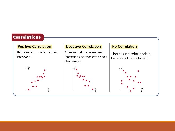
A correlation describes a relationship between two data sets. A graph may show the correlation between data. The correlation can help you analyze trends and make predictions. There are three types of correlations between data.

You can graph a function on a scatter plot to help show a relationship in the data. Sometimes the function is a straight line. This line, called a Line of Best Fit or Trend Line, helps show the correlation between data sets more clearly. It can also be helpful when making predictions based on the data.

Example 1 A: Identifying Correlations Identify the correlation you would expect to see between the pair of data sets. Explain. the average temperature in a city and the number of speeding tickets given in the city You would expect to see no correlation. The number of speeding tickets has nothing to do with the temperature.

Example 1 B: Identifying Correlations Identify the correlation you would expect to see between the pair of data sets. Explain. a runner’s time and the distance to the finish line You would expect to see a negative correlation. As a runner’s time increases, the distance to the finish line decreases.

Example 1 C Identify the type of correlation you would expect to see between the pair of data sets. Explain. the number of members in a family and the size of the family’s grocery bill You would expect to see positive correlation. As the number of members in a family increases, the size of the grocery bill increases.

Example 2: Matching Scatter Plots to Situations Choose the scatter plot that best represents the relationship between the age of a car and the amount of money spent each year on repairs. Explain. Graph A Graph B Graph C

Example 2 Continued Choose the scatter plot that best represents the relationship between the age of a car and the amount of money spent each year on repairs. Explain. Graph A shows negative values, so it is incorrect. Graph C shows negative correlation, so it is incorrect. Graph B is the correct scatter plot. Graph B Graph C

2/11/16 Choose the scatter plot that best represents the relationship between the number of minutes since a pie has been taken out of the oven and the temperature of the pie. Explain. Graph A Graph B Graph C

Check It Out! Example 4 Choose the scatter plot that best represents the relationship between the number of minutes since a pie has been taken out of the oven and the temperature of the pie. Explain. Graph A Graph B Graph C Graph B shows the pie cooling while it is in the oven, so it is incorrect. Graph C shows the temperature of the pie increasing, so it is incorrect. Graph A is the correct answer.

Example 5: Fund-Raising Application The scatter plot shows a relationship between the total amount of money collected at the concession stand the total number of tickets sold at a movie theater. Based on this relationship, predict how much money will be collected at the concession stand when 150 tickets have been sold. Draw a trend line and use it to make a prediction. Draw a line that has about the same number of points above and below it. Your line may or may not go through data points. Find the point on the line whose x-value is 150. The corresponding y-value is 750. Based on the data, $750 is a reasonable prediction of how much money will be collected when 150 tickets have been sold.

Example 5 Based on the trend line, predict how many wrapping paper rolls need to be sold to raise $500. Find the point on the line whose y-value is 500. The corresponding x-value is about 75. Based on the data, about 75 wrapping paper rolls is a reasonable prediction of how many rolls need to be sold to raise $500.

For Items 1 and 2, identify the correlation you would expect to see between each pair of data sets. Explain. 1. The outside temperature in the summer and the cost of the electric bill Positive correlation; as the outside temperature increases, the electric bill increases because of the air conditioner. 2. The price of a car and the number of passengers it seats No correlation; a very expensive car could seat only 2 passengers.

2/12/16 The scatter plot shows the number of orders placed for flowers before Valentine’s Day at one shop. Based on this relationship, predict the number of flower orders placed on February 12. about 45
- Slides: 15