Visuals Can Be More Attention Grabbing And Memorable
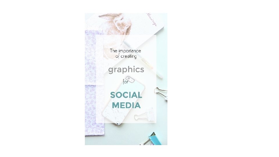
")
Visuals Can Be More Attention Grabbing And Memorable Than Text Alone (in some instances) • “For example, if you’re hungry and you see a picture of a sandwich on Facebook, you’ll continue to read the ad. On the other hand, if it had been a post without the visual of a sandwich, it wouldn’t have had much affect on you and it’s likely you wouldn’t have noticed it. ”

People Are More Compelled to Take Action With a Visual • Visual content is more than 40 X more likely to get shared on social media than other types of content (source) • Another on Facebook found:

With images • Make sure its relevant • “If the image doesn’t fit your: • Brand • Niche • Status Update Then you’re going to drive your audience away from the image—and the share button—and right onto the next post in their feed. ”
 • Studies show that")
Useful Graphics Get More Shares Than Text (Infographics, Quotes, Guides) • Studies show that people pay closer attention to the text they read on infographics. By presenting facts visually with accompanying relevant visuals, readers are more likely to follow directions and share and/or like your post.

Use visuals to break down complex subjects or in place of words/lists A major advantage of infographics is that they make it easy to understand what is otherwise complex information. Because they only allow for so many words, they take these complex situations and break them down into only what is necessary and is accompanied by a graphic. “It is the equivalent to a step-by-step blog post, only in few words and more pictures. ”

If you’re looking for maximum shares and engagement, your best choice is to go with a clear explanatory image—or a simple, easy-to-digest design—so the reader has to do less work to figure out what you’re trying to say.

• Quotes are very popular as well for likes and shares, because they express emotion.

Can help with branding

Tease out longform content • Create smaller images of key data points and use them to introduce the full content that lives on your blog.

Create evergreen content to use year round

Basic Design Principles

• The psychology of design shows that people are most responsive – and more likely to engage – with images or logos that are laid out in a clean and simple way. That’s because if people are presented with too much information, it can be overwhelming and force them to switch off.

• Clarity • Whether your design is simple or complex, it should be clear, especially with regard to social media graphics. Don’t overdo the design and keep the balance between simplicity and informativeness. You don’t have much time to impress followers, so ensure your message is obvious. • That means Less is more: Don’t give your audience too much to look at.

Legibility • Don’t overdo it with fancy typefaces that might look pretty, but ultimately will detract from legibility. • A large share of your content will be consumed on the small screen. Keep that font size up.

Emotion in fonts • Fonts have been shown to impact everything from your political beliefs, to whether you’re an optimist or a pessimist and how long someone will read an article for. • Decide on your emotion: You’ve already seen how emotion is a driver behind sharing, so be clear on the emotion you want them to feel.

• Hierarchy • Color & Typography: tone • Try to use the colors to make standout points in your images.

Fonts • Choose clear, crisp fonts. Since typography quotes are as much about the message as they are about the design, you must ensure the text doesn’t take time to decipher, otherwise all the impact will be lost. Save fancier ones to add emphasis when needed. • Use colors from your background image to make your text pop

Your Infographics for Social Media Don’t Have to Be Complex

Emotion: Why are there so many quote graphics? • The more emotions you can work into your image, the better. Research shows a direct correlation between the emotional content of an image, and how viral it goes.

Don’t Make One Infographic Fit Into All Social Media Channels • Your customers that like you on Pinterest behave differently than your customers on Instagram, Twitter, and Facebook. Your content should cater to these audiences individually, with different size specifications and content strategies for each of them. • Examples: large images and minimal content for Instagram users • Share your full infographic on Pinterest, where the tile format makes it easier to see and share long images. • Really long infographics rarely look good on Twitter or Facebook, and are incredibly hard to read. Uncluttered images with moderate or minimal text will perform much better or a teaser (cause more likely to be traffic driver)

• Canva • Piktochart • Adobe Spark • Adobe In. Design
- Slides: 22