Visualizing Major Change Using an Interactive Sankey Diagram


- Slides: 32

Visualizing Major Change Using an Interactive Sankey Diagram

Visualizing Major Change Using an Interactive Sankey Diagram - M. Davenport Who am I? • Mark Davenport – Sr Research Associate, IR, UNCG • I started computer programming in 1982; BASIC and COBOL • My programming career lasted 6 months • This fact will become relevant by the end of the presentation 9/15/2021 2

Visualizing Major Change Using an Interactive Sankey Diagram - M. Davenport Why am I here? • Analytics and visualization are becoming increasingly important in higher ed • Patterns of major change from application through graduation are one important example • IR must learn to do more with less • For every costly software solution, there is likely an opensource (free) alternative 9/15/2021 3

Visualizing Major Change Using an Interactive Sankey Diagram - M. Davenport Why major change? • Can be an indicator of program viability • Can provide predictive metrics for monitoring growth/decline, changing need for resources • Can provide insights into changes in student interests/needs • Can provide insights into retention/graduation anomalies 9/15/2021 4

Visualizing Major Change Using an Interactive Sankey Diagram - M. Davenport Monitoring program viability/change • Do the students that start in a program stay with that program? • How long does it take them to graduate? • Do programs have unknown ‘feeder’ programs? • Which programs loose the most students between Fall 1 and Fall 2? Fall 2 and Fall 3? 9/15/2021 5

Visualizing Major Change Using an Interactive Sankey Diagram - M. Davenport Change in student interest • If students leave the program, where do they go (e. g. , pre-professional majors that don’t make the cut)? • Is interest in particular majors dwindling/ballooning? • Stop-out/drop-out patterns? 9/15/2021 6

Visualizing Major Change Using an Interactive Sankey Diagram - M. Davenport Outcome anomalies: An example • Geography program at UNCG • Fewer than 5 start in Geography as FT-FY new students but 20 of 30 may graduate • Grad rate based only on the FT-FY cohort may swing wildly due to low numbers • Geography picks up many 2 nd- and 3 rd-year from other data-intensive majors like computer science 9/15/2021 7

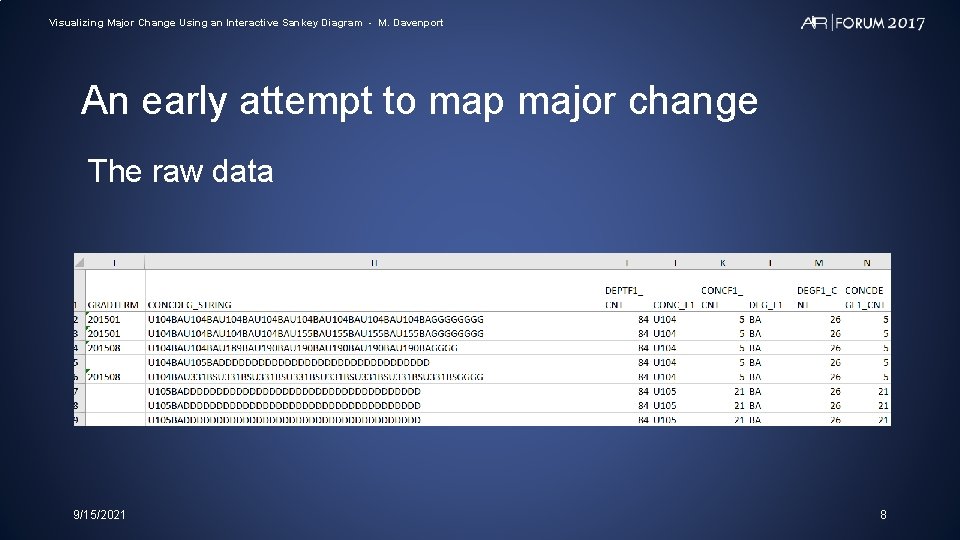
Visualizing Major Change Using an Interactive Sankey Diagram - M. Davenport An early attempt to map major change The raw data 9/15/2021 8

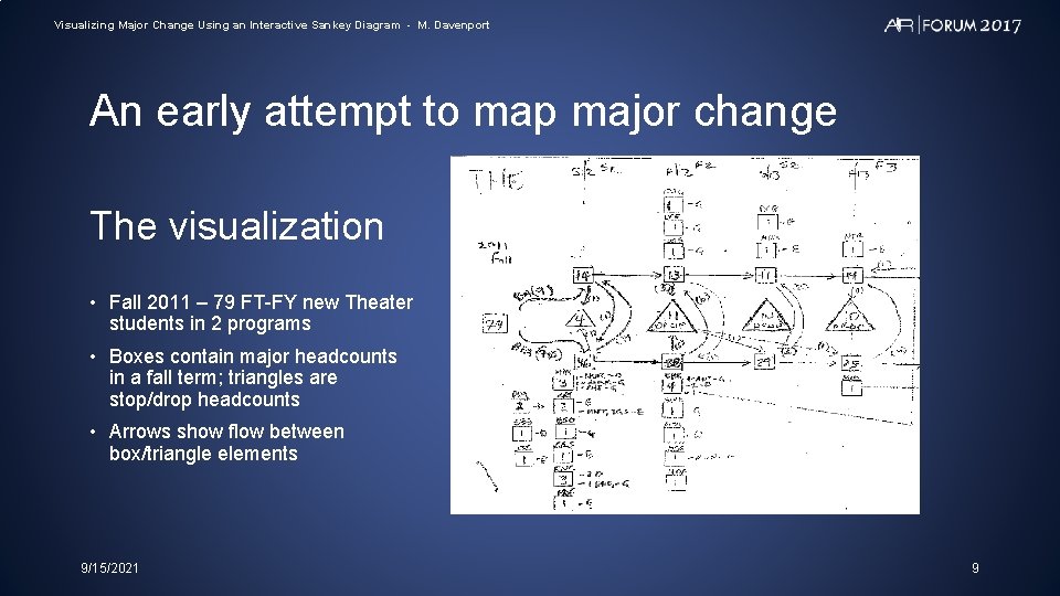
Visualizing Major Change Using an Interactive Sankey Diagram - M. Davenport An early attempt to map major change The visualization • Fall 2011 – 79 FT-FY new Theater students in 2 programs • Boxes contain major headcounts in a fall term; triangles are stop/drop headcounts • Arrows show flow between box/triangle elements 9/15/2021 9

Visualizing Major Change Using an Interactive Sankey Diagram - M. Davenport An early attempt to map major change The problem? • Tedious to create • Impossible to explain 9/15/2021 10

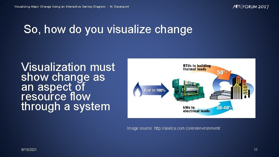
Visualizing Major Change Using an Interactive Sankey Diagram - M. Davenport So, how do you visualize change Visualization must show change as an aspect of resource flow through a system Image source: http: //aselca. com. co/en/environment/ 9/15/2021 11

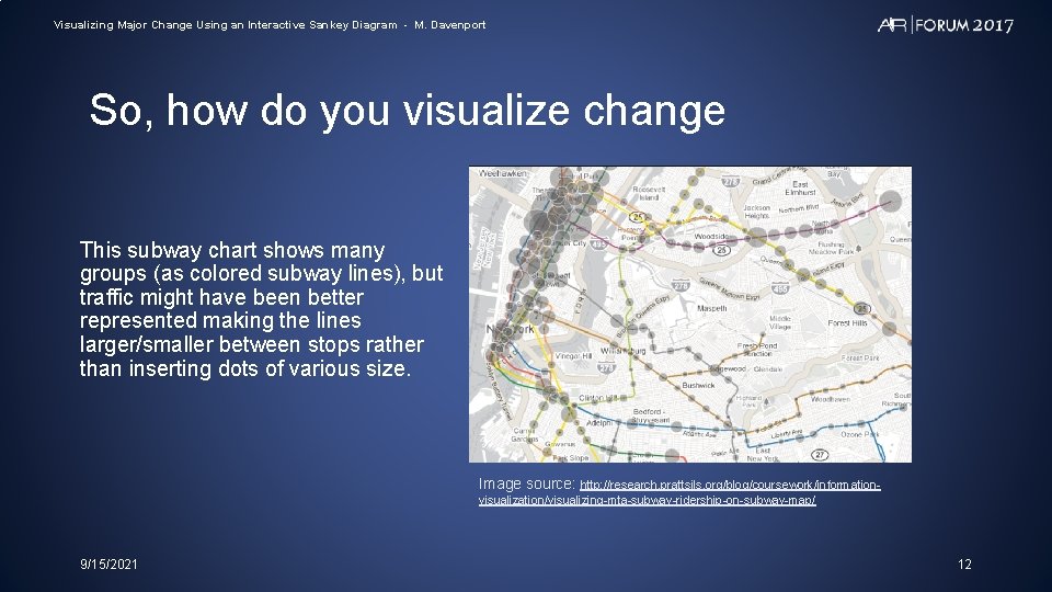
Visualizing Major Change Using an Interactive Sankey Diagram - M. Davenport So, how do you visualize change This subway chart shows many groups (as colored subway lines), but traffic might have been better represented making the lines larger/smaller between stops rather than inserting dots of various size. Image source: http: //research. prattsils. org/blog/coursework/informationvisualization/visualizing-mta-subway-ridership-on-subway-map/ 9/15/2021 12

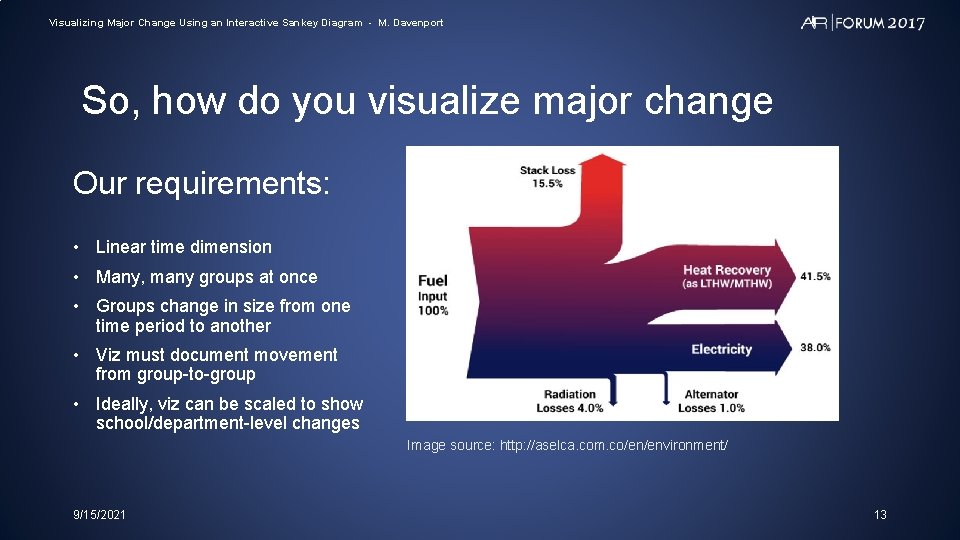
Visualizing Major Change Using an Interactive Sankey Diagram - M. Davenport So, how do you visualize major change Our requirements: • Linear time dimension • Many, many groups at once • Groups change in size from one time period to another • Viz must document movement from group-to-group • Ideally, viz can be scaled to show school/department-level changes Image source: http: //aselca. com. co/en/environment/ 9/15/2021 13

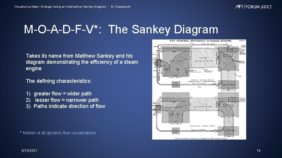
Visualizing Major Change Using an Interactive Sankey Diagram - M. Davenport M-O-A-D-F-V*: The Sankey Diagram Takes its name from Matthew Sankey and his diagram demonstrating the efficiency of a steam engine The defining characteristics: 1) greater flow = wider path 2) lesser flow = narrower path 3) Paths indicate direction of flow * Mother of all dynamic flow visualizations 9/15/2021 14

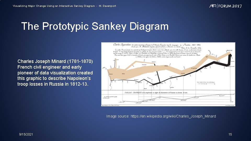
Visualizing Major Change Using an Interactive Sankey Diagram - M. Davenport The Prototypic Sankey Diagram Charles Joseph Minard (1781 -1870) French civil engineer and early pioneer of data visualization created this graphic to describe Napoleon’s troop losses in Russia in 1812 -13. Image source: https: //en. wikipedia. org/wiki/Charles_Joseph_Minard 9/15/2021 15

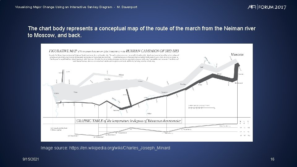
Visualizing Major Change Using an Interactive Sankey Diagram - M. Davenport The chart body represents a conceptual map of the route of the march from the Neiman river to Moscow, and back. Image source: https: //en. wikipedia. org/wiki/Charles_Joseph_Minard 9/15/2021 16

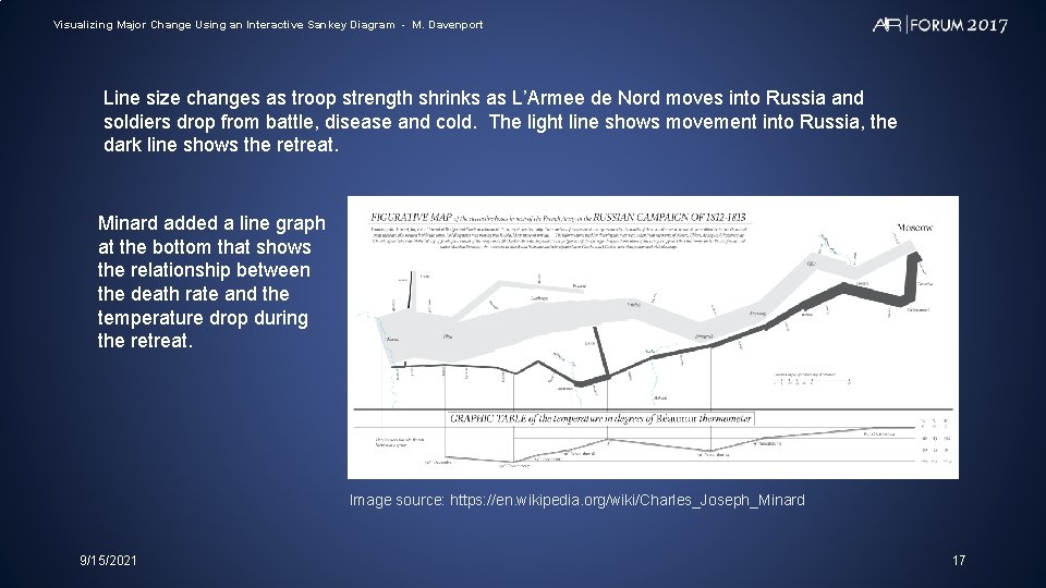
Visualizing Major Change Using an Interactive Sankey Diagram - M. Davenport Line size changes as troop strength shrinks as L’Armee de Nord moves into Russia and soldiers drop from battle, disease and cold. The light line shows movement into Russia, the dark line shows the retreat. Minard added a line graph at the bottom that shows the relationship between the death rate and the temperature drop during the retreat. Image source: https: //en. wikipedia. org/wiki/Charles_Joseph_Minard 9/15/2021 17

Visualizing Major Change Using an Interactive Sankey Diagram - M. Davenport Sankey diagram software • Google https: //developers. google. com/chart/interactive/docs/gallery/sankey • R packages: ‘riverplot’ ‘google. Vis’ • Tableau https: //community. tableau. com/thread/152115 • D 3 https: //bost. ocks. org/mike/sankey/ 9/15/2021 18

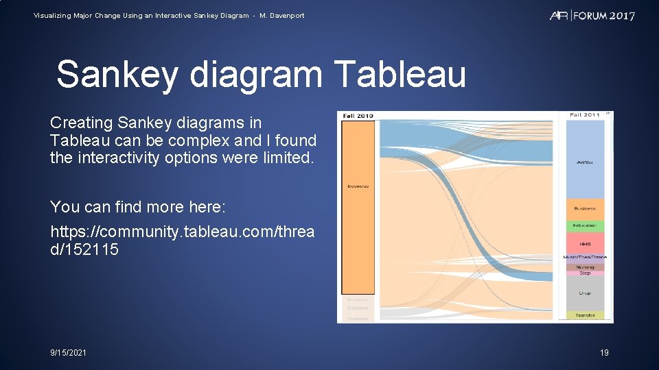
Visualizing Major Change Using an Interactive Sankey Diagram - M. Davenport Sankey diagram Tableau Creating Sankey diagrams in Tableau can be complex and I found the interactivity options were limited. You can find more here: https: //community. tableau. com/threa d/152115 9/15/2021 19

Visualizing Major Change Using an Interactive Sankey Diagram - M. Davenport Sankey diagram D 3 is a javascript library designed to ease the process of making interactive webvisualizations Steep learning curve but well worth the trip 9/15/2021 20

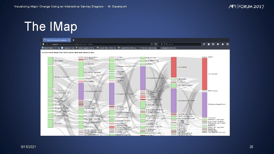
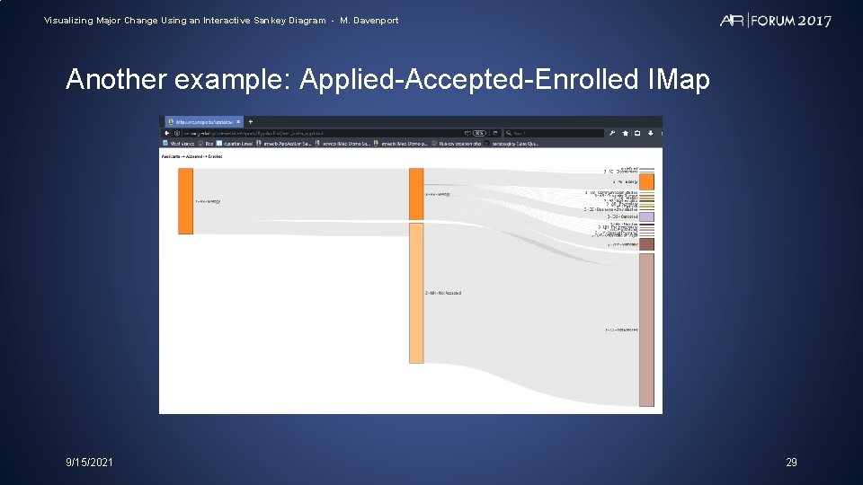
Visualizing Major Change Using an Interactive Sankey Diagram - M. Davenport The Interactive Major Movement Map (Imap) Five-year IMap for the Bryan School of Business: • http: //ire. uncg. edu/research/Air-2017 -Mark-Davenport/IMap_BE_Demo_5. html Applied—Accepted—Enrolled IMap: • http: //ire. uncg. edu/research/Air-2017 -Mark-Davenport/web_index_app. html 9/15/2021 21

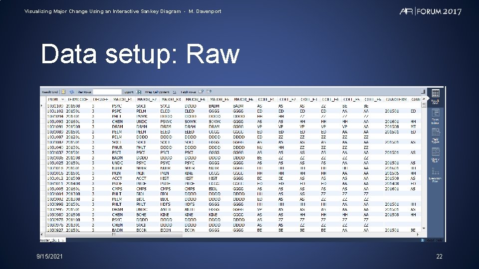
Visualizing Major Change Using an Interactive Sankey Diagram - M. Davenport Data setup: Raw 9/15/2021 22

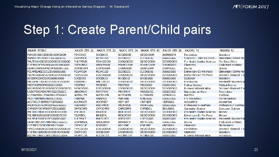
Visualizing Major Change Using an Interactive Sankey Diagram - M. Davenport Step 1: Create Parent/Child pairs 9/15/2021 23

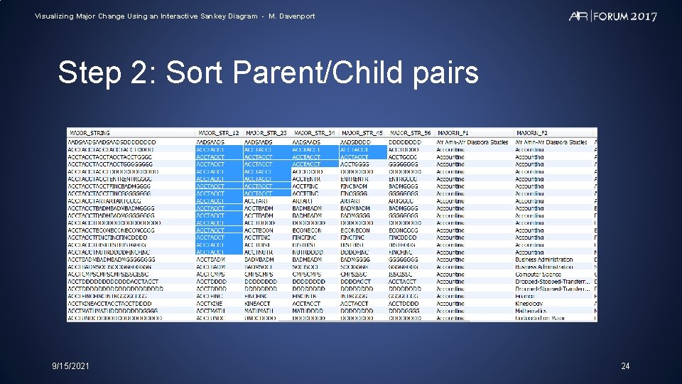
Visualizing Major Change Using an Interactive Sankey Diagram - M. Davenport Step 2: Sort Parent/Child pairs 9/15/2021 24

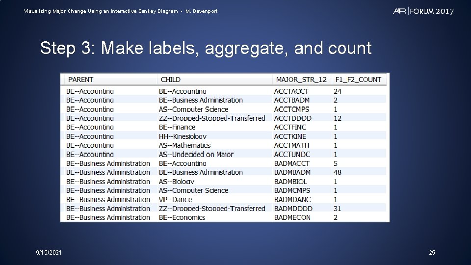
Visualizing Major Change Using an Interactive Sankey Diagram - M. Davenport Step 3: Make labels, aggregate, and count 9/15/2021 25

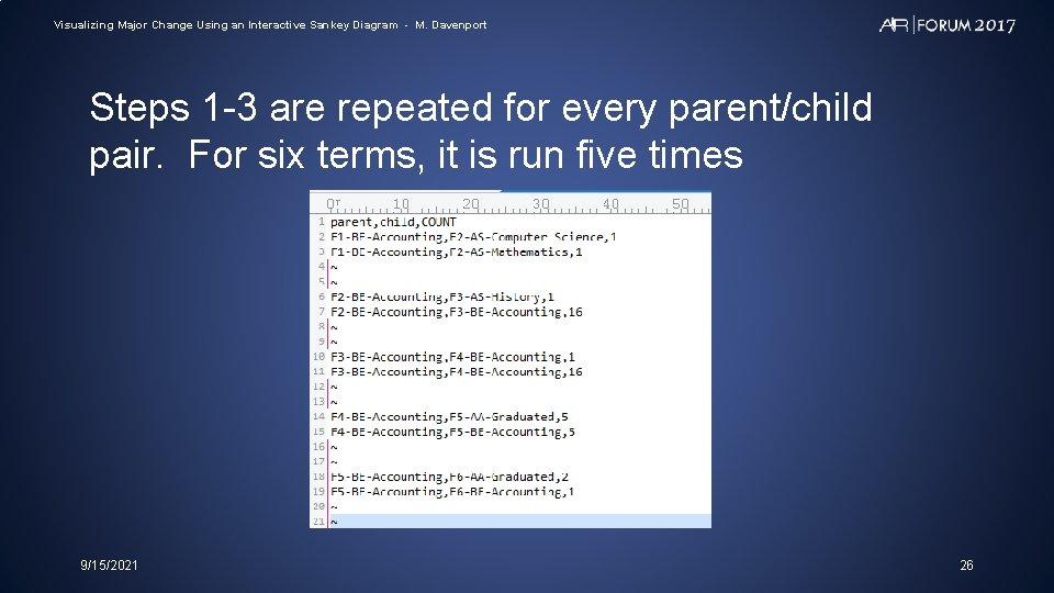
Visualizing Major Change Using an Interactive Sankey Diagram - M. Davenport Steps 1 -3 are repeated for every parent/child pair. For six terms, it is run five times 9/15/2021 26

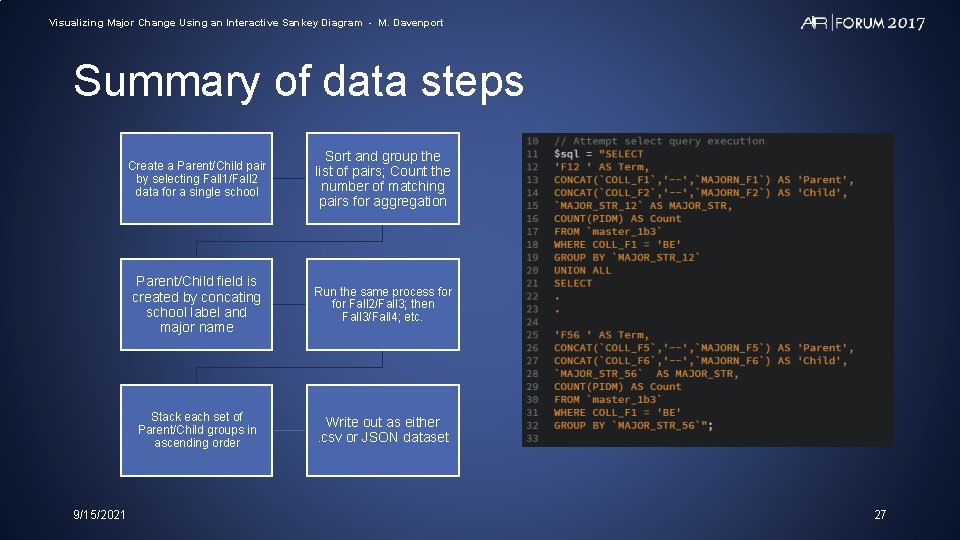
Visualizing Major Change Using an Interactive Sankey Diagram - M. Davenport Summary of data steps 9/15/2021 Create a Parent/Child pair by selecting Fall 1/Fall 2 data for a single school Sort and group the list of pairs; Count the number of matching pairs for aggregation Parent/Child field is created by concating school label and major name Run the same process for Fall 2/Fall 3; then Fall 3/Fall 4; etc. Stack each set of Parent/Child groups in ascending order Write out as either. csv or JSON dataset 27

Visualizing Major Change Using an Interactive Sankey Diagram - M. Davenport The IMap 9/15/2021 28

Visualizing Major Change Using an Interactive Sankey Diagram - M. Davenport Another example: Applied-Accepted-Enrolled IMap 9/15/2021 29

Visualizing Major Change Using an Interactive Sankey Diagram - M. Davenport Future improvements • Fully functional webpage that allows schools and departments to drill down to their own students • PHP/My. Sql functionality that runs the entire process from raw data at the click of a button • Programs to be posted on my Git. Hub site when complete 9/15/2021 30

Visualizing Major Change Using an Interactive Sankey Diagram - M. Davenport Acknowledgements Much of the code used in this project was produced by others and posted on Git. Hub. My gratitude to: Sara Quigley -- https: //github. com/saraquigley Mike Bostock – https: //d 3 js. org/ Creator of D 3 9/15/2021 31

Please remember to submit your evaluation for this session through the My. Forum app