Visualizing Data Received From GOES16 Using Python and

- Slides: 1

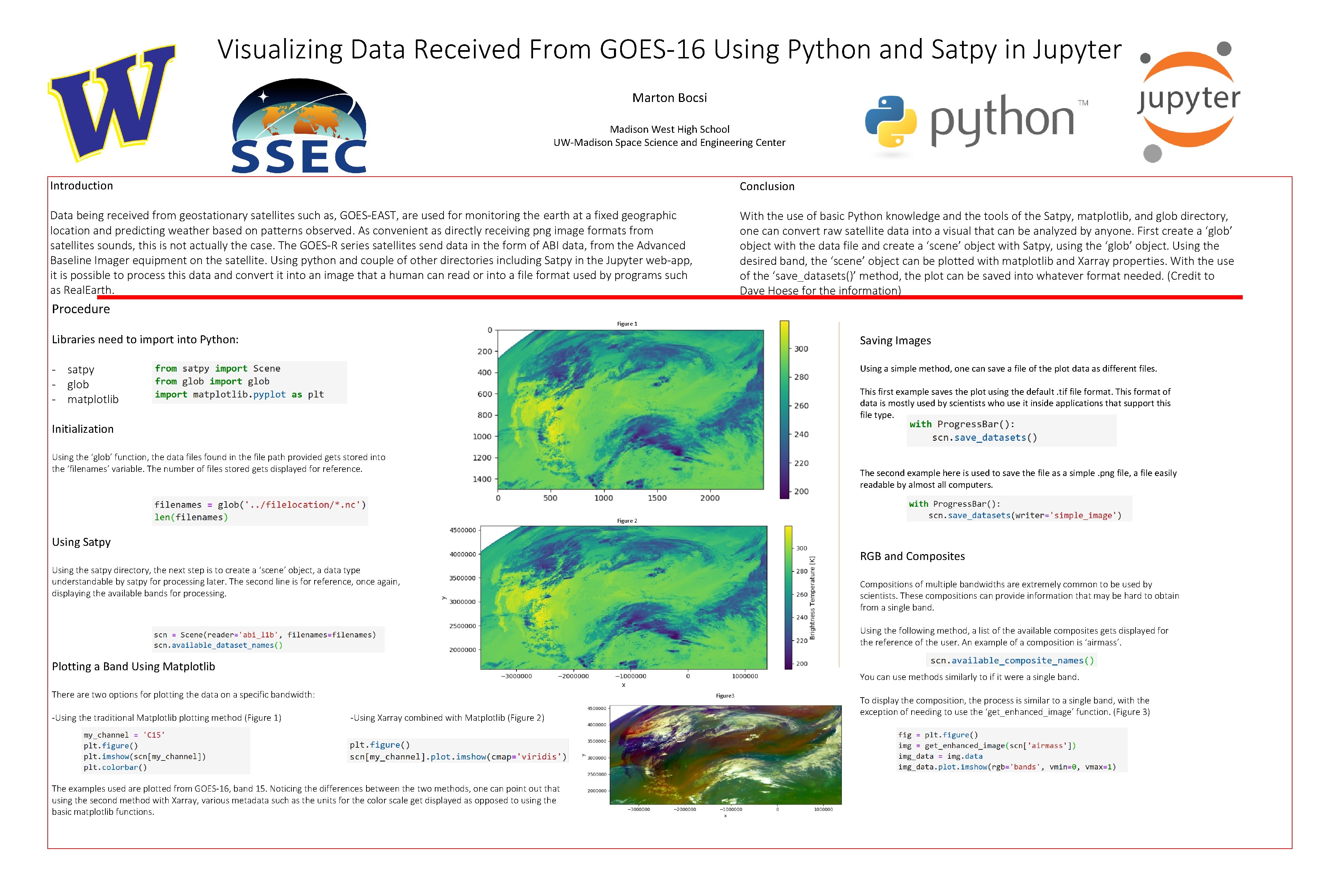
Visualizing Data Received From GOES-16 Using Python and Satpy in Jupyter Marton Bocsi Madison West High School UW-Madison Space Science and Engineering Center Introduction Conclusion Data being received from geostationary satellites such as, GOES-EAST, are used for monitoring the earth at a fixed geographic location and predicting weather based on patterns observed. As convenient as directly receiving png image formats from satellites sounds, this is not actually the case. The GOES-R series satellites send data in the form of ABI data, from the Advanced Baseline Imager equipment on the satellite. Using python and couple of other directories including Satpy in the Jupyter web-app, it is possible to process this data and convert it into an image that a human can read or into a file format used by programs such as Real. Earth. With the use of basic Python knowledge and the tools of the Satpy, matplotlib, and glob directory, one can convert raw satellite data into a visual that can be analyzed by anyone. First create a ‘glob’ object with the data file and create a ‘scene’ object with Satpy, using the ‘glob’ object. Using the desired band, the ‘scene’ object can be plotted with matplotlib and Xarray properties. With the use of the ‘save_datasets()’ method, the plot can be saved into whatever format needed. (Credit to Dave Hoese for the information) Procedure Figure 1 Libraries need to import into Python: Saving Images - satpy - glob - matplotlib Using a simple method, one can save a file of the plot data as different files. This first example saves the plot using the default. tif file format. This format of data is mostly used by scientists who use it inside applications that support this file type. Initialization Using the ‘glob’ function, the data files found in the file path provided gets stored into the ‘filenames’ variable. The number of files stored gets displayed for reference. The second example here is used to save the file as a simple. png file, a file easily readable by almost all computers. Figure 2 Using Satpy RGB and Composites Using the satpy directory, the next step is to create a ‘scene’ object, a data type understandable by satpy for processing later. The second line is for reference, once again, displaying the available bands for processing. Compositions of multiple bandwidths are extremely common to be used by scientists. These compositions can provide information that may be hard to obtain from a single band. Using the following method, a list of the available composites gets displayed for the reference of the user. An example of a composition is ‘airmass’. Plotting a Band Using Matplotlib You can use methods similarly to if it were a single band. There are two options for plotting the data on a specific bandwidth: -Using the traditional Matplotlib plotting method (Figure 1) Figure 3 -Using Xarray combined with Matplotlib (Figure 2) The examples used are plotted from GOES-16, band 15. Noticing the differences between the two methods, one can point out that using the second method with Xarray, various metadata such as the units for the color scale get displayed as opposed to using the basic matplotlib functions. To display the composition, the process is similar to a single band, with the exception of needing to use the ‘get_enhanced_image’ function. (Figure 3)