Visualizing Collections Data Why Pie Charts Arent Always
- Slides: 28

Visualizing Collections Data Why Pie Charts Aren't Always the Answer

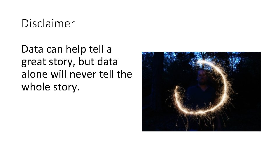
Disclaimer Data can help tell a great story, but data alone will never tell the whole story.

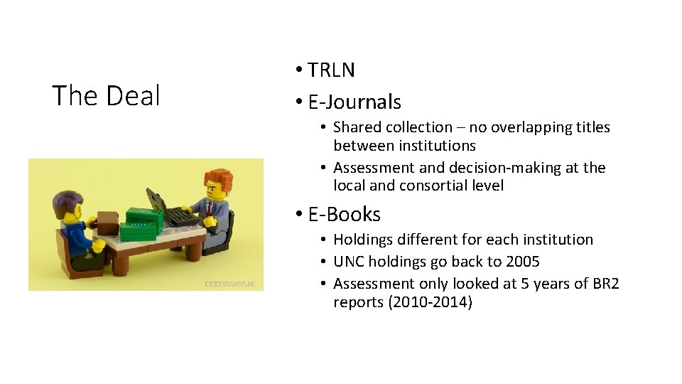
The Deal • TRLN • E-Journals • Shared collection – no overlapping titles between institutions • Assessment and decision-making at the local and consortial level • E-Books • Holdings different for each institution • UNC holdings go back to 2005 • Assessment only looked at 5 years of BR 2 reports (2010 -2014)

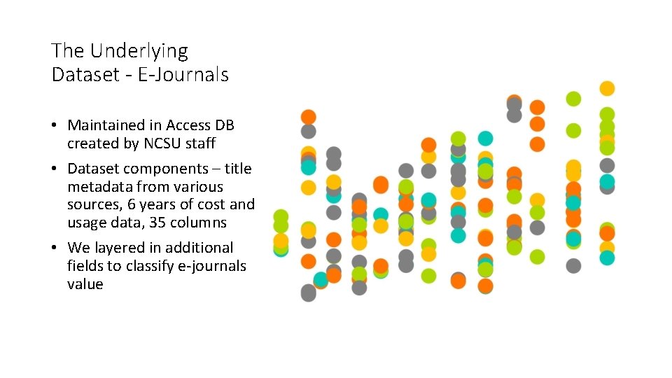
The Underlying Dataset - E-Journals • Maintained in Access DB created by NCSU staff • Dataset components – title metadata from various sources, 6 years of cost and usage data, 35 columns • We layered in additional fields to classify e-journals value

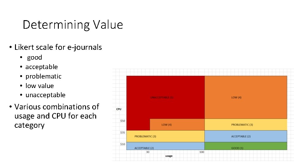
Determining Value • Likert scale for e-journals • • • good acceptable problematic low value unacceptable • Various combinations of usage and CPU for each category

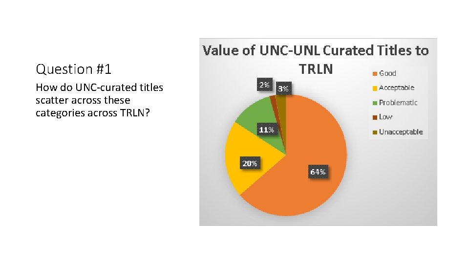
Question #1 How do UNC-curated titles scatter across these categories across TRLN?

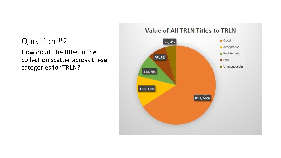
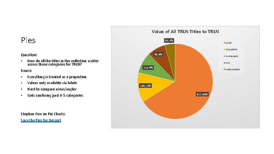
Question #2 How do all the titles in the collection scatter across these categories for TRLN?

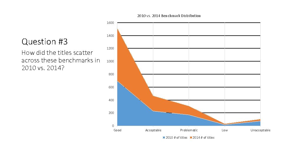
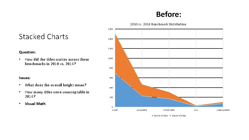
2010 vs. 2014 Benchmark Distribution 1600 Question #3 How did the titles scatter across these benchmarks in 2010 vs. 2014? 1400 1200 1000 800 600 400 200 0 Good Acceptable Problematic 2010 # of titles 2014 # of titles Low Unacceptable

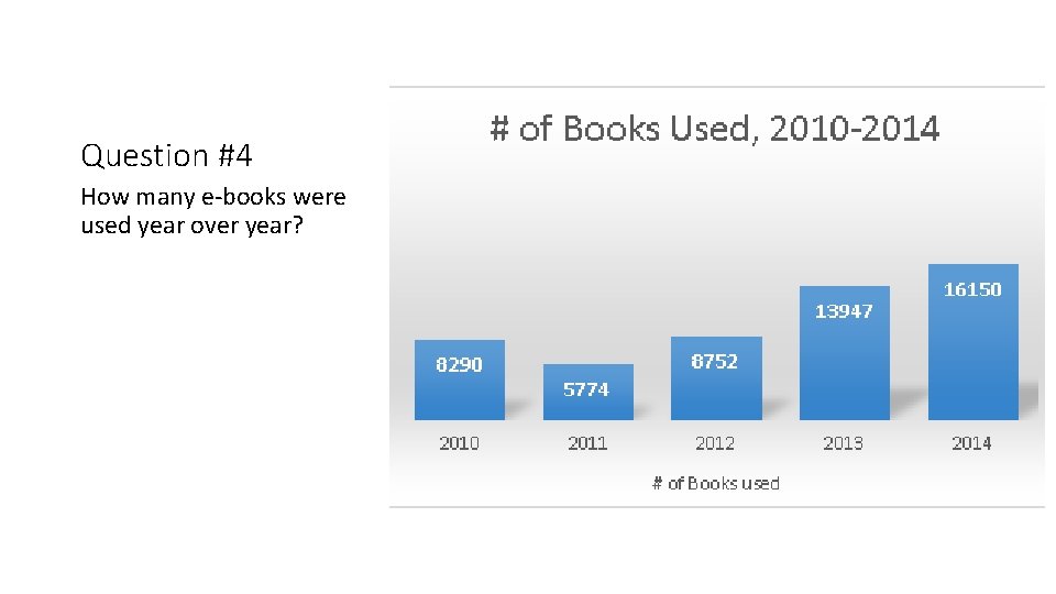
Question #4 How many e-books were used year over year?

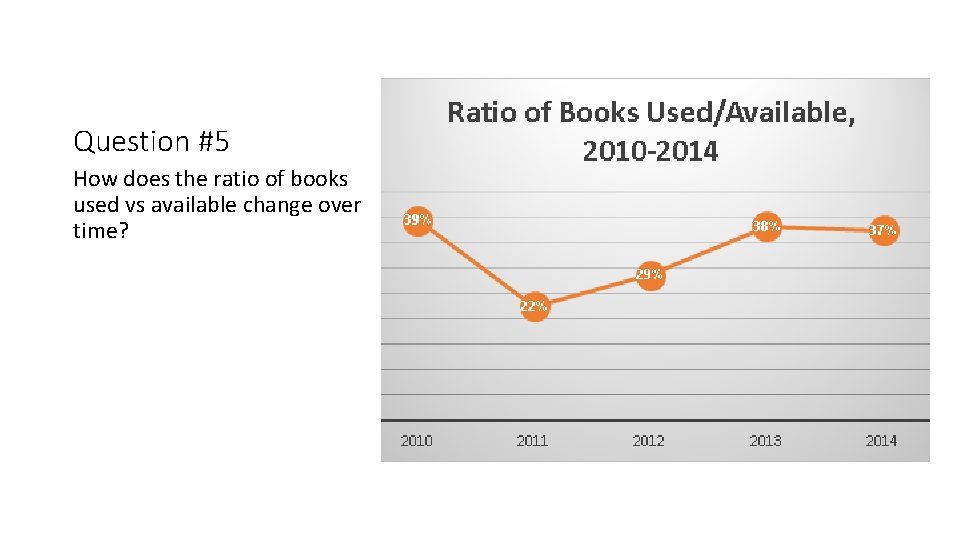
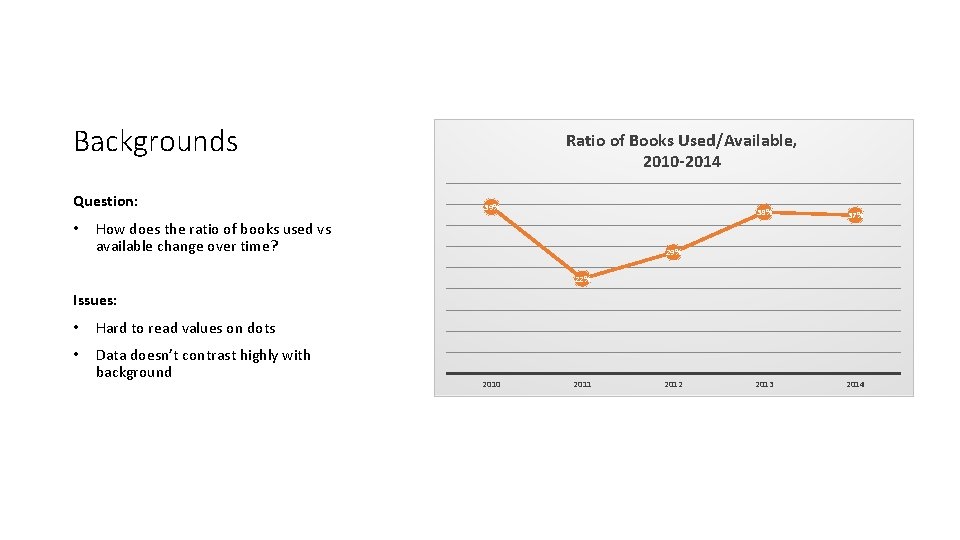
Question #5 How does the ratio of books used vs available change over time?

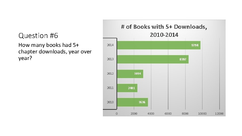
Question #6 How many books had 5+ chapter downloads, year over year?

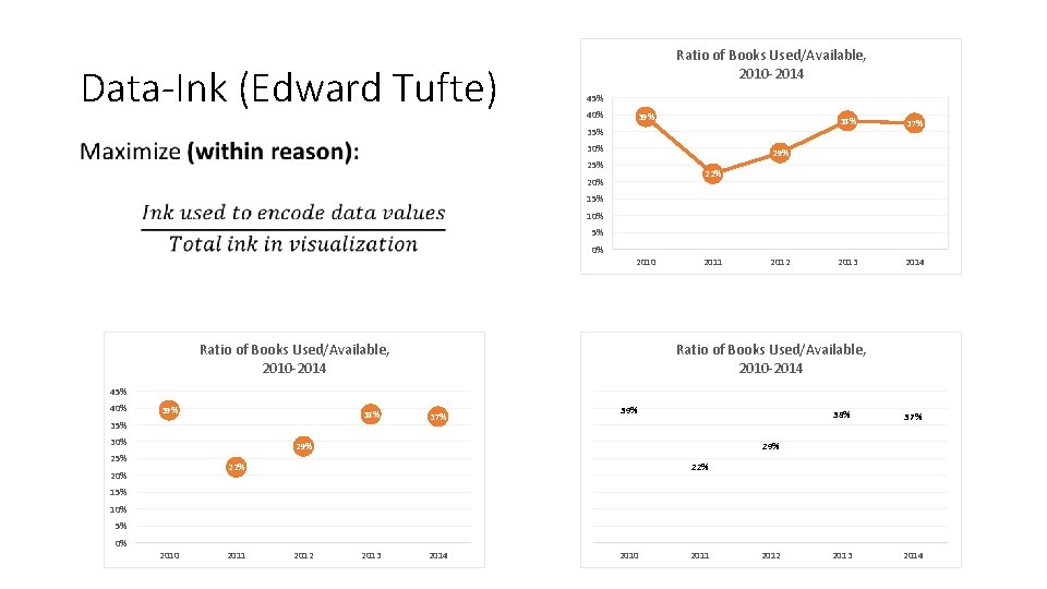
Best Practices • Pies and human perception • The Data-Ink Ratio • Visual Math

Value of All TRLN Titles to TRLN Pies 55; 4% Good Acceptable Question: • How do all the titles in the collection scatter across these categories for TRLN? Issues: • Everything is treated as a proportion • Values only available via labels • Hard to compare areas/angles • Gets confusing past 4 -5 categories Stephen Few on Pie Charts: Save the Pies for Dessert 95; 8% Problematic Low 113; 9% Unacceptable 159; 13% 817; 66%

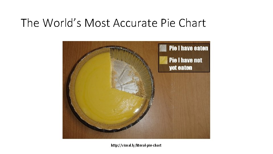
The World’s Most Accurate Pie Chart http: //visual. ly/literal-pie-chart

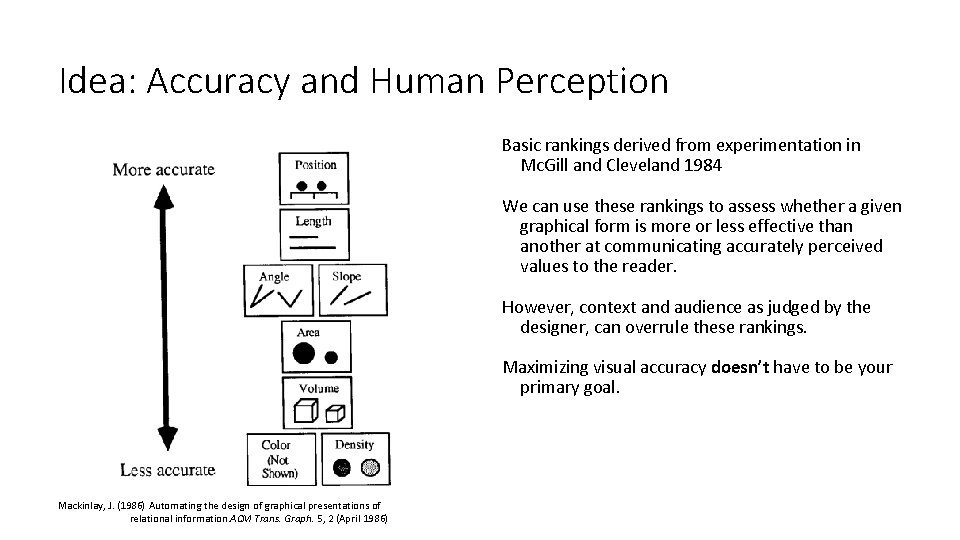
Idea: Accuracy and Human Perception Basic rankings derived from experimentation in Mc. Gill and Cleveland 1984 We can use these rankings to assess whether a given graphical form is more or less effective than another at communicating accurately perceived values to the reader. However, context and audience as judged by the designer, can overrule these rankings. Maximizing visual accuracy doesn’t have to be your primary goal. Mackinlay, J. (1986) Automating the design of graphical presentations of relational information. ACM Trans. Graph. 5, 2 (April 1986)

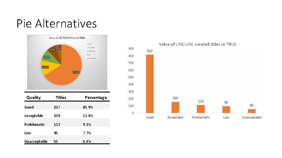
Pie Alternatives 900 Value of UNC-UNL curated titles to TRLN 817 800 700 600 500 400 300 Quality Titles Percentage Good 817 65. 9% Acceptable 159 12. 8% Problematic 113 9. 1% Low 95 7. 7% Unacceptable 55 4. 4% 159 200 113 95 Problematic Low 100 55 0 Good Acceptable Unacceptable

Backgrounds Question: • Ratio of Books Used/Available, 2010 -2014 39% How does the ratio of books used vs available change over time? 38% 37% 2013 2014 29% 22% Issues: • Hard to read values on dots • Data doesn’t contrast highly with background 2010 2011 2012

Data-Ink (Edward Tufte) Ratio of Books Used/Available, 2010 -2014 45% 40% 39% 35% • 30% 38% 37% 2013 2014 29% 25% 22% 20% 15% 10% 5% 0% 2010 Ratio of Books Used/Available, 2010 -2014 2011 2012 Ratio of Books Used/Available, 2010 -2014 45% 40% 39% 38% 35% 30% 37% 39% 25% 37% 2013 2014 29% 22% 20% 38% 22% 15% 10% 5% 0% 2010 2011 2012 2013 2014 2010 2011 2012

Before: 2010 vs. 2014 Benchmark Distribution 1600 Stacked Charts Question: • How did the titles scatter across these benchmarks in 2010 vs. 2014? 1400 1200 1000 800 Issues: • What does the overall height mean? • How many titles were unacceptable in 2014? • Visual Math 600 400 200 0 Good Acceptable Problematic 2010 # of titles 2014 # of titles Low Unacceptable

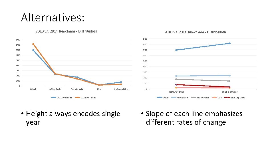
Alternatives: 2010 vs. 2014 Benchmark Distribution 900 800 700 600 500 400 300 200 100 Good Acceptable Problematic 2010 # of titles Low Unacceptable 2014 # of titles • Height always encodes single year 0 2010 # of titles Good Acceptable 2014 # of titles Problematic Low Unacceptable • Slope of each line emphasizes different rates of change

Tool Landscape • • • Spreadsheets In-browser tools Business Intelligence Tools Coding Design

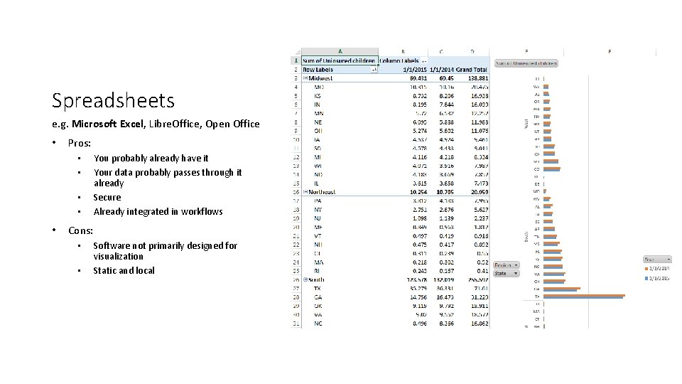
Spreadsheets e. g. Microsoft Excel, Libre. Office, Open Office • Pros: • • • You probably already have it Your data probably passes through it already Secure Already integrated in workflows Cons: • • Software not primarily designed for visualization Static and local

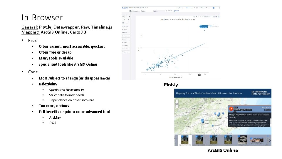
In-Browser General: Plot. ly, Datawrapper, Raw, Timeline. js Mapping: Arc. GIS Online, Carto. DB • Pros: • • • Often easiest, most accessible, quickest Often free or cheap Many tools available Specialized tools like Arc. GIS Online Cons: • • Most subject to change (or disappearance) Inflexibility • • • Specialized functionality Strict data format needs Dependence on other software Plot. ly Too many options Full benefits require a more advanced tool • • Arc. Map QGIS Arc. GIS Online

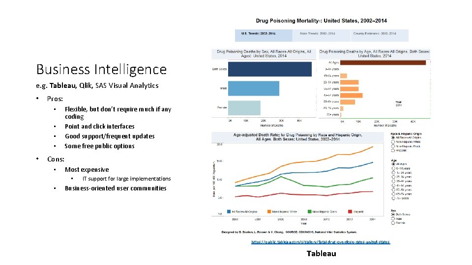
Business Intelligence e. g. Tableau, Qlik, SAS Visual Analytics • Pros: • • • Flexible, but don’t require much if any coding Point and click interfaces Good support/frequent updates Some free public options Cons: • Most expensive • • IT support for large implementations Business-oriented user communities https: //public. tableau. com/s/gallery/fatal-drug-overdose-rates-united-states Tableau

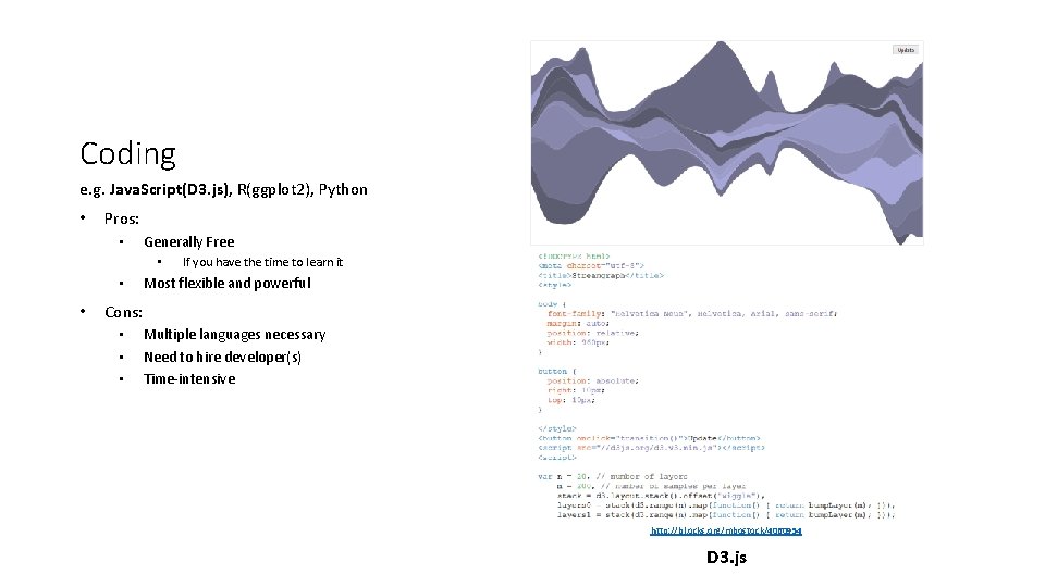
Coding e. g. Java. Script(D 3. js), R(ggplot 2), Python • Pros: • Generally Free • • • If you have the time to learn it Most flexible and powerful Cons: • • • Multiple languages necessary Need to hire developer(s) Time-intensive http: //bl. ocks. org/mbostock/4060954 D 3. js

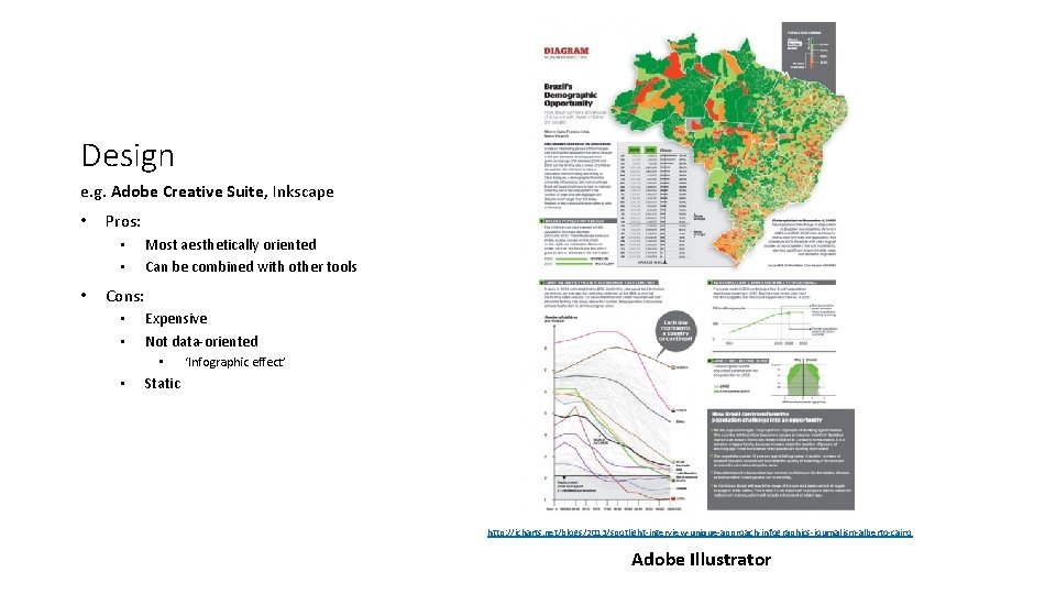
Design e. g. Adobe Creative Suite, Inkscape • Pros: • • • Most aesthetically oriented Can be combined with other tools Cons: • • Expensive Not data-oriented • • ‘Infographic effect’ Static http: //icharts. net/blogs/2013/spotlight-interview-unique-approach-infographics-journalism-alberto-cairo Adobe Illustrator

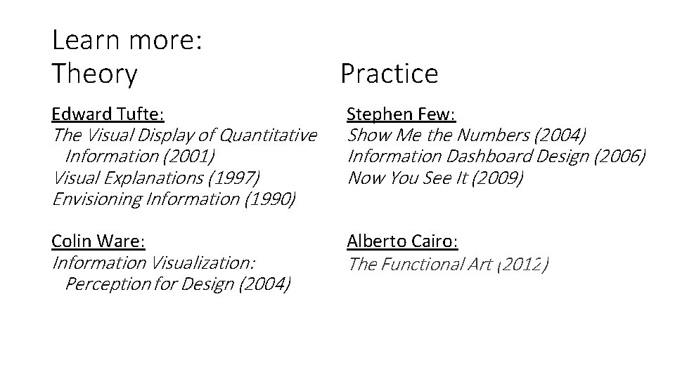
Learn more: Theory Practice Edward Tufte: Stephen Few: Colin Ware: Alberto Cairo: The Visual Display of Quantitative Information (2001) Visual Explanations (1997) Envisioning Information (1990) Information Visualization: Perception for Design (2004) Show Me the Numbers (2004) Information Dashboard Design (2006) Now You See It (2009) The Functional Art (2012)

Learn more: Tools • Tool lists: • http: //dirtdirectory. org/ • http: //selection. datavisualization. ch/ • Map Galleries • Carto. DB: https: //cartodb. com/gallery/ • Arc. GIS Online: http: //www. arcgis. com/home/gallery. html#c=esri&t=maps&o=avgrating • Sample Galleries • D 3: https: //github. com/mbostock/d 3/wik i/Gallery • Tableau: https: //public. tableau. com/s/gallery • Plot. ly https: //plot. ly/feed/