Visualizing and Analyzing NIAIDs Research Portfolio Dolan Ghosh

- Slides: 1

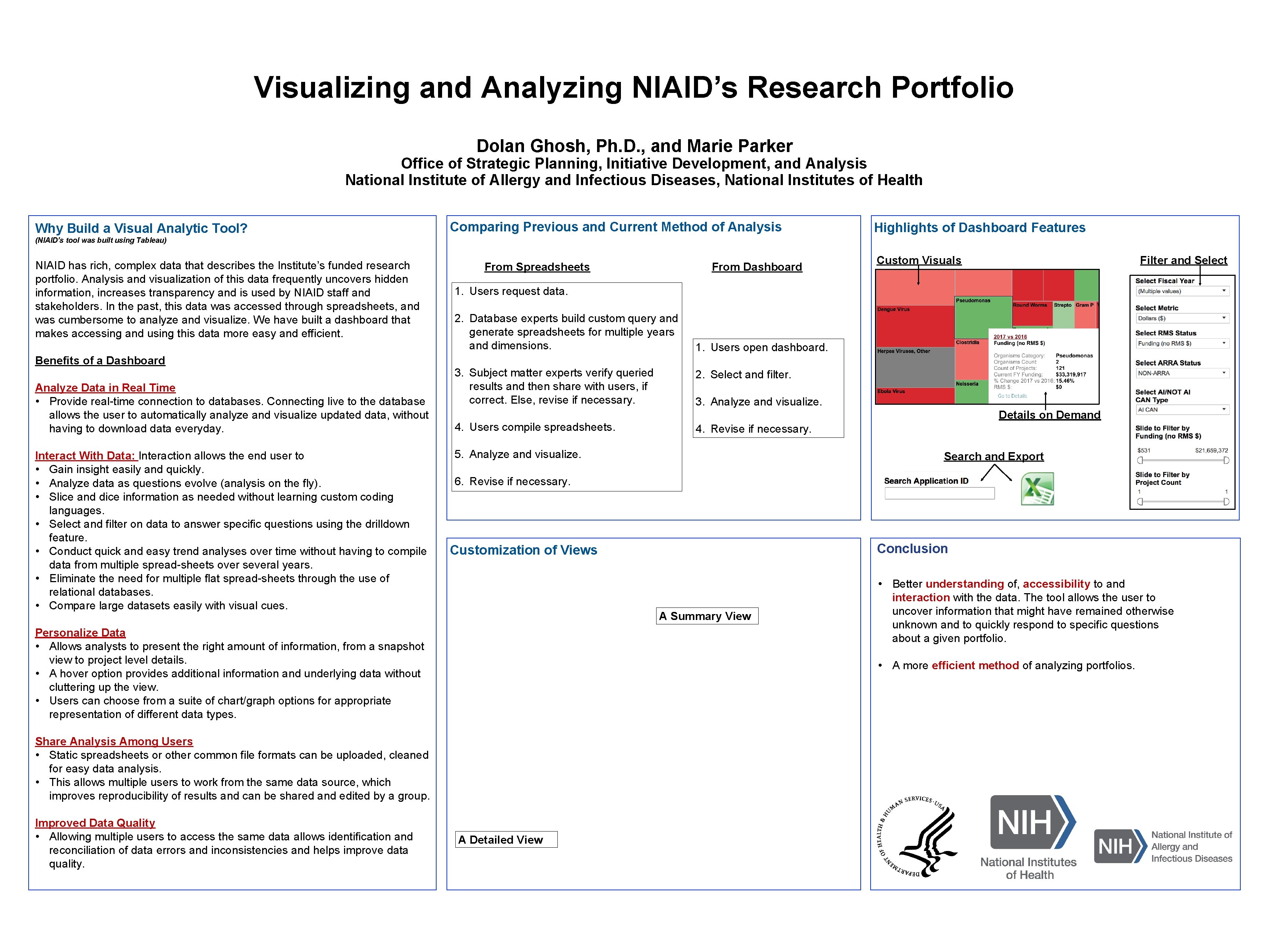
Visualizing and Analyzing NIAID’s Research Portfolio Dolan Ghosh, Ph. D. , and Marie Parker Office of Strategic Planning, Initiative Development, and Analysis National Institute of Allergy and Infectious Diseases, National Institutes of Health Why Build a Visual Analytic Tool? Comparing Previous and Current Method of Analysis Highlights of Dashboard Features (NIAID’s tool was built using Tableau) NIAID has rich, complex data that describes the Institute’s funded research portfolio. Analysis and visualization of this data frequently uncovers hidden information, increases transparency and is used by NIAID staff and stakeholders. In the past, this data was accessed through spreadsheets, and was cumbersome to analyze and visualize. We have built a dashboard that makes accessing and using this data more easy and efficient. Benefits of a Dashboard Analyze Data in Real Time • Provide real-time connection to databases. Connecting live to the database allows the user to automatically analyze and visualize updated data, without having to download data everyday. Interact With Data: Interaction allows the end user to • Gain insight easily and quickly. • Analyze data as questions evolve (analysis on the fly). • Slice and dice information as needed without learning custom coding languages. • Select and filter on data to answer specific questions using the drilldown feature. • Conduct quick and easy trend analyses over time without having to compile data from multiple spread-sheets over several years. • Eliminate the need for multiple flat spread-sheets through the use of relational databases. • Compare large datasets easily with visual cues. Filter and Select 1. Users request data. 2. Database experts build custom query and generate spreadsheets for multiple years and dimensions. 3. Subject matter experts verify queried results and then share with users, if correct. Else, revise if necessary. 4. Users compile spreadsheets. 1. Users open dashboard. 2. Select and filter. 3. Analyze and visualize. Details on Demand 4. Revise if necessary. 5. Analyze and visualize. Search and Export 6. Revise if necessary. Conclusion Customization of Views A Summary View Personalize Data • Allows analysts to present the right amount of information, from a snapshot view to project level details. • A hover option provides additional information and underlying data without cluttering up the view. • Users can choose from a suite of chart/graph options for appropriate representation of different data types. • Better understanding of, accessibility to and interaction with the data. The tool allows the user to uncover information that might have remained otherwise unknown and to quickly respond to specific questions about a given portfolio. • A more efficient method of analyzing portfolios. Share Analysis Among Users • Static spreadsheets or other common file formats can be uploaded, cleaned for easy data analysis. • This allows multiple users to work from the same data source, which improves reproducibility of results and can be shared and edited by a group. Improved Data Quality • Allowing multiple users to access the same data allows identification and reconciliation of data errors and inconsistencies and helps improve data quality. From Dashboard From Spreadsheets Custom Visuals A Detailed View