Visualization Workshop Agenda Introduction Chart Type Dashboard Flow

Visualization Workshop

Agenda Introduction Chart Type & Dashboard Flow Pre-Attentive Processing Title & Tooltip Next steps & additional resources

Housekeeping Save a copy of your workbook Topic Discussion - 15 minutes Hands On – 25 minutes Share and Tell – 15 minutes Take breaks during the working sessions as you need them

The Creative Process

The Creative Process

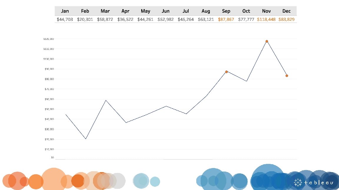
What question are you trying to answer?

Chart Type

Do I have the right chart?

Choosing a Chart Type

Comparison

Composition

Distribution

Relationship

Dashboard Flow

What is a dashboard? “A dashboard is a visual display of the most important information needed to achieve one or more objectives; consolidated and arranged on a single screen so the information can be monitored at a glance. ” Stephen Few (2004) “A dashboard is a visual display of data used to monitor conditions and/or facilitate understanding” Big Book of Dashboards (2017)

Y R O T A R O L XP E L A R T U NE

y r o t a n LA P X E OPINIONATED Poojah Gandhi https: //public. tableau. com/profile/poojagandhi#!/vizhome/Iron. Viz-Philadelphia. Crime. Scene/Philadelphia. Crime. Scene

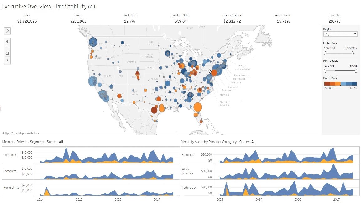
What makes a good dashboard? Answers a set of questions Follows a flow and invites interactivity Condensed; primarily in the form of summaries and exceptions Specific to and customized for the dashboard’s audience and objectives Provides appropriate text for clarity and direction, if needed Makes strategic use of color

Layout

Layout Top Left:

What are you emphasizing?

Inverted Pyramid Most Newsworthy Info Who? What? When? Where? Why? How? Important Details Other General Info

Filters at the top, so user knows when and how to start interacting Most important information at the top and centered Starts with the highest level and works down to more precise details No more than 4 -5 worksheets

Using BANs

Does your dashboard pass the 5 second test? Most important view is on top or top left Legends are near their views Avoid multiple color schemes Uses 5 or fewer views (charts)

Chart Type & Dashboard Flow Hands-on

What dashboard changes did you make? Did anyone change a chart type?

Pre-Attentive Processing

 Color (Intensity)")
Length Width Orientation Size Shape Enclosure 2 D Position Grouping Color (Hue) Color (Intensity)
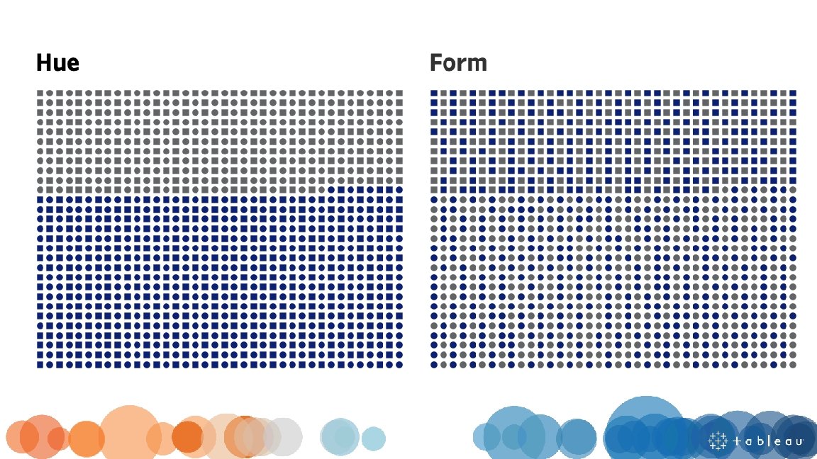
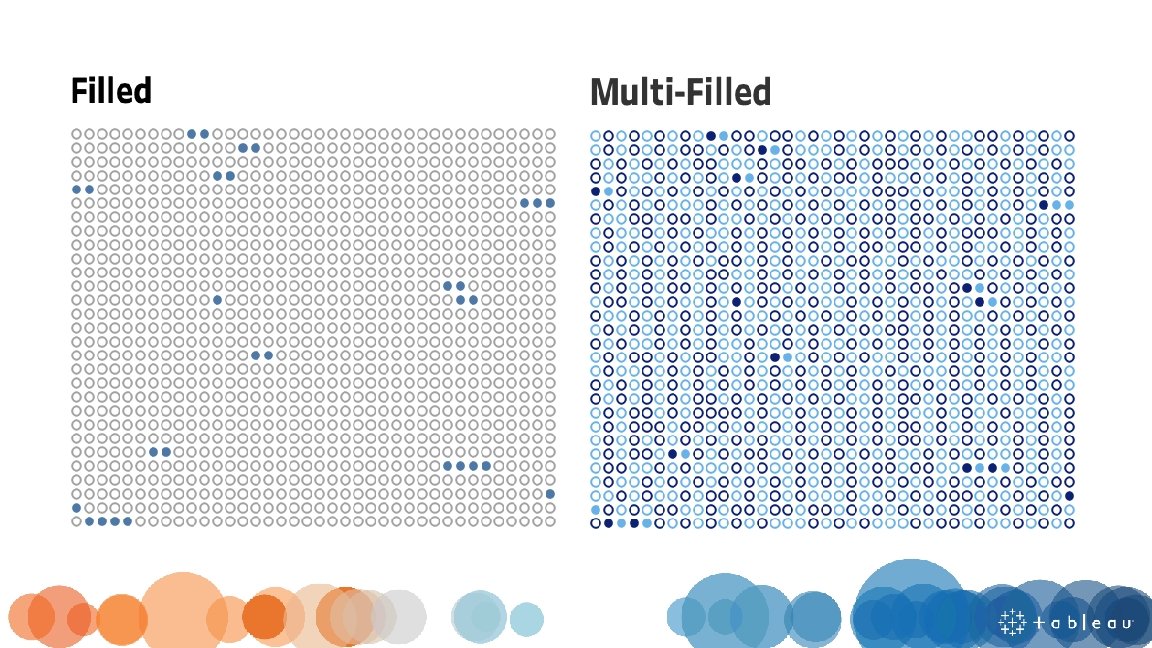

COLOR

Hue Saturation Tone Shade Tint

Using Hue Qualitative / Categorical

Using Saturation Relationship /Sequence Quantitative / Numerical

Maintain Color Identities Once a color is assigned to an attribute, be consistent with the usage of that color. This eliminates confusion and establishes identity throughout a workbook.

Use Hot Colors Sparingly What are we supposed to be looking at? 'HOT' colors, like RED, are attention grabbers. They carry heavy visual weight and will draw the eye of the reader. Save them for elements truly deserving of your reader's attention.

Be Careful Not To Become The Next Vincent van Gogh

DONT BE AFRAID. . . WHITE SPACE

Style Guide - Custom Color Palette

Title

A concise, descriptive title can make a huge difference in garnering attention and making a chart more memorable

Which title is more impactful?

Do your titles capture attention?

Context is not just in the title

Adding additional context

Tooltip

Tooltips can make the difference between a user loving your visualization and not understanding it.

Tips for improving the basic tooltip Use a proper font Identify the most important part of the tool tip and make it your title Change measure names/values to make them specific and understandable Include proper units Remove command prompts Default vs Modified

Viz in Tooltips What are they good for? Highlighting trends Describing the distribution of data Layering different levels of time or geography String aggregations – getting rid of that *

Pre-Attentive Attributes, Title, and Tooltips Hands On

Share and Tell

Next steps…
")
You learned a lot today. Want to keep learning? Visual Best Practices (classroom training) Learning Paths (e. Learning) Public Gallery (inspiration) TC 19 on-demand (virtual) TC 20 (October 5– 8 th 2020)

Want to read more about visualization? The Big Book of Dashboards Visual Reporting and Analysis: Seeing is Knowing Whitepaper Visual Analysis Best Practices: A Guidebook Whitepaper Data Storytelling: Using visualization to share the human impact of numbers Whitepaper Beautiful Evidence – Edward Tufte Information Dashboard Design – Stephen Few Information Visualization – Colin Ware

One last thing that is guaranteed to make your dashboards amazing…


THANK YOU!


- Slides: 70