Visualization Of NASA REGARDS Dataset Using Spring Embedder
Visualization Of NASA REGARDS Dataset Using Spring Embedder Ontology Sumitra Madhav 9/16/2021 Rensselaer Polytechnic Institute
Use Case • Many modern information tools represent ontologies and instance data in the form of graphs give the user insight into the structure and relationships that are present but not visible in the text • The NASA REGARDS project makes use of high resolution satellite imagery to understand the relationship between blood pressure, land use or land cover and temperature. • The use case highlights a new OWL based information visualization tool to represent complex data, using the spring embedder technology 9/16/2021 Rensselaer Polytechnic Institute
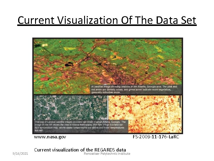
Current Visualization Of The Data Set www. nasa. gov 9/16/2021 FS-2009 -11 -176 -La. RC Current visualization of the REGARDS data Rensselaer Polytechnic Institute
Challenges • Development of a methodology to delineate LCLU classes into rural, suburban, and urban living environments and evaluate it • Linkage of REGARDS data with classifications 9/16/2021 Rensselaer Polytechnic Institute

Existing methods used • Dominant Class Method • Numeric Method • Resampling and Delineation Method Open water Developed open space Deciduous forest. . . 9/16/2021 Rensselaer Polytechnic Institute

Challenges • Development of a methodology to delineate LCLU classes into rural, suburban, and urban living environments and evaluate it • Linkage of REGARDS data with classifications • Development of a methodology to completely visualize the linked data 9/16/2021 Rensselaer Polytechnic Institute
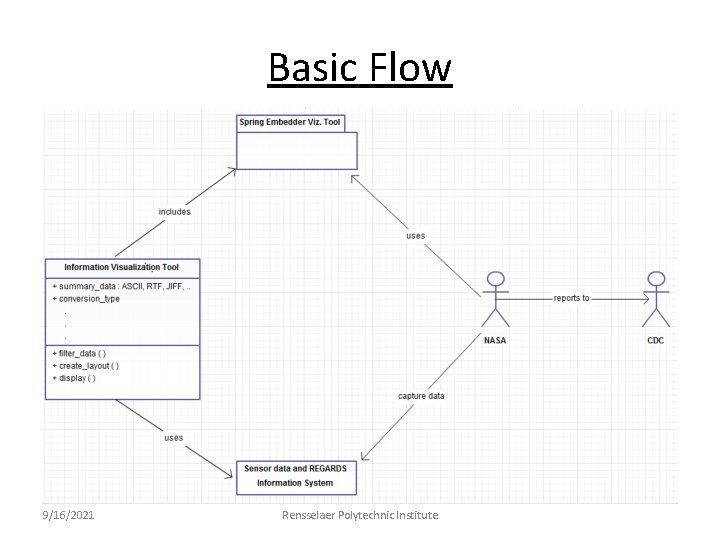
Basic Flow 9/16/2021 Rensselaer Polytechnic Institute
Why The Spring Embedder? • Many visualization tools represent anomalies in their layout although it may not be clear what the anomalies mean. • Thus, even if the data being represented is important and vital to any research there on; it is of no use if the visualization cannot make sense of the data. • Protégé and Jambalaya come close to achieving these goals but are mostly used to browse ontologies and the overall picture obscures details of the underlying associative structure • The spring embedder uses force models based on Fruchterman and Reingold, to produce a graph drawing of tightly and loosely related clusters 9/16/2021 Rensselaer Polytechnic Institute
A Conceptual Data Model First • Spring embedding is a graph drawing where each node in the graph is modelled as a charged particle, thereby causing a repulsive force between every pair of nodes. • Each edge is modeled as a spring that exerts an attractive force between the pair of nodes it connects. • The graph is laid out by repeated iterations of a procedure that calculates the repulsive and attractive forces acting on all nodes in the graph. • At the end of each iteration, all nodes are moved according to the resultant forces acting on them. 9/16/2021 Rensselaer Polytechnic Institute
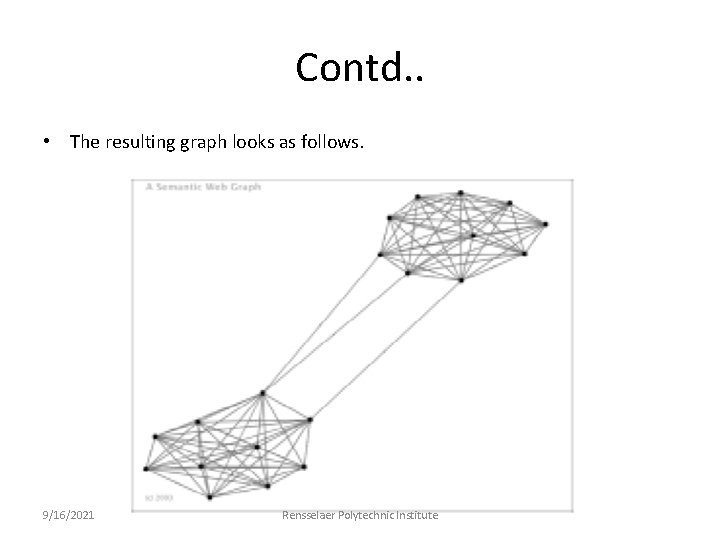
Contd. . • The resulting graph looks as follows. 9/16/2021 Rensselaer Polytechnic Institute
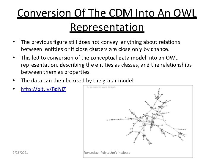
Conversion Of The CDM Into An OWL Representation • The previous figure still does not convey anything about relations between entities or if close clusters are close only by chance. • This led to conversion of the conceptual data model into an OWL representation, describing the entities as classes, and the relationships between them as properties. • The data can then be used by the graph model: • http: //bit. ly/Bd. Nl. Z 9/16/2021 Rensselaer Polytechnic Institute
Evaluation of the Use Case • It is not enough to describe the differences in levels of aerosols in the atmosphere by merely assigning color codes to each variant without understanding the relations among the variants. • With the help of a tool such as the spring embedder described above, complex data is in a much more usable format. This is very important for large volumes of sensor data such as those collected by satellites. • Uniform resource identifiers can be used to add properties to each entity and relation in the graph to provide information about the clusters, so that the data scientist can come to a conclusion about why some objects are tightly clustered and some, loosely. • For example, in the graph model above, one of the chains could convey that one particular race in a surveyed area is more hypertensive by 15% than another. This would be an answer to the question posed to the dataset via a dynamic query interface: how can I see the relation between blood pressure and population density in Atlanta, GA. 9/16/2021 Rensselaer Polytechnic Institute
Future Work • Associate each node with a URI that gives information about the node, thereby adding a lot more power to the exploratory process • Addition of a dynamic query interface to see changes made in the visualization real-time and to output only those instances which the user is interested in 9/16/2021 Rensselaer Polytechnic Institute
References • http: //www. eurekalert. org/pub_releases/2011 -02/rpi-wea 021111. php • http: //www. nasa. gov/topics/earth/features/breathe-easier. html • http: //appliedsciences-temp. nasa. gov/pdf/Project 1 P/15 -REGARDS. pdf • http: //www. ncbi. nlm. nih. gov/pmc/articles/PMC 2903881/ • http: //www. engineerlive. com/Hydrographic-eismic/Hydrographic_Survey/ • http: //www. cs. umd. edu/~golbeck/downloads/IV 03. pdf 9/16/2021 Rensselaer Polytechnic Institute
- Slides: 14