VISUALIZATION BASICS DH Bootcamp UNL 2016 A Beginners
VISUALIZATION BASICS DH Bootcamp @UNL 2016 A Beginner’s Guide to Digital Humanities Jennifer Isasi Ph. D Candidate in Hispanic Studies Text Analysis and Networks
Overview of this workshop • What is data visualization? • Data vs. Big Data • Introduction to #dataviz in the Humanities • Type of representations in the Humanities • Tools for data visualization • Voyant • RAW • Polinode • Timeline JS • Storymap JS
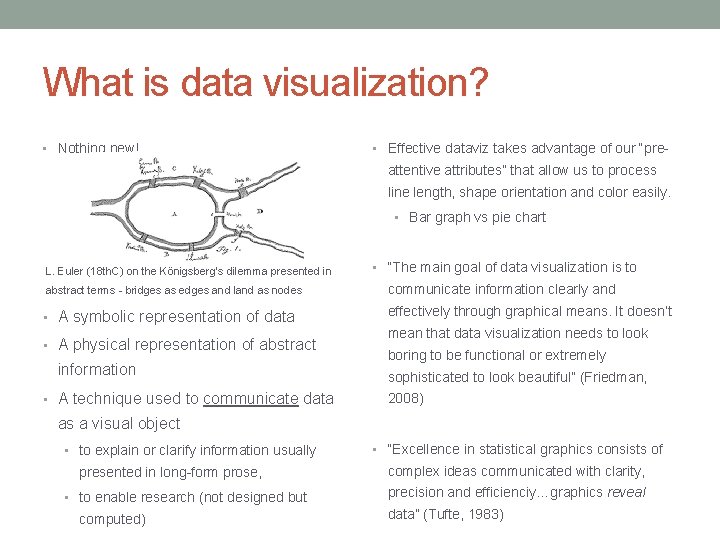
What is data visualization? • Nothing new! • Effective dataviz takes advantage of our “pre- attentive attributes” that allow us to process line length, shape orientation and color easily. • Bar graph vs pie chart L. Euler (18 th. C) on the Königsberg's dilemma presented in • “The main goal of data visualization is to abstract terms - bridges as edges and land as nodes communicate information clearly and • A symbolic representation of data effectively through graphical means. It doesn’t • A physical representation of abstract information • A technique used to communicate data mean that data visualization needs to look boring to be functional or extremely sophisticated to look beautiful” (Friedman, 2008) as a visual object • to explain or clarify information usually presented in long-form prose, • to enable research (not designed but computed) • “Excellence in statistical graphics consists of complex ideas communicated with clarity, precision and efficienciy…graphics reveal data” (Tufte, 1983)
Data visualization in the Humanities • Because it can feature relationships between: • Quantitative values • Non-quantitative values in nature • Social networks • Non-quantitative values + quantitative values • Social networks + number of times two entities interact • It allows scholars to perceive patterns • It is used to • expand the scope of research • discover and/or generate original knowledge • represent the process or the end result • Scholars are using charts, maps, networks, etc. to represent their data • as a complement on their texts/results or/and • as the only possible way to interpret their data • More importantly: trying to represent data exposes computational processes and makes us think about research/study/inspection of data
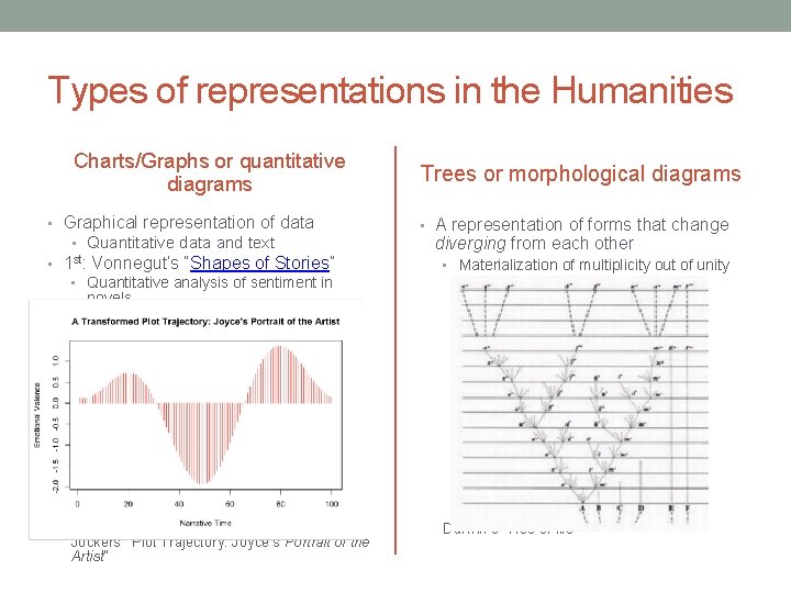
Types of representations in the Humanities Charts/Graphs or quantitative diagrams • Graphical representation of data • Quantitative data and text • 1 st: Vonnegut’s “Shapes of Stories” • Quantitative analysis of sentiment in novels • Jockers’ ”Plot Trajectory: Joyce’s Portrait of the Artist” Trees or morphological diagrams • A representation of forms that change diverging from each other • Materialization of multiplicity out of unity Darwin’s “Tree of life”
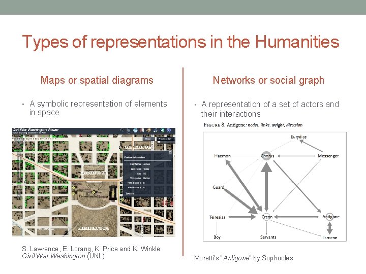
Types of representations in the Humanities Maps or spatial diagrams • A symbolic representation of elements in space S. Lawrence, E. Lorang, K. Price and K. Winkle: Civil War Washington (UNL) Networks or social graph • A representation of a set of actors and their interactions Moretti’s “Antigone” by Sophocles
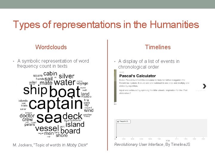
Types of representations in the Humanities Wordclouds • A symbolic representation of word frequency count in texts M. Jockers, “Topic of wo rds in Moby Dick” Timelines • A display of a list of events in chronological order Revolutionary User Interface, By Timeline. JS
To create visualizations at a beginner’s level, we want tools that are: • Intuitive • Easy to use • Free or cheap • Provided by an academic institution rather than a company • Allow easy import of data • Allow easy export of visualizations • Exports can be embedded in our website • Example: If you need to create a simple visualization for a social network, you can use Polinode or Paladio (intuitive) instead of Gephi (complex)
TOOLS FOR DATA VISUALIZATION No programming needed!
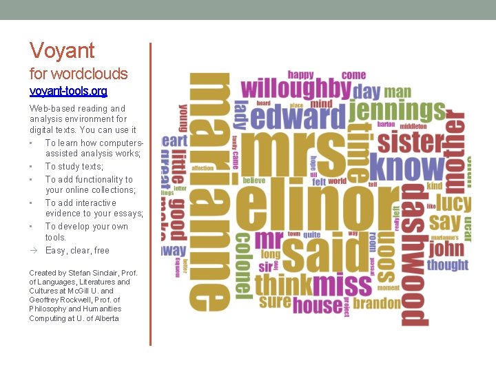
Voyant for wordclouds voyant-tools. org Web-based reading and analysis environment for digital texts. You can use it • To learn how computersassisted analysis works; • To study texts; • To add functionality to your online collections; • To add interactive evidence to your essays; • To develop your own tools. Easy, clear, free Created by Stefan Sinclair, Prof. of Languages, Literatures and Cultures at Mc. Gill U. and Geoffrey Rockwell, Prof. of Philosophy and Humanities Computing at U. of Alberta
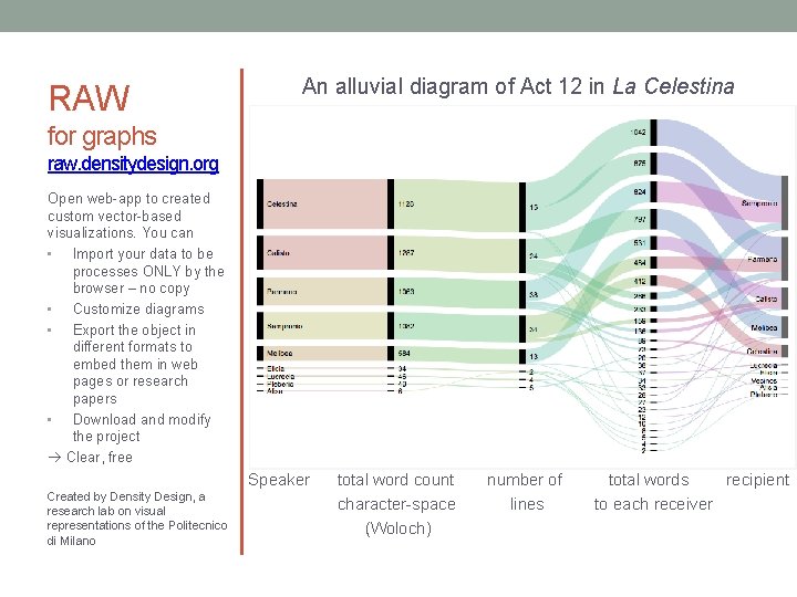
RAW An alluvial diagram of Act 12 in La Celestina for graphs raw. densitydesign. org Open web-app to created custom vector-based visualizations. You can • Import your data to be processes ONLY by the browser – no copy • Customize diagrams • Export the object in different formats to embed them in web pages or research papers • Download and modify the project Clear, free Speaker Created by Density Design, a research lab on visual representations of the Politecnico di Milano total word count character-space (Woloch) number of lines total words recipient to each receiver
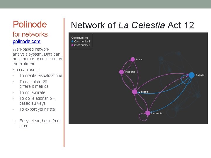
Polinode for networks polinode. com Web-based network analysis system. Data can be imported or collected on the platform. You can use it • To create visualizations • To calculate 20 different metrics • To collaborate • To do relationship – based surveys • To export your data Easy, clear, basic free plan Network of La Celestia Act 12
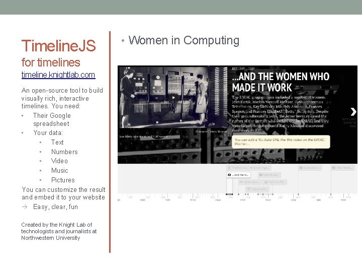
Timeline. JS for timelines timeline. knightlab. com An open-source tool to build visually rich, interactive timelines. You need: • Their Google spreadsheet • Your data: • Text • Numbers • Video • Music • Pictures You can customize the result and embed it to your website Easy, clear, fun Created by the Knight Lab of technologists and journalists at Northwestern University • Women in Computing

Storymap for maps & pictures storymap. knightlab. com A free tool to tell stories that highlight the location of a series of events. You need: • A story to tell • Locations • Pictures You can create a • Gigapixel map • Snap. Map You can customize the result and embed it to your website Easy, intuitive, fun Created by the Knight Lab of technologists and journalists at Northwestern University • A Snap. Map of the US Manifest Destiny • A Gigapixel of Bosch’s “Garden of Earthly Delights”
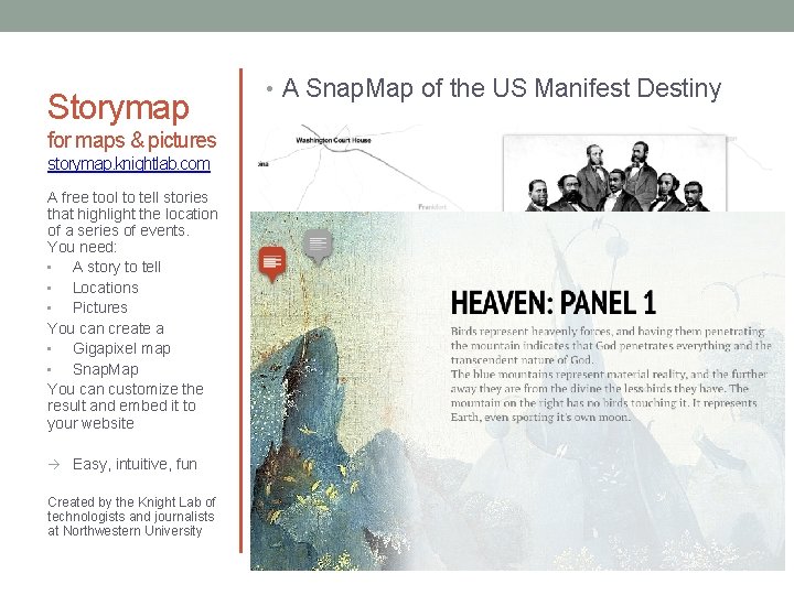
Storymap for maps & pictures storymap. knightlab. com A free tool to tell stories that highlight the location of a series of events. You need: • A story to tell • Locations • Pictures You can create a • Gigapixel map • Snap. Map You can customize the result and embed it to your website Easy, intuitive, fun Created by the Knight Lab of technologists and journalists at Northwestern University • A Snap. Map of the US Manifest Destiny • A Gigapixel of Bosch’s “Garden of Earthly Delights”
References • Few, Stephen. (2004) “ 35. Data Visualization for Human Perception” in M. Soegaard and R. Friss Dam, The Encyclopedia of Human. Computer Interaction, 2 nd edition. https: //www. interaction-design. org • Friedman, Vitaly. (2008) "Data Visualization and Infographics" in: Graphics, Monday Inspiration, January 14 th, 2008. • Mereilles, Isabel (2013) Design for Information: An introduction to the histories, theories, and best practices behind effective information visualizations. • Tufte, Edward (1983). The Visual Display of Quantitative Information. Cheshire, Connecticut: Graphics Press.
- Slides: 16