Visualization and Data Science Outline What is data

















- Slides: 57

Visualization and Data Science

Outline § What is data visualization? § Graphical excellence and lie factor § Representing data in 1 D, 2 D, and 3 D § Representing data in 4+ dimensions § Parallel coordinates § Scatterplots § Stick figures 2

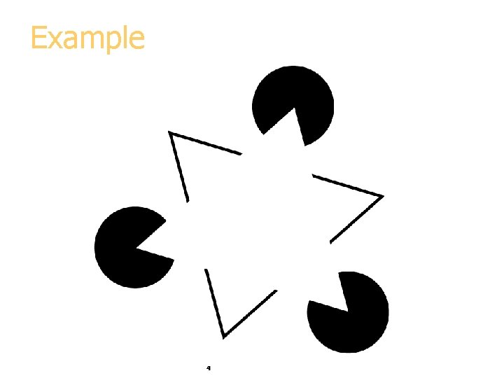
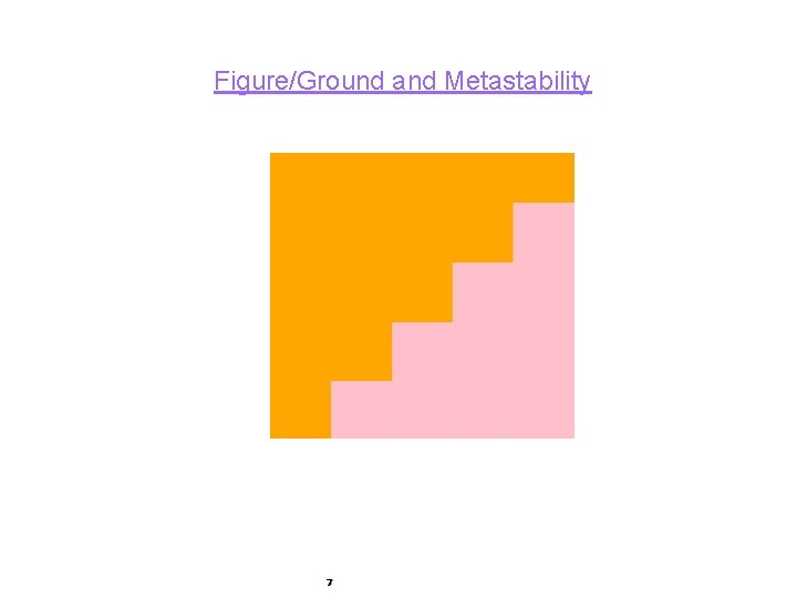
What is Data Visualization § Data visualization is the process of converting raw data into easily understood pictures of information that enable fast and effective decisions. § Early in the 20 th-century, gestalt psychologists observed that when elements were gathered into a figure, the figure took on a perceptual salience that exceeded the sum of its parts;

Example 4

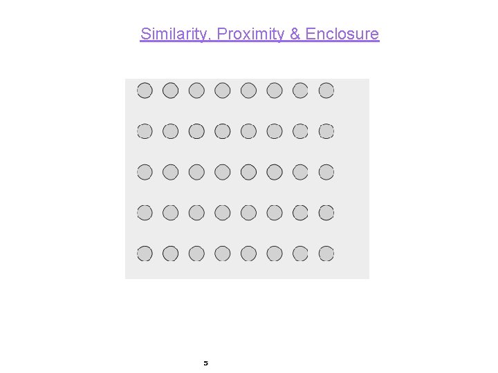
Similarity, Proximity & Enclosure 5

Common Fate, Parallelism and Connectedness

Figure/Ground and Metastability 7

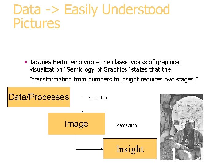
Data -> Easily Understood Pictures § Jacques Bertin who wrote the classic works of graphical visualization “Semiology of Graphics” states that the “transformation from numbers to insight requires two stages. ” Data/Processes Image Algorithm Perception Insight

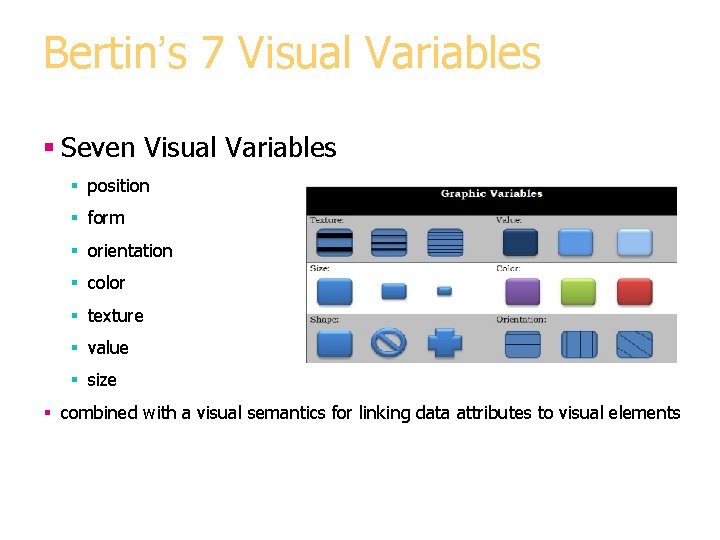
Bertin’s 7 Visual Variables § Seven Visual Variables § position § form § orientation § color § texture § value § size § combined with a visual semantics for linking data attributes to visual elements

Image Theory § Visual Processing occurs in 3 steps. § 1) formation of the retinal image, § 2) decomposition of the retinal image information into an array of specialized representations and § 3) reassembly of the information into object perception.

Image § Bertin's key concept is the image, from which theory derives its name. § Roughly speaking, an image is the fundamental perceptual unit of a visualization. § An ideal visualization will contain only a single image in order to optimize "efficiency, " the speed with which observer can extract the information

Uses Today § Data-driven actions are increasingly made without access to information provided by traditional information presentation § Information visualization is emerging as an important fusion of graphics, scientific visualization, databases, and human-computer interaction. l Data Visualization conveys complex results as understandable images.

What is Data Visualization § Data visualization is used in software applications to provide an intuitive graphical interface. § It is applied to many areas to enable users to glean useful information from their data for faster, more informed decision making. § These areas include: Military, private business sectors and scientific research.

What are the benefits of Data Visualization? § Data visualization allows users see several different perspectives of the data. § Data visualization makes it possible to interpret vast amounts of data § Data visualization offers the ability to note exceptions in the data. § Data visualization allows the user to analyze visual patterns in the data. § Exploring trends within a database through visualization by letting analysts navigate through data and visually orient themselves to the patterns in the data.

Benefits § Data visualization can help translate data patterns into insights, making it a highly effective decision-making tool. § Data visualization equips users with the ability to see influences that would otherwise be difficult to find. § With all the data available, it is difficult to find the nuances that can make a difference. § By simplifying the presentation, Data Visualization can reduce the time and difficulty it takes to move from data to decision making.

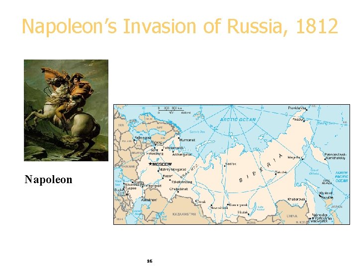
Napoleon’s Invasion of Russia, 1812 Napoleon 16

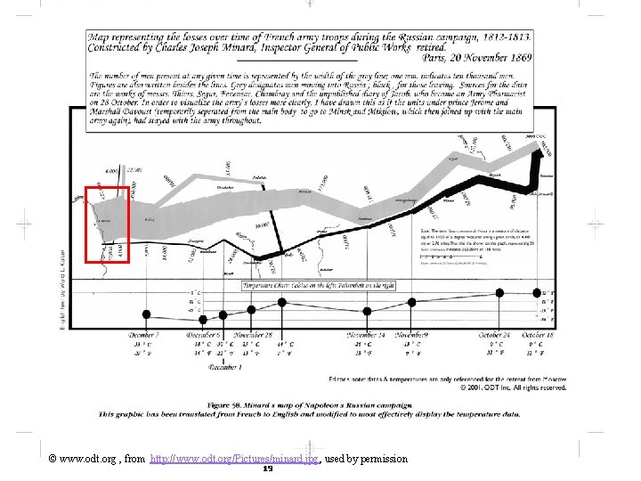
The Story Czar Alexander of Russia sees that Napoleon was becoming too powerful, so he refuses to participate in an embargo of the UK. Angry at Czar Alexander’s decision, Napoleon gathers a massive army of over 400, 000 to attack Russia in June of 1812. While Russia’s troops are not as numerous as France’s, Russia has a plan. Russian troops keep retreating as Napoleon’s troops move forward, burning everything they pass, ensuring that the French forces could not take anything from their environment. Eventually the French army follows the Russian army all the way to Moscow during October, suffering major losses from lack of food. By the time Napoleon gets to Moscow, he knows he has to retreat. As winter settles into Europe and the temperature drops, Napoleon’s troops suffer even more losses, returning to France from lack of food, disease, and weather conditions. 17

Marley, 1885 18

© www. odt. org , from http: //www. odt. org/Pictures/minard. jpg, used by permission 19

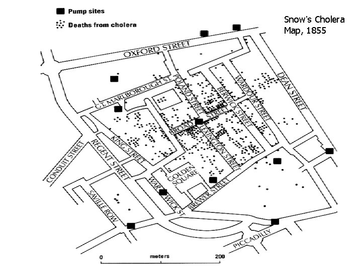
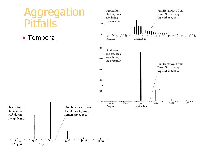
A Medical Detective Story § London, 1854: Cholera outbreak (500 deaths in 10 days)


Logic of Display and Analysis 1. Place data in appropriate context for assessing cause and effect. § Map vs list vs time series

Snow’s Cholera Map, 1855 23

Logic of Display and Analysis 2. Make qualitative comparisons (who escaped)

Logic of Display and Analysis 3. Consider alternative explanations and contrary cases.

Logic of Display and Analysis 4. Assess possible errors in numbers reported. § Missing addresses § Missing habit info

Aggregation Pitfalls § Spatial

Aggregation Pitfalls § Temporal

Visualization Role § Support interactive exploration § Help in result presentation § Disadvantage: requires human eyes § Can be misleading 29

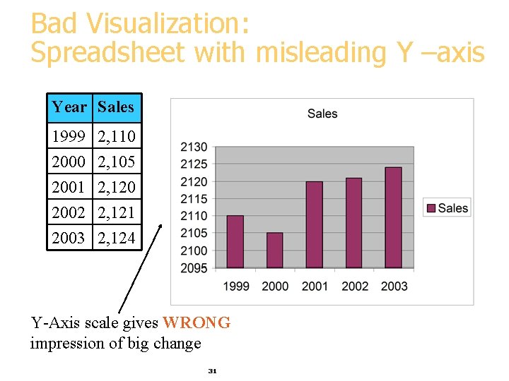
Bad Visualization: Spreadsheet Year Sales 1999 2, 110 2000 2, 105 2001 2, 120 2002 2, 121 2003 2, 124 What is wrong with this graph? 30

Bad Visualization: Spreadsheet with misleading Y –axis Year Sales 1999 2, 110 2000 2, 105 2001 2, 120 2002 2, 121 2003 2, 124 Y-Axis scale gives WRONG impression of big change 31

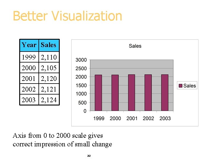
Better Visualization Year Sales 1999 2, 110 2000 2, 105 2001 2, 120 2002 2, 121 2003 2, 124 Axis from 0 to 2000 scale gives correct impression of small change 32

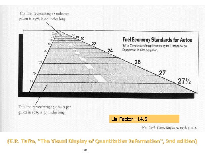
Lie Factor = _________ (maxg – ming) / ming (maxd – mind) / mind = ((5. 8 – 2) / ((2124 - 2105) / 2105) = 210. 5 Tufte requirement: 0. 95<Lie Factor<1. 05 (E. R. Tufte, “The Visual Display of Quantitative Information”, 2 nd edition) 33

Lie Factor=14. 8 (E. R. Tufte, “The Visual Display of Quantitative Information”, 2 nd edition) 34

Tufte’s Principles of Graphical Excellence § Give the viewer § the greatest number of ideas § in the shortest time § with the least ink in the smallest space. § Tell the truth about the data! (E. R. Tufte, “The Visual Display of Quantitative Information”, 2 nd edition) 35

Visualization Methods § Visualizing in 1 -D, 2 -D and 3 -D § well-known visualization methods § Visualizing more dimensions § Parallel Coordinates § Other ideas 36

1 -D (Univariate) Data § Representations 7 Tukey box plot 5 low 3 1 Middle 50% high Mean 0 Histogram 37 20

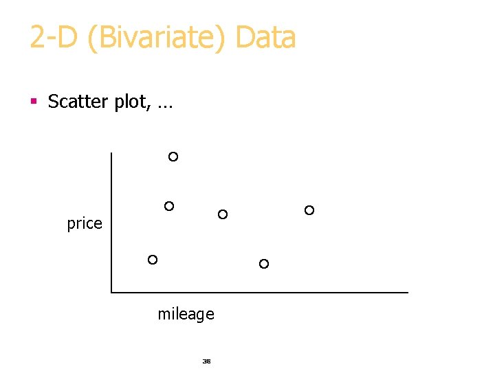
2 -D (Bivariate) Data § Scatter plot, … price mileage 38

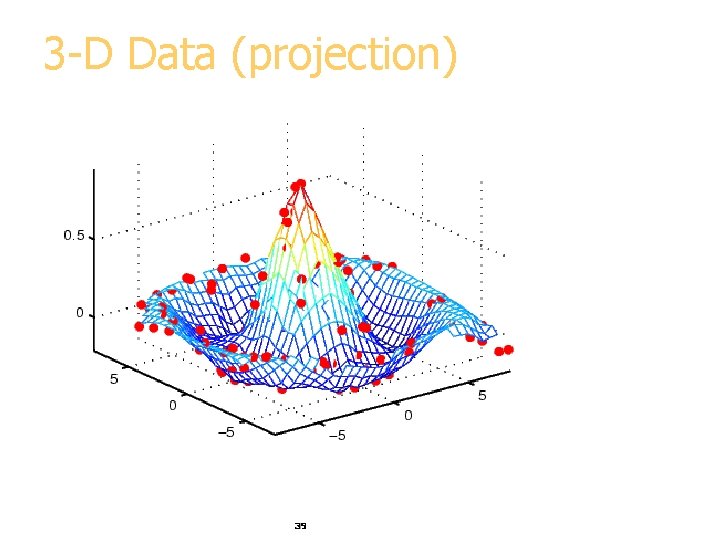
3 -D Data (projection) price 39

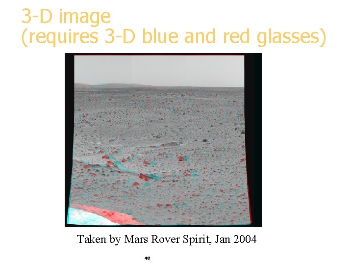
3 -D image (requires 3 -D blue and red glasses) Taken by Mars Rover Spirit, Jan 2004 40

Visualizing in 4+ Dimensions § Scatterplots § Parallel Coordinates § Chernoff faces § Stick Figures § … 41

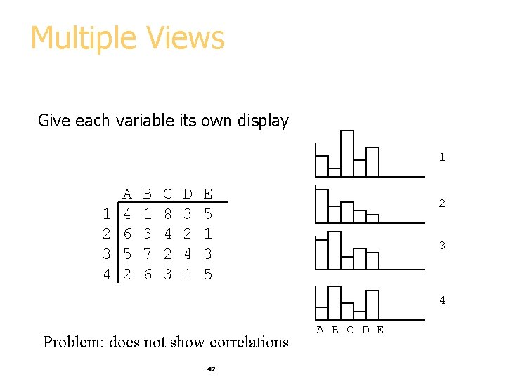
Multiple Views Give each variable its own display 1 1 2 3 4 A 4 6 5 2 B 1 3 7 6 C 8 4 2 3 D 3 2 4 1 E 5 1 3 5 2 3 4 Problem: does not show correlations 42 A B C D E

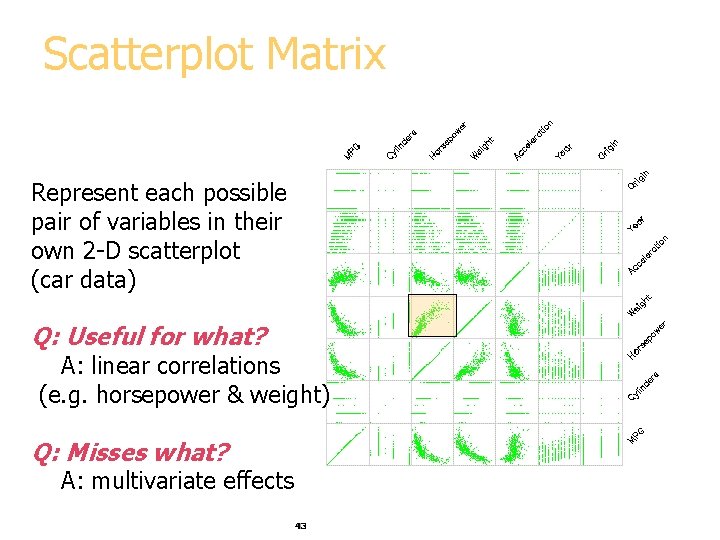
Scatterplot Matrix Represent each possible pair of variables in their own 2 -D scatterplot (car data) Q: Useful for what? A: linear correlations (e. g. horsepower & weight) Q: Misses what? A: multivariate effects 43

Parallel Coordinates • Encode variables along a horizontal row • Vertical line specifies values Same dataset in parallel coordinates Dataset in a Cartesian coordinates 44 Invented by Alfred Inselberg while at IBM, 1985

Example: Visualizing Iris Data Iris versicolor Iris setosa Iris virginica 45

Flower Parts Petal, a non-reproductive part of the flower Sepal, a non-reproductive part of the flower 46

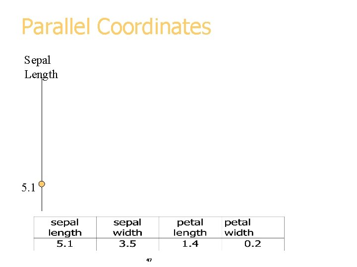
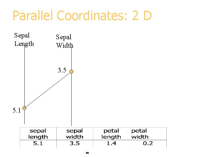
Parallel Coordinates Sepal Length 5. 1 47

Parallel Coordinates: 2 D Sepal Length Sepal Width 3. 5 5. 1 48

Parallel Coordinates: 4 D Sepal Length Petal length Sepal Width Petal Width 3. 5 5. 1 1. 4 49 0. 2

Parallel Visualization of Iris data 3. 5 5. 1 1. 4 50 0. 2

Parallel Visualization Summary § Each data point is a line § Similar points correspond to similar lines § Lines crossing over correspond to negatively correlated attributes § Interactive exploration and clustering § Problems: order of axes, limit to ~20 dimensions 51

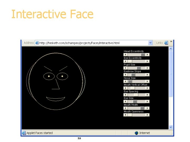
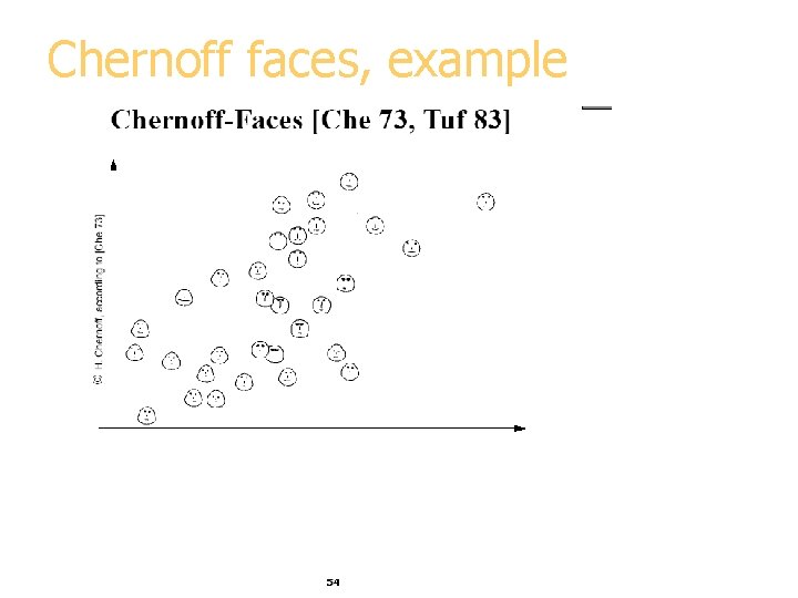
Chernoff Faces Encode different variables’ values in characteristics of human face Cute applets: http: //www. cs. uchicago. edu/~wiseman/chernoff/ http: //hesketh. com/schampeo/projects/Faces/chernoff. html 52

Interactive Face 53

Chernoff faces, example 54

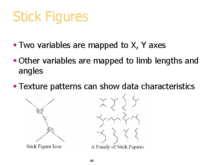
Stick Figures § Two variables are mapped to X, Y axes § Other variables are mapped to limb lengths and angles § Texture patterns can show data characteristics 55

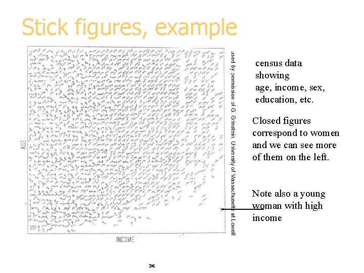
Stick figures, example census data showing age, income, sex, education, etc. Closed figures correspond to women and we can see more of them on the left. Note also a young woman with high income 56

Visualization Summary § Many methods § Visualization is possible in more than 3 -D § Aim for graphical excellence 57