Visual Journal 2 Analyzing Poster Designs using CRAP

- Slides: 12

Visual Journal 2 Analyzing Poster Designs using CRAP Jeinthiran Kajaintharan Johann Yong Bin Muhammad Faris Yong Ng Min Hui 1003 C 78432 0312491 1001 F 76564

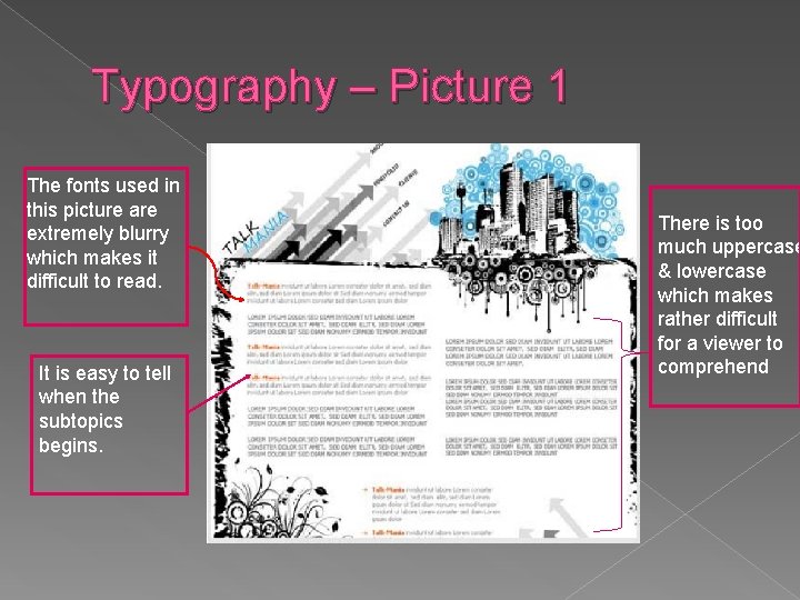
Typography – Picture 1 The fonts used in this picture are extremely blurry which makes it difficult to read. It is easy to tell when the subtopics begins. There is too much uppercase & lowercase which makes rather difficult for a viewer to comprehend

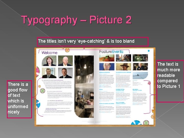
Typography – Picture 2 The titles isn’t very ‘eye-catching’ & is too bland There is a good flow of text which is uniformed nicely The text is much more readable compared to Picture 1

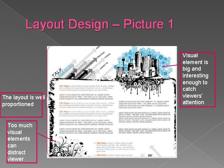
Layout Design – Picture 1 The layout is well proportioned Too much visual elements can distract viewer Visual element is big and interesting enough to catch viewers’ attention

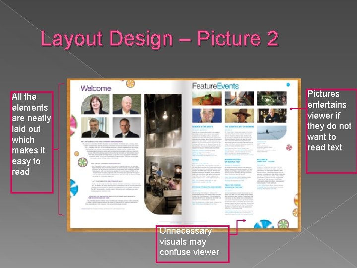
Layout Design – Picture 2 Pictures entertains viewer if they do not want to read text All the elements are neatly laid out which makes it easy to read Unnecessary visuals may confuse viewer

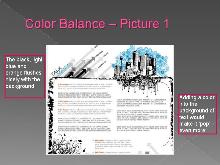
Color Balance – Picture 1 The black, light blue and orange flushes nicely with the background Adding a color into the background of text would make it ‘pop’ even more

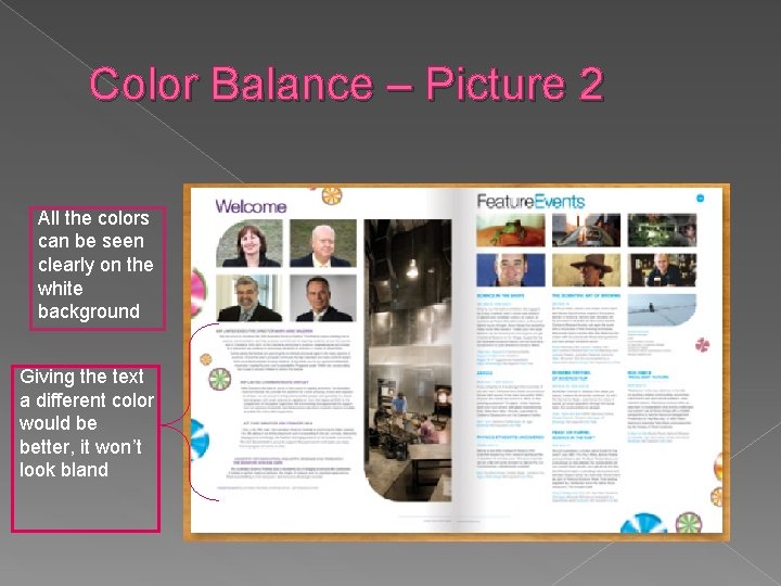
Color Balance – Picture 2 All the colors can be seen clearly on the white background Giving the text a different color would be better, it won’t look bland

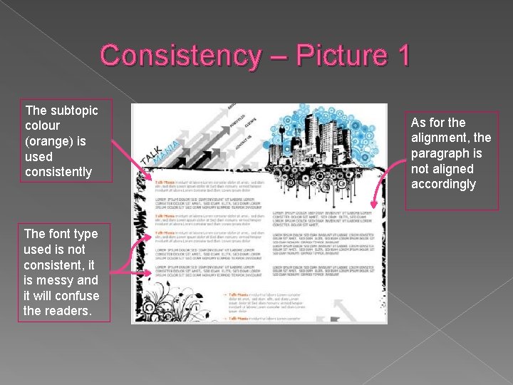
Consistency – Picture 1 The subtopic colour (orange) is used consistently The font type used is not consistent, it is messy and it will confuse the readers. As for the alignment, the paragraph is not aligned accordingly

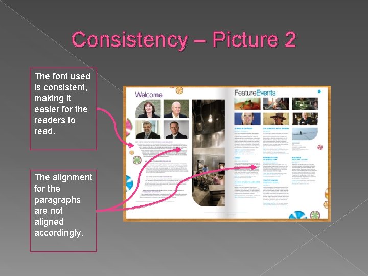
Consistency – Picture 2 The font used is consistent, making it easier for the readers to read. The alignment for the paragraphs are not aligned accordingly.

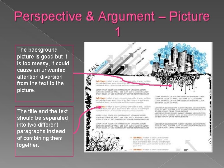
Perspective & Argument – Picture 1 The background picture is good but it is too messy, it could cause an unwanted attention diversion from the text to the picture. The title and the text should be separated into two different paragraphs instead of combining them together.

Perspective & Argument – Picture 2 The theme of the layout is much more proper and aligned. The fonts used for this design is clean, making the layout design more professional.

Thank You