Visual Communication Visual Journal 2 Croup Members Chan
Visual Communication Visual Journal 2 Croup Members: Chan Pui Yee(0312802) Lau Jia Wen(0312013) Ting Lee Si (0312092)
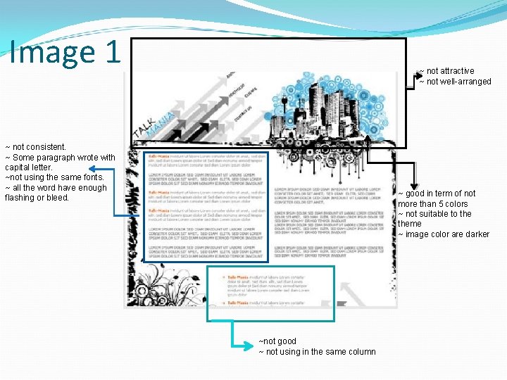
Image 1 ~ not attractive ~ not well-arranged ~ not consistent. ~ Some paragraph wrote with capital letter. ~not using the same fonts. ~ all the word have enough flashing or bleed. ~ good in term of not more than 5 colors ~ not suitable to theme ~ image color are darker ~not good ~ not using in the same column
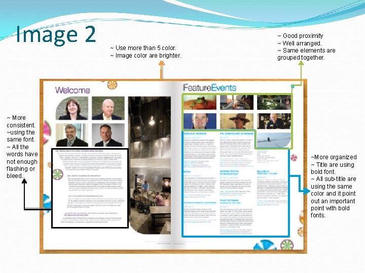
Image 2 ~ More consistent. ~using the same font. ~ All the words have not enough flashing or bleed. ~ Use more than 5 color. ~ Image color are brighter. ~ Good proximity ~ Well arranged. ~ Same elements are grouped together. ~More organized ~ Title are using bold font. ~ All sub-title are using the same color and it point out an important point with bold fonts.
Typography design & font Image 1: ~ Not consistent. ~ Some paragraph wrote with capital letter. ~ Not using the same fonts. ~ Have enough flashing or bleed. Image 2: ~ More consistent. ~ Using the same font. ~ Not having enough flashing or bleed.
Layout design Image 1: ~ Not attractive. ~ Not well-arranged. Image 2: ~ Good proximity -same elements are grouped together. ~ Well arranged.
Color balance Image 1: ~ Good in term of not more than 5 colors. ~ Not suitable to theme. ~ Image color are darker. Image 2: ~ Too colorful - use more than 5 color. ~ Look brighter – attractive.
Consistency (Font, alignment, color and etc. ) Image 1: ~ Font is not consistent. ~ Alignment is not consistent – from two columns to one column. Image 2: ~ More organized. ~ Title are using bold font. ~ Using the same color for the title. ~ Important points are highlighted with bold fonts.
Our perspective and argument Image 1: ~ Does not show any creativity and its hard to deliver messages. ~ From the layout itself is too simple and does not use colorful background yet it only use black, white and light blue. ~ Font use and size need to be adjusted because it’s difficult to read, and doesn’t know where to focus on. Image 2: ~ This layout design are too colorful and it show whose are the one who interviewed. ~ Added some image that could deliver message to other people to know what is this about. ~ Keep attract people to read, find out and stay focus.

END
- Slides: 9