Visual Aids for Computer Training CIRCA Operations Training

- Slides: 17

Visual Aids for Computer Training CIRCA Operations Training Program 1

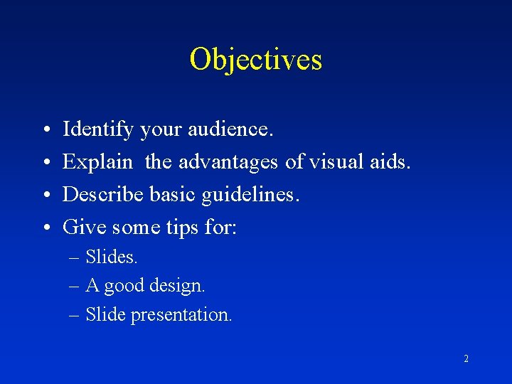
Objectives • • Identify your audience. Explain the advantages of visual aids. Describe basic guidelines. Give some tips for: – Slides. – A good design. – Slide presentation. 2

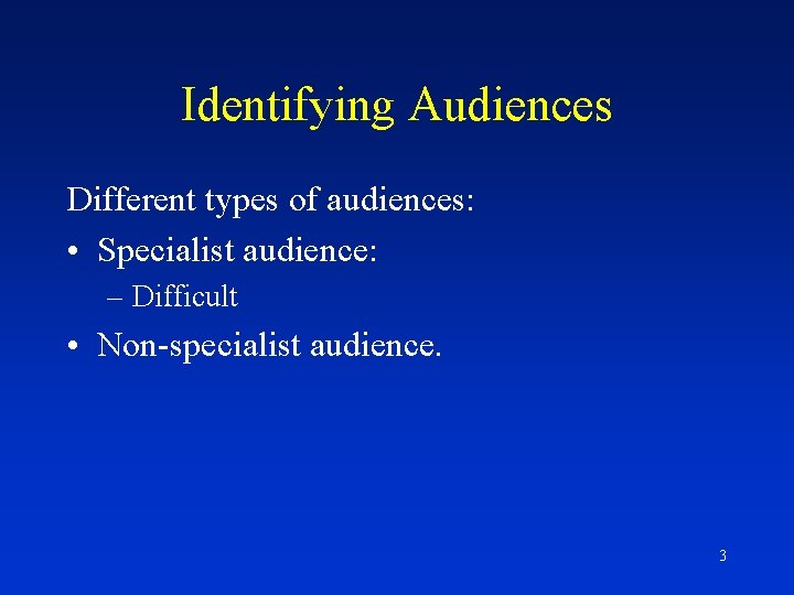
Identifying Audiences Different types of audiences: • Specialist audience: – Difficult • Non-specialist audience. 3

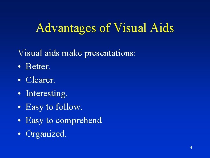
Advantages of Visual Aids Visual aids make presentations: • Better. • Clearer. • Interesting. • Easy to follow. • Easy to comprehend • Organized. 4

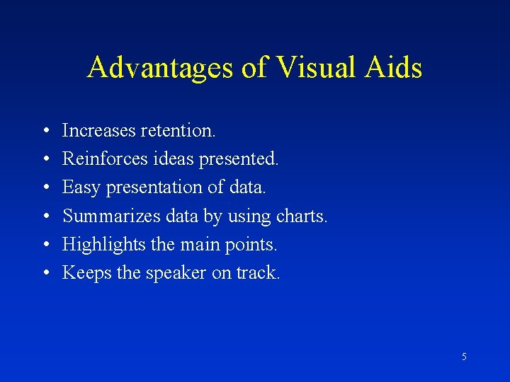
Advantages of Visual Aids • • • Increases retention. Reinforces ideas presented. Easy presentation of data. Summarizes data by using charts. Highlights the main points. Keeps the speaker on track. 5

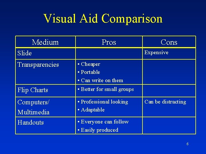
Visual Aid Comparison Medium Pros Cons Expensive Slide Transparencies • Cheaper • Portable • Can write on them Flip Charts • Better for small groups Computers/ Multimedia Handouts • Professional looking • Adaptable Can be distracting • Everyone can follow • Easily produced 6

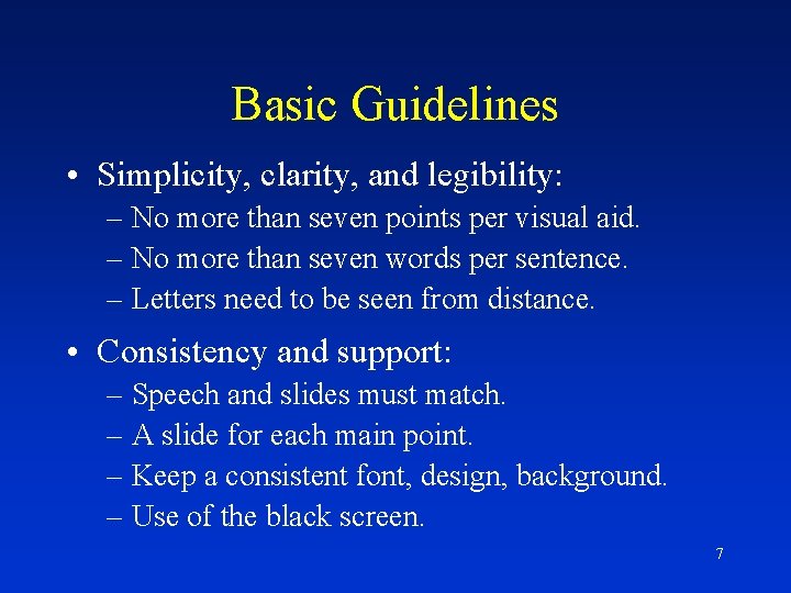
Basic Guidelines • Simplicity, clarity, and legibility: – No more than seven points per visual aid. – No more than seven words per sentence. – Letters need to be seen from distance. • Consistency and support: – Speech and slides must match. – A slide for each main point. – Keep a consistent font, design, background. – Use of the black screen. 7

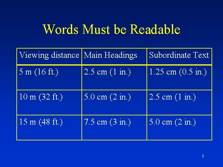
Words Must be Readable Viewing distance Main Headings Subordinate Text 5 m (16 ft. ) 2. 5 cm (1 in. ) 1. 25 cm (0. 5 in. ) 10 m (32 ft. ) 5. 0 cm (2 in. ) 2. 5 cm (1 in. ) 15 m (48 ft. ) 7. 5 cm (3 in. ) 5. 0 cm (2 in. ) 8

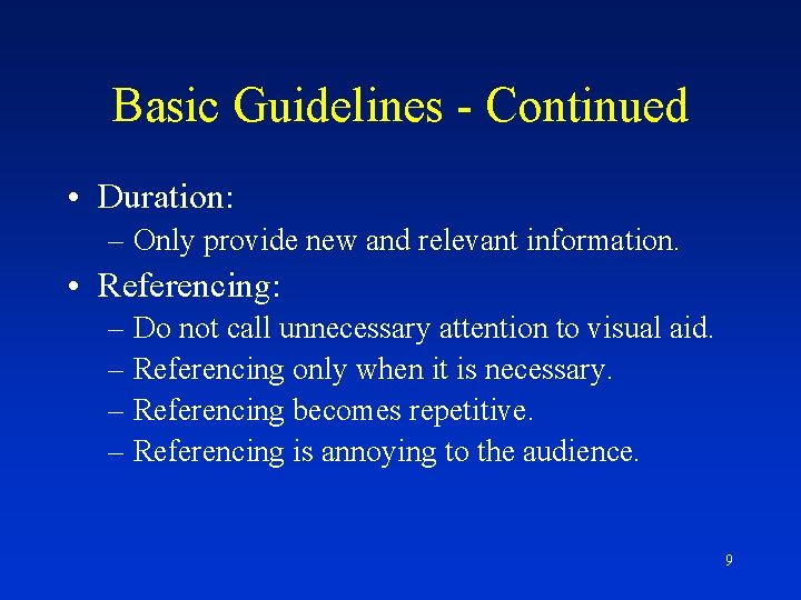
Basic Guidelines - Continued • Duration: – Only provide new and relevant information. • Referencing: – Do not call unnecessary attention to visual aid. – Referencing only when it is necessary. – Referencing becomes repetitive. – Referencing is annoying to the audience. 9

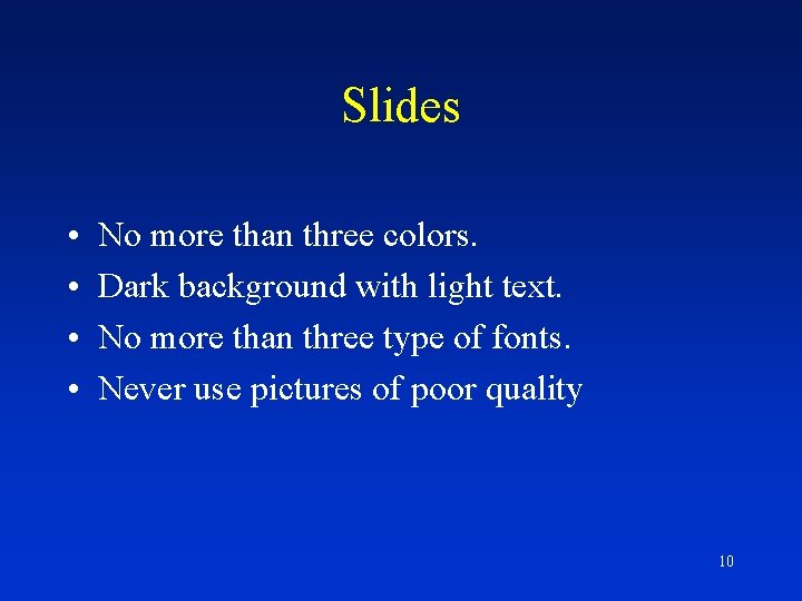
Slides • • No more than three colors. Dark background with light text. No more than three type of fonts. Never use pictures of poor quality 10

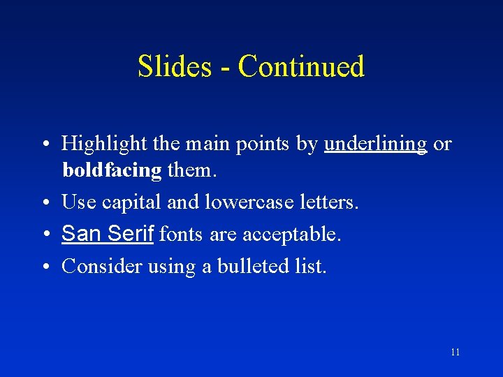
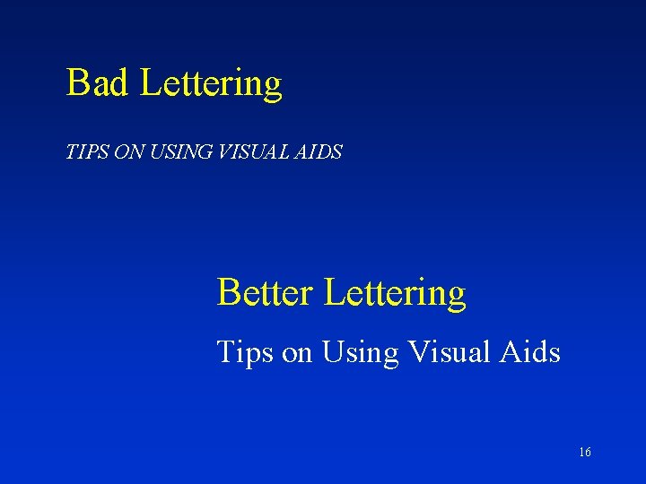
Slides - Continued • Highlight the main points by underlining or boldfacing them. • Use capital and lowercase letters. • San Serif fonts are acceptable. • Consider using a bulleted list. 11

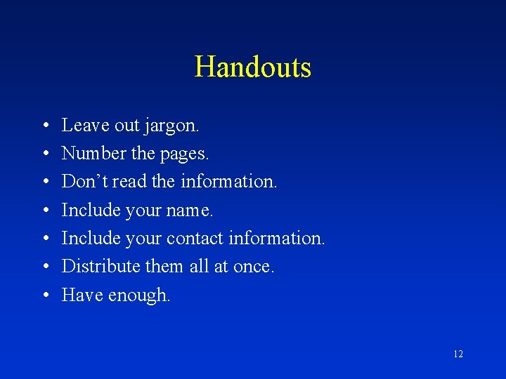
Handouts • • Leave out jargon. Number the pages. Don’t read the information. Include your name. Include your contact information. Distribute them all at once. Have enough. 12

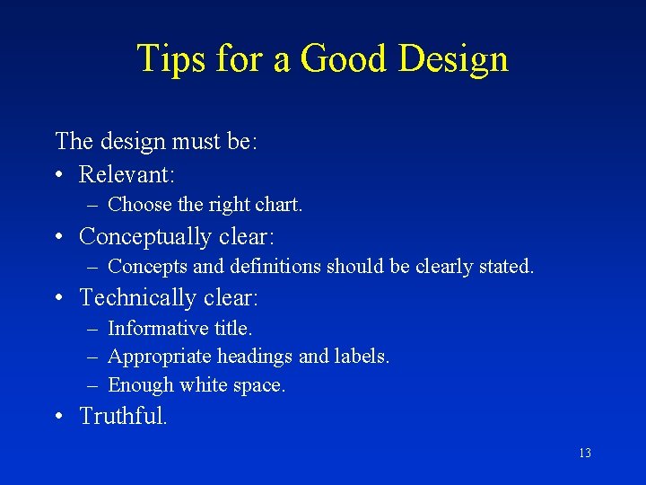
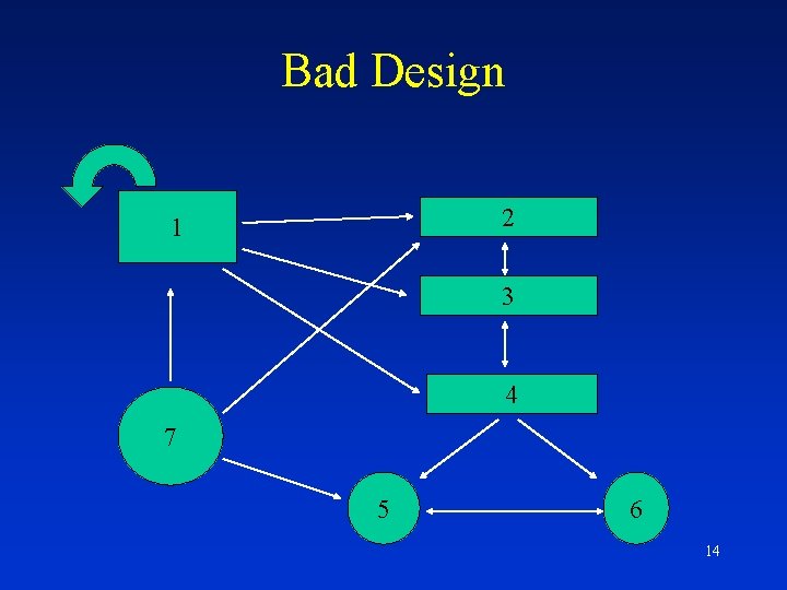
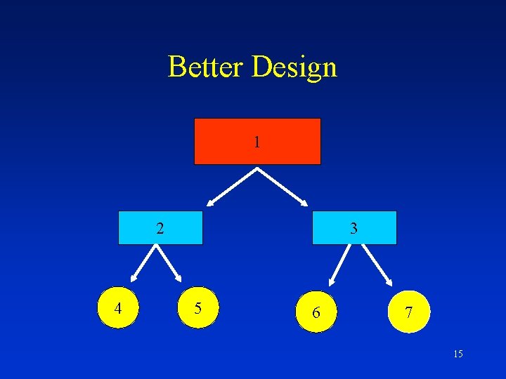
Tips for a Good Design The design must be: • Relevant: – Choose the right chart. • Conceptually clear: – Concepts and definitions should be clearly stated. • Technically clear: – Informative title. – Appropriate headings and labels. – Enough white space. • Truthful. 13

Bad Design 2 1 3 4 7 5 6 14

Better Design 1 2 4 3 5 6 7 15

Bad Lettering TIPS ON USING VISUAL AIDS Better Lettering Tips on Using Visual Aids 16

Tips for Slide Presentations • • Label and clean each slide. Arrive on time to prepare the room. First slide should be in focus. Turning on/off lights. Avoid showing a white screen. Do not announce each slide. Hide remote control. 17