VECTOR GRAPHICS v Vector graphics are made up
- Slides: 16


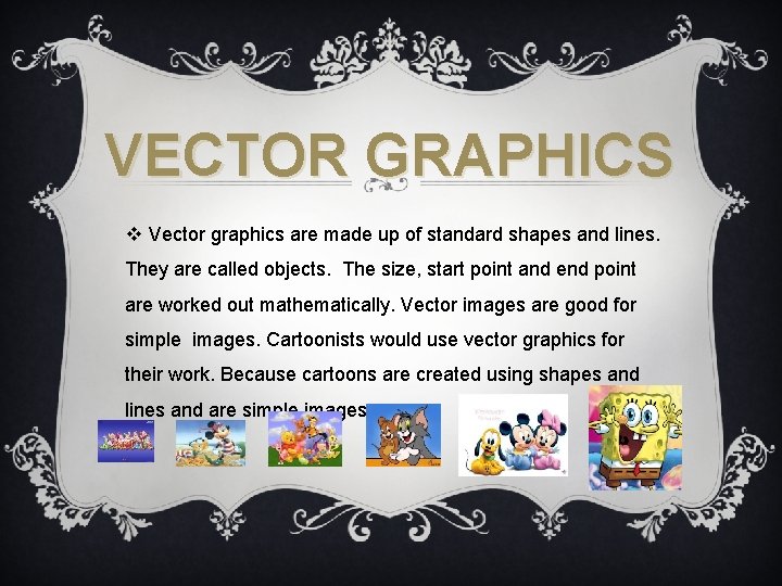
VECTOR GRAPHICS v Vector graphics are made up of standard shapes and lines. They are called objects. The size, start point and end point are worked out mathematically. Vector images are good for simple images. Cartoonists would use vector graphics for their work. Because cartoons are created using shapes and lines and are simple images.

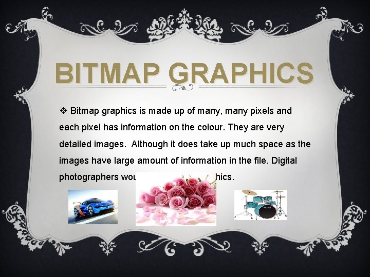
BITMAP GRAPHICS v Bitmap graphics is made up of many, many pixels and each pixel has information on the colour. They are very detailed images. Although it does take up much space as the images have large amount of information in the file. Digital photographers would use Bitmap graphics.

DIFFERENCE BETWEEN VECTOR GRAPHICS AND BITMAP GRAPHICS v The difference between vector graphic and bitmap graphic is that vector graphic can only create graphics using basic shapes and lines which creates images that aren’t very detailed and looks basically like a sketch it isn’t really eye catching because colour that you use can’t be too bright. Bitmap can create very detailed images with colours as bright as you want them to be which make the work look more realistic and more noticeable.

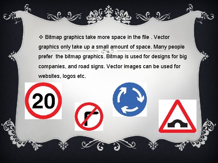
v Bitmap graphics take more space in the file. Vector graphics only take up a small amount of space. Many people prefer the bitmap graphics. Bitmap is used for designs for big companies, and road signs. Vector images can be used for websites, logos etc.

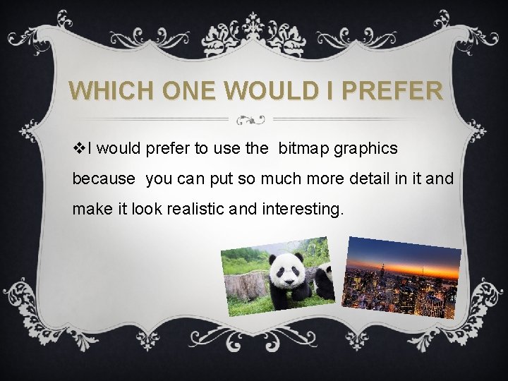
WHICH ONE WOULD I PREFER v. I would prefer to use the bitmap graphics because you can put so much more detail in it and make it look realistic and interesting.

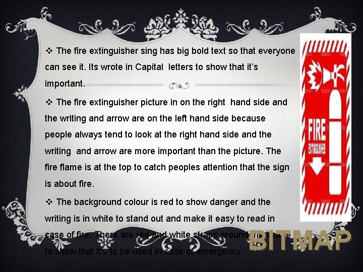
v The fire extinguisher sing has big bold text so that everyone can see it. Its wrote in Capital letters to show that it’s important. v The fire extinguisher picture in on the right hand side and the writing and arrow are on the left hand side because people always tend to look at the right hand side and the writing and arrow are more important than the picture. The fire flame is at the top to catch peoples attention that the sign is about fire. v The background colour is red to show danger and the writing is in white to stand out and make it easy to read in BITMAP case of fire. There are red and white straps around the image to show that it’s to be used in case of emergency.

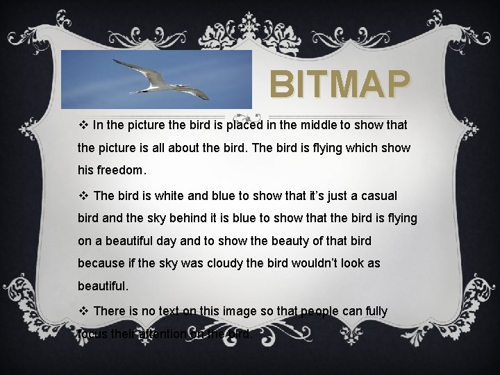
BITMAP v In the picture the bird is placed in the middle to show that the picture is all about the bird. The bird is flying which show his freedom. v The bird is white and blue to show that it’s just a casual bird and the sky behind it is blue to show that the bird is flying on a beautiful day and to show the beauty of that bird because if the sky was cloudy the bird wouldn’t look as beautiful. v There is no text on this image so that people can fully focus their attention on the bird.

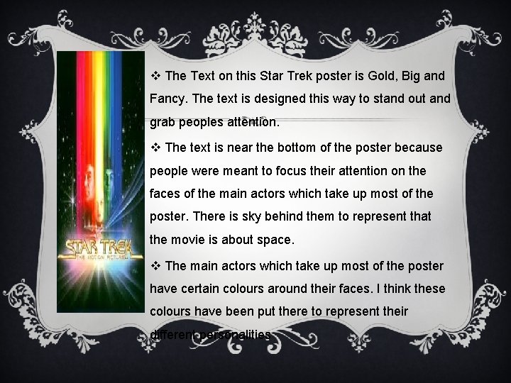
v The Text on this Star Trek poster is Gold, Big and Fancy. The text is designed this way to stand out and grab peoples attention. v The text is near the bottom of the poster because people were meant to focus their attention on the faces of the main actors which take up most of the poster. There is sky behind them to represent that the movie is about space. v The main actors which take up most of the poster have certain colours around their faces. I think these colours have been put there to represent their different personalities

Red would be dangerous or violent. Yellow could represent a happy and cheerful personality. Blue and green could represent someone who is naturally very calm and natural. The title has a yellow background with all the different colours yellow, red , green and blue. This makes the title stand out. BITMAP

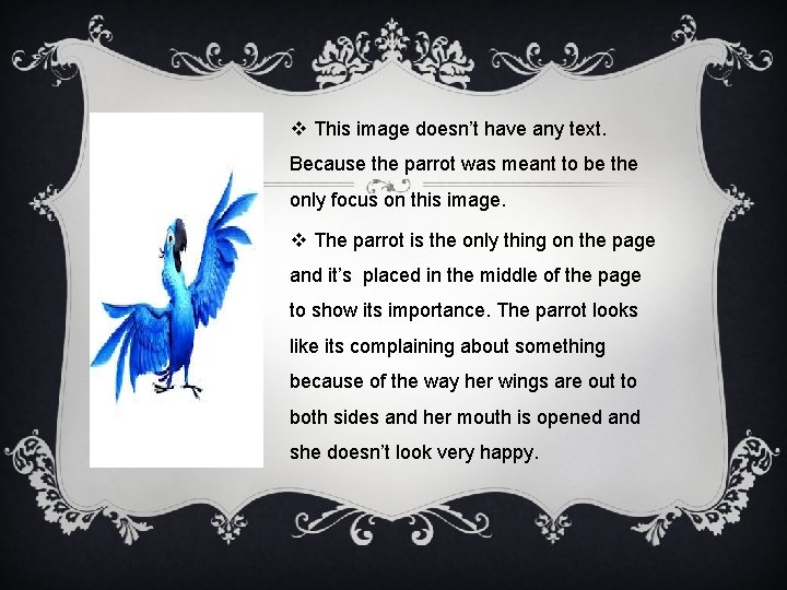
v This image doesn’t have any text. Because the parrot was meant to be the only focus on this image. v The parrot is the only thing on the page and it’s placed in the middle of the page to show its importance. The parrot looks like its complaining about something because of the way her wings are out to both sides and her mouth is opened and she doesn’t look very happy.

v The Parrot is coloured all in blue but with different shades. Her head and part of her body are a lighter shade of blue than the rest of her. Which makes her more noticeable and interesting. The background is white and the main point of it being white is to make the parrot more visible and noticeable. VECTOR

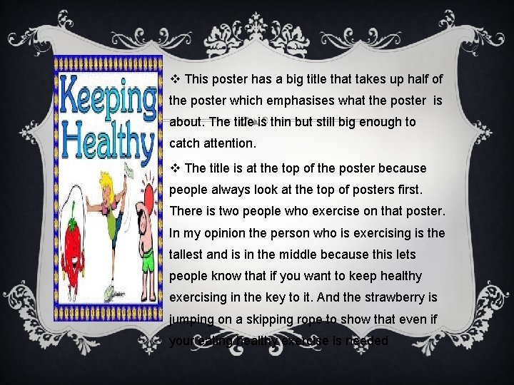
v This poster has a big title that takes up half of the poster which emphasises what the poster is about. The title is thin but still big enough to catch attention. v The title is at the top of the poster because people always look at the top of posters first. There is two people who exercise on that poster. In my opinion the person who is exercising is the tallest and is in the middle because this lets people know that if you want to keep healthy exercising in the key to it. And the strawberry is jumping on a skipping rope to show that even if your eating healthy exercise is needed

v The colours used on this poster are bright and colourful which is made that way to catch mostly children's attention because the habits you have when your young often stay with you for the rest of your life. VECTOR

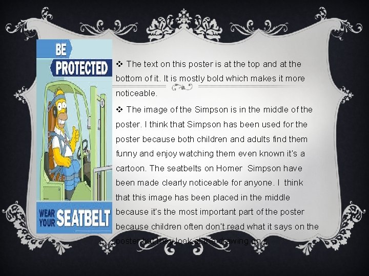
v The text on this poster is at the top and at the bottom of it. It is mostly bold which makes it more noticeable. v The image of the Simpson is in the middle of the poster. I think that Simpson has been used for the poster because both children and adults find them funny and enjoy watching them even known it’s a cartoon. The seatbelts on Homer Simpson have been made clearly noticeable for anyone. I think that this image has been placed in the middle because it’s the most important part of the poster because children often don’t read what it says on the poster but they look at the drawing on it.

Homer Simpson has his thumbs up which makes people feel that homer is telling them that wearing seat belts is fun. v Homer Simpson is yellow and he’s sitting in a green car and the seatbelts are yellow the background is blue and writing is white. All the colours used relate to both male and female so the poster doesn’t have a message for a specific gender but for everyone. VECTOR