VARIABLE CONTROL CHART Dr Raghu Nandan Sengupta Professor

VARIABLE CONTROL CHART Dr. Raghu Nandan Sengupta Professor Department of Industrial and Management Engineering All figures are taken from(unless otherwise mentioned): Introduction to Statistical process Control Douglas. C Montgomery 6 th Edition
 • monitoring production")
2 Basics of Statistical Process Control • Statistical Process Control (SPC) • monitoring production process to detect and prevent poor quality • Sample • subset of items produced to use for inspection • Control Charts • process is within statistical control limits UCL CL LCL

3 Variability • Variability is inherent in every process • Natural or common causes • Special or assignable causes • Provides a statistical signal when assignable causes are present • Detect and eliminate assignable causes of variation

4 Variability • Random • common causes • inherent in a process • Non-Random • special causes • due to identifiable factors • can be eliminated only through improvements in the system • can be modified through operator or management action

5 Random or Natural Variations • Natural variations in the production process • These are to be expected • Output measures follow a probability distribution • For any distribution there is a measure of central tendency and dispersion Non-Random or Assignable Variations • Variations that can be traced to a specific reason (machine wear, misadjusted equipment, fatigued or untrained workers) • The objective is to discover when assignable causes are present and eliminate them

6 Quality Measures Attribute • a product characteristic that can be evaluated with a discrete response • good – bad; yes – no Variable • a product characteristic that is continuous and can be measured • weight, length, …. .

Types of Data Variables Attributes • Characteristics that can take any real value • Defect-related characteristics • May be in whole or in fractional numbers • Classify products as either good or bad or count defects • Continuous random variables • Categorical or discrete random variables 7

Control Charts for Variables • For variables that have continuous dimensions • weight, speed, length, strength, etc. • x-charts are to control the central tendency of the process • R-charts are to control the dispersion of the process 8

Need for controlling mean and variability Change in process mean Mean and Standard deviation at nominal level Change in process SD

10 Samples To measure the process, we take samples and analyze the sample statistics following these steps # # Frequency (a) Samples of the product, say five boxes taken off the machine line, vary from each other in weight Each of these represents one sample of five boxes # # # # Weight # # # # #
 After enough samples are")
11 Samples The solid line represents the distribution Frequency (b) After enough samples are taken from a stable process, they form a pattern called a distribution Weight
There are many types of distributions, including the normal (bellshaped) distribution,")
12 Samples Frequency (c)There are many types of distributions, including the normal (bellshaped) distribution, but distributions do differ in terms of central tendency (mean), standard deviation or variance, and shape Central tendency Weight Variation Weight Shape Weight
If only natural causes of variation are present, the output of a process")
13 (d)If only natural causes of variation are present, the output of a process forms a distribution that is stable over time and is predictable Frequency Samples Prediction e Tim Weight

Normal Distribution 95% 99. 74% -3 -2 -1 =0 1 2 3

Basis of x and R chart • Let a quality characteristic is normally distributed with mean μ and standard deviation σ • If x 1, x 2 …… xn is a sample of size n, then sample mean is given by • With a probability of 1 -� , any sample mean will lie between • Using the above two equations we can find the central and control lines • However in real life we will not know μ or σ

Estimating μ and σ • Suppose we take m samples each of size n • The best estimate of process average is given as • Here represents the mean of each sample • To estimate the σ, we measure the range for the m samples • Range of each sample : • Average range for all samples:

Control Limits for the charts

Reference Charts

Reference Charts

Unbiased estimator of σ • If R is the average range of m samples, then to estimate sigma, we use • This is an unbiased estimator of σ

Phase 1 of Control Chart Usage • Since at the beginning, the chart uses preliminary samples, the control limits are treated as trial control limits • To check if process was in control during the initial m samples plot he charts and look for any pattern or any point outside the control limit • If there are points outside control limits • Revise the control limits • Check assignable cause for each of the points outside control limits • If there exists an assignable cause, discard the point and recalculate control limits with the remaining points

Phase 1 of Control Chart Usage • If no assignable cause if found • Discard the point without much justification • Retain the point and see in future if process remains in control • If initially a lot of points remain out of control • Dropping too many reduce available data points • Inspecting causes for all points may not be possible/worthwhile • In such cases look for patterns in control chart • Identification and removal of process problem causes major process improvement

An example

The R chart • Central Line for R chart • Control Limits for the chart • R chart • Process variability is in control

The x chart • The central line • The control limits • The x chart • No point is out of control

Estimating Process Capability • Estimating process standard deviation • Estimate of the fraction of nonconforming wafers produced • Assumption: Flow width is a normally distributed random variable with Mean=1. 5056 and Std. Dev. =. 1398 • About 0. 035 percent [350 parts per million (ppm)] of the wafers produced will be outside of the specifications.

Estimating Process Capability Ratio • Process Capability Ratio is expressed as: • For the above example • Another way to interpret the Process Capability Ratio • the percentage of the specification band that the process uses up • For above example

Revision of control limits and central lines • Practitioners establish regular periods for review and revision of control chart limits, such as every week, every month, or every 25, 50, or 100 samples • highly desirable to use at least 25 samples • Sometimes the user will replace the center line of the x chart with a target value • Helpful in shifting the process average to the desired value • Processes where the mean may be changed by a fairly simple adjustment of a variable that can be manipulated in the process • Once a set of reliable control limits is established, we use the control chart for monitoring future production (Phase 2 operations of the charts)

Some Guidelines for Creating the Charts • Rational Subgroup • The x chart monitors between-sample variability (variability in the process over time) • The R chart measures within-sample variability (the instantaneous process variability at a given time). • Rational subgroup concept means that subgroups or samples should be selected so that if assignable causes are present, the chance for differences between subgroups will be maximized, while the chance for differences due to these assignable causes within a subgroup will be minimized

Some guidelines …. continued • To design the x and R charts, we must specify the sample size, control limit width, and frequency of sampling to be used • If the x chart is used to detect moderate to large process shifts(2 σ or more) than small sample size is effective • For detecting small shifts, sample size of n=15 to 25 may be required

Some guidelines…. continued • The R chart is relatively insensitive to shifts in the process standard deviation for small samples. • samples of size n = 5 have only about a 40% chance of detecting on the first sample a shift in the process standard deviation from s to 2 s • Consequently, for large n—say, n>10 or 12—it is probably best to use a control chart for s 2 instead of the R chart • The problem of choosing the sample size and the frequency of sampling is one of allocating sampling effort

R example
![R code • data<-matrix(nrow=20, ncol=6) • data[, 1]=c(459, 443, 457, 469, 443, 444, 445,](http://slidetodoc.com/presentation_image_h2/08f572d04214ec2686b380d9db8ed273/image-33.jpg "R code • data<-matrix(nrow=20, ncol=6) • data[, 1]=c(459, 443, 457, 469, 443, 444, 445,")
R code • data<-matrix(nrow=20, ncol=6) • data[, 1]=c(459, 443, 457, 469, 443, 444, 445, 446, 444, 4 • • 32, 445, 456, 459, 441, 460, 453, 451, 422, 444, 450) data[, 2]=c(449, 440, 444, 463, 457, 456, 449, 455, 452, 4 63, 452, 457, 445, 465, 453, 444, 460, 431, 446, 450) data[, 3]=c(435, 442, 449, 453, 445, 456, 450, 449, 457, 4 63, 453, 436, 441, 438, 457, 451, 450, 437, 448, 454) data[, 4]=c(450, 442, 444, 438, 454, 457, 445, 452, 440, 4 43, 438, 457, 447, 450, 438, 435, 457, 429, 467, 454) library(qcc) • # Here we use the package qcc • # The package has to be installed first before using • i<-qcc(data, type='xbar') • j<-qcc(data, type="R")
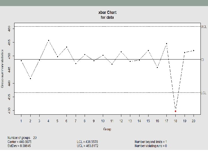
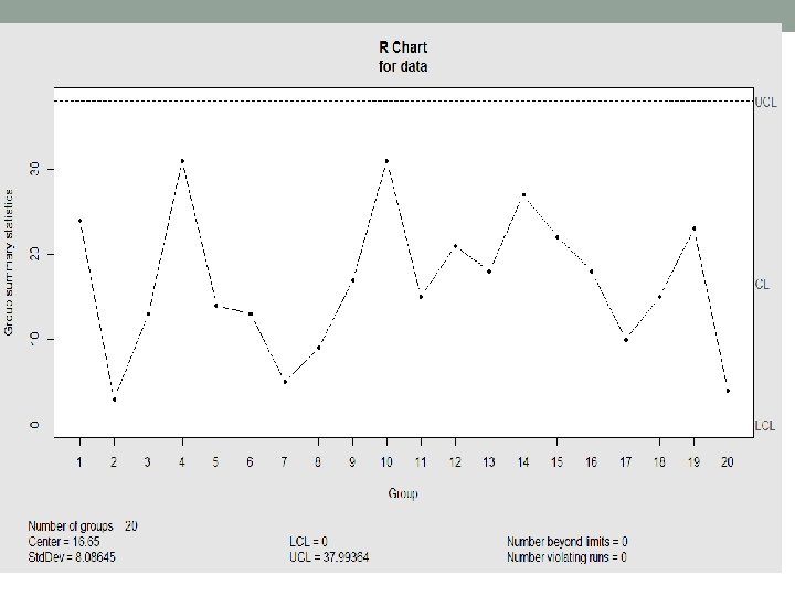

Example - Continued • As can be seen from x bar chart, the third last point is out of control • We remove to point to recalculate the control limits of both the charts • In real life we do this only after finding some assignable cause • i<-qcc(data[-18, ], type="xbar") • j<-qcc(data[-18, ], type="R") • # if you type i$ in Rstudio, it will give you the available parameters like std. dev. , Center etc. • Mean can be seen fro the charts • We will estimate the standard deviation after 2 slides

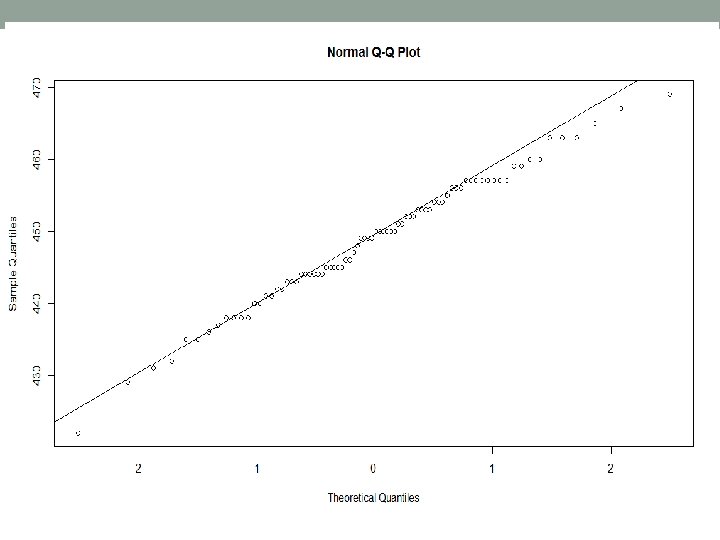
Example continued • To check normality, we draw the q-q plot or the quantile-quantile plot • A Q-Q plot is a scatterplot created by plotting two sets of quantiles against one another. If both sets of quantiles came from the same distribution, we should see the points forming a line that’s roughly straight. • In checking normality, one quantile is taken from normal to see if the other data set is also normal. • qqnorm(z) • qqline(z)

Example continued • Checking process capability: • First we estimate the standard deviation • Here estimated σ=16. 65/2. 059 (check from table for n=4) • So estimated σ=8. 08645 • For these calculations we use the values that includes the 18 th point • Now process capability • Cp= 60/(6*8. 08)=1. 2376

Variable Sample Size • When a permanent change is required for the sample size, the limits are to be recalculated • Let

New control limits • For x chart • The central line x is unchanged • For R chart

Example For x chart the calculations are

Example continued Calculation for R chart x chart R chart

Probability limits on x chart • Control limits in the charts are often expressed in terms of multiples of standard deviation • It is also possible to define the control limits by specifying the type I error level for the test • These are called probability limits for control charts

Probability limits on x chart • Assuming x is normally distributed • We may obtain a desired type I error of a by choosing the multiple of sigma for the control limit as k = Z�/2, where Z �/2 is the upper � /2 percentage point of the standard normal distribution • If we choose �= 0. 002, then Z �/2 = Z 0. 001 = 3. 09 • There is very little difference between the control limits and the probability

x and R chart when μ and σ are known • The x chart • Defining 3/√n as A, we get • For R chart • Defining the constants we get:

Interpreting the charts • In interpreting patterns on the chart, we must first determine whether or not the R chart is in control • You must eliminate assignable causes from R chart first • Never attempt to interpret the x chart when the R chart indicates an out-of-control condition • Typical patterns may be seen and interpreted from the charts

Cyclic Pattern • Such a pattern on the chart may result from systematic environmental changes such as temperature, operator fatigue, regular rotation of operators and/or machines, or fluctuation in voltage or pressure or some other variable in the production equipment. • R charts will sometimes reveal cycles because of maintenance schedules, operator fatigue, or tool wear resulting in excessive variability.

Mixture • A mixture is indicated when the plotted points tend to fall near or slightly outside the control limits, with relatively few points near the center line • A mixture pattern can also occur when output product from several sources (such as parallel machines) is fed into a common stream

Shift in process level • Shifts may result from the introduction of new workers; changes in methods, raw materials, or machines; a change in the inspection method or standards

Trend • Continuous movement in one direction • Causes-gradual wearing out or deterioration of a tool or some other critical process component, operator fatigue, seasonal influences, such as temperature

Stratification • Tendency for the points to cluster artificially around the center line • incorrect calculation of control limits, sampling process collects one or more units from several different underlying distributions within each subgroup

S chart • It is occasionally desirable to estimate the process standard deviation directly instead of indirectly through the use of the range R • S chart is preferred over R chart when • The sample size n is moderately large—say, n>10 or 12. • The sample size n is variable.

The operating characteristic function • The ability of the x and R charts to detect shifts in process quality is described by their operating characteristic (OC) curves • For an x chart • If the mean shifts from the in-control value—say, μ 0 to another value μ 1 = μ 0 + kσ, the probability of not detecting this shift on the first subsequent sample or the β-risk is

OC curve • Suppose that we are using an x chart with L = 3 (the usual three-sigma limits), the sample size n = 5, and we wish to determine the probability of detecting a shift to μ 1 = μ 0 + 2σ on the first sample following the shift. Then, since L = 3, k = 2, and n = 5, we have • This is the probability of not detecting the shift

OC curve • The probability that such a shift will be detected on the first subsequent sample is 1 − β = 1 − 0. 0708 = 0. 9292 • The probability that the shift will be detected on the rth subsequent sample is simply 1 − β times the probability of not detecting the shift on each of the initial r − 1 samples • The expected number of samples taken before the shift is detected is simply the average run length • For the example

Calculating parameters of x and s chart • When σ is known • When σ is not known, we use s which is the average s of m preliminary sample available For x chart, the parameters become

Example

Solution • Calculate average mean and average Standard Deviation • Parameters for x chart • Parameters for s chart

The charts and process SD estimation • The x control chart • The s control chart

The s 2 chart • This is based on sample variance • Here s 2 is the average sample variance • Χ 2 refers to chi-square distribution • Look at the degrees of freedom • This chart has its limits defined in terms of probability

Moving Range Control Chart • In many cases sample size used for process monitoring is 1 • Repeat measurements on the process differ only because of laboratory or analysis error, as in many chemical processes • Multiple measurements are taken on the same unit of product, such as measuring oxide thickness at several different locations on a wafer in semiconductor manufacturing. • In such situations, the control chart for individual units is useful • We use the moving range two successive observations as the basis of estimating the process variability

Example

Charts

Normality assumption before using the MR chart • If the process shows evidence of even moderate departure from normality, the control limits calculated may be entirely inappropriate • One approach to dealing with the problem of nonnormality would be to determine the control limits for the individuals control chart based on the percentiles of the correct underlying distribution • These percentiles could be obtained from a histogram if a large sample (at least 100 but preferably 200 observations) were available, or from a probability distribution fit to the data • Before plotting a MR chart, it is better to check for normality using histogram or normal probability plot

R Example
![R code • data 1<-matrix(nrow=25, ncol=3) • data 1[, 2]<- c(16. 11, 16. 08,](http://slidetodoc.com/presentation_image_h2/08f572d04214ec2686b380d9db8ed273/image-67.jpg "R code • data 1<-matrix(nrow=25, ncol=3) • data 1[, 2]<- c(16. 11, 16. 08,")
R code • data 1<-matrix(nrow=25, ncol=3) • data 1[, 2]<- c(16. 11, 16. 08, 16. 12, 16. 10, 16. 11, 16. 12, 16. 09, 16. 12, 16. 10, 16. 09, 16. 07, 16. 13, 16. 12, 16. 10, 16. 08, 1 6. 13, 16. 15, 16. 12, 16. 10, 16. 08, 16. 07, 16. 11, 16. 13, 16. 10) • library(qicharts) # to plot the MR and I chart we use qicharts package • The package must be installed prior to it usage • i<-qic(data 1[, 2], chart="i") • j<-qic(data 1[, 2], chart="mr") • Keep in mind in the I chart the control limits are rounded off • For example i$cl gives 16. 02 while it is shown 16 in the graph
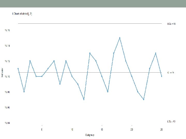
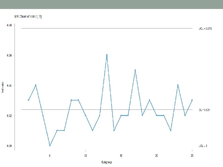

Calculations • Mean • i$cl=16. 052 • Standard deviation estimation • Here SD=. 8865*. 02375=. 0210 • . 02375 is obtained by j$cl • To check normality we again use the qqplot • qqnorm(data 1[, 2]) • qqline(data 1[, 2])

Normal Q-Q Plot

Percentage of cans under filled • % cans under filled can be estimated from the lower control limit • For a can to remain under filed, the weight must be below the lower control limit. • So if we can find the probability of cans having weight below the lower control limit, we should know the %of cans to be under filled • Pr(x<16. 04204)=(16. 04204 -16. 052)/. 0210=. 317

References • http: //data. library. virginia. edu/understanding-q- q-plots/
- Slides: 73