Using R and QGIS for Geospatial Analysis Dan



- Slides: 41

Using R and QGIS for Geospatial Analysis Dan Vollrath Institutional Research Analyst Trinity University dvollrat@trinity. edu

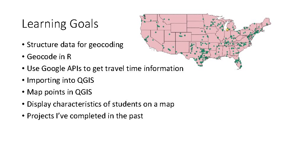
Learning Goals • Structure data for geocoding • Geocode in R • Use Google APIs to get travel time information • Importing into QGIS • Map points in QGIS • Display characteristics of students on a map • Projects I’ve completed in the past

Downloading R, Rstudio, and QGIS R http: //cran. stat. ucla. edu/ RStudio https: //www. rstudio. com/products/rstudio/download/ QGIS http: //www. qgis. org/en/site/forusers/download. html *I always download 64 bit

• R is a language and environment for statistical computing CRAN • CRAN is the network of servers allowing us to use R. When you download R, it will ask you to choose your location, finding the nearest server. • RStudio is an environment for using R. • Allows us to use R more intuitively.

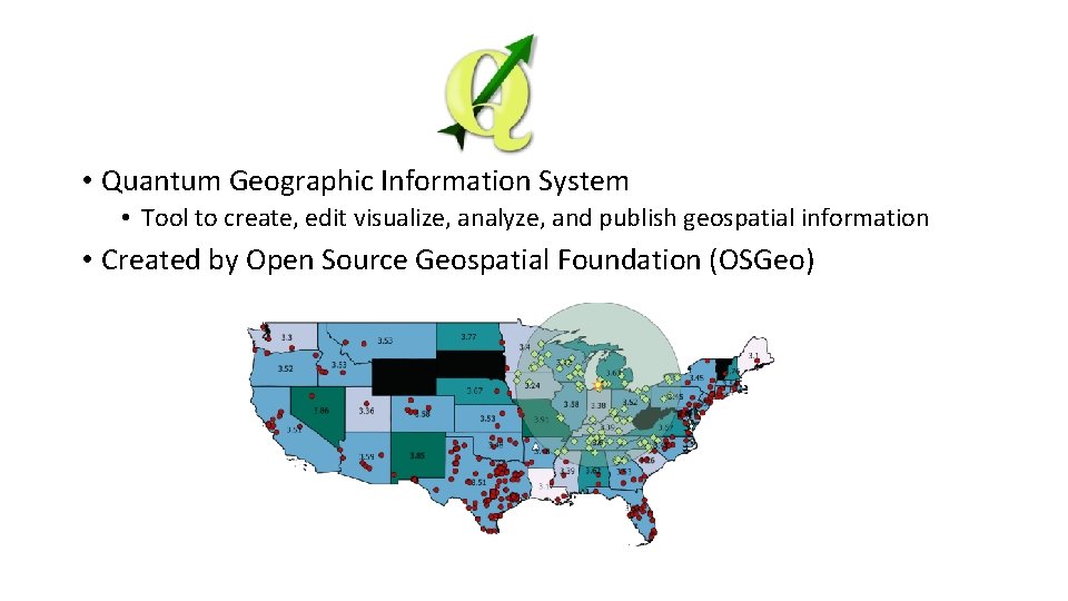
• Quantum Geographic Information System • Tool to create, edit visualize, analyze, and publish geospatial information • Created by Open Source Geospatial Foundation (OSGeo)

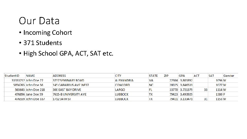
Our Data • Incoming Cohort • 371 Students • High School GPA, ACT, SAT etc.

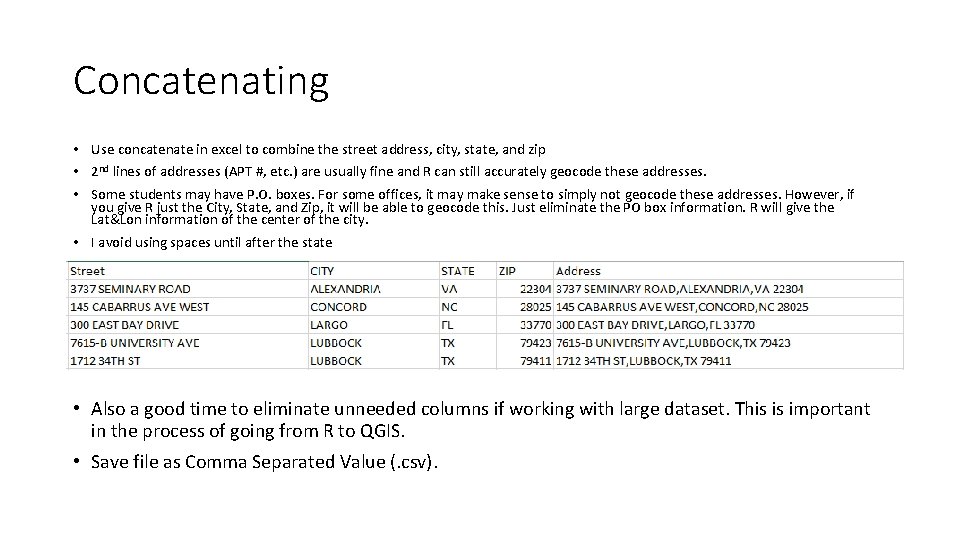
Concatenating • Use concatenate in excel to combine the street address, city, state, and zip • 2 nd lines of addresses (APT #, etc. ) are usually fine and R can still accurately geocode these addresses. • Some students may have P. O. boxes. For some offices, it may make sense to simply not geocode these addresses. However, if you give R just the City, State, and Zip, it will be able to geocode this. Just eliminate the PO box information. R will give the Lat&Lon information of the center of the city. • I avoid using spaces until after the state • Also a good time to eliminate unneeded columns if working with large dataset. This is important in the process of going from R to QGIS. • Save file as Comma Separated Value (. csv).

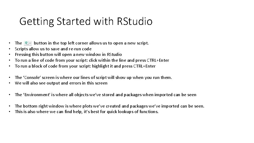
Getting Started with RStudio • • • The button in the top left corner allows us to open a new script. Scripts allow us to save and re-run code Pressing this button will open a new window in RStudio To run a line of code from your script: click within the line and press CTRL+Enter To run a block of code from your script: highlight it and press CTRL+Enter • The ‘Console’ screen is where our lines of script will show up when you run them. • We will also see output and errors in this screen • The ‘Environment’ is where all objects we’ve stored and packages when imported can be seen • The bottom right window is where plots we’ve created and packages we’ve imported can be seen. • This is also where we can find help, it’s best for quick lookups of functions.

Coding • It is a good idea to annotate any code you create neatly, and plentifully • Naming and dating allows others to know the who, when, why of your code. • Hashtags (#) makes any line of code a comment • We can still enter a comment, but nothing will happen

Packages # Packages are groups of functions created by other R programmers # Packages are one of the most powerful parts of R, there are packages for all sorts of uses # People are always creating them, which keeps R constantly updating # This project requires ggplot 2, a graphics package # This project uses ggmap, a collection of function to visualize spatial data # For more information on these packages, go to: # https: //cran. r-project. org/web/packages/ggplot 2. pdf # https: //cran. r-project. org/web/packages/ggmap. pdf

Libraries # The directory where packages are stored are called libraries # We need to run these before we can use functions from our package # Notice the change in coding, install. packages() uses quotes inside, library() doesn't

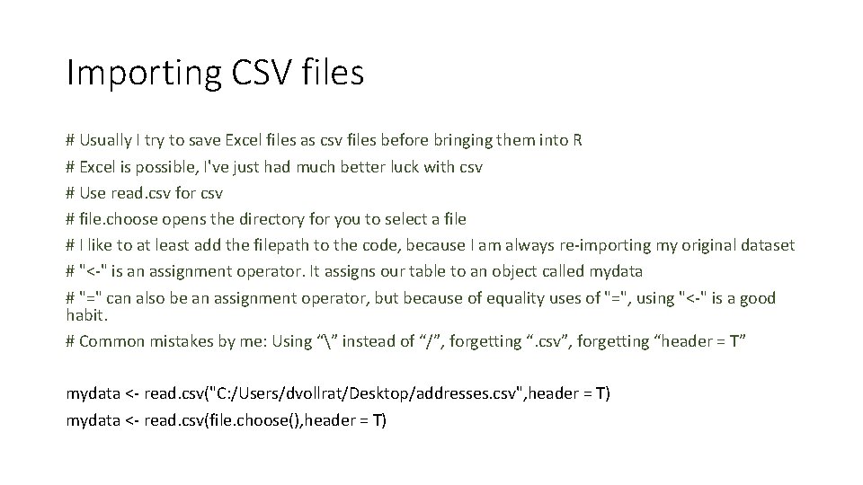
Importing CSV files # Usually I try to save Excel files as csv files before bringing them into R # Excel is possible, I've just had much better luck with csv # Use read. csv for csv # file. choose opens the directory for you to select a file # I like to at least add the filepath to the code, because I am always re-importing my original dataset # "<-" is an assignment operator. It assigns our table to an object called mydata # "=" can also be an assignment operator, but because of equality uses of "=", using "<-" is a good habit. # Common mistakes by me: Using “” instead of “/”, forgetting “. csv”, forgetting “header = T” mydata <- read. csv("C: /Users/dvollrat/Desktop/addresses. csv", header = T) mydata <- read. csv(file. choose(), header = T)

Viewing Data # Click on the object in the Environment window to view your dataframe # R is great because you can have multiple dataframes in your environment # Or use View(), View(mydata)

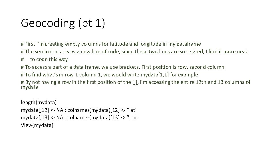
Geocoding (pt 1) # First I'm creating empty columns for latitude and longitude in my dataframe # The semicolon acts as a new line of code, since these two lines are so related, I find it more neat # to code this way # To access a part of a data frame, we use brackets. First position is row, second column # To find what’s in row 1 column 1, we would write mydata[1, 1] for example # By not having a row in the first position of the [, ], I'm accessing the entire 12 th and 13 columns of mydata length(mydata) mydata[, 12] <- NA ; colnames(mydata)[12] <- "lat" mydata[, 13] <- NA ; colnames(mydata)[13] <- "lon" View(mydata)

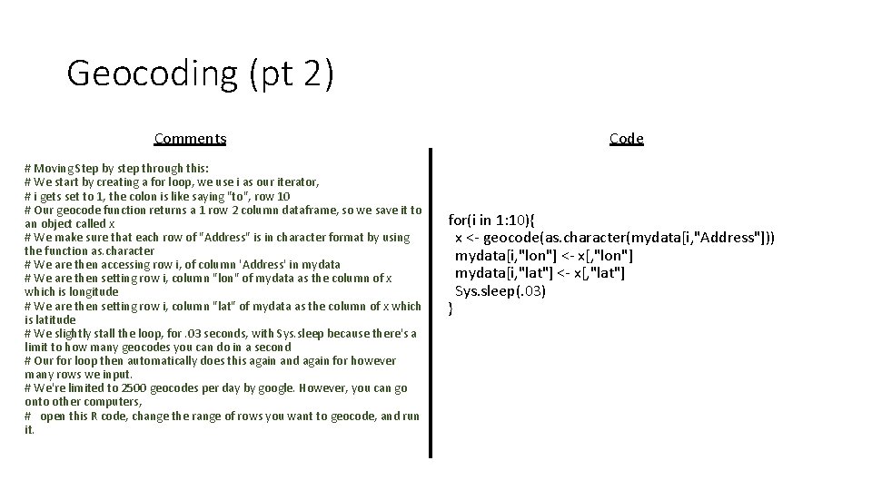
Geocoding (pt 2) Comments # Moving Step by step through this: # We start by creating a for loop, we use i as our iterator, # i gets set to 1, the colon is like saying "to", row 10 # Our geocode function returns a 1 row 2 column dataframe, so we save it to an object called x # We make sure that each row of "Address" is in character format by using the function as. character # We are then accessing row i, of column 'Address' in mydata # We are then setting row i, column "lon" of mydata as the column of x which is longitude # We are then setting row i, column "lat" of mydata as the column of x which is latitude # We slightly stall the loop, for. 03 seconds, with Sys. sleep because there's a limit to how many geocodes you can do in a second # Our for loop then automatically does this again and again for however many rows we input. # We're limited to 2500 geocodes per day by google. However, you can go onto other computers, # open this R code, change the range of rows you want to geocode, and run it. Code for(i in 1: 10){ x <- geocode(as. character(mydata[i, "Address"])) mydata[i, "lon"] <- x[, "lon"] mydata[i, "lat"] <- x[, "lat"] Sys. sleep(. 03) }

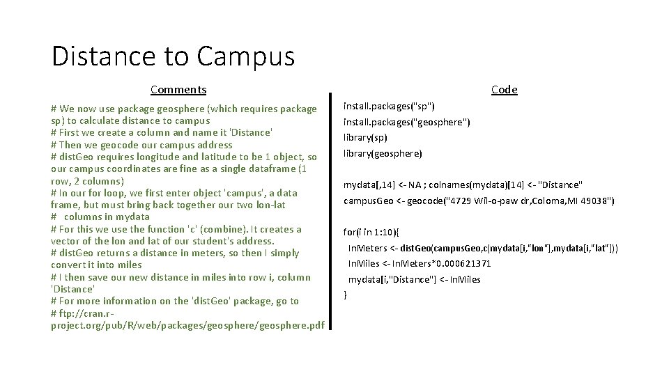
Distance to Campus Comments # We now use package geosphere (which requires package sp) to calculate distance to campus # First we create a column and name it 'Distance' # Then we geocode our campus address # dist. Geo requires longitude and latitude to be 1 object, so our campus coordinates are fine as a single dataframe (1 row, 2 columns) # In our for loop, we first enter object 'campus', a data frame, but must bring back together our two lon-lat # columns in mydata # For this we use the function 'c' (combine). It creates a vector of the lon and lat of our student's address. # dist. Geo returns a distance in meters, so then I simply convert it into miles # I then save our new distance in miles into row i, column 'Distance' # For more information on the 'dist. Geo' package, go to # ftp: //cran. rproject. org/pub/R/web/packages/geosphere. pdf Code install. packages("sp") install. packages("geosphere") library(sp) library(geosphere) mydata[, 14] <- NA ; colnames(mydata)[14] <- "Distance" campus. Geo <- geocode("4729 Wil-o-paw dr, Coloma, MI 49038") for(i in 1: 10){ In. Meters <- dist. Geo(campus. Geo, c(mydata[i, "lon"], mydata[i, "lat"])) In. Miles <- In. Meters*0. 000621371 mydata[i, "Distance"] <- In. Miles }

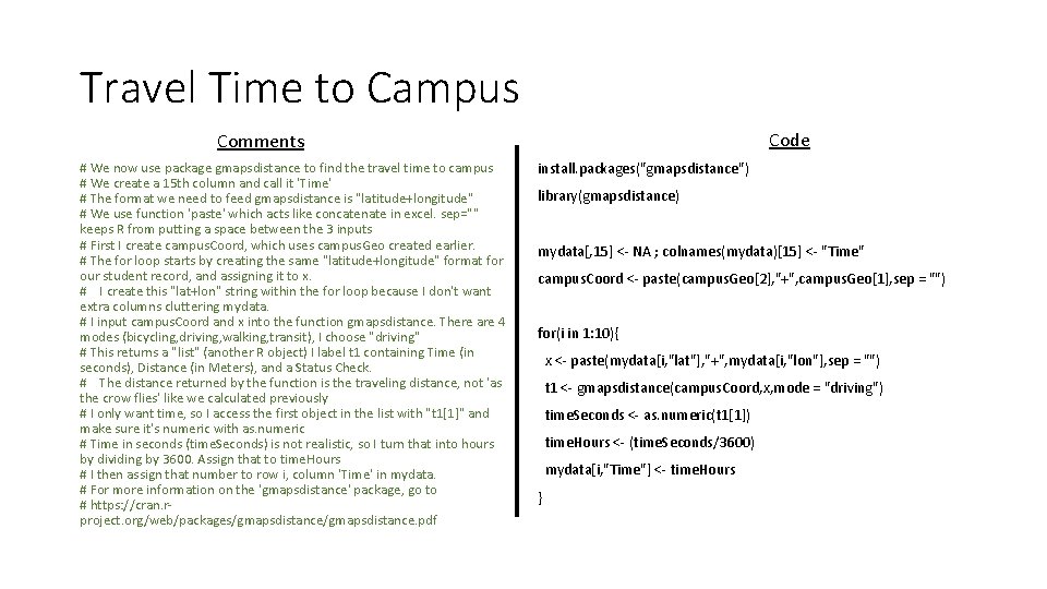
Travel Time to Campus Code Comments # We now use package gmapsdistance to find the travel time to campus # We create a 15 th column and call it 'Time' # The format we need to feed gmapsdistance is "latitude+longitude" # We use function 'paste' which acts like concatenate in excel. sep="" keeps R from putting a space between the 3 inputs # First I create campus. Coord, which uses campus. Geo created earlier. # The for loop starts by creating the same "latitude+longitude" format for our student record, and assigning it to x. # I create this "lat+lon" string within the for loop because I don't want extra columns cluttering mydata. # I input campus. Coord and x into the function gmapsdistance. There are 4 modes (bicycling, driving, walking, transit), I choose "driving" # This returns a "list" (another R object) I label t 1 containing Time (in seconds), Distance (in Meters), and a Status Check. # The distance returned by the function is the traveling distance, not 'as the crow flies' like we calculated previously # I only want time, so I access the first object in the list with "t 1[1]" and make sure it's numeric with as. numeric # Time in seconds (time. Seconds) is not realistic, so I turn that into hours by dividing by 3600. Assign that to time. Hours # I then assign that number to row i, column 'Time' in mydata. # For more information on the 'gmapsdistance' package, go to # https: //cran. rproject. org/web/packages/gmapsdistance. pdf install. packages("gmapsdistance") library(gmapsdistance) mydata[, 15] <- NA ; colnames(mydata)[15] <- "Time" campus. Coord <- paste(campus. Geo[2], "+", campus. Geo[1], sep = "") for(i in 1: 10){ x <- paste(mydata[i, "lat"], "+", mydata[i, "lon"], sep = "") t 1 <- gmapsdistance(campus. Coord, x, mode = "driving") time. Seconds <- as. numeric(t 1[1]) time. Hours <- (time. Seconds/3600) mydata[i, "Time"] <- time. Hours }

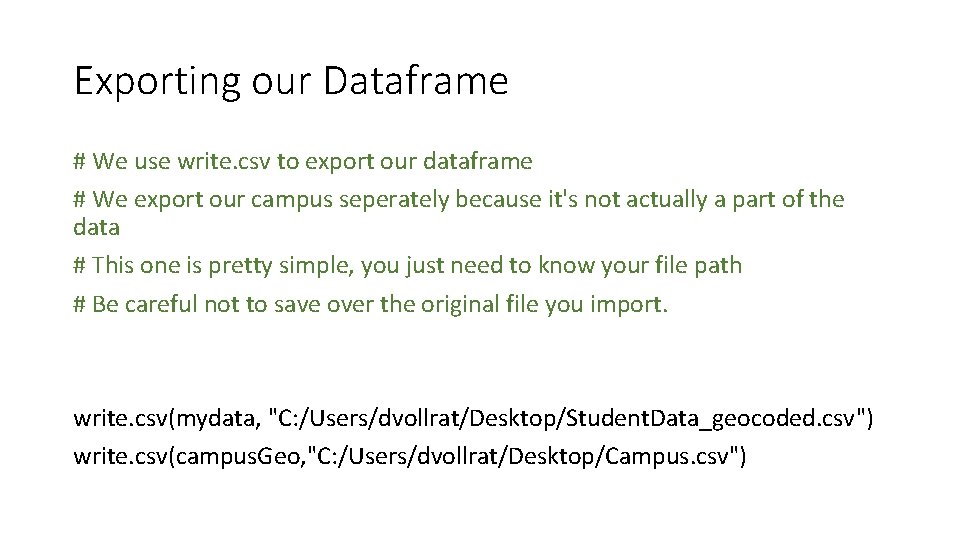
Exporting our Dataframe # We use write. csv to export our dataframe # We export our campus seperately because it's not actually a part of the data # This one is pretty simple, you just need to know your file path # Be careful not to save over the original file you import. write. csv(mydata, "C: /Users/dvollrat/Desktop/Student. Data_geocoded. csv") write. csv(campus. Geo, "C: /Users/dvollrat/Desktop/Campus. csv")

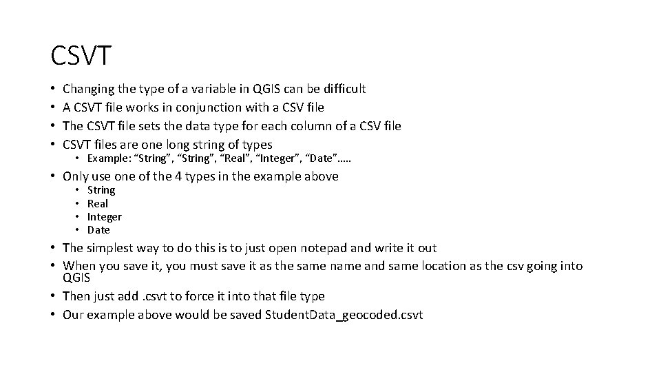
CSVT • • Changing the type of a variable in QGIS can be difficult A CSVT file works in conjunction with a CSV file The CSVT file sets the data type for each column of a CSV file CSVT files are one long string of types • Example: “String”, “Real”, “Integer”, “Date”…. . • Only use one of the 4 types in the example above • • String Real Integer Date • The simplest way to do this is to just open notepad and write it out • When you save it, you must save it as the same name and same location as the csv going into QGIS • Then just add. csvt to force it into that file type • Our example above would be saved Student. Data_geocoded. csvt

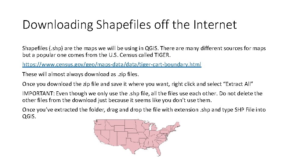
Downloading Shapefiles off the Internet Shapefiles (. shp) are the maps we will be using in QGIS. There are many different sources for maps but a popular one comes from the U. S. Census called TIGER. https: //www. census. gov/geo/maps-data/tiger-cart-boundary. html These will almost always download as. zip files. Once you download the zip file and save it where you want, right click and select “Extract All” IMPORTANT: Even though we only use the. shp file, all the files use each other. Do not delete the other files from the download just because it seems like you don’t use them. Once you’ve extracted the folder, drag and drop the file with extension. shp and type SHP File into QGIS.

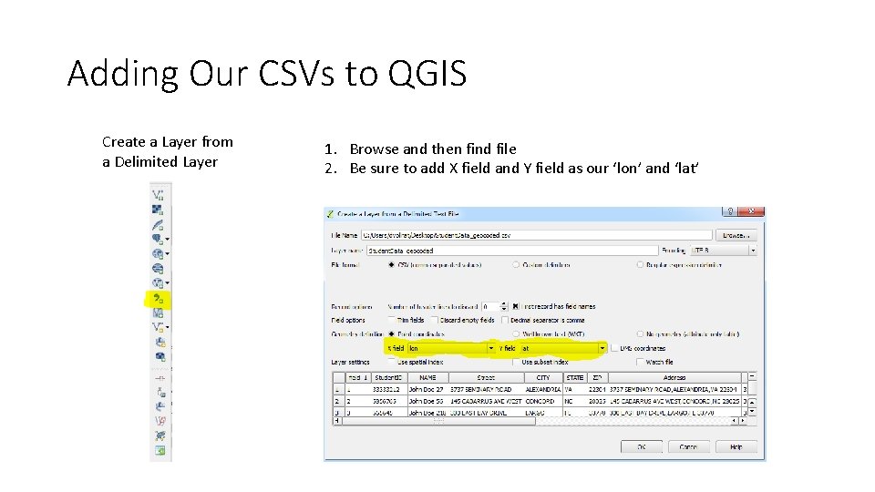
Adding Our CSVs to QGIS Create a Layer from a Delimited Layer 1. Browse and then find file 2. Be sure to add X field and Y field as our ‘lon’ and ‘lat’

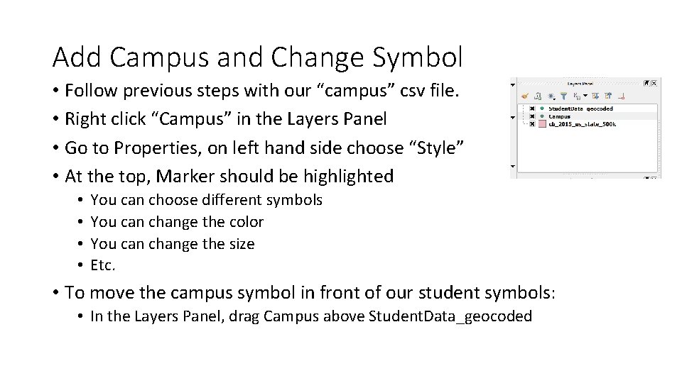
Add Campus and Change Symbol • Follow previous steps with our “campus” csv file. • Right click “Campus” in the Layers Panel • Go to Properties, on left hand side choose “Style” • At the top, Marker should be highlighted • • You can choose different symbols You can change the color You can change the size Etc. • To move the campus symbol in front of our student symbols: • In the Layers Panel, drag Campus above Student. Data_geocoded

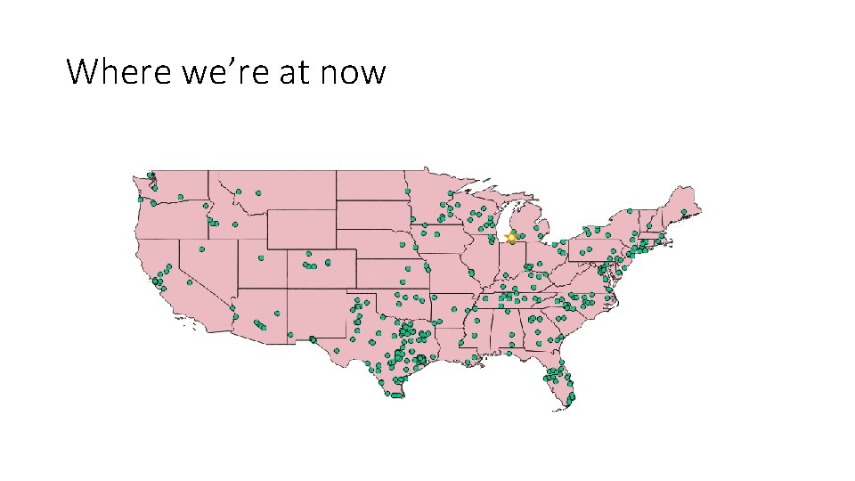
Where we’re at now

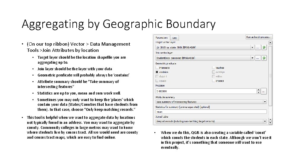
Aggregating by Geographic Boundary • (On our top ribbon) Vector > Data Management Tools >Join Attributes by location • Target layer should be the location shapefile you are aggregating up to. • Join layer should be the layer with your data • Geometric predicate will probably always be ‘contains’ • Attribute summary should be “Take summary of intersecting features” • Statistics are up to you, mean and sum work well. • Sometimes you may only want to keep the ‘places’ which contain your data (States/Counties that have students from them). In that case, choose “Only keep matching records. ” • This tool is helpful when we want to aggregate data by locations not typically found in an address. You may want to aggregate by county. Community colleges in large metros may want to know where students live by census tract. All we would need are county and census tract maps, which are easy to find online. • When we do this, QGIS is also creating a variable called ‘count’ which counts the students in each state. Although we won’t use it in this project, it’s something that someone will want to use eventually.

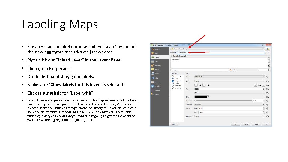
Labeling Maps • Now we want to label our new “Joined Layer” by one of the new aggregate statistics we just created. • Right click our “Joined Layer” in the Layers Panel • Then go to Properties. • On the left hand side, go to labels. • Make sure “Show labels for this layer” is selected • Choose a statistic for “Label with” • I want to make a special point at something that tripped me up a lot when I was learning. When we joined the layers and created means, QGIS only created means of variables of type “Real” or “Integer”. If you skip the csvt step and don’t make sure your ACT, SAT, GPA (or whatever quantifiable variable) is of type Real or Integer, you’re not going to get means of these variables at the aggregation and joining step.

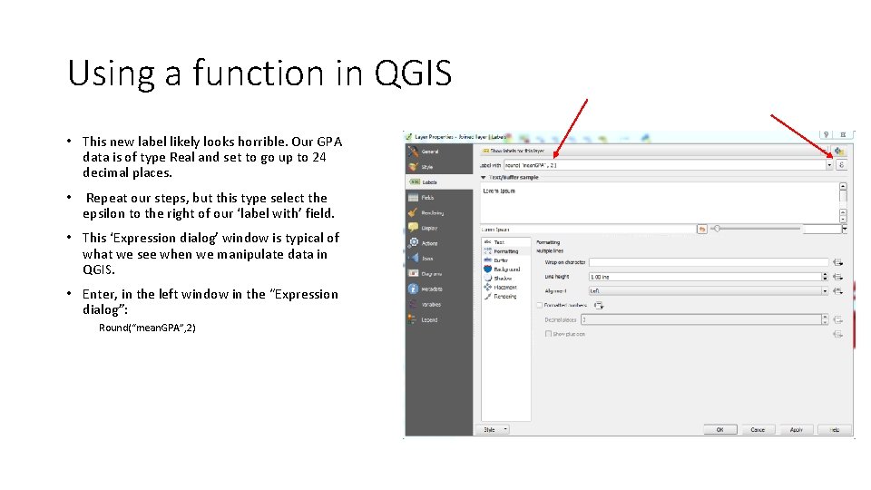
Using a function in QGIS • This new label likely looks horrible. Our GPA data is of type Real and set to go up to 24 decimal places. • Repeat our steps, but this type select the epsilon to the right of our ‘label with’ field. • This ‘Expression dialog’ window is typical of what we see when we manipulate data in QGIS. • Enter, in the left window in the “Expression dialog”: Round(“mean. GPA”, 2)

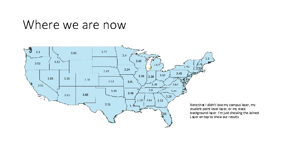
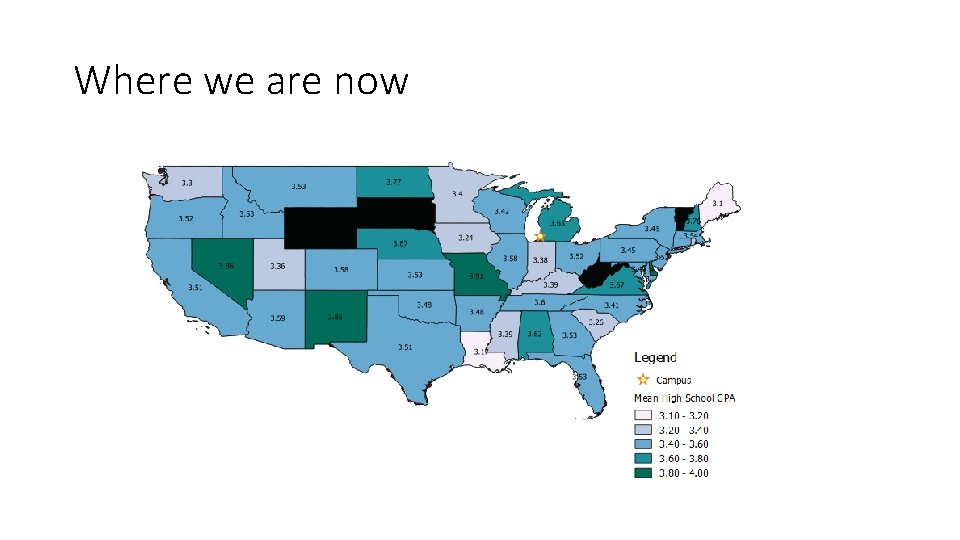
Where we are now Note that I didn’t lose my campus layer, my student point level layer, or my state background layer. I’m just showing the Joined Layer on top to show our results.

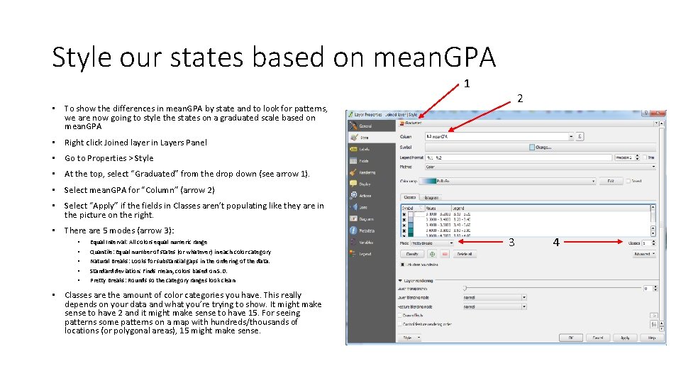
Style our states based on mean. GPA 1 2 • To show the differences in mean. GPA by state and to look for patterns, we are now going to style the states on a graduated scale based on mean. GPA • Right click Joined layer in Layers Panel • Go to Properties > Style • At the top, select “Graduated” from the drop down (see arrow 1). • Select mean. GPA for “Column” (arrow 2) • Select “Apply” if the fields in Classes aren’t populating like they are in the picture on the right. • There are 5 modes (arrow 3): • • • Equal Interval: All colors equal numeric range Quantile: Equal number of states (or whatever) in each color category Natural Breaks: Looks for substantial gaps in the ordering of the data. Standard deviation: Finds mean, colors based on S. D. Pretty Breaks: Rounds so the category ranges look clean • Classes are the amount of color categories you have. This really depends on your data and what you’re trying to show. It might make sense to have 2 and it might make sense to have 15. For seeing patterns some patterns on a map with hundreds/thousands of locations (or polygonal areas), 15 might make sense. 3 4

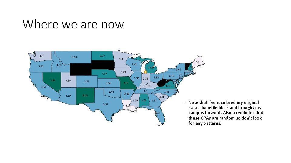
Where we are now • Note that I’ve recolored my original state shapefile black and brought my campus forward. Also a reminder that these GPAs are random so don’t look for any patterns.

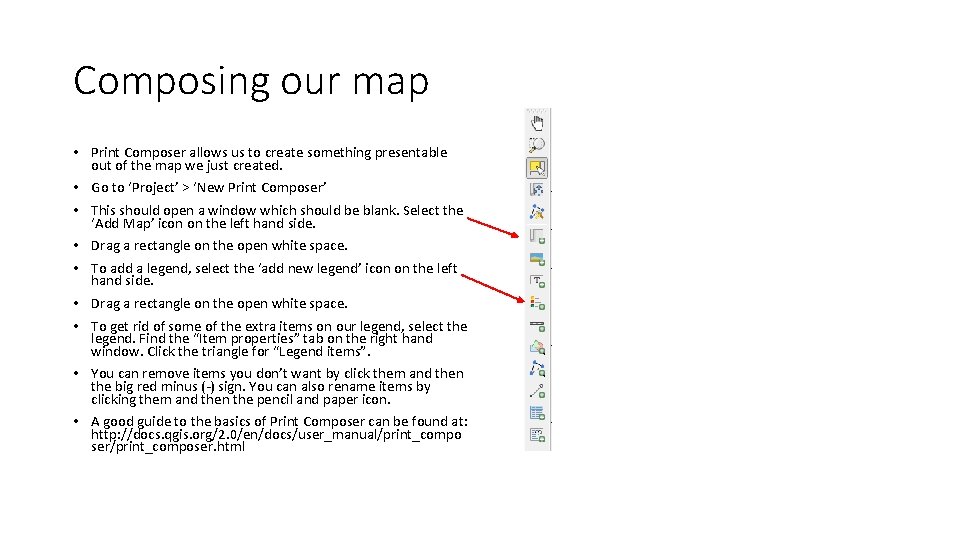
Composing our map • Print Composer allows us to create something presentable out of the map we just created. • Go to ‘Project’ > ‘New Print Composer’ • This should open a window which should be blank. Select the ‘Add Map’ icon on the left hand side. • Drag a rectangle on the open white space. • To add a legend, select the ‘add new legend’ icon on the left hand side. • Drag a rectangle on the open white space. • To get rid of some of the extra items on our legend, select the legend. Find the “Item properties” tab on the right hand window. Click the triangle for “Legend items”. • You can remove items you don’t want by click them and then the big red minus (-) sign. You can also rename items by clicking them and then the pencil and paper icon. • A good guide to the basics of Print Composer can be found at: http: //docs. qgis. org/2. 0/en/docs/user_manual/print_compo ser/print_composer. html

Where we are now

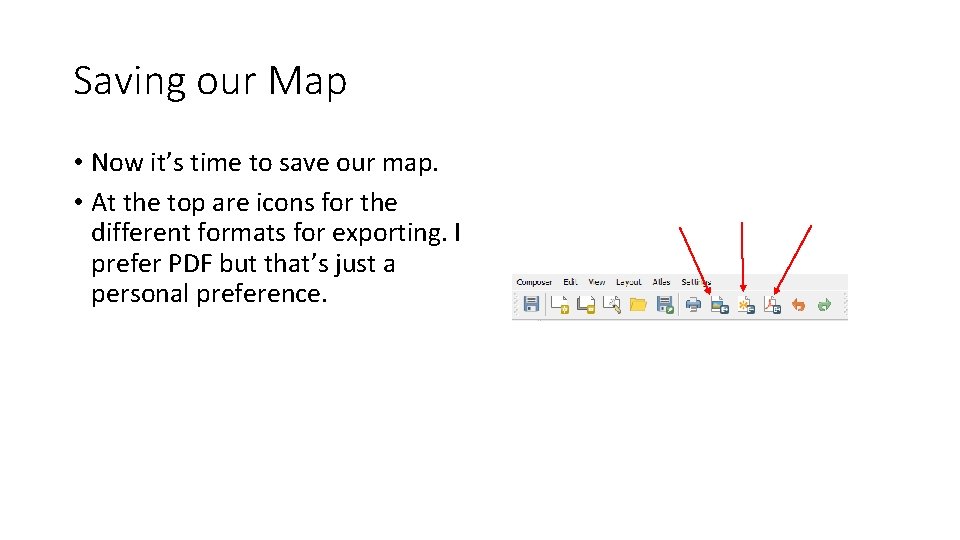
Saving our Map • Now it’s time to save our map. • At the top are icons for the different formats for exporting. I prefer PDF but that’s just a personal preference.

Thank You

Using R and QGIS for Geospatial Analysis TAIR Presentation February 2017 Houston, Texas Dan Vollrath Institutional Research Analyst Trinity University 210 -999 -8483 dvollrat@trinity. edu Please feel free to contact me with any questions you may have about todays presentation.

Bonus Tools

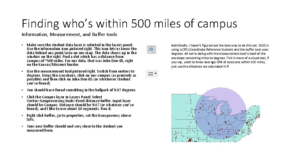
Finding who’s within 500 miles of campus Information, Measurement, and Buffer tools • Make sure the student data layer is selected in the layers panel. Use the information icon pictured right. This icon lets us know the data behind any point/area on our map. The data shows up in the window on the right. Find a dot which has a distance from campus of ~500 miles. For our data, that was John Doe 65, right on the Kansas/Missouri border. • Use the measurement tool pictured right. Switch from meters to degrees. Using the crosshairs, click on our campus (as precisely as possible) and then click on John Doe 65 (or whichever student you’ve found). • You should have found something in the ballpark of 9. 07 degrees. • Click the Campus layer in Layers Panel. Select Vector>Geoprocessing tools>Fixed distance buffer. Input layer should be Campus. Distance should be 9. 07 (or whatever you’ve found), and I like to use about 10 segments. Run it. • Right click buffer, go to properties, set the transparency above 50%. • Your new buffer should end very close to the student you measured from. Admittedly, I haven’t figured out the best way to do this yet. QGIS is using a CRS (Coordinate Reference System) and the buffer tool uses degrees. All we’re doing with the measurement tool is back of the envelope converting miles to degrees. This is more of a visual tool, if you say, want to know average GPA of everyone within 100 miles, just use the distances we calculated in R.

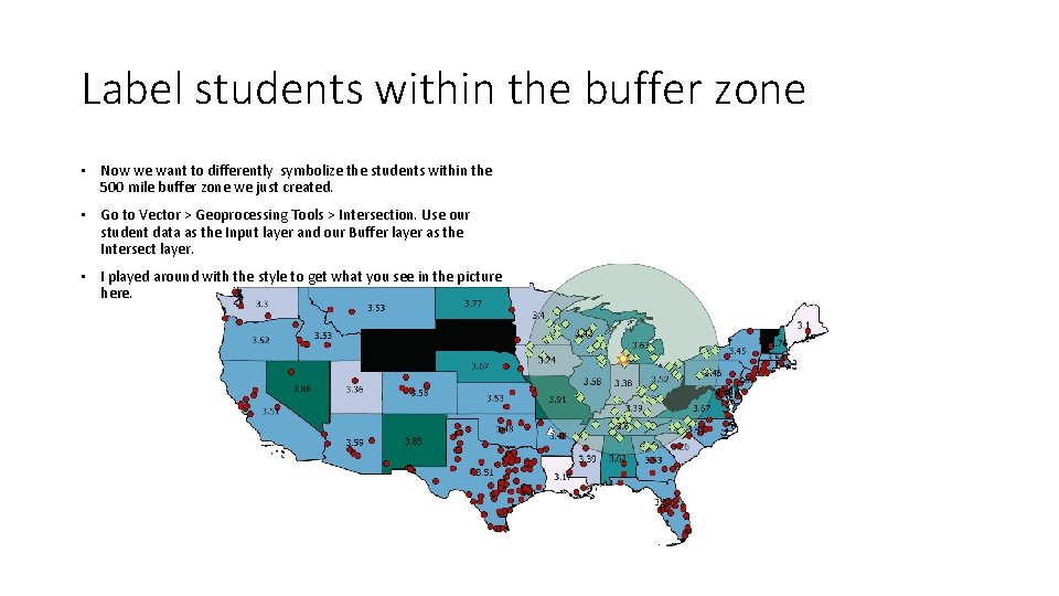
Label students within the buffer zone • Now we want to differently symbolize the students within the 500 mile buffer zone we just created. • Go to Vector > Geoprocessing Tools > Intersection. Use our student data as the Input layer and our Buffer layer as the Intersect layer. • I played around with the style to get what you see in the picture here.

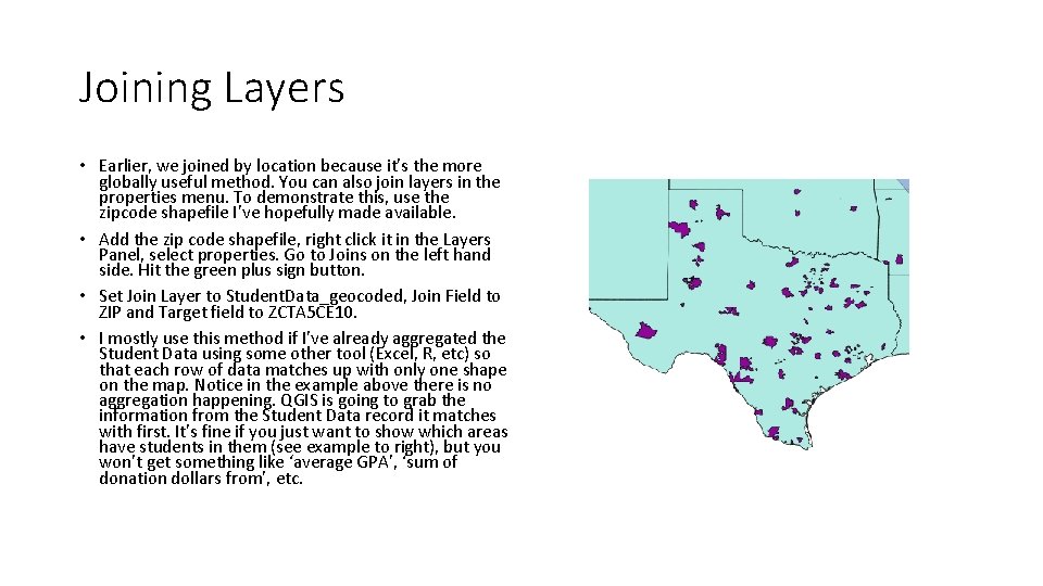
Joining Layers • Earlier, we joined by location because it’s the more globally useful method. You can also join layers in the properties menu. To demonstrate this, use the zipcode shapefile I’ve hopefully made available. • Add the zip code shapefile, right click it in the Layers Panel, select properties. Go to Joins on the left hand side. Hit the green plus sign button. • Set Join Layer to Student. Data_geocoded, Join Field to ZIP and Target field to ZCTA 5 CE 10. • I mostly use this method if I’ve already aggregated the Student Data using some other tool (Excel, R, etc) so that each row of data matches up with only one shape on the map. Notice in the example above there is no aggregation happening. QGIS is going to grab the information from the Student Data record it matches with first. It’s fine if you just want to show which areas have students in them (see example to right), but you won’t get something like ‘average GPA’, ‘sum of donation dollars from’, etc.

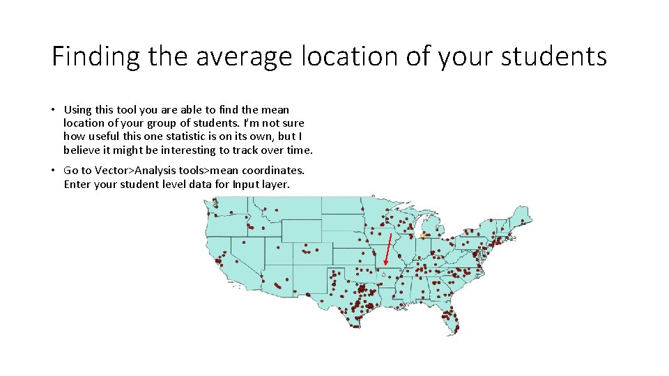
Finding the average location of your students • Using this tool you are able to find the mean location of your group of students. I’m not sure how useful this one statistic is on its own, but I believe it might be interesting to track over time. • Go to Vector>Analysis tools>mean coordinates. Enter your student level data for Input layer.

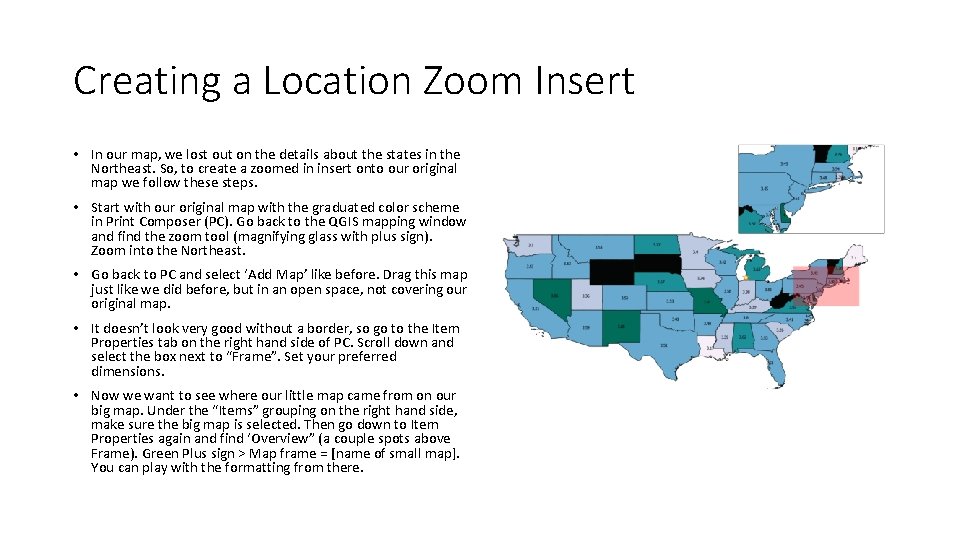
Creating a Location Zoom Insert • In our map, we lost out on the details about the states in the Northeast. So, to create a zoomed in insert onto our original map we follow these steps. • Start with our original map with the graduated color scheme in Print Composer (PC). Go back to the QGIS mapping window and find the zoom tool (magnifying glass with plus sign). Zoom into the Northeast. • Go back to PC and select ‘Add Map’ like before. Drag this map just like we did before, but in an open space, not covering our original map. • It doesn’t look very good without a border, so go to the Item Properties tab on the right hand side of PC. Scroll down and select the box next to “Frame”. Set your preferred dimensions. • Now we want to see where our little map came from on our big map. Under the “Items” grouping on the right hand side, make sure the big map is selected. Then go down to Item Properties again and find ‘Overview” (a couple spots above Frame). Green Plus sign > Map frame = [name of small map]. You can play with the formatting from there.

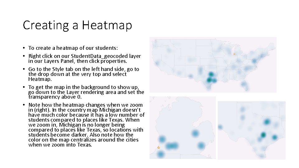
Creating a Heatmap • To create a heatmap of our students: • Right click on our Student. Data_geocoded layer in our Layers Panel, then click properties. • Go to the Style tab on the left hand side, go to the drop down at the very top and select Heatmap. • To get the map in the background to show up, go down to the Layer rendering area and set the transparency above 0. • Note how the heatmap changes when we zoom in (right). In the country map Michigan doesn’t have much color because it has a low number of students compared to places like Texas. When we zoom in, Michigan is no longer being compared to places like Texas, so locations with students become darker. Also note how the color on the map centralizes around the cities when we zoom into Texas.