Using Process Screening in JMP Pro to Analyze
- Slides: 6

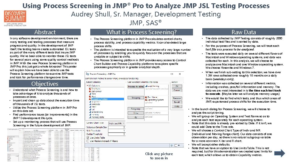
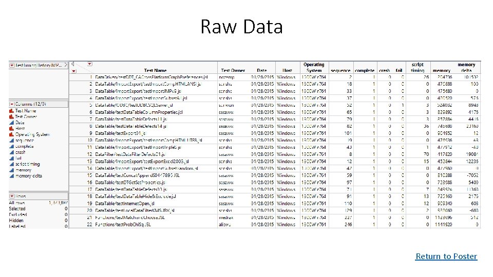
Using Process Screening in JMP® Pro to Analyze JMP JSL Testing Processes Audrey Shull, Sr. Manager, Development Testing JMP, SAS® Abstract In any software development environment, there are many testing and tooling processes that measure progress and quality. In the development of JMP itself, the testing teams create automated JSL tests as part of the many different tests that insure JMP quality. We've been able to monitor these JSL tests for several years using some quality control methods in JMP. With the new Process Screening platform in JMP Pro, this just got a whole lot easier! This poster will explain how we have been able to use the Process Screening platform to examine JMP tests and look for performance changes over time. Raw Data What is Process Screening? • The Process Screening platform in JMP Pro calculates control charts, process stability, and process capability metrics. It can also detect large process shifts. • The platform is intended to expedite the evaluation of a very large number of processes by enabling you to quickly focus on the processes that are unstable or subject to shifts. • The Process Screening platform in JMP provides easy access to Control Chart Builder and Process Capability platforms to explore specific processes graphically or in greater analytical depth. Objectives • Understand what Process Screening is and how to take advantage of it to analyze thousands of processes at once. • Import and clean up data about the execution time of thousands of JSL tests. • Utilize the Process Screening platform in JMP Pro on this data set. • Find performance issues (or improvements) in the JMP 13 development life cycle. • Set up a monitoring process that will use Process Screening in the future development of JMP. Click any picture to zoom in • The data collected by JMP Testing consists of roughly 2000 individual test files and is sorted by date. • For the purposes of Process Screening, we will treat each test file as a process to be analyzed. • The tests were executed daily on several different flavors of Macintosh and Windows operating systems, and data was collected for each. In this analysis, we will choose to analyze one Macintosh and one Windows operating system. We choose Yosemite and Windows 7. • When we finish sub-setting to this selection, we have over 1. 3 M rows collected over roughly 18 months on a daily basis (weekdays only). • Information was collected on several different metrics, including crashes, pass/fail information and memory. The data we are most interested in is the time each test took to execute. (Maybe later we will analyze memory usage. ) • We would like to find which tests, and thus which areas of JMP, experienced process shifts for the execution time. • In the launch dialog for Process Screening, we will choose to analyze the script timing. • We will group on Operating System and Test Name so as to analyze each test separately for each operating system. • Note that this data is already pre-sorted by Date. If it isn’t, we could add Date to the Time role. • We will choose a Control Chart Type of Indiv and MR (Individual and Moving Range chart). Our data consists of one observation per day, so there is no natural subgroup variable for a more common X-bar and R chart. • We will accept other defaults. • Note that we have an option to Use Limits Table. This is not required, but for this demonstration we created spec limits for each test, which allows us to obtain Capability metrics.

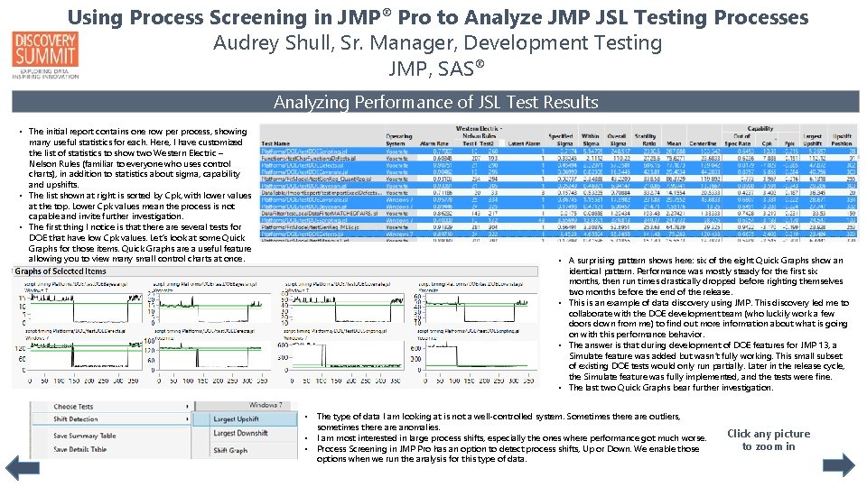
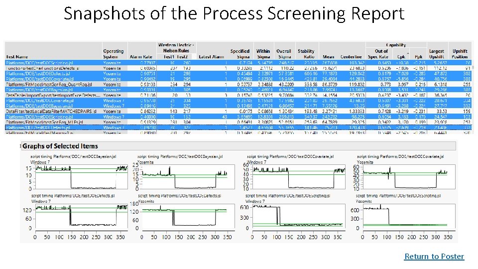
Using Process Screening in JMP® Pro to Analyze JMP JSL Testing Processes Audrey Shull, Sr. Manager, Development Testing JMP, SAS® Analyzing Performance of JSL Test Results • The initial report contains one row per process, showing many useful statistics for each. Here, I have customized the list of statistics to show two Western Electric – Nelson Rules (familiar to everyone who uses control charts), in addition to statistics about sigma, capability and upshifts. • The list shown at right is sorted by Cpk, with lower values at the top. Lower Cpk values mean the process is not capable and invite further investigation. • The first thing I notice is that there are several tests for DOE that have low Cpk values. Let’s look at some Quick Graphs for those items. Quick Graphs are a useful feature allowing you to view many small control charts at once. • A surprising pattern shows here: six of the eight Quick Graphs show an identical pattern. Performance was mostly steady for the first six months, then run times drastically dropped before righting themselves two months before the end of the release. • This is an example of data discovery using JMP. This discovery led me to collaborate with the DOE development team (who luckily work a few doors down from me) to find out more information about what is going on with this performance behavior. • The answer is that during development of DOE features for JMP 13, a Simulate feature was added but wasn’t fully working. This small subset of existing DOE tests would only run partially. Later in the release cycle, the Simulate feature was fully implemented, and the tests were fine. • The last two Quick Graphs bear further investigation. • The type of data I am looking at is not a well-controlled system. Sometimes there are outliers, sometimes there anomalies. • I am most interested in large process shifts, especially the ones where performance got much worse. • Process Screening in JMP Pro has an option to detect process shifts, Up or Down. We enable those options when we run the analysis for this type of data. Click any picture to zoom in

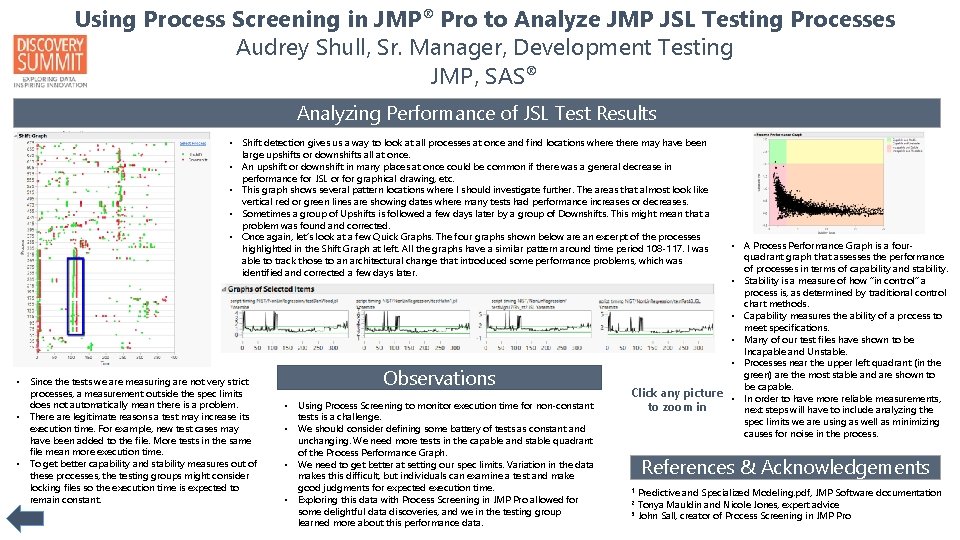
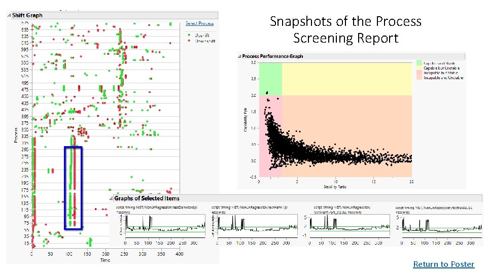
Using Process Screening in JMP® Pro to Analyze JMP JSL Testing Processes Audrey Shull, Sr. Manager, Development Testing JMP, SAS® Analyzing Performance of JSL Test Results • Shift detection gives us a way to look at all processes at once and find locations where there may have been large upshifts or downshifts all at once. • An upshift or downshift in many places at once could be common if there was a general decrease in performance for JSL or for graphical drawing, etc. • This graph shows several pattern locations where I should investigate further. The areas that almost look like vertical red or green lines are showing dates where many tests had performance increases or decreases. • Sometimes a group of Upshifts is followed a few days later by a group of Downshifts. This might mean that a problem was found and corrected. • Once again, let’s look at a few Quick Graphs. The four graphs shown below are an excerpt of the processes highlighted in the Shift Graph at left. All the graphs have a similar pattern around time period 108 -117. I was able to track those to an architectural change that introduced some performance problems, which was identified and corrected a few days later. • Since the tests we are measuring are not very strict processes, a measurement outside the spec limits does not automatically mean there is a problem. • There are legitimate reasons a test may increase its execution time. For example, new test cases may have been added to the file. More tests in the same file mean more execution time. • To get better capability and stability measures out of these processes, the testing groups might consider locking files so the execution time is expected to remain constant. Observations • Using Process Screening to monitor execution time for non-constant tests is a challenge. • We should consider defining some battery of tests as constant and unchanging. We need more tests in the capable and stable quadrant of the Process Performance Graph. • We need to get better at setting our spec limits. Variation in the data makes this difficult, but individuals can examine a test and make good judgments for expected execution time. • Exploring this data with Process Screening in JMP Pro allowed for some delightful data discoveries, and we in the testing group learned more about this performance data. • A Process Performance Graph is a fourquadrant graph that assesses the performance of processes in terms of capability and stability. • Stability is a measure of how “in control” a process is, as determined by traditional control chart methods. • Capability measures the ability of a process to meet specifications. • Many of our test files have shown to be Incapable and Unstable. • Processes near the upper left quadrant (in the green) are the most stable and are shown to be capable. Click any picture • In order to have more reliable measurements, to zoom in next steps will have to include analyzing the spec limits we are using as well as minimizing causes for noise in the process. References & Acknowledgements Predictive and Specialized Modeling. pdf, JMP Software documentation Tonya Mauldin and Nicole Jones, expert advice 3 John Sall, creator of Process Screening in JMP Pro 1 2

Raw Data Return to Poster

Snapshots of the Process Screening Report Return to Poster

Snapshots of the Process Screening Report Return to Poster