Using Graphics Effectively Why Use Graphics Visual Learning
- Slides: 8

Using Graphics Effectively

Why Use Graphics: Visual Learning Show use of tools Show results of actions Present overviews Suggest uses/functions Make the abstract concrete Explain processes Support text

Types of Graphics Screen shots (windows, dialog boxes, etc. ) Reports/results Photographs & drawings – Exploded drawings Icons Maps Charts & diagrams Graphs Tables

Elements of Graphics Title – Numbered – Listed Labels (“callouts”) – Brief – Aligned – Consistent Placement – Consistent – Close to relevant text Rules & Lines – Straight – Consistent – Hierarchical Size – 1 page (rotate larger ones) – Crop for impact Colors – Use meaningfully – Use consistently

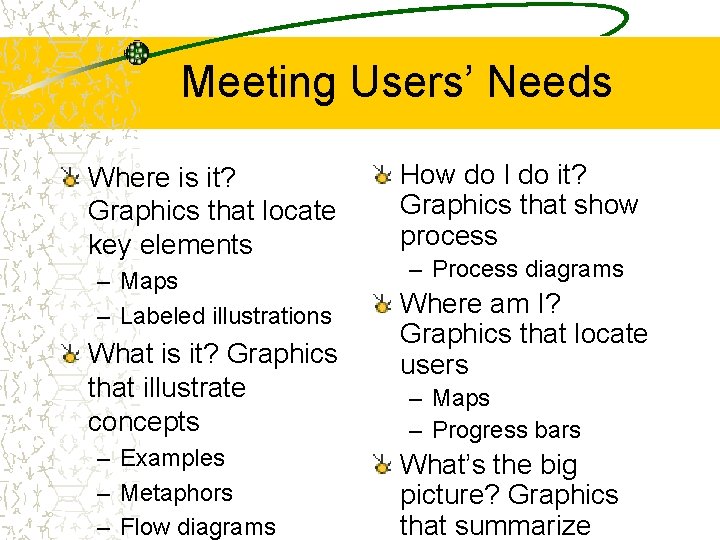
Meeting Users’ Needs Where is it? Graphics that locate key elements – Maps – Labeled illustrations What is it? Graphics that illustrate concepts – Examples – Metaphors – Flow diagrams How do I do it? Graphics that show process – Process diagrams Where am I? Graphics that locate users – Maps – Progress bars What’s the big picture? Graphics that summarize

Making Things Visual Show program/project elements Illustrate abstract concepts Make visuals clear and easy to read – Sized for viewing – Uncluttered

Making Visuals Effective Keep styles consistent (fonts, lines, boxes, etc. ) Use graphics as needed, not just because you can Label graphics consistently – Labels shouldn’t hide graphics – Graphic shouldn’t hide labels – Labels should line up – Figure titles should be consistent

Making Visuals Effective (cont’d) Rely on typographic techniques – Important things larger – Important things darker – Important things central – Important things sharper – Related things aligned Lay out the image correctly – Use enough White space & boundaries (¼” - ½”) – Stay within margins – Size for readability – Larger is usually better