Using data visualizations to improve understanding about the
Using data visualizations to improve understanding about the labor market and economy Jay Meisenheimer Chief, Division of New Media
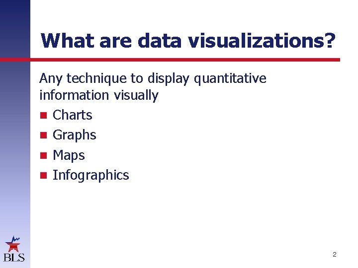
What are data visualizations? Any technique to display quantitative information visually Charts Graphs Maps Infographics 2
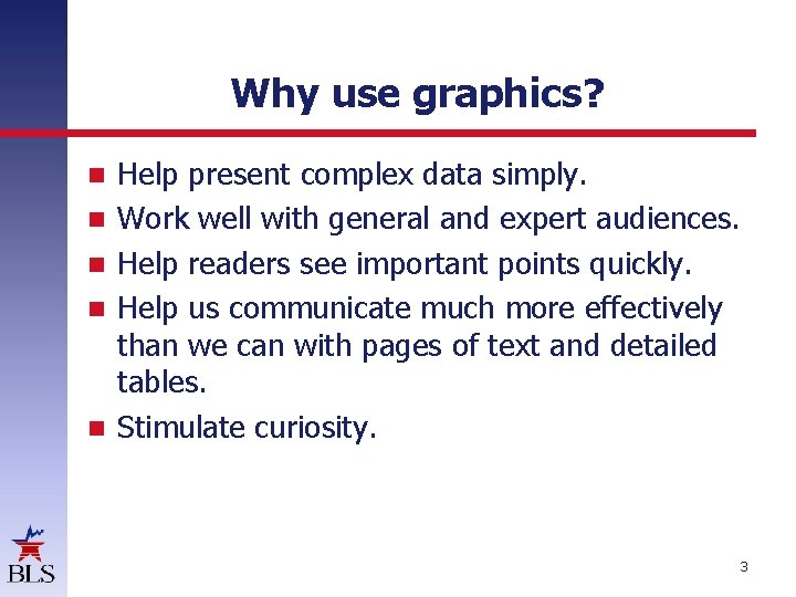
Why use graphics? Help present complex data simply. Work well with general and expert audiences. Help readers see important points quickly. Help us communicate much more effectively than we can with pages of text and detailed tables. Stimulate curiosity. 3

Static versus interactive Static images have served us well, but… 4
…interactive graphics let us do more Long-term price trends for computers, TVs, and related items 5
Where do we use graphics at BLS? The Economics Daily (TED) Spotlight on Statistics Beyond the Numbers Monthly Labor Review News releases, blogs, and more 6
TED Published daily since 1998 Unemployment rates by educational attainment in August 2015 Employee compensation costs $31. 39 per hour worked in June 2015 Job openings rise in several industries over the year Employment projections by occupational group 2014– 24 7
Geography is interesting Charts State employment changes by industry, February 2013 to February 2014 208 out of 372 metro areas had unemployment rates below U. S. rate 8
Maps Union membership rates by state, 2015 Employment increased in 280 metropolitan areas over the 12 months ending in December 2015 Average weekly wages of workers in counties bearing names of U. S. presidents 9
Animated maps State unemployment, 2004 to 2014 Largest industries by state, 1990– 2013 Employment in political organizations by state 10
Statistics for the Holidays Job growth at small businesses, 1992– 2013 Unemployment rates and French import prices for Bastille Day Sweets for the sweet: employment at gift-related retailers Prost! Celebrating Oktoberfest with a look at brewery employment 11
Spotlight on Statistics Fifty years of looking at changes in people's lives A look at pay at the top, the bottom, and in between Illustrating statistical concepts 12
Other cool stuff Enhancing our news releases Hurricane flood zone maps K-12 Chart Maker tool 13

Contact Information Jay Meisenheimer Chief, Division of New Media Office of Publications and Special Studies www. bls. gov 202 -691 -7409 meisenheimer. joseph@bls. gov
- Slides: 14