Using and describing on Graphs and Charts What
Using and describing on Graphs and Charts
What types of graphs and charts are you familiar with? And what are they used for? ? ?
Before we can describe a graph/chart… Let’s graph a description! Ready to draw?
Draw • • A line graph A bar graph A pie chart A Venn diagram

A line graph is most for showing trends, and for identifying whether two variables relate to (or "correlate with") one another.

A bar graph shows relationships between different data series
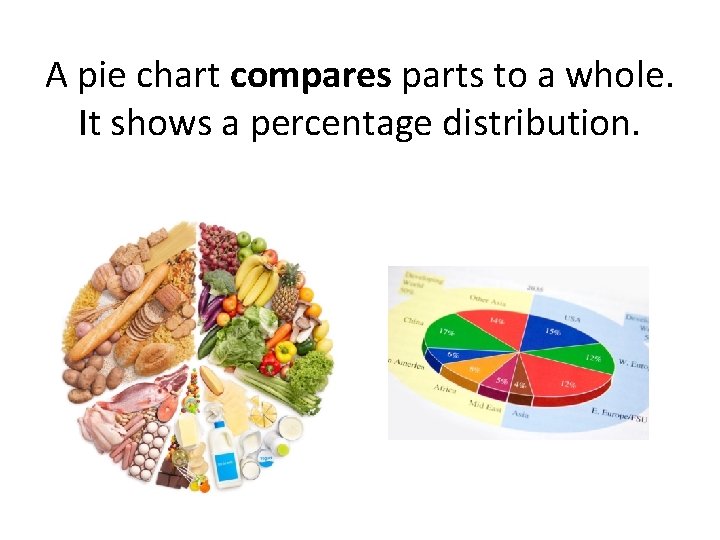
A pie chart compares parts to a whole. It shows a percentage distribution.

A Venn diagram is a great method for conveying the amount of commonality or difference between distinct groups.
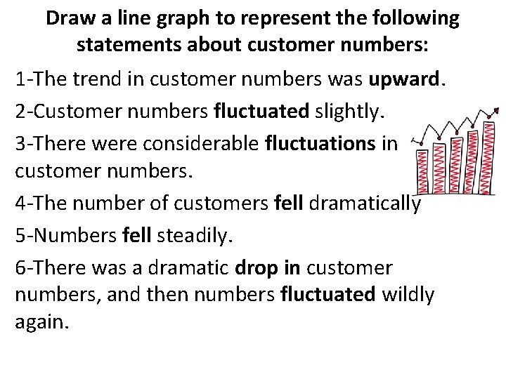
Draw a line graph to represent the following statements about customer numbers: 1 -The trend in customer numbers was upward. 2 -Customer numbers fluctuated slightly. 3 -There were considerable fluctuations in customer numbers. 4 -The number of customers fell dramatically 5 -Numbers fell steadily. 6 -There was a dramatic drop in customer numbers, and then numbers fluctuated wildly again.

More drawing… 7 -There was a downward trend in customer numbers. 8 -Customer numbers were erratic. 9 -There was a steady fall in customer numbers. 10 -Customer numbers plunged. 11 -The trend was flat. 12 -There was a slight dip in customer numbers. 13 -Customer numbers dipped suddenly. 14 -Customer numbers reached a peak.

Draw a bar graph to show relationship in the descriptions below: 1. I had Sunday off, so no work. 2. My work increased sharply on Monday because I had two meetings with new clients and one class. 3. It plateaued on Tuesday as I had the same amount of meetings and classes. 4. My work decreased sharply on Wednesday because although I still had one class, I had no meetings 4. It stayed the same on Thursday because I had no classes – just one meeting. 5. It peaked on Friday because I had two classes and three meetings. 6. It decreased slightly on Saturday because I only had two meetings and two classes.

Draw a pie chart that shows the relative size of populations of countries of the European Union in 2007, as described: • We can see that the country with the largest population was Germany with 17 % of the European Union’s population. • We can also see that the second largest population was that of France with 12 % of the population. • You can see that the four largest countries (Germany, France, the United Kingdom and Italy) together make up more than half of the European Union’s population. • We do NOT know from this chart which country has the smallest population because the 21 smallest countries are included in one group. • The twenty-one least populated countries of the European Union make up nearly 30% of the population. • Although Poland shows the smallest population percentage, we know that 21 other countries have populations smaller than Poland’s.

Verbs for describing how data have changed: • to increase, to go up, to rise, to climb • to remain (unchanged), to be steady, to plateau • to decrease, to go down, to decline, to drop Adverbs • sharply, dramatically, significantly • steadily, gradually • slightly, slowly Adjectives • sharp, dramatic, significant • steady, gradual • slight, slow You can describe the changes presented in the graph in two ways: • From October to December, attendance decreased steadily or • From October to December, there was a steady decrease in attendance.

Make your own graph or chart and describe it. Possible topics for practice: Laziness Problems Free time Happiness Weight Sleep Work Money Sport

Graphs to describe online: GRAPH http: //www. google. com/url? sa=i&rct=j&q=&esrc=s&source=images&cd=&ca d=rja&uact=8&ved=0 CAc. Qj. Rw&url=http%3 A%2 F%2 Fmathgoodies. com%2 Fles sons%2 Fgraphs%2 Fline. html&ei=QYT 2 VMal. Ecvog. SN_4 Cg. BA&bvm=bv. 87269000, d. c. GU&psig=AFQj. CNGx. G 4 KPKki. LPZe. Dp. BC NUx 4 T-kq 2 mw&ust=1425528256096927 BAR GRAPH/CHART http: //www. google. com/url? sa=i&rct=j&q=&esrc=s&source=images&cd=&cad=rj a&uact=8&ved=0 CAc. Qj. Rw&url=http%3 A%2 F%2 Fwww. mathsisfun. com%2 Fdata% 2 Fbargraphs. html&ei=go. T 2 VIn 2 IITWo. ATYp 4 KQBA&bvm=bv. 87269000, d. c. GU&psig=AF Qj. CNGx. G 4 KPKki. LPZe. Dp. BCNUx 4 T-kq 2 mw&ust=1425528256096927 + GOOGLE: GROUPED COLUMN CHART, PIE CHART
- Slides: 15