User Interface Diagram in Enterprise Architect Department of


- Slides: 14
User Interface Diagram in Enterprise Architect Department of Software
User Interface Elements When designing your interface, try to be consistent and predictable in your choice of interface elements. Whether they are aware of it or not, users have become familiar with elements acting in a certain way, so choosing to adopt those elements when appropriate will help with task completion, efficiency, and satisfaction.
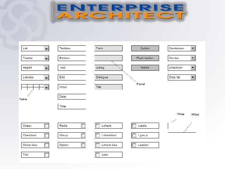
User Interface Diagram ﻣﺤﺘﻮﻳﺎﺕ ﻧﻔﺲ ﻳﺤﻮﻱ Requirement: • List Table Text Box Label Form Panel Button Combobox Checkbox (left hand side) Radio button (left hand side) Vertical Line Horizontal Line.
• List , like checkboxes, allow users to select a multiple items at a time, but are more compact and can support a longer list of options if needed. • Tabel Shows the ability to display the contents of a table in the user interface • Text Box Text fields allow users to enter text. It can allow either a single line or multiple lines of text. • Label The label is a graphical control that displays text on a form. It is usually a static control. There is no reaction. . some labels can respond to events such as mouse clicks, allowing the transition to another event.
• Form This is a method of enabling you to interact with an application, provides limited choices as to the use, can also be used to enter data into a system. • Panel a particular arrangement of information grouped together for presentation to users , commonly packaged as part of a widget toolkit (libraries that contain a collection of graphical control elements). • Button A button indicates an action upon touch and is typically labeled using text, an icon, or both. • Combobox it is a combination of a drop-down list or list box and a single-line editable textbox, allowing the user to either type a value directly or select a value from the list
• Checkbox • Checkboxes allow the user to select one or more options from a set. It is usually best to present checkboxes in a vertical list. More than one column is acceptable as well if the list is long enough that it might require scrolling or if Radio button comparison of terms might be necessary. Radio buttons are used to allow users to select one item at a time. • Vertical Line Text fields allow users to enter text. It can allow either a single line or multiple lines of text. • Horizontal Line The label is a graphical control that displays text on a form. It is usually a static control. There is no reaction. . some labels can respond to events such as mouse clicks, allowing the transition to another event.
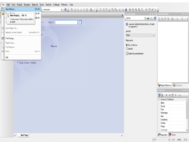
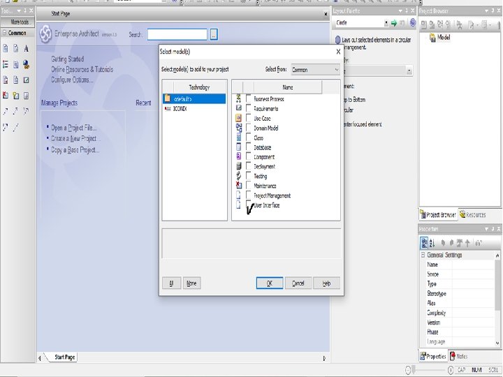
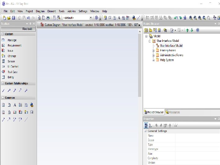
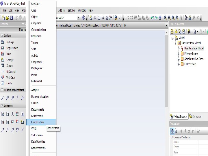
A Package is a namespace as well as an element that can be contained in other packages' namespaces. A Screen element represents a graphical user interface. You can place GUI elements onto the screen element. UI Control elements are placed onto the screen element to build up a graphical user interface diagram. There are different stereotyped elements such as buttons and combo boxes. An Object is an instance of a Class. To add an element to the current diagram, click on the required icon, and drag it into position on the diagram. Set an element name and other properties as prompted. To add a relationship, click on the required icon, then click on the start element in the diagram and drag to the end element.
Thank You