Unit 7 Graphic Design What is Graphic Design

- Slides: 18

Unit 7: Graphic Design

What is Graphic Design? Graphic Design is a creative process that combines art and technology to communicate ideas using a skillful combination of text and pictures in advertisements, magazines, flyers, business cards, etc.

4 Basic Principles of Design: Proximity Alignment Repetition Contrast

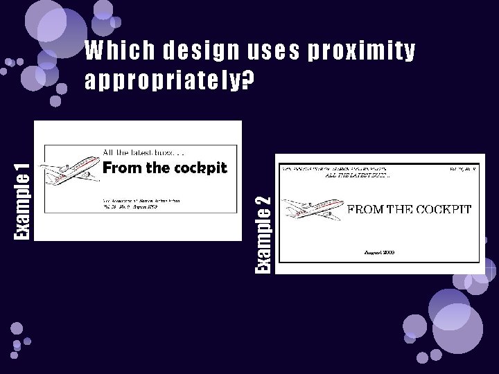
Proximity Grouping related items together

Example 2 Example 1 Which design uses proximity appropriately?

Alignment Nothing should be placed on the page at random. Every item should have a visual connection with something else on the page.

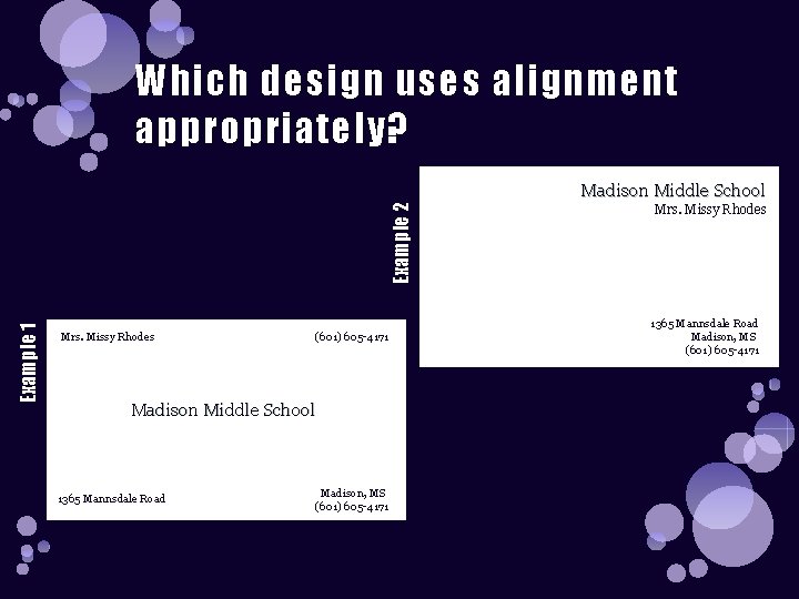
Which design uses alignment appropriately? Example 1 Example 2 Madison Middle School Mrs. Missy Rhodes (601) 605 -4171 Madison Middle School 1365 Mannsdale Road Madison, MS (601) 605 -4171 Mrs. Missy Rhodes 1365 Mannsdale Road Madison, MS (601) 605 -4171

Repetition Repeat some aspect of the design throughout the entire piece

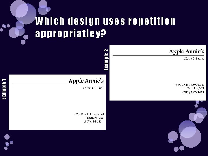
Example 1 Example 2 Which design uses repetition appropriatley?

Contrast Making two elements different

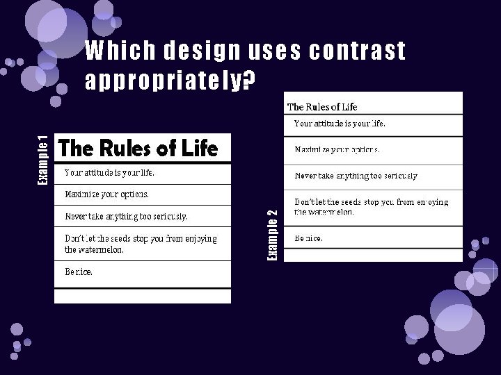
Example 2 Example 1 Which design uses contrast appropriately?

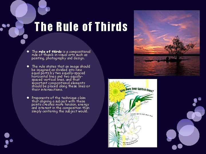
The Rule of Thirds The rule of thirds is a compositional rule of thumb in visual arts such as painting, photography and design. The rule states that an image should be imagined as divided into nine equal parts by two equally-spaced horizontal lines and two equallyspaced vertical lines, and that important compositional elements should be placed along these lines or their intersections. Proponents of the technique claim that aligning a subject with these points creates more tension, energy and interest in the composition than simply centering the subject would.

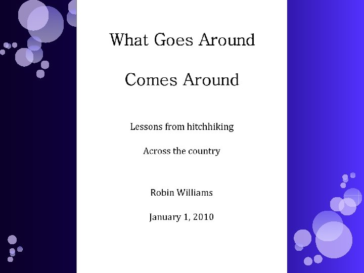
Review: There is one more general guiding principle of Design (and of Life): Don’t be a wimp! ØDon’t be afraid to create your Design (or your Life) with plenty of blank space- it’s rest for the eyes (and the Soul). ØDon’t be afraid to be asymmetrical, to uncover your format- it often makes the effect stronger. It’s okay to do the unexpected. ØDon’t be afraid to make words very large or very small; don’t be afraid to speak loudly or to speak in a whisper. Both can be effective in the right situation. ØDon’t be afraid to make your graphics very bold or very minimal, as long as the result complements or reinforces your design or your attitude. Let’s take the following rather dull report cover and apply each PARC principle to it.


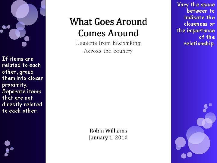
Vary the space between to indicate the closeness or the importance of the relationship. If items are related to each other, group them into closer proximity. Separate items that are not directly related to each other.

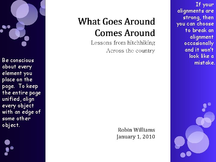
Be conscious about every element you place on the page. To keep the entire page unified, align every object with an edge of some other object. If your alignments are strong, then you can choose to break an alignment occasionally and it won’t look like a mistake.

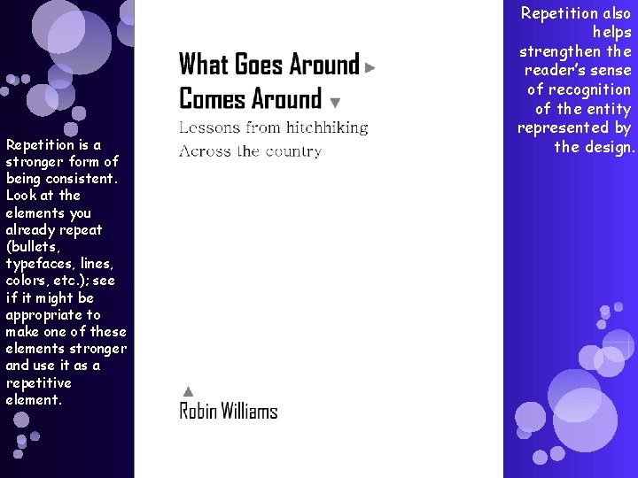
Repetition is a stronger form of being consistent. Look at the elements you already repeat (bullets, typefaces, lines, colors, etc. ); see if it might be appropriate to make one of these elements stronger and use it as a repetitive element. Repetition also helps strengthen the reader’s sense of recognition of the entity represented by the design.

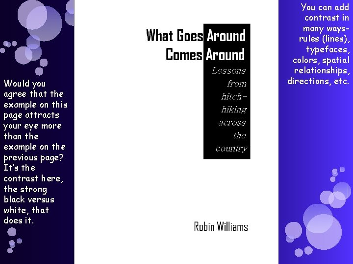
Would you agree that the example on this page attracts your eye more than the example on the previous page? It’s the contrast here, the strong black versus white, that does it. You can add contrast in many waysrules (lines), typefaces, colors, spatial relationships, directions, etc.