Unit 6 Statistics Mean Median Mode Range Measures
- Slides: 9

Unit 6: Statistics Mean, Median, Mode, Range Measures of Variation Box Plots Line Plots Histograms

CCGPS Standards MCC 6. SP. 1. Recognize a statistical question as one that anticipates variability in the data related to the question and accounts for it in the answers. For example, “How old am I? ” is not a statistical question, but “How old are the students in my school? ” is a statistical question because one anticipates variability in students’ ages. MCC 6. SP. 2. Understand that a set of data collected to answer a statistical question has a distribution which can be described by its center, spread, and overall shape. MCC 6. SP. 3 Recognize that a measure of center for a numerical data set summarizes all of its values with a single number, while a measure of variation describes how its values vary with a single number. MCC 6. SP. 4. Display numerical data in plots on a number line, including dot plots, histograms, and box plots. MCC 6. SP. 5. Summarize numerical data sets in relation to their context, such as by: MCC 6. SP. 5. a. Reporting the number of observations. MCC 6. SP. 5. b. Describing the nature of the attribute under investigation, including how it was measured and its units of measurement MCC 6. SP. 5. c. Giving quantitative measures of center (median and/or mean) and variability (interquartile range and/or mean absolute deviation), as well as describing any overall pattern and any striking deviations from the overall pattern with reference to the context in which the data were gathered.

Mathematical Practices 1) Make sense of problems and persevere in solving them. 2) Reason abstractly and quantitatively. 3) Construct viable arguments and critique the reasoning of others. 4) Model with mathematics 5) Use appropriate tools strategically. 6) Attend to precision. 7) Look for and make use of structure. 8) Look for and express regularity in repeated reasoning

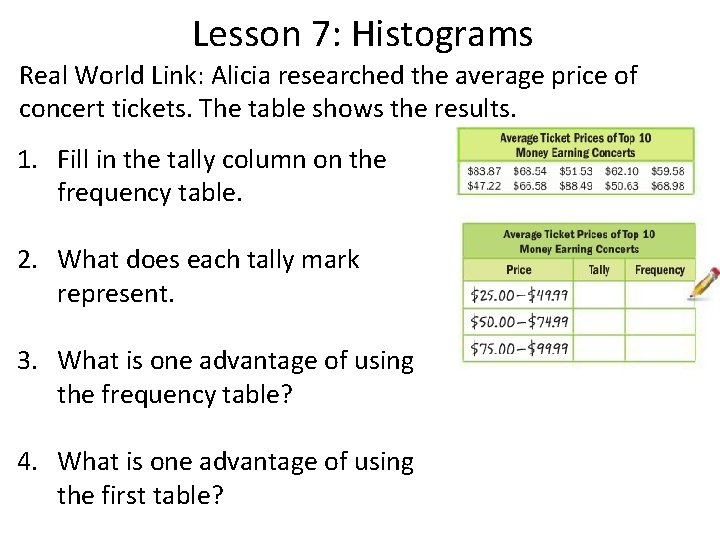
Lesson 7: Histograms Real World Link: Alicia researched the average price of concert tickets. The table shows the results. 1. Fill in the tally column on the frequency table. 2. What does each tally mark represent. 3. What is one advantage of using the frequency table? 4. What is one advantage of using the first table?

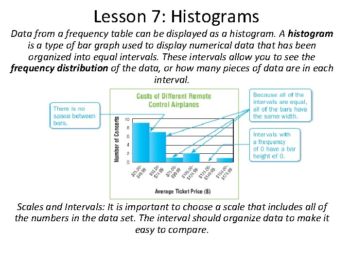
Lesson 7: Histograms Data from a frequency table can be displayed as a histogram. A histogram is a type of bar graph used to display numerical data that has been organized into equal intervals. These intervals allow you to see the frequency distribution of the data, or how many pieces of data are in each interval. Scales and Intervals: It is important to choose a scale that includes all of the numbers in the data set. The interval should organize data to make it easy to compare.

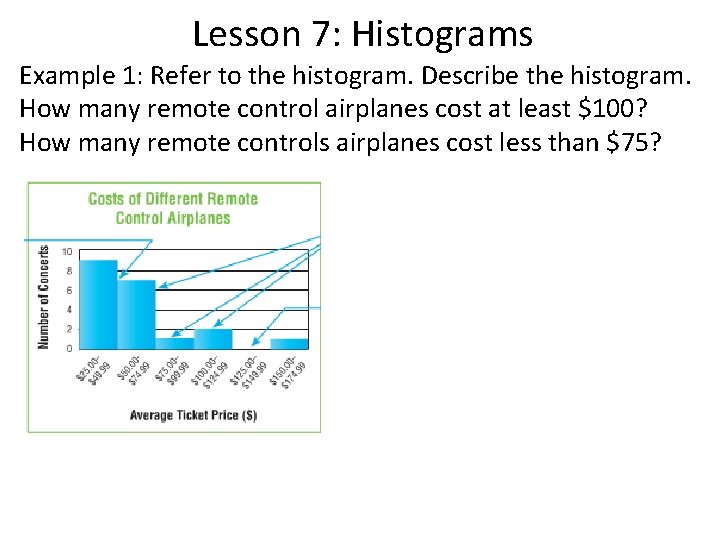
Lesson 7: Histograms Example 1: Refer to the histogram. Describe the histogram. How many remote control airplanes cost at least $100? How many remote controls airplanes cost less than $75?

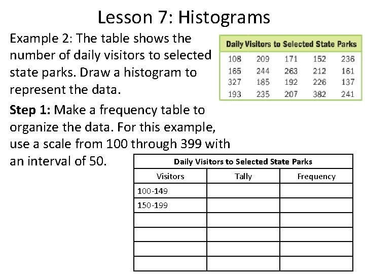
Lesson 7: Histograms Example 2: The table shows the number of daily visitors to selected state parks. Draw a histogram to represent the data. Step 1: Make a frequency table to organize the data. For this example, use a scale from 100 through 399 with Daily Visitors to Selected State Parks an interval of 50. Visitors 100 -149 150 -199 Tally Frequency

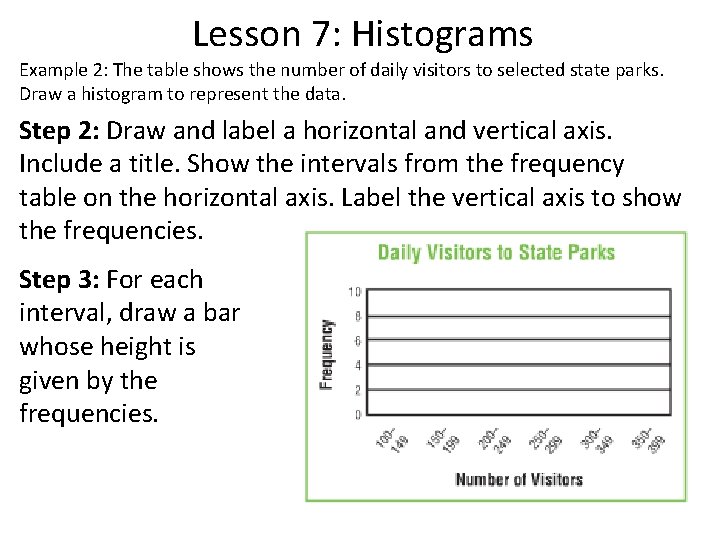
Lesson 7: Histograms Example 2: The table shows the number of daily visitors to selected state parks. Draw a histogram to represent the data. Step 2: Draw and label a horizontal and vertical axis. Include a title. Show the intervals from the frequency table on the horizontal axis. Label the vertical axis to show the frequencies. Step 3: For each interval, draw a bar whose height is given by the frequencies.

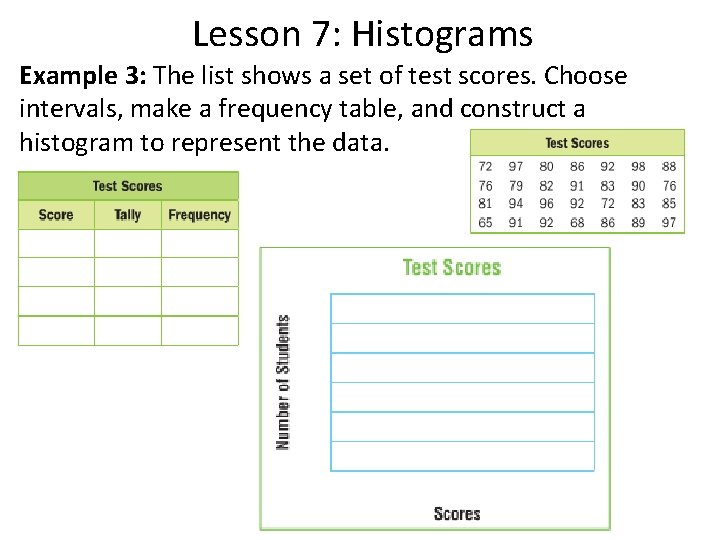
Lesson 7: Histograms Example 3: The list shows a set of test scores. Choose intervals, make a frequency table, and construct a histogram to represent the data.