Unit 6 Graphics Assignment 1 Application and features
- Slides: 10

Unit 6 Graphics Assignment 1: Application and features of digital graphics products. By Usamah Ishaq

Manchester United crest logo. This image is a vector graphic image because it can be scaled up and down in size without loss of quality. This logo represents a football club called Manchester United. Its main colours are red and yellow. In the centre of the logo there is a devil and a boat. The devil promotes the nickname of the club ‘The Red Devils’. The boat stand for the ‘Manchester City Council coat of arms’.

Manchester United crest logo. The target audience is from teenage up to old age. Also, it is preferably targeted at men as its from a male dominant sport. This logo is for any man, employed or unemployed. This logo has the clubs name written in capitals at the top and the bottom of the logo. The clubs name is written in the colour yellow and the font is quite large. Also, its quite bold. On the other hand, the font is not written in italics and its not underlined.

Manchester United crest logo. The logo includes two colours, yellow and red. There is no solid fill or gradient fill on this logo. The colours are sharp and bright. Together the two colours stand out. The colours don’t clash because one colour does not affect the other colour. This logo has a black outline which makes the colours stand out more. This image includes a devil. This is devil is the character of this logo. It also includes objects like footballs and a boat. One of the football is located on the left and the other one on the right.

Manchester United crest logo. Also, in the centre of the logo there is a pentagon. This is the main focus of the logo. The top of the pentagon has been overlapped by the top part of the logo and the bottom part of the pentagon is overlapping the bottom part of the logo. At the top of the pentagon the picture of the boat is there also right underneath it is the red devil.

Manchester United crest logo. Strength and weakness + This image is very colourful and bright. It is easy to see and its more appealing towards men File Size: 44. 9 KB File Format: SVG - This logo has a devil on it. Some people may find it scary or weird. The graphics products are fit for the purpose because the target audience would know that it’s the Manchester United clubs crest.

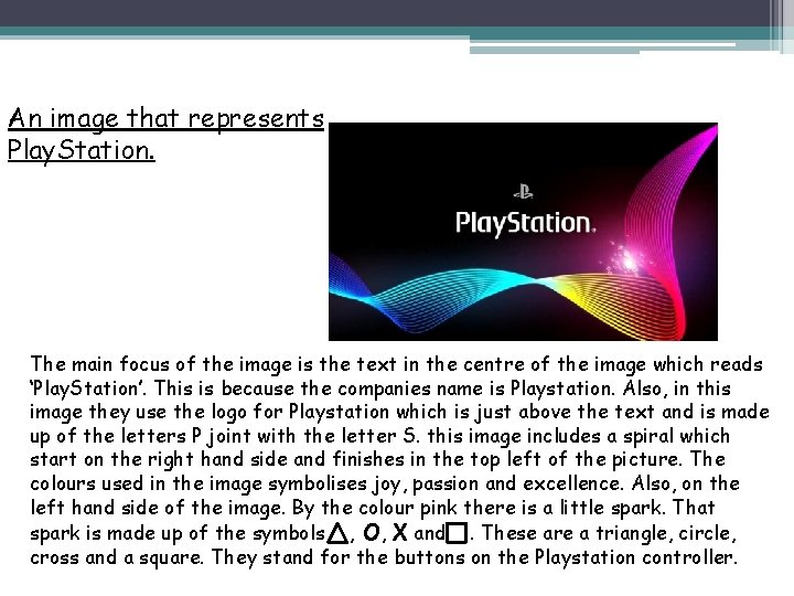
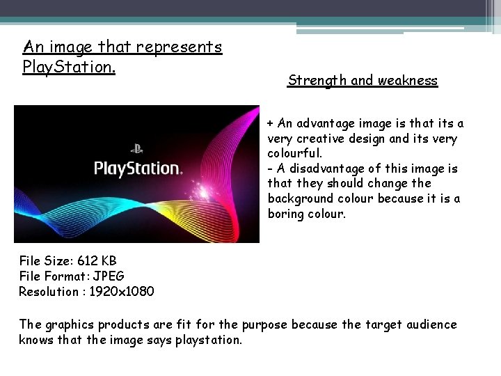
An image that represents Play. Station. This image is a bitmap image because if you scale it up the image will appear pixelated. This is because the pixels cannot be enlarged and maintain the image quality. This image represents a massive gaming company which makes consoles and console games. The company is called ‘Playstation’. The owner of playstation is ‘Sony Interactive Entertainment’. The original Play. Station was released on December, 3, 1994. Also, the image promotes the company playstation in one picture.

An image that represents Play. Station. The target audience is from teenage up to young adult. It is aimed at both male and female. This logo is for any female and male youths. They can be employed or unemployed. This logo has the a ‘P’ and an ‘S’ which stands for Playstation. This logo was created by a Japanese designer called Manabu Sakamoto. In this image, below the logo it says Playstation. This is written in white and it uses a custom typeface which is designed by Sakamoto specifically for the company. The background colour for this image is black because it makes every other feature stand out. On this image there four other colours; Pink, yellow, light blue and dark blue. These colours are bright because they symbolise joy, passion and excellence. These colours don’t clash because each colour is visible and clear.

An image that represents Play. Station. The main focus of the image is the text in the centre of the image which reads ‘Play. Station’. This is because the companies name is Playstation. Also, in this image they use the logo for Playstation which is just above the text and is made up of the letters P joint with the letter S. this image includes a spiral which start on the right hand side and finishes in the top left of the picture. The colours used in the image symbolises joy, passion and excellence. Also, on the left hand side of the image. By the colour pink there is a little spark. That spark is made up of the symbols , O, X and. These are a triangle, circle, cross and a square. They stand for the buttons on the Playstation controller.

An image that represents Play. Station. Strength and weakness + An advantage image is that its a very creative design and its very colourful. - A disadvantage of this image is that they should change the background colour because it is a boring colour. File Size: 612 KB File Format: JPEG Resolution : 1920 x 1080 The graphics products are fit for the purpose because the target audience knows that the image says playstation.