Unit 4 Statistical Analysis Data Representations 3 RULES

- Slides: 42

Unit 4 Statistical Analysis Data Representations

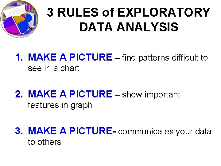
3 RULES of EXPLORATORY DATA ANALYSIS 1. MAKE A PICTURE – find patterns difficult to see in a chart 2. MAKE A PICTURE – show important features in graph 3. MAKE A PICTURE- communicates your data to others

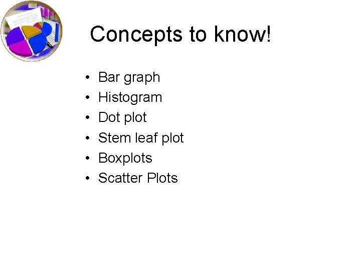
Concepts to know! • • • Bar graph Histogram Dot plot Stem leaf plot Boxplots Scatter Plots

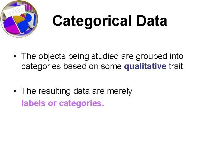
Categorical Data • The objects being studied are grouped into categories based on some qualitative trait. • The resulting data are merely labels or categories.

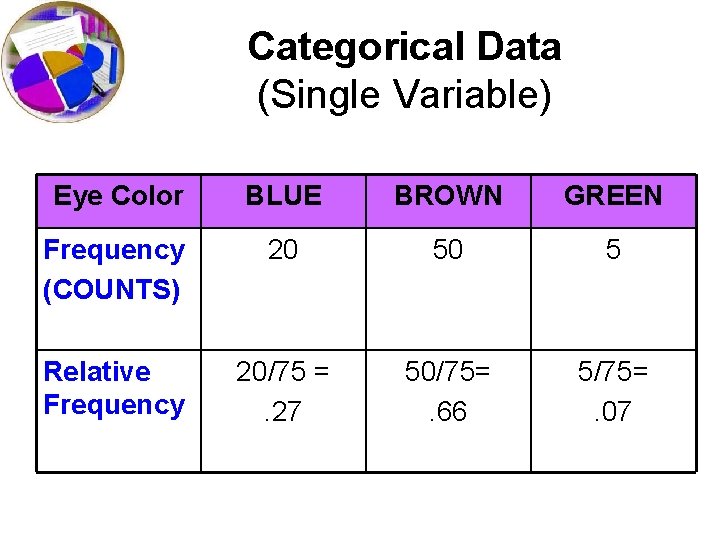
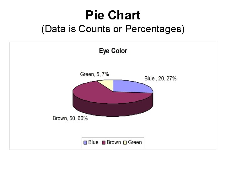
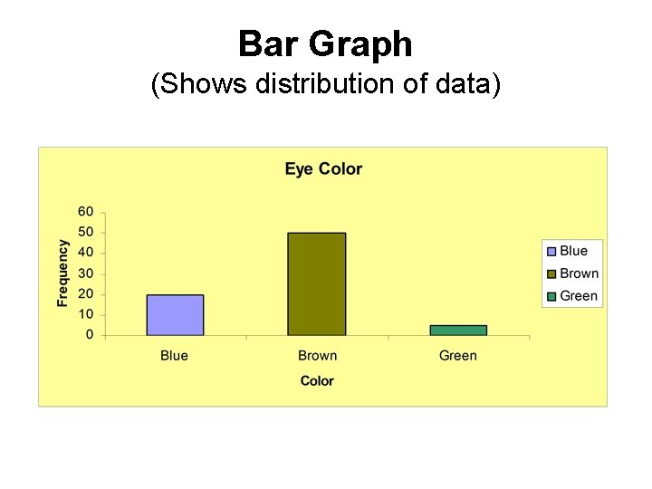
Categorical Data (Single Variable) Eye Color BLUE BROWN GREEN Frequency (COUNTS) 20 50 5 Relative Frequency 20/75 =. 27 50/75=. 66 5/75=. 07

Pie Chart (Data is Counts or Percentages)

Bar Graph • Summarizes categorical data. • Horizontal axis represents categories, while vertical axis represents either counts (“frequencies”) or percentages (“relative frequencies”). • Used to illustrate the differences in percentages (or counts) between categories.

Bar Graph (Shows distribution of data)

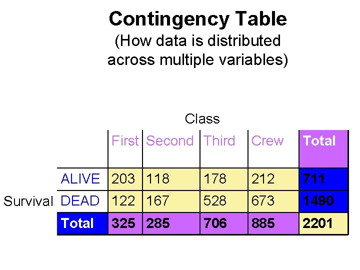
Contingency Table (How data is distributed across multiple variables) Class First Second Third Crew Total ALIVE 203 118 178 212 711 Survival DEAD 122 167 528 673 1490 706 885 2201 Total 325 285

What can go wrong when working with categorical data? • Pay attention to the variables and what the percentages represent (9. 4% of passengers who were in first class survived is different from 67% of survivors were first class passengers!!!) • Make sure you have a reasonably large data set (67% of the rats tested died and 1 lived)

Analogy Bar chart is to categorical data as histogram is to. . . quantitative data.

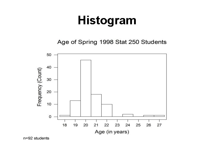
Histogram

Histogram • Divide measurement up into equal-sized categories (BIN WIDTH) • Determine number (or percentage) of measurements falling into each category. • Draw a bar for each category so bars’ heights represent number (or percent) falling into the categories. • Label and title appropriately. • http: //www. stat. sc. edu/~west/javahtml/Histogram. html

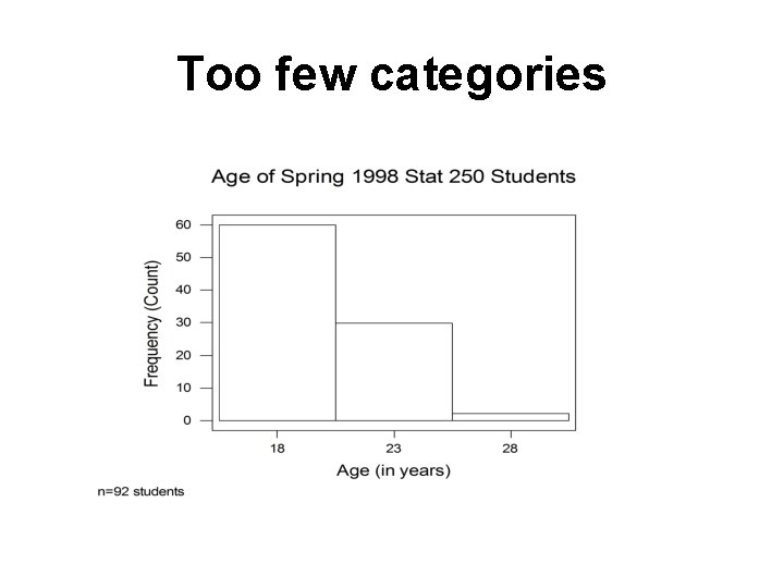
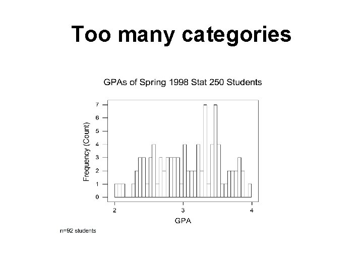
Histogram Use common sense in determining number of categories to use. Between 6 & 15 intervals is preferable (Trial-and-error works fine, too. )

Too few categories

Too many categories

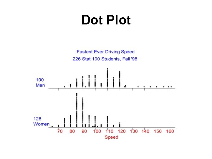
Dot Plot • Summarizes quantitative data. • Horizontal axis represents measurement scale. • Plot one dot for each data point.

Dot Plot

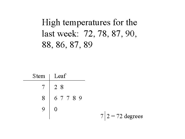
Stem-and-Leaf Plot • Summarizes quantitative data. • Each data point is broken down into a “stem” and a “leaf. ” • First, “stems” are aligned in a column. • Then, “leaves” are attached to the stems.

High temperatures for the last week: 72, 78, 87, 90, 88, 86, 87, 89 Stem Leaf 7 2 8 8 6 7 7 8 9 9 0 7 2 = 72 degrees

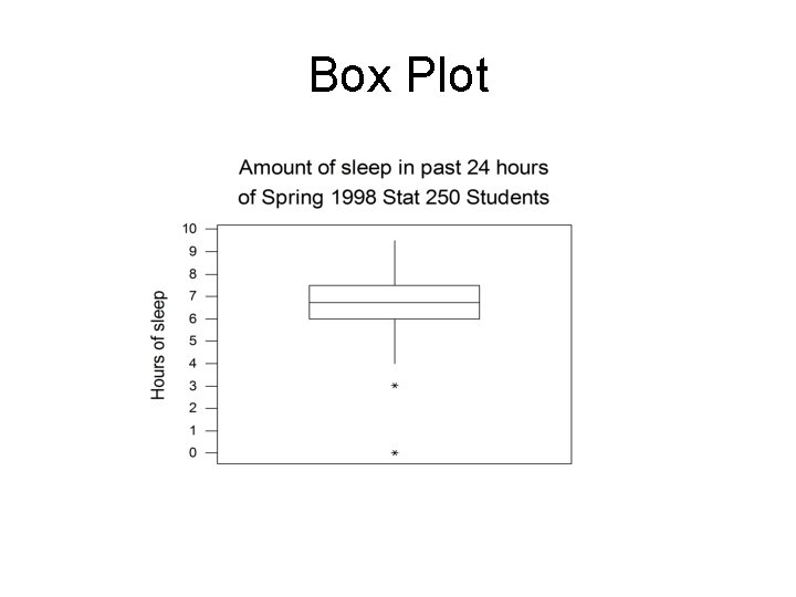
Box Plot • Summarizes quantitative data. • Vertical (or horizontal) axis represents measurement scale. • Lines in box represent the 25 th percentile (“first quartile”), the 50 th percentile (“median”), and the 75 th percentile (“third quartile”), respectively.

Box Plot

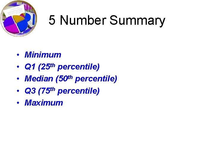
5 Number Summary • • • Minimum Q 1 (25 th percentile) Median (50 th percentile) Q 3 (75 th percentile) Maximum

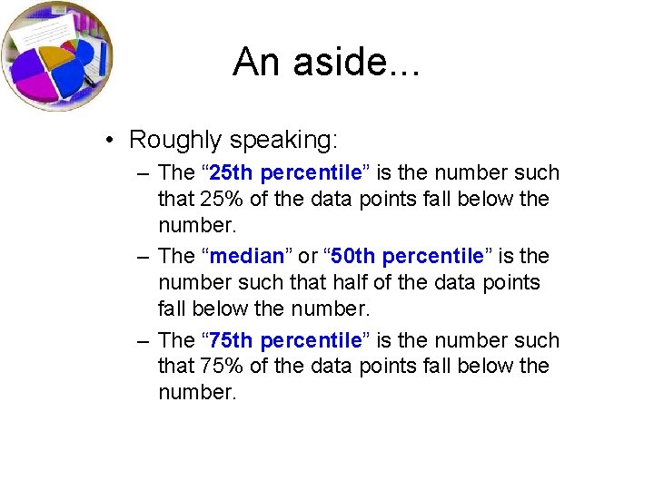
An aside. . . • Roughly speaking: – The “ 25 th percentile” is the number such that 25% of the data points fall below the number. – The “median” or “ 50 th percentile” is the number such that half of the data points fall below the number. – The “ 75 th percentile” is the number such that 75% of the data points fall below the number.

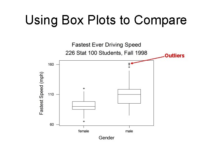
Using Box Plots to Compare Outliers

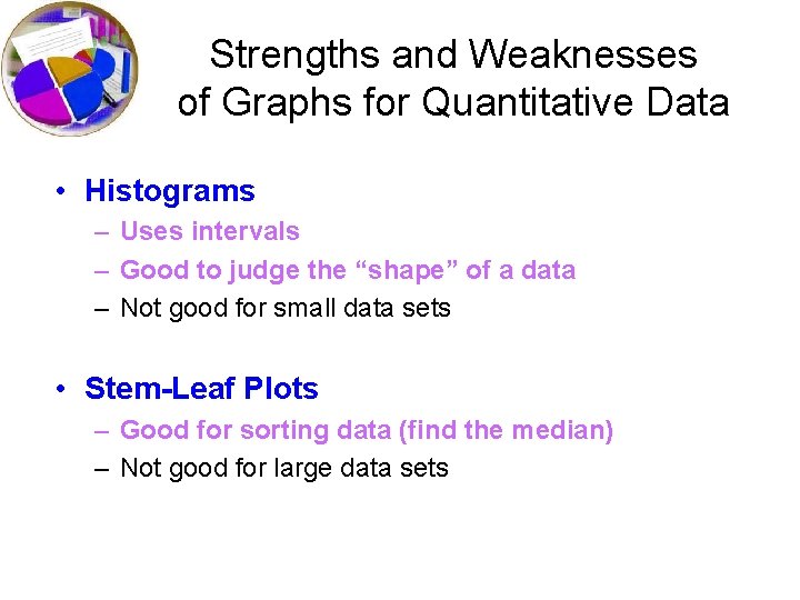
Strengths and Weaknesses of Graphs for Quantitative Data • Histograms – Uses intervals – Good to judge the “shape” of a data – Not good for small data sets • Stem-Leaf Plots – Good for sorting data (find the median) – Not good for large data sets

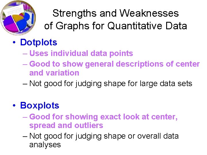
Strengths and Weaknesses of Graphs for Quantitative Data • Dotplots – Uses individual data points – Good to show general descriptions of center and variation – Not good for judging shape for large data sets • Boxplots – Good for showing exact look at center, spread and outliers – Not good for judging shape or overall data analyses

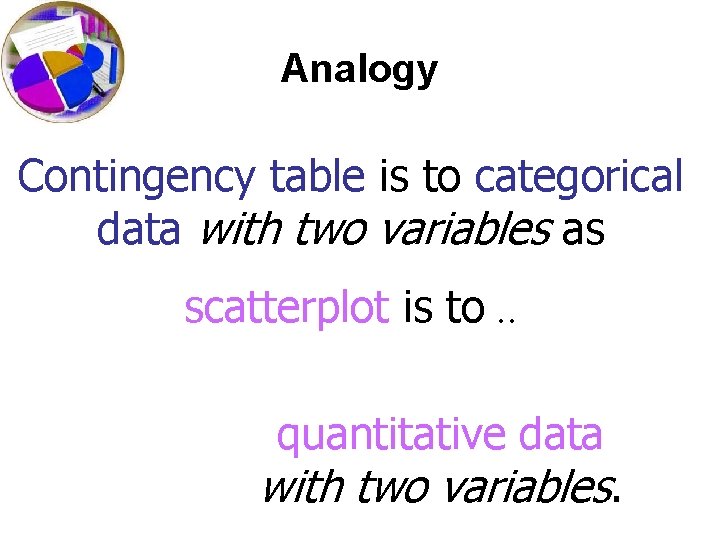
Analogy Contingency table is to categorical data with two variables as scatterplot is to. . quantitative data with two variables.

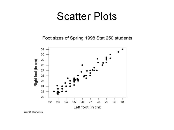
Scatter Plots

Scatter Plots • Summarizes the relationship between two quantitative variables. • Horizontal axis represents one variable and vertical axis represents second variable. • Plot one point for each pair of measurements.

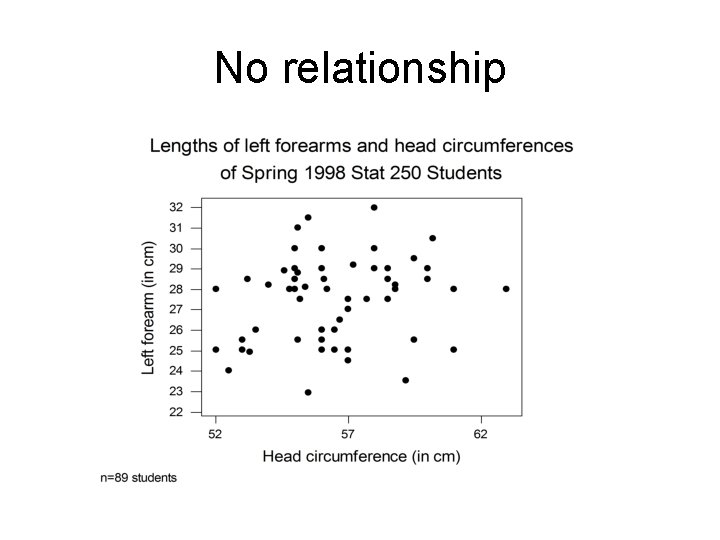
No relationship

Summary • Many possible types of graphs. • Use common sense in reading graphs. • When creating graphs, don’t summarize your data too much or too little. • When creating graphs, label everything for others. Remember you are trying to communicate something to others!

How to Compare Distributions When you’re visualizing data, you have lots of options as to how we display it. If we are comparing data on the same type of graph, it is important we focus on the relevant qualities. In order to do this, we need to CUSS!

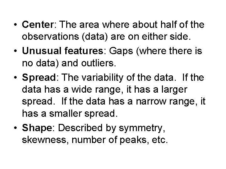
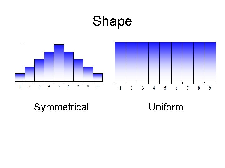
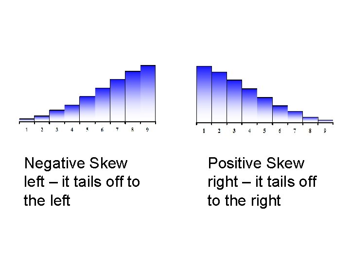
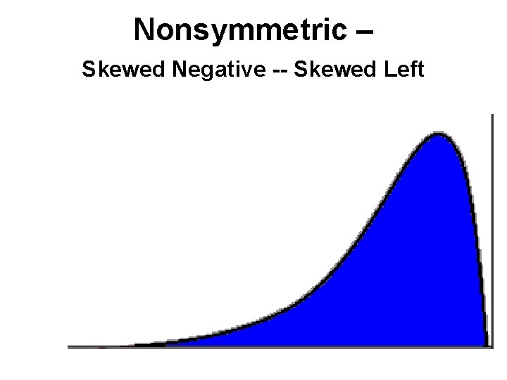
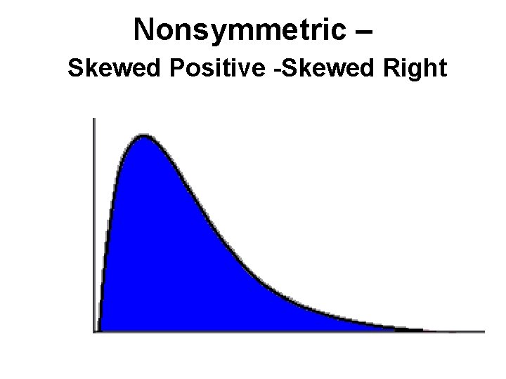
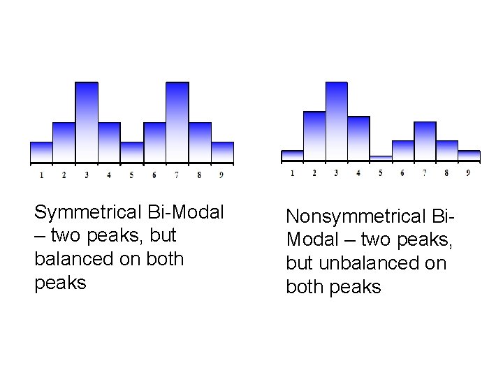
• Center: The area where about half of the observations (data) are on either side. • Unusual features: Gaps (where there is no data) and outliers. • Spread: The variability of the data. If the data has a wide range, it has a larger spread. If the data has a narrow range, it has a smaller spread. • Shape: Described by symmetry, skewness, number of peaks, etc.

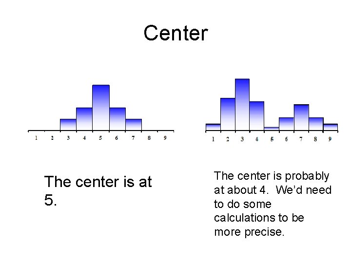
Center The center is at 5. The center is probably at about 4. We’d need to do some calculations to be more precise.

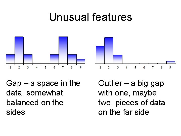
Unusual features Gap – a space in the data, somewhat balanced on the sides Outlier – a big gap with one, maybe two, pieces of data on the far side

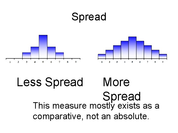
Spread Less Spread More Spread This measure mostly exists as a comparative, not an absolute.

Shape Symmetrical Uniform

Negative Skew left – it tails off to the left Positive Skew right – it tails off to the right

Nonsymmetric – Skewed Negative -- Skewed Left

Nonsymmetric – Skewed Positive -Skewed Right

Symmetrical Bi-Modal – two peaks, but balanced on both peaks Nonsymmetrical Bi. Modal – two peaks, but unbalanced on both peaks