Unit 4 Describing Data After 10 long weeks

Unit 4: Describing Data After 10 long weeks, we have finally finished Unit 3: Linear & Exponential Functions. Now on to Unit 4 which will last 5 weeks. This unit is all about statistics, so let’s begin by getting to know some of the vocabulary of statistics…
 Center Dot plot First Quartile")
Vocabulary: • • • • Box-and-Whisker Plot (Box Plot) Center Dot plot First Quartile Histogram Interquartile Range Mean Absolute Deviation Outlier Second Quartile (Q 2) Shape Symmetry Number of Peaks Direction of Skew Uniformity Spread • • • • Third quartile Trend Association Bivariate data Categorical variables Causation Conditional Relative Frequencies Correlation Coefficient Joint Frequencies Line of best fit Marginal Frequencies Quantitative Variables Residuals Scatter plot Two-frequency table

Learning Target: Students can identify the best way to represent, compare, and interpret sets of data. Standard: MCC 9 -12. S. ID. 1 -3, 5 -9, SP. 5

Box Plot A plot showing the minimum, maximum, first quartile, median, and third quartile of a data set; the middle 50% of the data is indicated by a box. Example:

Box Plot: Pros and Cons Advantages: • Shows 5 -point summary and outliers • Easily compares two or more data sets • Handles extremely large data sets easily Disadvantages: • Not as visually appealing as other graphs • Exact values not retained

Dot Plot A frequency plot that shows the number of times a response occurred in a data set, where each data value is represented by a dot. Example:

Dot Plot: Pros and Cons Advantages: • Simple to make • Shows each individual data point Disadvantages: • Can be time consuming with lots of data points to make • Have to count to get exact total. Fractions of units are hard to display.

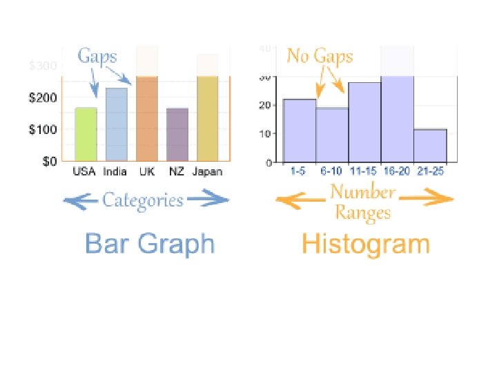
Histogram A frequency plot that shows the number of times a response or range of responses occurred in a data set. Example:

Histogram: Pros and Cons Advantages: • Visually strong • Good for determining the shape of the data Disadvantages: • Cannot read exact values because data is grouped into categories • More difficult to compare two data sets

Histogram vs. Bar Graph • Histograms are a great way to show results of continuous data, such as: – weight – how much time – etc. • But if your data is in categories (such as Country or Favorite Movie), then you should use a Bar Graph
- Slides: 11