Unit 2 Geographical Skills An overview of Unit


- Slides: 46

Unit 2: Geographical Skills

An overview of Unit 2 • Worth 30% of your AS • 1 hour exam on Friday 15 th May • Total of 50 marks • Questions on skills (part 1) and your fieldwork investigation (part 2) You will need the following equipment in the exam: • Rubber • Ruler • Protractor • Compasses • Calculator

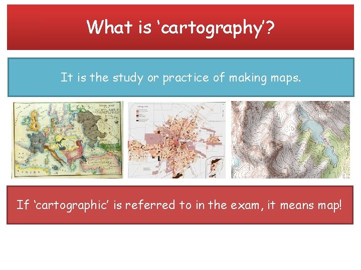
What is ‘cartography’? It is the study or practice of making maps. If ‘cartographic’ is referred to in the exam, it means map!

Cartographic skills In the next few lessons we will cover the following cartographic skills: • • • Atlas maps Base maps Sketch maps Ordnance Survey maps at a variety of scales Maps with located proportional symbols: squares, circles, semicircles, bars Maps showing movement: flow lines, desire lines, trip lines Detailed town centre plans Choropleth maps Dot maps

Incorporating ‘basic skills’ annotations • You have been developing basic skills as a geographer since Year 7. • With literacy, annotations and analysis the devil is in the detail. • A high level of accuracy, sophistication and detail are expected as well as appropriate use of geographical terminology.

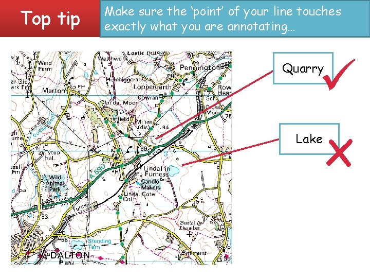
What is an annotation? • An annotation is a detailed label. • The list of potential resources you could be asked to annotate is endless, but the skill is the same. • Pick out the significant trend, features, areas or data. Only describe things that are relevant to the question or theme of the investigation. • You need to be as detailed, accurate and precise as possible.

Top tip Make sure the ‘point’ of your line touches exactly what you are annotating… x Quarry Lake

Base, atlas and sketch maps • A map is defined as a representation, usually on a flat surface, of a whole or part of an area. • The job of a map is to describe spatial relationships or specific features that the map aims to represent. • There are many different types of maps that attempt to represent specific things. Maps can display political boundaries, physical features, roads, climate, elevation (topography), natural resources, population and economic activities. • You should be able to interpret maps, read data from maps, identify patterns and read the scale, as well as being able to plot data onto a map using appropriate techniques.

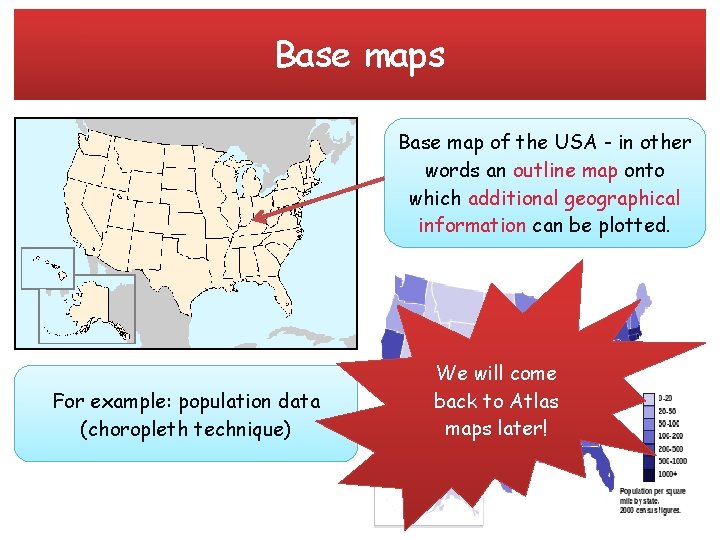
Base maps Base map of the USA - in other words an outline map onto which additional geographical information can be plotted. For example: population data (choropleth technique) We will come back to Atlas maps later!

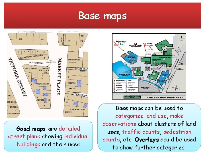
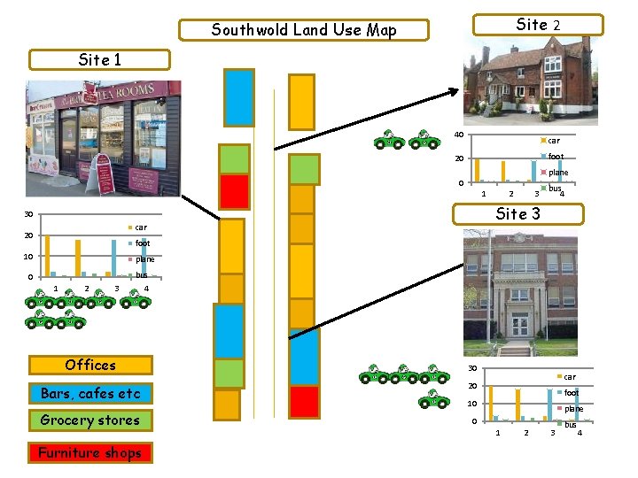
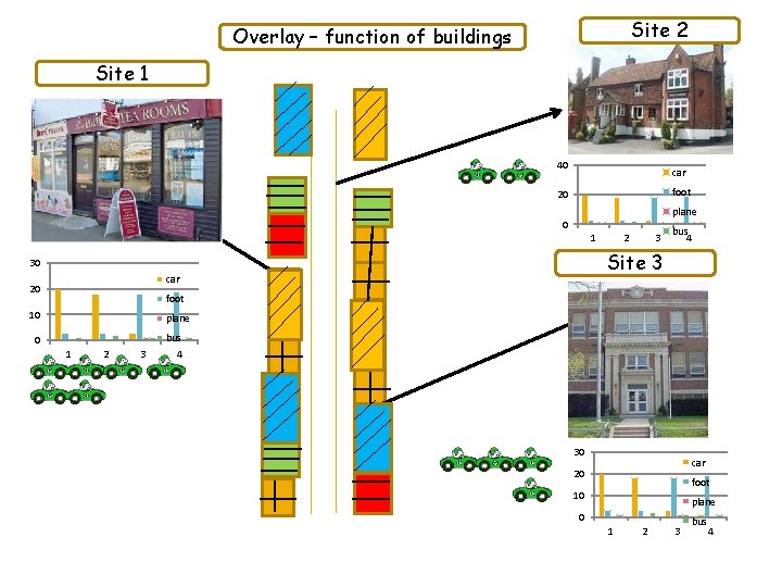
Base maps Goad maps are detailed street plans showing individual buildings and their uses Base maps can be used to categorize land use, make A base map could take the form observations about clusters of land of a Goad map, aerial view of an uses, traffic counts, pedestrian area or town plan. counts, etc. Overlays could be used to show further categories.

Site 2 Southwold Land Use Map Site 1 40 car foot 20 plane 0 1 3 bus 4 Site 3 30 car 20 2 foot 10 plane 0 1 2 3 bus 4 Offices Bars, cafes etc Grocery stores Furniture shops 30 car 20 foot 10 plane 0 1 2 3 bus 4

Site 2 Overlay – function of buildings Site 1 40 car foot 20 plane 0 1 3 bus 4 Site 3 30 car 20 2 foot 10 plane 0 1 2 3 bus 4 30 car 20 foot 10 plane 0 1 2 3 bus 4

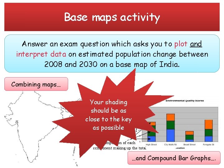
Base maps activity Answer an exam question which asks you to plot and interpret data on estimated population change between 2008 and 2030 on a base map of India. Combining maps… Your shading should be as close to the key as possible …and Compound Bar Graphs….

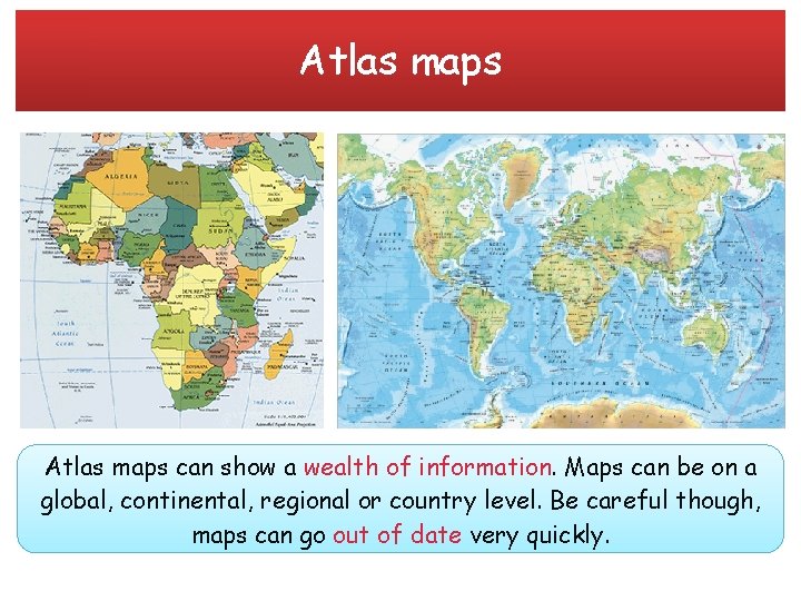
Atlas maps can show a wealth of information. Maps can be on a global, continental, regional or country level. Be careful though, maps can go out of date very quickly.

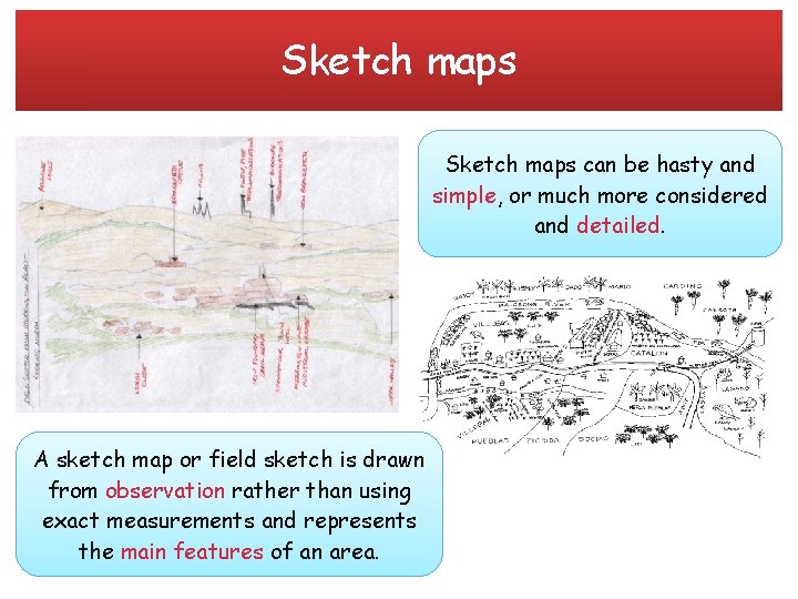
Sketch maps can be hasty and simple, or much more considered and detailed. A sketch map or field sketch is drawn from observation rather than using exact measurements and represents the main features of an area.

Cartographic skills Progress review: • • • Atlas maps Base maps Sketch maps Ordnance Survey maps at a variety of scales Maps with located proportional symbols: squares, circles, semicircles, bars Maps showing movement: flow lines, desire lines, trip lines Detailed town centre plans Choropleth maps Dot maps

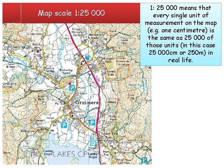
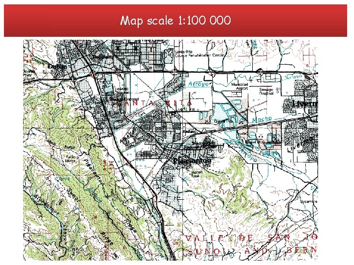
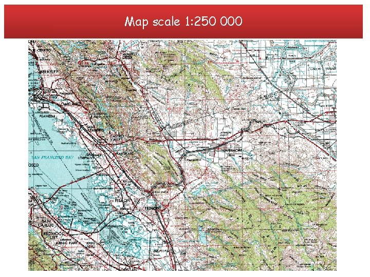
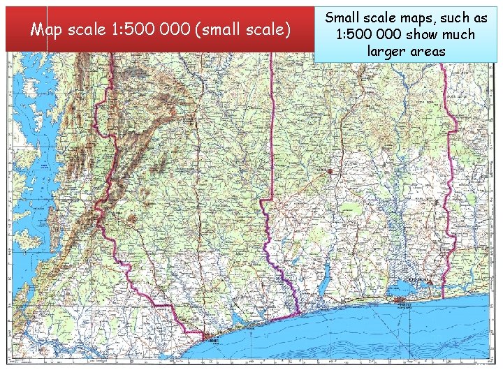
Ordnance Survey maps at a variety of scales Ordnance Survey is a non-ministerial government department (no political influence) and the national mapping agency for Great Britain. OS produce maps of Great Britain and are one of the world's largest producers of paper maps. Ordnance and digital Survey mapping products. OS maps mainly produces maps scales. drawn come in three to many different scales, depending on What is scale? what people want to thempossible. for… It takes real life things Scale is what makes mapuse drawing and reduces them in size many times so they can be shown on a map. Every map has a scale printed on the front and you should always check this figure before you start reading it. It will tell you how much smaller the area shown on the map is compared to the same area in real life.

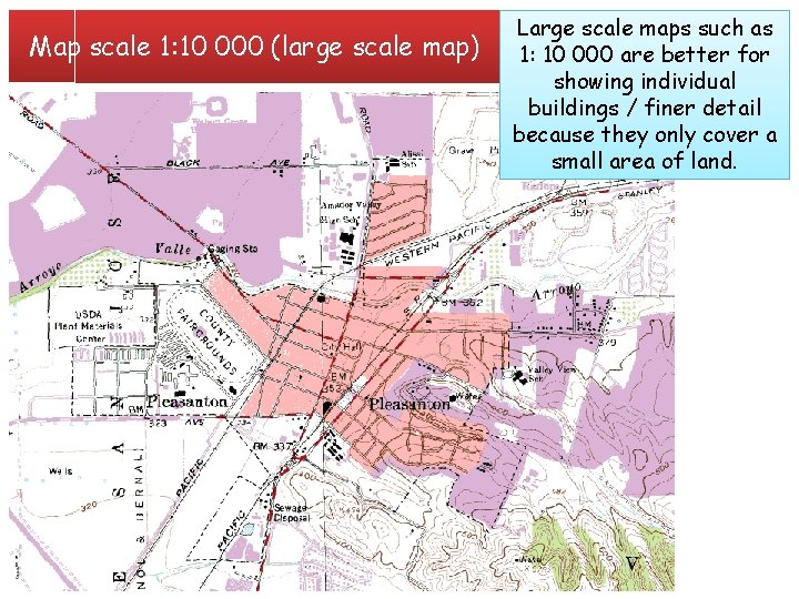
Map scale 1: 10 000 (large scale map) Large scale maps such as 1: 10 000 are better for showing individual buildings / finer detail because they only cover a small area of land.

Map scale 1: 25 000 means that every single unit of measurement on the map (e. g. one centimetre) is the same as 25 000 of those units (in this case 25 000 cm or 250 m) in real life.

Map scale 1: 100 000

Map scale 1: 250 000

Map scale 1: 500 000 (small scale) Small scale maps, such as 1: 500 000 show much larger areas

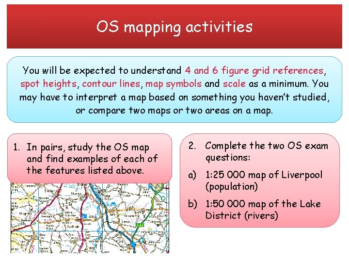
OS mapping activities You will be expected to understand 4 and 6 figure grid references, spot heights, contour lines, map symbols and scale as a minimum. You may have to interpret a map based on something you haven’t studied, or compare two maps or two areas on a map. 1. In pairs, study the OS map and find examples of each of the features listed above. 2. Complete the two OS exam questions: a) 1: 25 000 map of Liverpool (population) b) 1: 50 000 map of the Lake District (rivers)

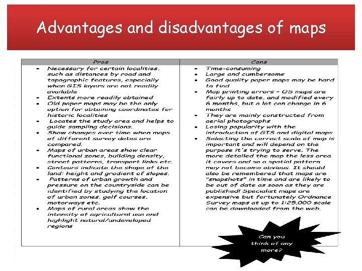
Advantages and disadvantages of maps

Cartographic skills Progress review: • • • Atlas maps Base maps Sketch maps Ordnance Survey maps at a variety of scales Maps with located proportional symbols: squares, circles, semicircles, bars Maps showing movement: flow lines, desire lines, trip lines Detailed town centre plans Choropleth maps Dot maps

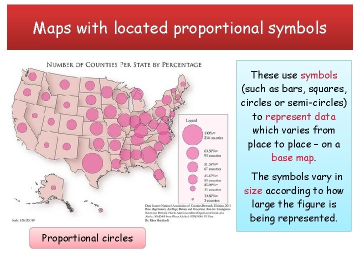
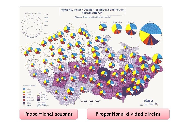
Maps with located proportional symbols These use symbols (such as bars, squares, circles or semi-circles) to represent data which varies from place to place – on a base map. The symbols vary in size according to how large the figure is being represented. Proportional circles

Proportional squares Proportional divided circles

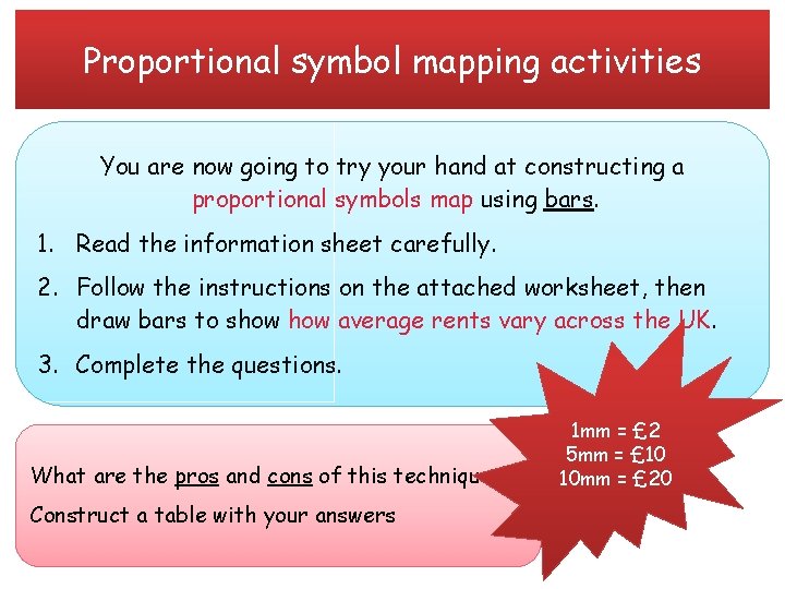
Proportional symbol mapping activities You are now going to try your hand at constructing a proportional symbols map using bars. 1. Read the information sheet carefully. 2. Follow the instructions on the attached worksheet, then draw bars to show average rents vary across the UK. 3. Complete the questions. What are the pros and cons of this technique? Construct a table with your answers 1 mm = £ 2 5 mm = £ 10 10 mm = £ 20

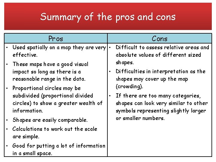
Summary of the pros and cons Pros Cons • Used spatially on a map they are very • Difficult to assess relative areas and effective. absolute values of different sized shapes. • These maps have a good visual impact so long as there is a reasonable range in the data. • Proportional circles may be subdivided (proportional divided circles) to show a greater wealth of information. • Difficulties in interpretation as the shapes may cover up the map (crowding). • Shapes are easily comparable. • If there are too many categories, shapes can look very similar to other symbols representing slightly larger or smaller numbers. • Calculations to work out the scale are simple. • Good for putting a lot of information in a small space.

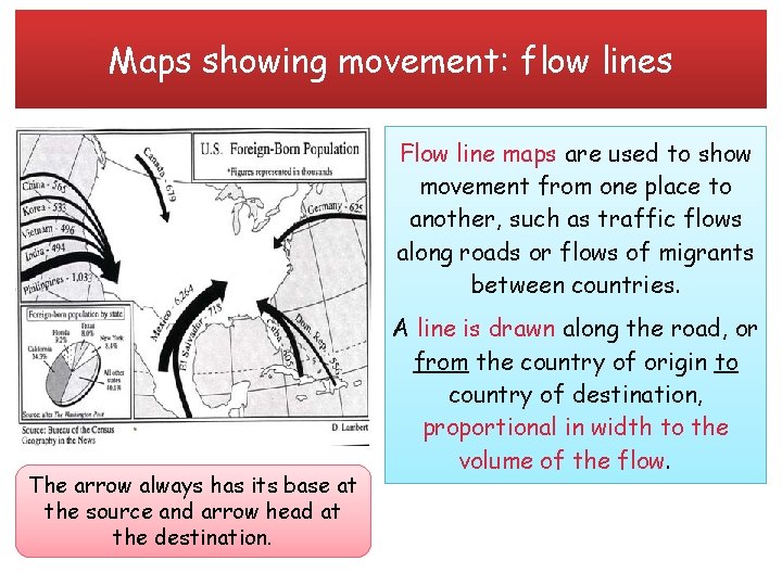
Maps showing movement: flow lines Flow line maps are used to show movement from one place to another, such as traffic flows along roads or flows of migrants between countries. The arrow always has its base at the source and arrow head at the destination. A line is drawn along the road, or from the country of origin to country of destination, proportional in width to the volume of the flow.

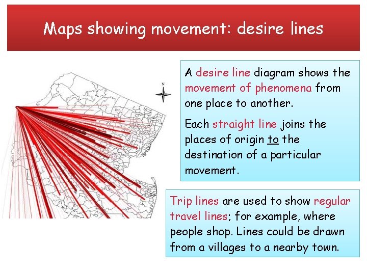
Maps showing movement: desire lines A desire line diagram shows the movement of phenomena from one place to another. Each straight line joins the places of origin to the destination of a particular movement. Trip lines are used to show regular travel lines; for example, where people shop. Lines could be drawn from a villages to a nearby town.

Flow lines mapping activities You are going to plot air passenger movement between the UK and selected European countries for 1995 using proportional arrows. 1. Read the information sheet if necessary. 2. Follow the instructions to draw your flow map. 3. Complete the analysis questions. What are the pros and cons of this technique? Construct a table with your answers Think carefully 1 mm about your scale to avoid crowding represents your map! 1 million?

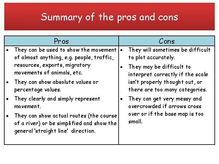
Summary of the pros and cons Pros They can be used to show the movement of almost anything, e. g. people, traffic, resources, exports, migratory movements of animals, etc. They can show absolute values or percentage values. They clearly and simply represent movement. They can show actual routes (the course of a river) or be simplified and show the general ‘straight line’ direction. Cons They will sometimes be difficult to plot accurately. They may be difficult to interpret correctly if the scale isn’t properly thought out, or there are too many categories. They can get very messy and overcrowded if arrows cross over or if the base map is too small.

Cartographic skills Progress review: • • • Atlas maps Base maps Sketch maps Ordnance Survey maps at a variety of scales Maps with located proportional symbols: squares, circles, semicircles, bars Maps showing movement: flow lines, desire lines, trip lines Detailed town centre plans Choropleth maps Dot maps

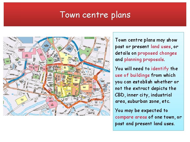
Town centre plans may show past or present land uses, or details on proposed changes and planning proposals. You will need to identify the use of buildings from which you can establish whether or not the extract depicts the CBD, inner city, industrial area, suburban zone, etc. You may be expected to compare areas of one town, or past and present land uses.

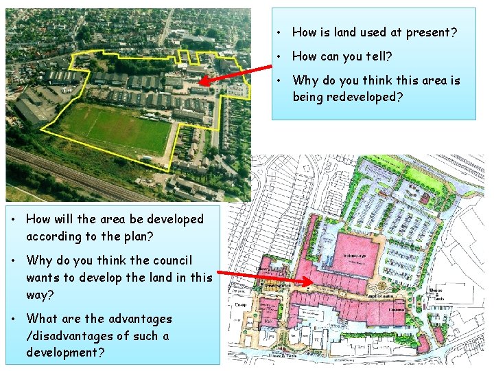
• How is land used at present? • How can you tell? • Why do you think this area is being redeveloped? • How will the area be developed according to the plan? • Why do you think the council wants to develop the land in this way? • What are the advantages /disadvantages of such a development?

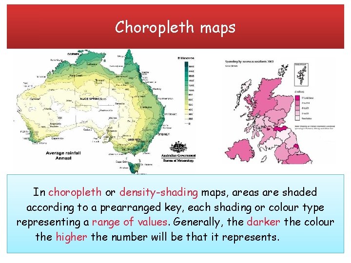
Choropleth maps In choropleth or density-shading maps, areas are shaded according to a prearranged key, each shading or colour type representing a range of values. Generally, the darker the colour the higher the number will be that it represents.

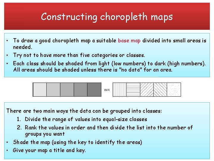
Constructing choropleth maps • To draw a good choropleth map a suitable base map divided into small areas is needed. • Try not to have more than five categories or classes. • Each class should be shaded from light (low numbers) to dark (high numbers). All areas should be shaded unless there is "no data" for an area. There are two main ways the data can be grouped into classes: 1. Divide the range of values into equal-size classes 2. Rank the values in order and then divide the list into the number of groups you want • Shade the map (using the key to identify the areas) • Give your map a title and key.

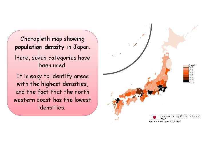
Choropleth map showing population density in Japan. Here, seven categories have been used. It is easy to identify areas with the highest densities, and the fact that the north western coast has the lowest densities.

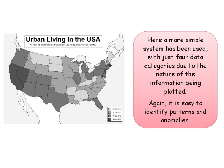
Here a more simple system has been used, with just four data categories due to the nature of the information being plotted. Again, it is easy to identify patterns and anomalies.

Choropleth mapping activity You are going to construct a choropleth map to show population losses in the Borough of London. Follow the instructions on the sheet carefully, and complete the accompanying questions. What are the pros and cons of this technique? Construct a table with your answers Think carefully about your categories – try not to have more than 4 or 5

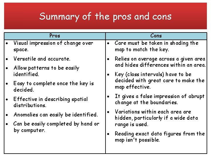
Summary of the pros and cons Pros Visual impression of change over space. Cons Care must be taken in shading the map to match the key. Versatile and accurate. Allow patterns to be easily identified. Relies on average across a given area and hides differences within an area. Easy to complete once the key is decided. Key (class intervals) have to be decided with great care to make the map effective. Effective in describing spatial distributions. It gives a false impression of abrupt change at the boundaries. Anomalies can easily be identified. Can be easily completed by hand or by computer. Variations within each area are hidden, particularly if a wide data range is used. Reading exact data figures from the map isn't possible.

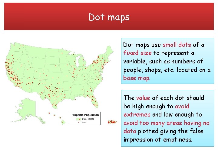
Dot maps use small dots of a fixed size to represent a variable, such as numbers of people, shops, etc. located on a base map. The value of each dot should be high enough to avoid extremes and low enough to avoid too many areas having no data plotted giving the false impression of emptiness.

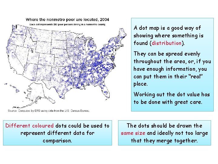
A dot map is a good way of showing where something is found (distribution). They can be spread evenly throughout the area, or, if you have enough information, you can put them in their “real” place. Working out the dot value has to be done with great care. Different coloured dots could be used to represent different data for comparison. The dots should be drawn the same size and ideally not too large that they merge together.

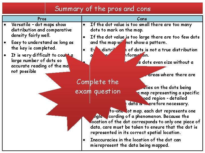
Summary of the pros and cons Pros Versatile – dot maps show distribution and comparative density fairly well. Easy to understand as long as the key is completed. It is very difficult to count a large number of dots so accurate reading of the map is not possible Cons If the dot value is too small there are too many dots to mark on the map. If the dot value is too large there are too few dots and the map will not show a pattern. Even distribution of dots is not a true distribution and gives little information. Difficult to keep all the dots even size without a stencil. Difficult to plot high value areas where there are lots of dots Complete the This mapping technique relies on the dots being examplotted question accurately on a map representing a specific location rather than a broad region - detailed knowledge of the data is therefore necessary. In a one-to-one dot map, each dot represents one single recording of a phenomenon. Because the location of the dot corresponds to only one piece of data, care must be taken to ensure that the dot is represented in its correct spatial location. Inaccuracies in the location of the dot can misrepresent the data being mapped.

Cartographic skills Progress review: • • • Atlas maps Base maps Sketch maps Ordnance Survey maps at a variety of scales Maps with located proportional symbols: squares, circles, semicircles, bars Maps showing movement: flow lines, desire lines, trip lines Detailed town centre plans Choropleth maps Dot maps