Understanding the Relative Operating Characteristic ROC Simon Mason





- Slides: 54

Understanding the Relative Operating Characteristic (ROC) Simon Mason International Research Institute for Climate Prediction The Earth Institute of Columbia University

What? The WMO has included the relative operating characteristic (ROC) as part of its standardized verification system (SVS). The incomprehensible name is not meant to be intimidating! The name was inherited from signal detection theory. Most meteorologists refer to it simply as ROC. The ROC is used to measure how good forecasts are, but it is not a single measure of forecast skill like correlation. Instead it is usually presented as a graph.

Why? The ROC was selected as part of the WMO SVS for many reasons, including the following: 1. It can be used with deterministic and probabilistic forecasts. 2. It is designed to measure how good forecasts are in the context of a very simple decisionmaking model, and is thus better suited to measure how good forecasts are from the perspective of the user than are many other commonly used measures. 3. It recognizes that forecast quality cannot be measured by a single number.

When? The ROC works with binary variables. Binary variables are questions that have “yes”/“no” answers. For example? Will it rain this afternoon? Will it be hot tomorrow? Will this summer be unusually wet? Will this storm spawn tornadoes? Of course, the second and third questions have to be defined precisely: “hot” could be defined as “above 30°C”; “unusually wet” could mean “more than 500 mm of rain”.

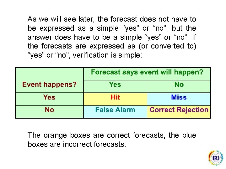
As we will see later, the forecast does not have to be expressed as a simple “yes” or “no”, but the answer does have to be a simple “yes” or “no”. If the forecasts are expressed as (or converted to) “yes” or “no”, verification is simple: The orange boxes are correct forecasts, the blue boxes are incorrect forecasts.

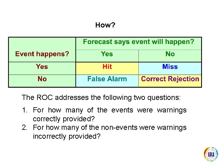
How? The ROC addresses the following two questions: 1. For how many of the events were warnings correctly provided? 2. For how many of the non-events were warnings incorrectly provided?

The best way to illustrate is by means of a game…

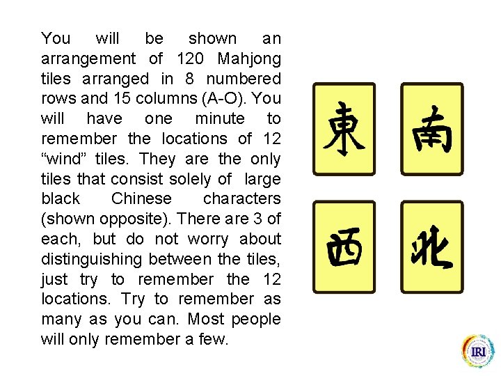
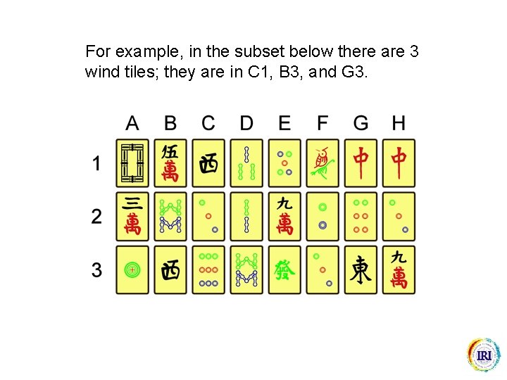
You will be shown an arrangement of 120 Mahjong tiles arranged in 8 numbered rows and 15 columns (A-O). You will have one minute to remember the locations of 12 “wind” tiles. They are the only tiles that consist solely of large black Chinese characters (shown opposite). There are 3 of each, but do not worry about distinguishing between the tiles, just try to remember the 12 locations. Try to remember as many as you can. Most people will only remember a few.

For example, in the subset below there are 3 wind tiles; they are in C 1, B 3, and G 3.

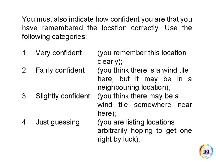
You must also indicate how confident you are that you have remembered the location correctly. Use the following categories: 1. Very confident 2. Fairly confident 3. Slightly confident 4. Just guessing (you remember this location clearly); (you think there is a wind tile here, but it may be in a neighbouring location); (you think there may be a wind tile somewhere near here); (you are listing locations arbitrarily hoping to get one right by luck).

If you cannot remember all 12, try listing a cluster of locations for those you are not totally sure about. For example, if you think there is a wind tile somewhere in the middle of row 1 but cannot remember the exact column, list the one you think is correct first, and then list locations either side. Proceed only when you are ready for the test …

Time Up!

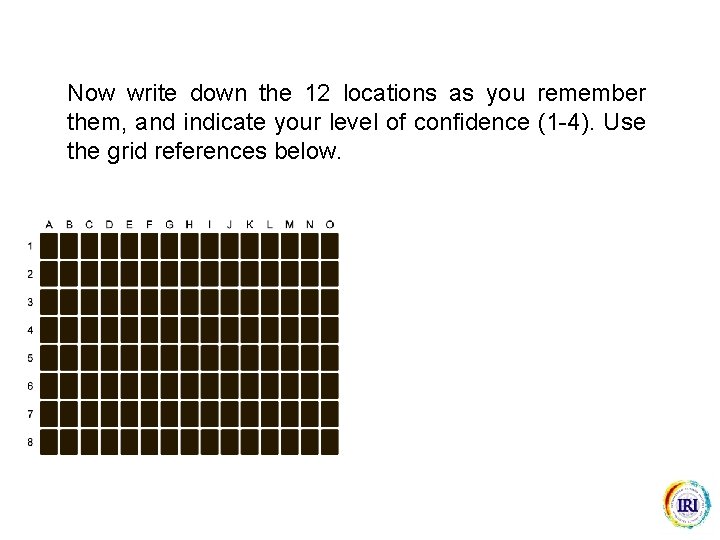
Now write down the 12 locations as you remember them, and indicate your level of confidence (1 -4). Use the grid references below.

You should now have a list of 12 locations with indications on how confident you are that the locations are correct. Once you are happy with your responses, and have indicated your level of confidence appropriately, go ahead and check against the answers on the next slide …


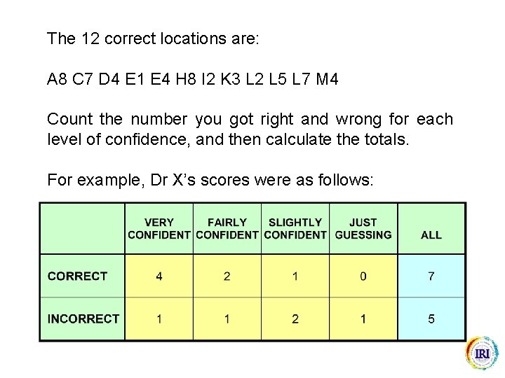
The 12 correct locations are: A 8 C 7 D 4 E 1 E 4 H 8 I 2 K 3 L 2 L 5 L 7 M 4 Count the number you got right and wrong for each level of confidence, and then calculate the totals. For example, Dr X’s scores were as follows:

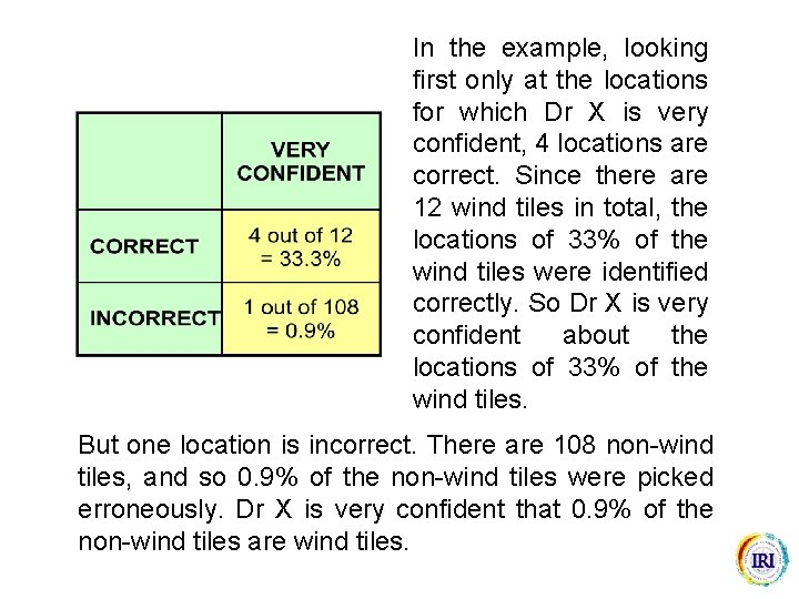
In the example, looking first only at the locations for which Dr X is very confident, 4 locations are correct. Since there are 12 wind tiles in total, the locations of 33% of the wind tiles were identified correctly. So Dr X is very confident about the locations of 33% of the wind tiles. But one location is incorrect. There are 108 non-wind tiles, and so 0. 9% of the non-wind tiles were picked erroneously. Dr X is very confident that 0. 9% of the non-wind tiles are wind tiles.

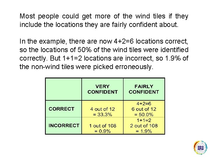
Most people could get more of the wind tiles if they include the locations they are fairly confident about. In the example, there are now 4+2=6 locations correct, so the locations of 50% of the wind tiles were identified correctly. But 1+1=2 locations are incorrect, so 1. 9% of the non-wind tiles were picked erroneously.

Similarly you may be able to get even more of the wind tiles if we include the locations you were slightly confident about, and those for which you were just guessing. However, as we start including locations for which you are less confident, the number of locations picked incorrectly is likely to increase. So the proportion of wind tiles picked correctly increases as confidence decreases, but so also does the proportion of non-wind tiles picked incorrectly.

Calculate the proportion correct and incorrect at all levels of confidence. Your table should look something like the following We can plot these points on a graph …


Congratulations!! You have just drawn (part of) an ROC graph! Before we try to make more sense of the graph let us try to work out how good your score is.

How can we determine how good your score is? One way is to compare your score with the scores of people who had not been given an opportunity to memorize the locations of the tiles. These people would have had to guess all of the locations. The people guessing also list 12 locations, but they are all listed as “just guessing”. Let us consider how many locations they are likely to get correct …

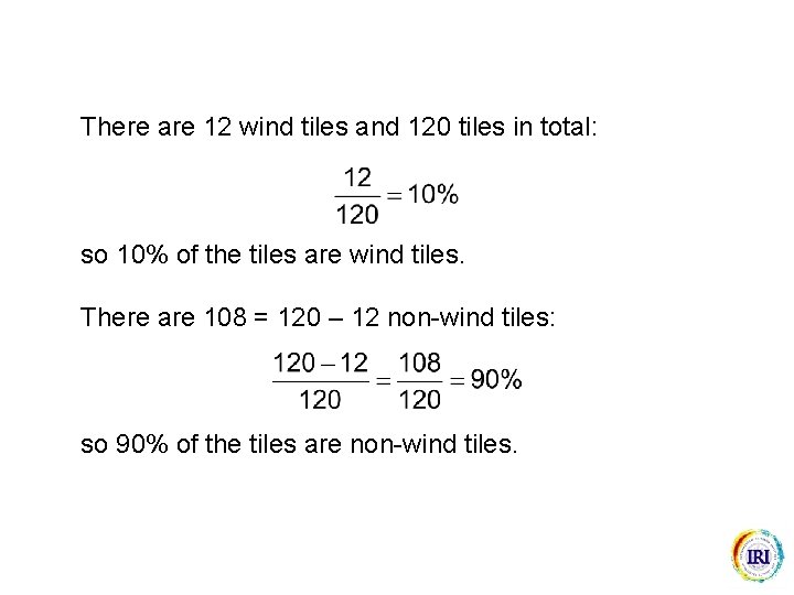
There are 12 wind tiles and 120 tiles in total: so 10% of the tiles are wind tiles. There are 108 = 120 – 12 non-wind tiles: so 90% of the tiles are non-wind tiles.

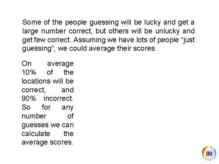
Some of the people guessing will be lucky and get a large number correct, but others will be unlucky and get few correct. Assuming we have lots of people “just guessing”, we could average their scores. On average 10% of the locations will be correct, and 90% incorrect. So for any number of guesses we can calculate the average scores.

The percentage of wind tiles guessed correctly, and of nonwind tiles guessed incorrectly, are the same. Let us add these scores to the graph …

The line for any number of guesses is shown, but marks are shown only for direct comparison with the example scores.

Memory scores are better than guessing if there are more wind tiles and fewer non-wind tiles selected, i. e. more of the locations are identified correctly than are guessed correctly. In the example, 5 tiles were marked “very confident”, and 4 of these were correct. On average, only 0. 5 tiles would be correct by guessing, so Dr X’s memory is good. On the graph, a good memory would show points to the left and above the line for guesses. Later on we will consider the question of how much better than guessing your scores are. But now let us apply what has been learnt to some climate forecasts.

In the Mahjong example you were given 12 chances to point to the locations of 12 wind tiles out of a total of 120 tiles. You were able to use your memory to improve on guessing, and we were able to identify whether your memory improved upon guesses. This kind of problem is very common, so now let us take an equivalent climatological example…

This time we have 30 years of rainfall forecasts, and the problem is to identify the 10 “dry” years over the 30 -year period. The problem is similar to the Mahjong game, but with the following differences: 30 years 10 dry years 20 non-dry years instead of 120 tiles instead of 12 wind tiles instead of 108 non-wind tiles We do not have access to the rainfall data, and so cannot memorize the years. Instead we will use the forecasts to select the “dry” years.

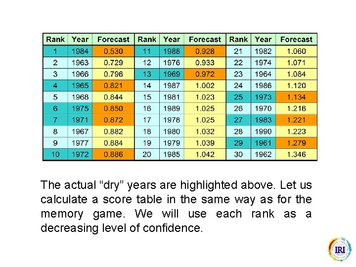
The most logical approach is to use the forecast for the least rainfall (1984 at 0. 530) as our most likely indication of a “dry” year, the forecast for the second least rainfall (1963 at 0. 729) as our second most likely, and the forecast for the third least rainfall (1966 at 0. 796) as our third most likely. . .

We could continue listing all years in order of how confident we are that each year is one of the 10 “dry” years. We would be most confident that 1984 is “dry” and least confident that 1962 is “dry”.

The actual “dry” years are highlighted above. Let us calculate a score table in the same way as for the memory game. We will use each rank as a decreasing level of confidence.

Our first selection is correct, so we have identified 1 (10%) of the 10 “dry” years correctly. The second is incorrect, so we have selected 1 (5%) of the 20 “nondry” years incorrectly. Now we can plot these points …


We can assess how good the forecasts are in exactly the same way as for the memory game. Let us compare the scores for the forecasts with the scores for people who have no forecasts available. These people would have had to guess all of the “dry” years.

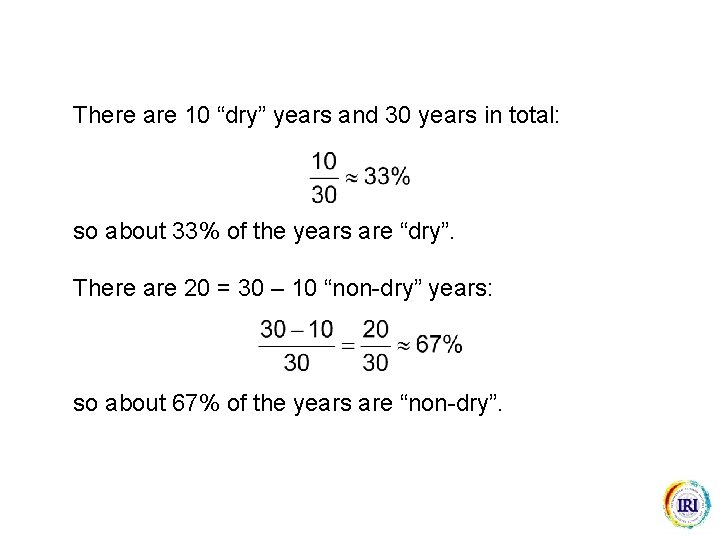
There are 10 “dry” years and 30 years in total: so about 33% of the years are “dry”. There are 20 = 30 – 10 “non-dry” years: so about 67% of the years are “non-dry”.

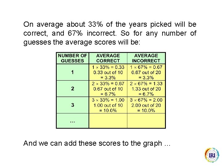
On average about 33% of the years picked will be correct, and 67% incorrect. So for any number of guesses the average scores will be: And we can add these scores to the graph …


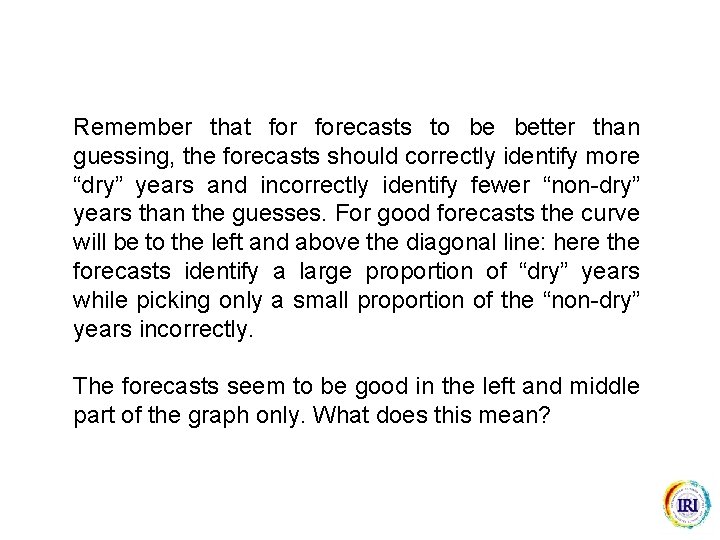
Remember that forecasts to be better than guessing, the forecasts should correctly identify more “dry” years and incorrectly identify fewer “non-dry” years than the guesses. For good forecasts the curve will be to the left and above the diagonal line: here the forecasts identify a large proportion of “dry” years while picking only a small proportion of the “non-dry” years incorrectly. The forecasts seem to be good in the left and middle part of the graph only. What does this mean?

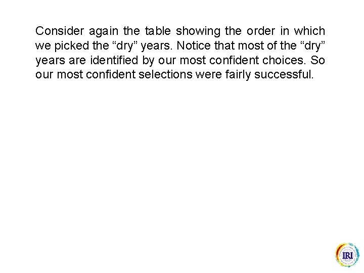
Consider again the table showing the order in which we picked the “dry” years. Notice that most of the “dry” years are identified by our most confident choices. So our most confident selections were fairly successful.

However, after about the 13 th selection, the forecasts do not provide useful guidance for identifying any more of the “dry” years.

We can draw the following conclusion from the ROC graph: When the forecast suggests that conditions are going to be dry we can be reasonably confident that “dry” conditions will occur. However, when the forecast suggests that conditions are going to be normal or wet we cannot make any useful statement about the likelihood of “dry” conditions.

The correlation between the observed and the forecast rainfall is 0. 044. Based on the correlation, we would normally ignore these forecasts, but the ROC graph suggests they may be useful in forecasting “dry” conditions. The ROC graph indicates that the forecasts are better than guesses, but by how much?

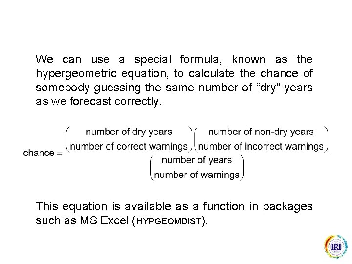
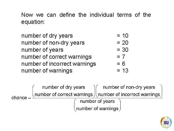
We can use a special formula, known as the hypergeometric equation, to calculate the chance of somebody guessing the same number of “dry” years as we forecast correctly. This equation is available as a function in packages such as MS Excel (HYPGEOMDIST).

To use this equation to calculate how good the forecasts are, we must first chose which years we are going to treat as forecasts of “dry” conditions. Let us issue a warning of “dry” conditions when the forecast is less than 1. 0. The actual “dry” years are marked in dark blue.

Now we can define the individual terms of the equation: number of dry years number of non-dry years number of correct warnings number of incorrect warnings number of warnings = 10 = 20 = 30 =7 =6 = 13

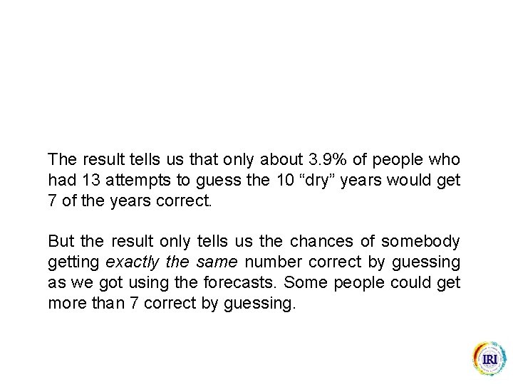
The result tells us that only about 3. 9% of people who had 13 attempts to guess the 10 “dry” years would get 7 of the years correct. But the result only tells us the chances of somebody getting exactly the same number correct by guessing as we got using the forecasts. Some people could get more than 7 correct by guessing.

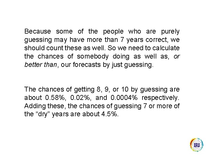
Because some of the people who are purely guessing may have more than 7 years correct, we should count these as well. So we need to calculate the chances of somebody doing as well as, or better than, our forecasts by just guessing. The chances of getting 8, 9, or 10 by guessing are about 0. 58%, 0. 02%, and 0. 0004% respectively. Adding these, the chances of guessing 7 or more of the “dry” years are about 4. 5%.

We would, of course, get a different answer if we used a different criterion for deciding when to issue a warning. You should be wary of the many problems in performing such significance tests. However, the ROC graph does suggest that these forecasts do contain some useful information, despite a correlation of close to zero. As a summary measure of the graph, the area under the ROC curve is frequently calculated …

The area beneath the guessing line is 0. 5, and so an area greater than 0. 5 suggests the forecasts are good. The area beneath the graph for our forecasts is 0. 61. What does this mean?

The area beneath the graph tells us the probability that the forecast for a “dry” year is drier than the forecast for a “non-dry” year. If we were given a forecast for one of the “dry” years and one for one of the “non-dry” years, we would identify the “dry” year correctly 61% of the time. In practice, this information is not very helpful to the user! However, the graph as a whole should be very informative to the forecaster.

Feedback In order to monitor the usefulness of this course, and to make revisions and improvements, please could you forward any comments or suggestions. Dr Simon J. Mason International Research Institute for Climate Prediction Columbia University 61 Route 9 W Palisades, NY 10964 -8000 USA E-mail: simon@iri. columbia. edu

Recommended readings • Murphy, A. H. , 1993: What is a good forecast? An essay on the nature of goodness in weather forecasting. Weather and Forecasting, 8, 281– 293. • Wilks, D. S. , 1995: Statistical Methods in the Atmospheric Sciences, Academic Press, San Diego. Chapter 7, Forecast verification, pp 233– 283. • Mason, S. J. , and N. E. Graham, 1999: Conditional probabilities, relative operating characteristics, and relative operating levels. Weather Forecasting, 14, 713– 725. • Mason, S. J. , and N. E. Graham, 2002: Areas beneath the relative operating characteristics (ROC), and levels (ROL) curves: statistical significance and interpretation. Quarterly Journal of the Royal Meteorological Society, 128, 2145– 2166.