Understanding Data Characteristics Based in part on notes
Understanding Data Characteristics Based in part on notes from: Data Mining: Concepts and Techniques, Third Edition by Han, Kamber, Pei
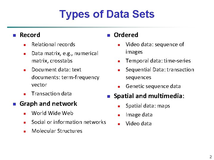
Types of Data Sets n Record n n n n Ordered Relational records n Data matrix, e. g. , numerical matrix, crosstabs n Document data: text documents: term-frequency vector Transaction data Graph and network n n World Wide Web Social or information networks Molecular Structures n n n Video data: sequence of images Temporal data: time-series Sequential Data: transaction sequences Genetic sequence data Spatial and multimedia: n n n Spatial data: maps Image data Video data 2
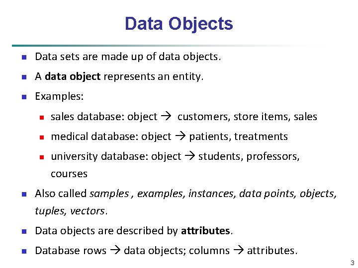
Data Objects n Data sets are made up of data objects. n A data object represents an entity. n Examples: n sales database: object customers, store items, sales n medical database: object patients, treatments n n university database: object students, professors, courses Also called samples , examples, instances, data points, objects, tuples, vectors. n Data objects are described by attributes. n Database rows data objects; columns attributes. 3
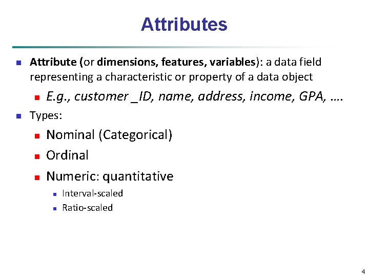
Attributes n Attribute (or dimensions, features, variables): a data field representing a characteristic or property of a data object n n E. g. , customer _ID, name, address, income, GPA, …. Types: n n n Nominal (Categorical) Ordinal Numeric: quantitative n n Interval-scaled Ratio-scaled 4
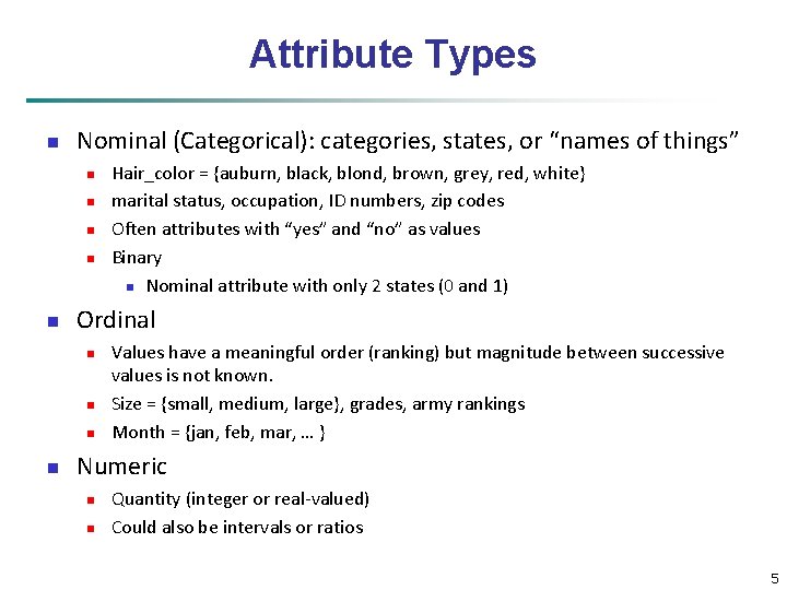
Attribute Types n Nominal (Categorical): categories, states, or “names of things” n n n Ordinal n n Hair_color = {auburn, black, blond, brown, grey, red, white} marital status, occupation, ID numbers, zip codes Often attributes with “yes” and “no” as values Binary n Nominal attribute with only 2 states (0 and 1) Values have a meaningful order (ranking) but magnitude between successive values is not known. Size = {small, medium, large}, grades, army rankings Month = {jan, feb, mar, … } Numeric n n Quantity (integer or real-valued) Could also be intervals or ratios 5
Basic Statistical Descriptions of Data Before deeper analysis, it’s important to explore the basic characteristics and relationships in the data set n Descriptive Statistics n To better understand the characteristics of attributes and fields: central tendency, variation, spread, etc. n To get a feel for general patterns or relationships among variables: e. g. , correlation, covariance, etc. n Data Visualization n Visual examination of data distributions often help in uncovering important patterns and guide further investigation or decision making n 6
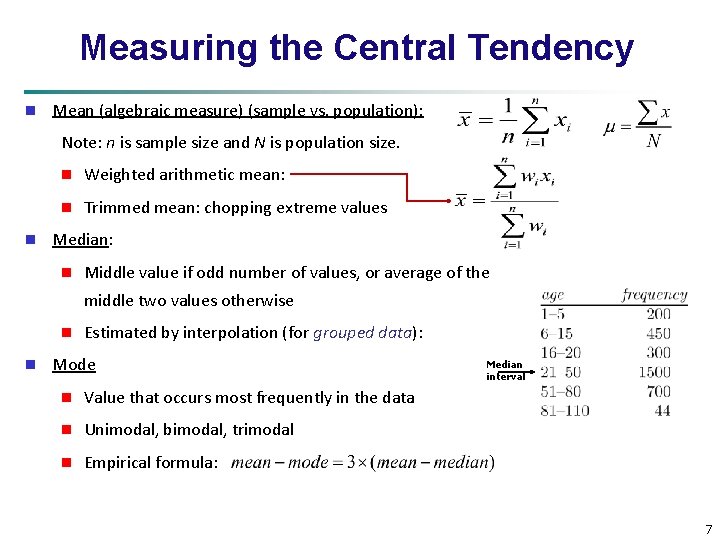
Measuring the Central Tendency n Mean (algebraic measure) (sample vs. population): Note: n is sample size and N is population size. n n Weighted arithmetic mean: n Trimmed mean: chopping extreme values Median: n Middle value if odd number of values, or average of the middle two values otherwise n n Estimated by interpolation (for grouped data): Mode n Value that occurs most frequently in the data n Unimodal, bimodal, trimodal n Empirical formula: Median interval 7
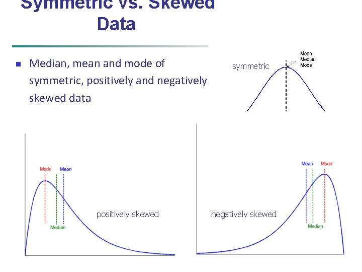
Symmetric vs. Skewed Data n Median, mean and mode of symmetric, positively and negatively skewed data positively skewed February 14, 2022 symmetric negatively skewed Data Mining: Concepts and Techniques 8
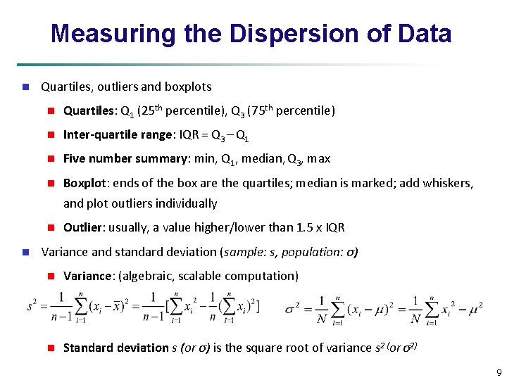
Measuring the Dispersion of Data n Quartiles, outliers and boxplots n Quartiles: Q 1 (25 th percentile), Q 3 (75 th percentile) n Inter-quartile range: IQR = Q 3 – Q 1 n Five number summary: min, Q 1, median, Q 3, max n Boxplot: ends of the box are the quartiles; median is marked; add whiskers, and plot outliers individually n n Outlier: usually, a value higher/lower than 1. 5 x IQR Variance and standard deviation (sample: s, population: σ) n Variance: (algebraic, scalable computation) n Standard deviation s (or σ) is the square root of variance s 2 (or σ2) 9
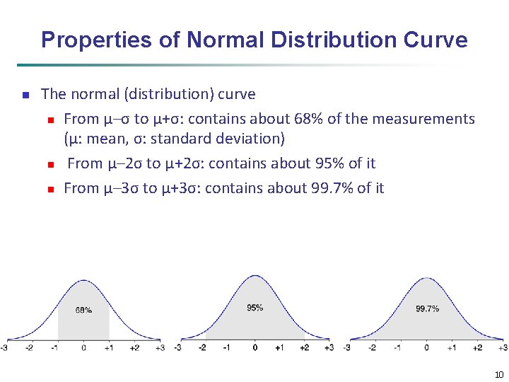
Properties of Normal Distribution Curve n The normal (distribution) curve n From μ–σ to μ+σ: contains about 68% of the measurements (μ: mean, σ: standard deviation) n From μ– 2σ to μ+2σ: contains about 95% of it n From μ– 3σ to μ+3σ: contains about 99. 7% of it 10
Graphic Displays of Basic Statistical Descriptions n Boxplot: graphic display of five-number summary n Histogram: x-axis are values, y-axis repres. frequencies n Quantile plot: each value xi is paired with fi indicating that approximately 100 fi % of data are xi n Quantile-quantile (q-q) plot: graphs the quantiles of one univariant distribution against the corresponding quantiles of another n Scatter plot: each pair of values is a pair of coordinates and plotted as points in the plane 11
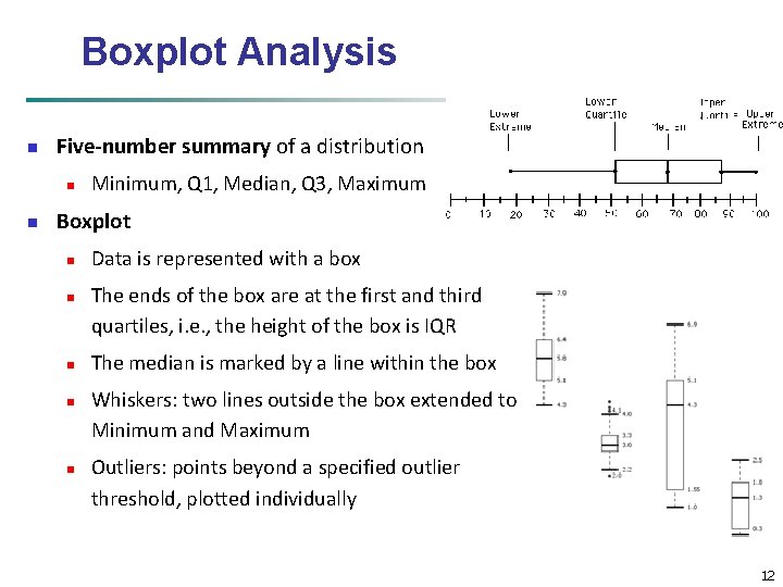
Boxplot Analysis n Five-number summary of a distribution n n Minimum, Q 1, Median, Q 3, Maximum Boxplot n n n Data is represented with a box The ends of the box are at the first and third quartiles, i. e. , the height of the box is IQR The median is marked by a line within the box Whiskers: two lines outside the box extended to Minimum and Maximum Outliers: points beyond a specified outlier threshold, plotted individually 12
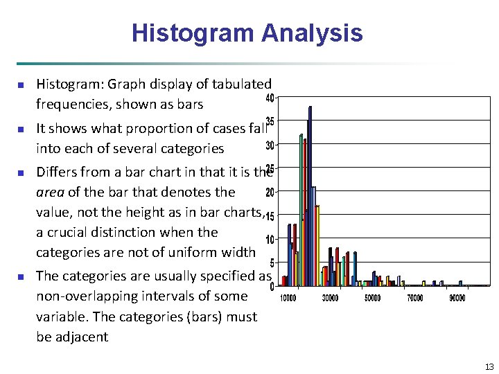
Histogram Analysis n n Histogram: Graph display of tabulated frequencies, shown as bars It shows what proportion of cases fall into each of several categories Differs from a bar chart in that it is the area of the bar that denotes the value, not the height as in bar charts, a crucial distinction when the categories are not of uniform width The categories are usually specified as non-overlapping intervals of some variable. The categories (bars) must be adjacent 13
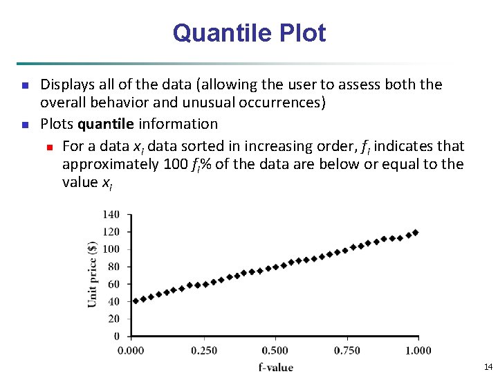
Quantile Plot n n Displays all of the data (allowing the user to assess both the overall behavior and unusual occurrences) Plots quantile information n For a data xi data sorted in increasing order, fi indicates that approximately 100 fi% of the data are below or equal to the value xi Data Mining: Concepts and Techniques 14
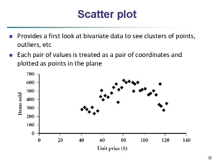
Scatter plot n n Provides a first look at bivariate data to see clusters of points, outliers, etc Each pair of values is treated as a pair of coordinates and plotted as points in the plane 15
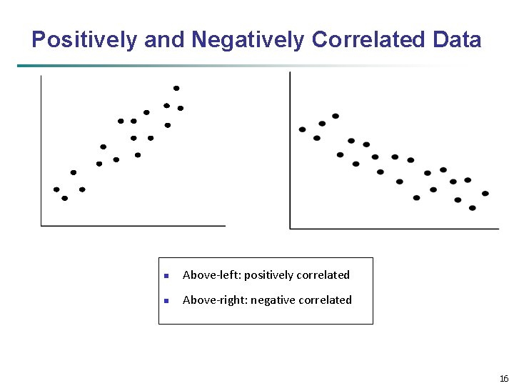
Positively and Negatively Correlated Data n Above-left: positively correlated n Above-right: negative correlated 16
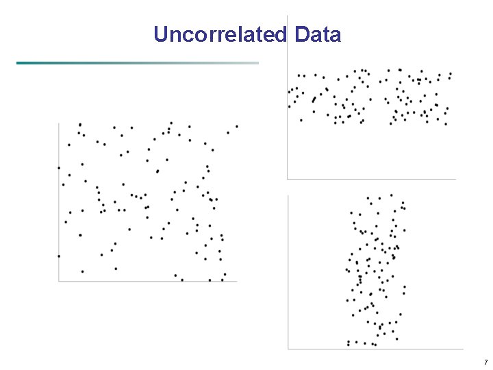
Uncorrelated Data 17
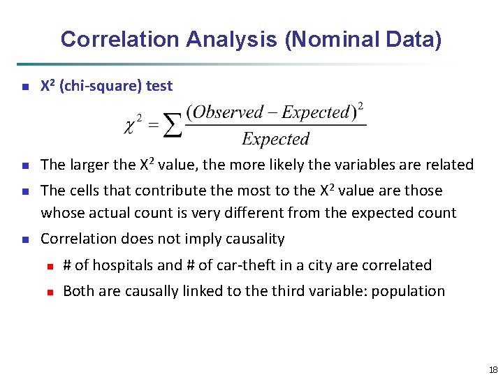
Correlation Analysis (Nominal Data) n Χ 2 (chi-square) test n The larger the Χ 2 value, the more likely the variables are related n n The cells that contribute the most to the Χ 2 value are those whose actual count is very different from the expected count Correlation does not imply causality n # of hospitals and # of car-theft in a city are correlated n Both are causally linked to the third variable: population 18
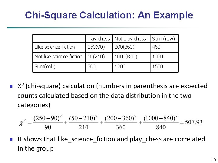
Chi-Square Calculation: An Example n n Play chess Not play chess Sum (row) Like science fiction 250(90) 200(360) 450 Not like science fiction 50(210) 1000(840) 1050 Sum(col. ) 300 1200 1500 Χ 2 (chi-square) calculation (numbers in parenthesis are expected counts calculated based on the data distribution in the two categories) It shows that like_science_fiction and play_chess are correlated in the group 19
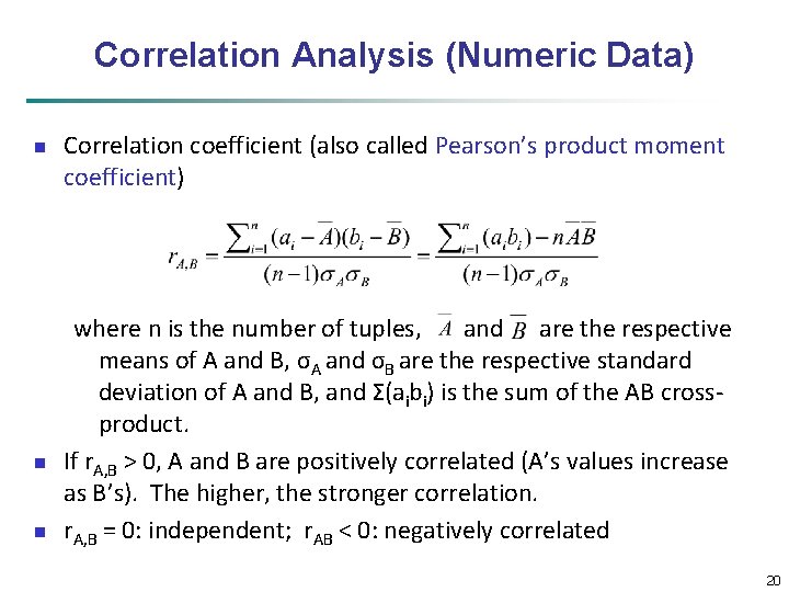
Correlation Analysis (Numeric Data) n n n Correlation coefficient (also called Pearson’s product moment coefficient) where n is the number of tuples, and are the respective means of A and B, σA and σB are the respective standard deviation of A and B, and Σ(aibi) is the sum of the AB crossproduct. If r. A, B > 0, A and B are positively correlated (A’s values increase as B’s). The higher, the stronger correlation. r. A, B = 0: independent; r. AB < 0: negatively correlated 20
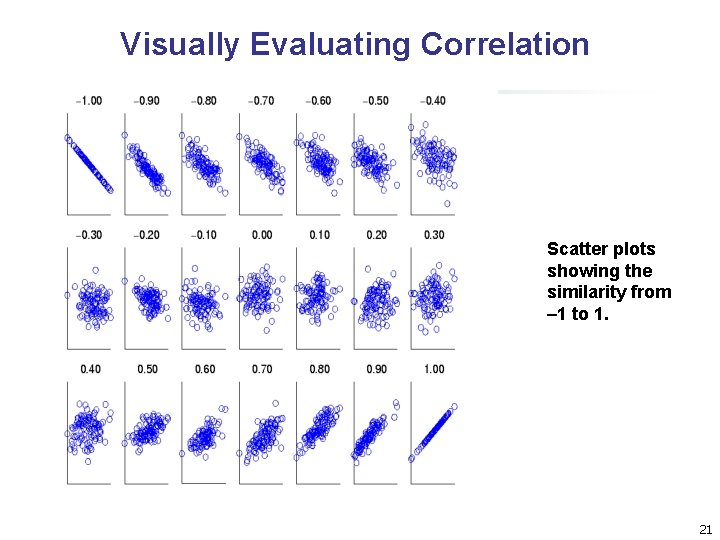
Visually Evaluating Correlation Scatter plots showing the similarity from – 1 to 1. 21
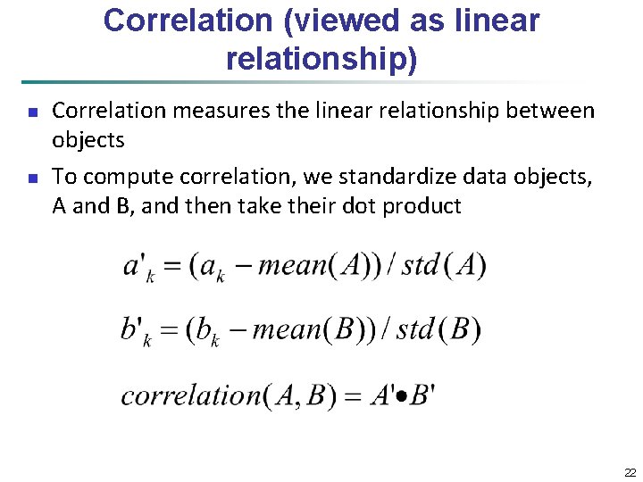
Correlation (viewed as linear relationship) n n Correlation measures the linear relationship between objects To compute correlation, we standardize data objects, A and B, and then take their dot product 22
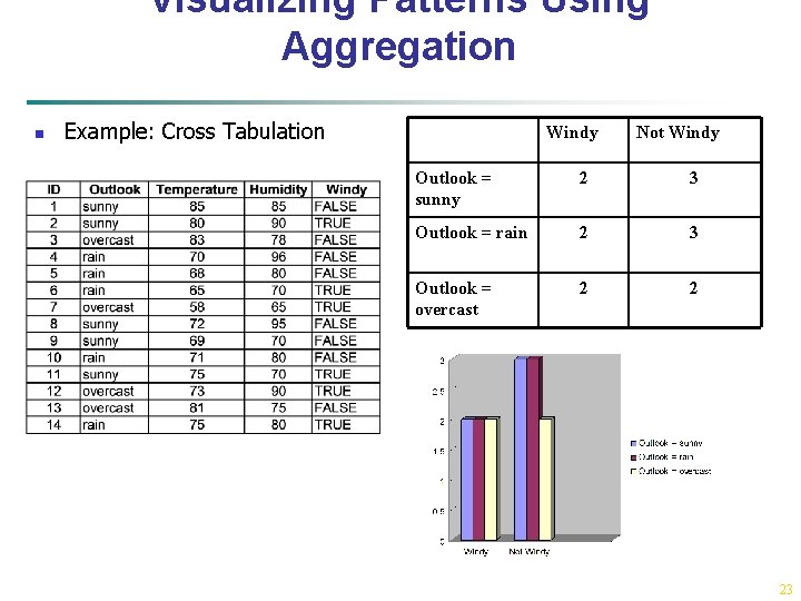
Visualizing Patterns Using Aggregation n Example: Cross Tabulation Windy Not Windy Outlook = sunny 2 3 Outlook = rain 2 3 Outlook = overcast 2 2 23
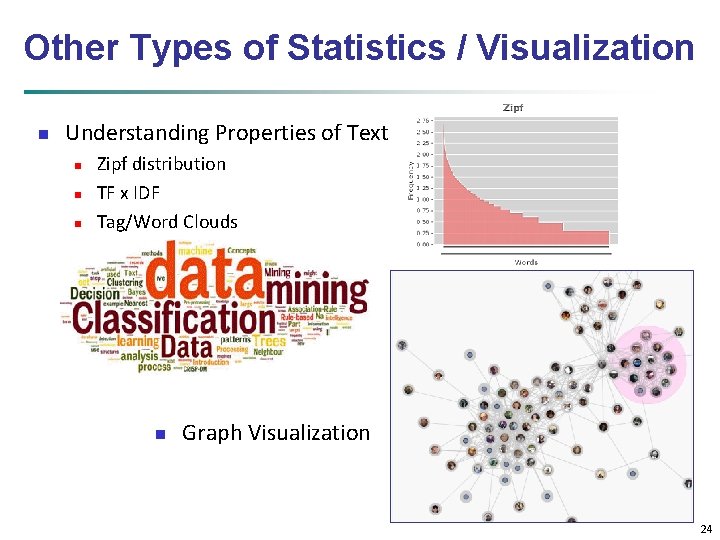
Other Types of Statistics / Visualization n Understanding Properties of Text n n n Zipf distribution TF x IDF Tag/Word Clouds n Graph Visualization 24
- Slides: 24