Typography Typography exists to honor content Robert Bringhurst

Typography

• Typography exists to honor content. —Robert Bringhurst

• The letterforms we use today were not always as we see them now. Over the past 5000 years, they evolved, linked to the rise and fall of civilizations, different cultures adding their own distinct imprint on the symbols of language.

• Typography is the balance and interplay of letterforms on the page—a verbal and visual equation that helps the reader understand the form and absorb the substance of the page content. • Typography plays a dual role as both verbal and visual communication. When readers scan a page they are subconsciously aware of both functions: first they survey the overall graphic patterns of the page, and then they parse the language and read.

• Good typography establishes a visual hierarchy for rendering prose on the page by providing visual punctuation and graphic accents that help readers understand relations between prose and pictures, headlines and subordinate blocks of text.

Bodoni Designed after the work of Giambattista Bodoni, an 18 th century typographer. Bodoni is a good representative of the Modern typeface. Caslon Designed after the work of William Caslon, circa 1732, this is an archetypal Old Style font. Industria Designed in 1990 by Neville Brody, one of the most influential designers of the eighties and nineties.

Univers Dr. No Platelet Designed by Adrian Designed by Ian Anderson Designed by Conor Frutiger in 1957, this of the Designers Republic Mangat in 1993. Platelet is typeface is the in 1992, it is a typeface a good example of Post archetypical sans serif font. that pushes the limits of Modern type design and legibility without the effect of Emigre on conforming to the cliches contemporary typography. of grunge typography.

OCRB Designed by Adrian Frutiger, OCRB is a sans serif face designed for optical character recognition adapted for human readers. VOLT Campbel Designed in 1996 by Taylor Designed by Alexander Smith Deupree to cross legible text in 1996, this typeface was fonts with experimental inspired by a drainplate in typographic elements. Often Central Park looks "normal" at first glance, but shows its unique elements subtly.

Snell Courier Moon. Base Alpha Designed by Matthew Originally designed by Designed by Cornel Windlin Carter for Linotype in 1965. Howard Kettler for IBM and for Fuse in 1993. Derived Carter derived the typeface redrawn by Adrian Frutiger, from bitmapped printouts, from the handwriting of Courier is the prototypical this font is designed for Charles Snell, the English typewriter font, and one of graphic form rather than writing master and author. the most popular fixedsuperior legibility. width fonts.

Clarendon Amoeba Clarendon was designed by Designed by Marius Watz Hermann Eidendenz in to resemble the style of 1951, adapted from Robert fonts used in early Space Besley's original design Invaders games. Protozoan done in 1845 for delight - a fist full of fun. Thorowgood & Beseley. Pilot Designed by Magnus Rakeng in 1995. An aerodynamic font for the next millennium. Available from Magnus Rakeng

The meaning of a word can be dramatically changed by the typeface, case size and spacing in which it is set. Lower case and smaller point sizes are less assuming but can harbor a extreme emotion if used correctly

Here the oblique nature of the type gives a sharp edge to the visual statement. While this is not always the effect of using an oblique typeface, the word bitter takes on a more biting feel, in effect it becomes more emotional.

Introducing Serifs adds warmth to the word as well as an old style feeling. Notice the resentment carried in the smallest point size lower case. This is a good example of how you enhance the meaning of a word through type treatment.

Presented in a script, a dichotomy appears between the visual message and the meaning of the word. This creates a visual irony that enhances the meaning of the word on many levels.

By opening up the tracking on a single word, one creates a more dynamic visual statement. Because this spacing becomes slightly more difficult to read it can result in the viewing audience paying slightly more attention to the content.

Here the tracking has been increased significantly. The word becomes increasingly difficult to read, however the letters begin to feel isolated and small, particularly in the lower case. Does this add to the significance of the word or increase its emotional impact?

Emphasis • A web page of solid body text is hard to scan for content structure and will not engage the eye. • Adding display type to a document will provide landmarks to direct the reader through your content. • Display type establishes an information structure and adds visual variety to draw the reader into your material. • The key to effective display type is the careful and economic use of typographic emphasis.

• There are time-honored typographical devices for adding emphasis to a block of text, but be sure to use them sparingly. • If you make everything bold, then nothing will stand out and you will appear to be shouting at your readers. • You will soon discover that only a small variation is required to establish visual contrast.

Italics • Italicized text attracts the eye because it contrasts in shape from body text. • Use italics for convention—for example, when listing book or magazine titles—or within text for stressed or foreign words and phrases. • Avoid setting large blocks of text in italics because the readability of italicized text, particularly at screen resolutions, is much lower than in comparably sized roman (“plain”) text.

Bold • Boldface text gives emphasis because it contrasts in weight from the body text. • Section subheads work well set in bold. • Boldface text is readable on-screen, though large blocks of text set in bold lack contrast and therefore lose effectiveness.
,")
Underlining • In addition to its aesthetic shortcomings (too heavy, interferes with letter shapes), underlining has a special functional meaning in web documents. • Most readers have their browser preferences set to underline links. This default browser setting ensures that people with monochromatic monitors or people who are color-blind can identify links within text blocks. • If you include underlined text on your web page, it will certainly be confused with a hypertext link.

Color • You should avoid putting colored text within text blocks because readers will assume that the colored text is a hypertext link and click on it. • Colored text does work well as a subtle means to distinguish section heads. Choose dark shades of color that contrast with the page background, and avoid using colors close to the default web link colors of blue and violet. • Bear in mind that some users cannot distinguish colors. • Also be sure that there is sufficient contrast between the background and text on your page. Although contrast is particularly important for vision-impaired users, all users will benefit from greater readability.

CAPITALS • Capitalized text is one of the most common and least effective methods for adding typographical emphasis. • Whether you choose capital or lowercase letters has a strong effect on the legibility of your text. Indeed, words set in all capitals should generally be avoided— except perhaps for short headings—because they are hard to scan. • We read primarily by recognizing the overall shape of words, not by parsing each letter and then assembling a recognizable word.

Words formed with capital letters are monotonous rectangles that offer few distinctive shapes to catch the eye

What is Typography? • Definition: A vast majority of what is created by multimedia professionals includes type. The word “typography” refers to the art and process of arranging type on a page. Changing the typeface (font), size, color, weight, and placement of type in your design can add extra emphasis to your words and enhance the visual appeal of your message. Type has character take a look below, which one of the font types would best describe the feeling of anger?

Type has character take a look below, which one of the font types would best describe the feeling of anger? • You may have had to think about this for a minute to select your choice. • What were some of the things you were looking for? • Why did you make your selection: was it color, weight (bold), size, font? • See if you can get an idea of what elements of typography are important to a designer.

Class Assignment • Ask at least three people to look at this page and decide which word best represents the idea of anger, ask them why they decided on that one. • They may not know what you are looking for in an answer at first. Let them think about it for a minute and then describe their selection to you. • It is likely that they will talk about it color, weight (bold), size, and describe the font. • Don't lead them in their answers, let them tell you first!!

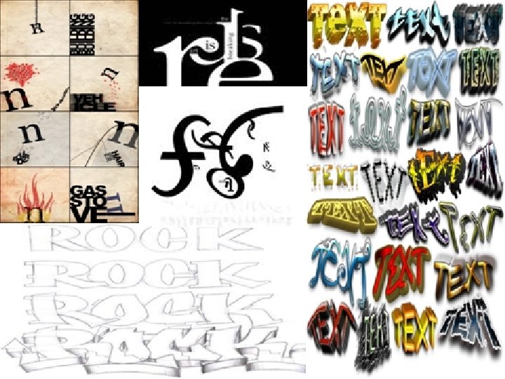
Creativity and Characteristics • Using typography is one of the most interesting and enjoyable parts of image creation. • There all kinds of things you can create with letters, not just words! • Sometimes just textures and designs are what works.


Your Project • You will create 20 thumbnail sketches over the course of the next few days that include both images that are meaningful to you and creative ways to write your name and initials • Divide your paper into sections that are NOT equal. You want 12 -16 spaces • Choose your best sketches and transfer them onto the good paper
- Slides: 33