Typography The designer crafted word Typography Font Family


.")


- Slides: 18
Typography The designer crafted word
Typography Font Family Bold vs. Light Italic Extended Condensed Serif Sans Serif Script Kerning Leading Point size
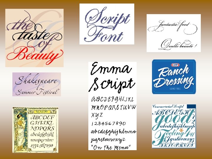
Font Family
Letter Spacing Kerning • Leading-"ledding" The vertical spacing between lines of type (between baselines). The name comes from the early hot-metal days of typesetting when the space was achieved with thin bars of lead. Leading is measured in points and includes the point size of the typeface and the actual space between the lines.
Leading is Space from Baseline to Baseline
Point Size Arial Rounded 24 pt. Arial Rounded 60 pt.
Serif Fonts A serif is a cross line at the end of a letter stroke that leads the eye onto the following letterform. Examples of serif fonts are Times New Roman, Garamond and Palatino. http: //www. rsc-ne-scotland. ac. uk/eolympics/banff/armenia/Typography-170. htm
Sans Serif • These fonts are clearer at smaller sizes when viewed on screen. Verdana Comic Sans Helvetica Trebuchet
Extended-Horizontal Stretch-shorter and wider
Condensed • Stretches vertically
Italic Leaning!
BE BOLD… or Try to lighted up
What you have learned. • Serif Fonts have additional strokes and look more formal and have authority. • Sans serif fonts have cleaner lines and look more modern. • Words in UPPERCASE are all the same shape and should be used with care. • Words in lower case have more shape and are easier and quicker to read. • Text styles of bold and italic can add emphasis to text. • Typefaces have impact that add to your words’ meanings. • Kerning is the adjustment of spacing between letters to create a more aesthetically pleasing arrangement of letterforms.
Name that Text! 1 2 3 5 4 6 7 8
Thank you to Mrs. Little!