Typography Terms Typography is the design of letterforms
- Slides: 28

Typography Terms

Typography is the design of letterforms and the arrangement of them.

Font A complete set of letterforms, numerals, and signs in a particular face, size, and style.

Type Family Several font designs contributing a range of style variations based on a single typeface design. Most type families include at least a light, medium, and bold weight, each with its own italic.

Text The main body of words or copy in any type of documents (also called body, copy, body copy)

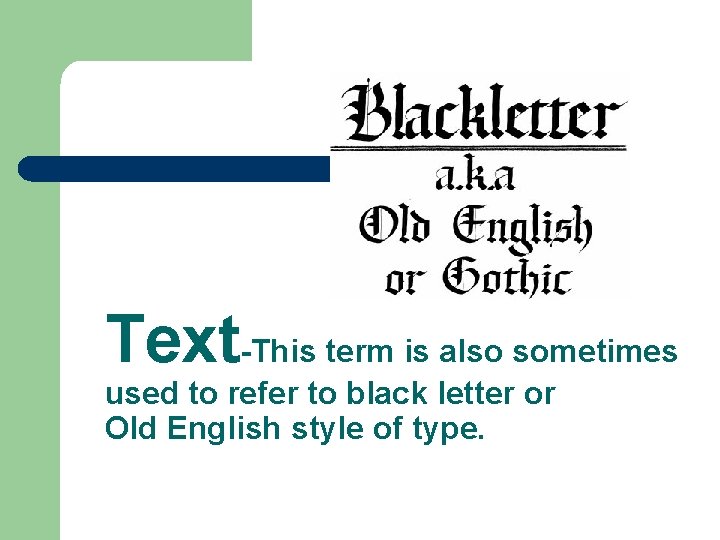
Text-This term is also sometimes used to refer to black letter or Old English style of type.

Body Copy The textual matter set in one face and point size, with a common leading and column width. (see text)

Point Size l l l A very small unit of measure used in the graphic communication industry. A point is 0. 0138”. 12 points equal 1 pica. Most “body copy” is set in 12 point type. 72 points is equal to 1 inch.

Pica l l l It is a unit of measurement. One of the main units of measurement used in the graphic communication industry. A pica is equal to 0. 1666”. 12 points is equal to 1 pica. There about 6 pica in one inch.

Type is measured from the baseline to the top of different parts of the letters.

Baseline is the imaginary line drawn along the bottom of body height letters. Descenders extend below the baseline. Also known as the "reading line. " The line along which the bases of all capital letters (and most lowercase letters) are positioned.

Cap Height The height of the uppercase letters within a font. (See also cap line. )

X-height the x-height is the height of the lowercase x in a given alphabet.

Uppercase (upper case) -CAPITAL letters of a font.

Lower Case. The small, non-capital letters.

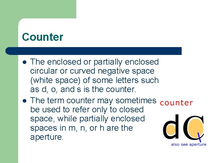
Counter l l The enclosed or partially enclosed circular or curved negative space (white space) of some letters such as d, o, and s is the counter. The term counter may sometimes be used to refer only to closed space, while partially enclosed spaces in m, n, or h are the aperture.

Serif- “Little feet” Small, finishing strokes on the ends of letters. Serif typefaces are usually used for text since the serifs form a link between letters that leads the eye across a line of type.

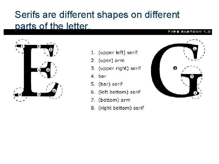
Serifs are different shapes on different parts of the letter.

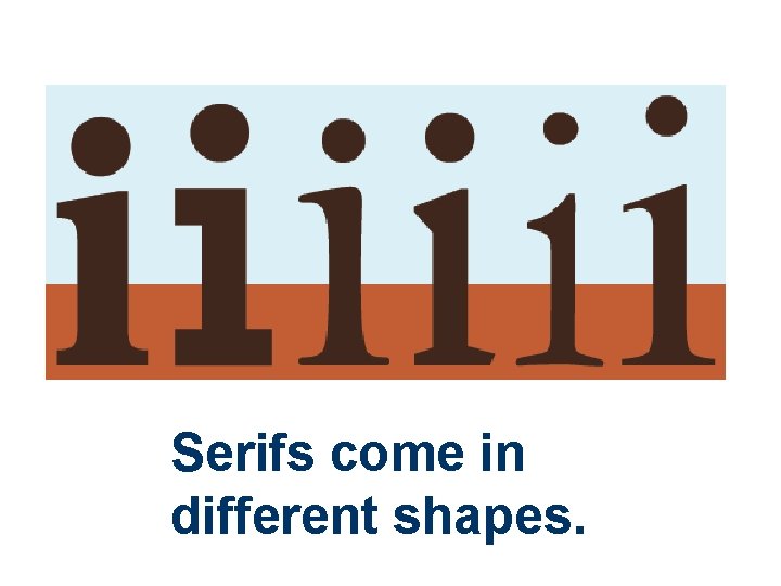
Serifs come in different shapes.

Serif typefaces are usually used for text (body copy) since the serifs form a link between letters that leads the eye across a line of type. Serif letters are easier to read.

Sans Serif- Means Without the little feet. (This is written in a sans serif type style. )

Ascender- That part of a lowercase letter that rises above the x-height, as in letters 'b', 'd', 'f', 'h', 'k', 't' and 'l'.

Descender- That portion of a letter that falls below the baseline, as in 'j', 'g', 'q', 'p' and 'y'.

Tracking inserts uniform spaces between characters to affect the width of selected words or entire blocks of text.

Kerning is the adjustment of space between any two letters, particularly letters that don’t naturally fit together. (It is particularly useful for improving the appearance of headlines and other display text. )

Kerning Moving pairs of letters either closer together or farther apart to adjust and improve the space between them.

Leading (rhymes with sledding) Originally a horizontal strip of soft metal (such as lead) used for vertical spacing between lines of type. Now meaning the vertical distance, negative or positive, of the baseline of one line to the baseline of the next from a solid setting.

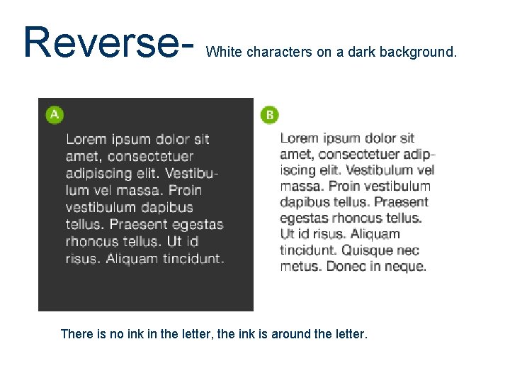
Reverse- White characters on a dark background. There is no ink in the letter, the ink is around the letter.