TYPOGRAPHY in Design OBJECTIVES 1 Understand typographic terms
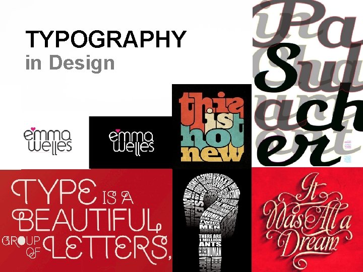
TYPOGRAPHY in Design
OBJECTIVES 1. Understand typographic terms and measurement systems. 2. Learn how to select typefaces appropriate to a project's design and communication goals. 3. Explore ways type can lend expression to a design. 4. Examine harmonious combinations of type with imagery and other design elements. 5. Learn how to appropriately use type when legibility is a factor.

Terms that Identify Type and Typographic Forms Typeface/Font or Font Family Design of single set of letterforms, unified by consistent properties Range of style variations based on single typeface design Type style Modifications in a typeface that create design variety (ie. Bold, Regular, Italic, Narrow… etc. )

Terms that Identify Type and Typographic Forms (continued) Letterform Style and form of each individual letter Character Individual letters, numerals, punctuation marks Lowercase Small, not capital letters Uppercase Capital letters

Terms Associated with Sizing and Adjusting Type Points used to measure height of type and distance between lines of type Lines of type measured by picas or inches Leading used to describe distance between lines of type.
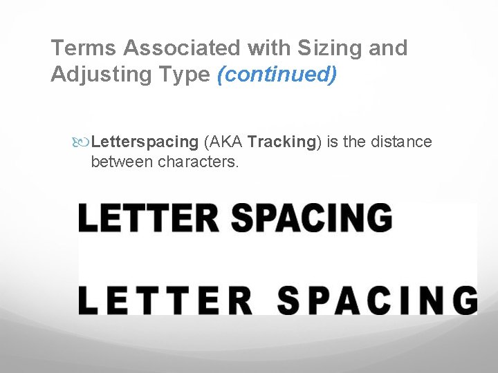
Terms Associated with Sizing and Adjusting Type (continued) Letterspacing (AKA Tracking) is the distance between characters.
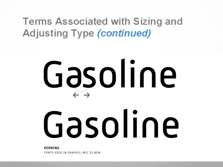
Terms Associated with Sizing and Adjusting Type (continued) Kerning involves making selective adjustments between the letters in a word.
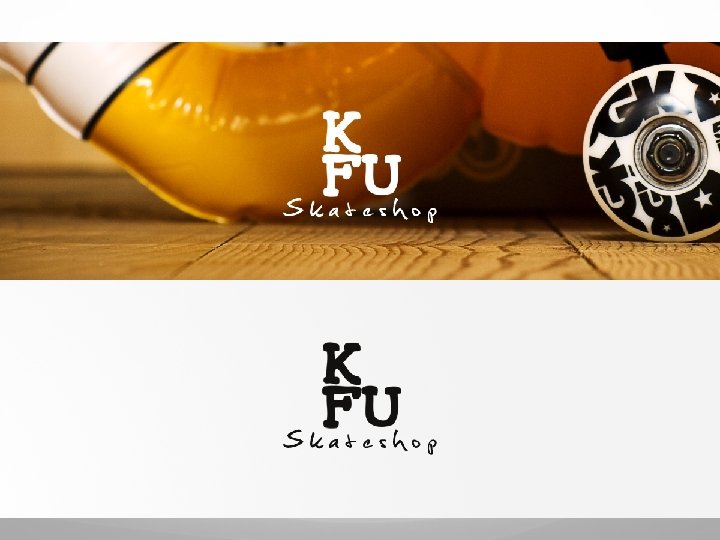
Legibility vs. Expression Text needs to be easy to read. Mastheads or logotypes need to project an attitude.
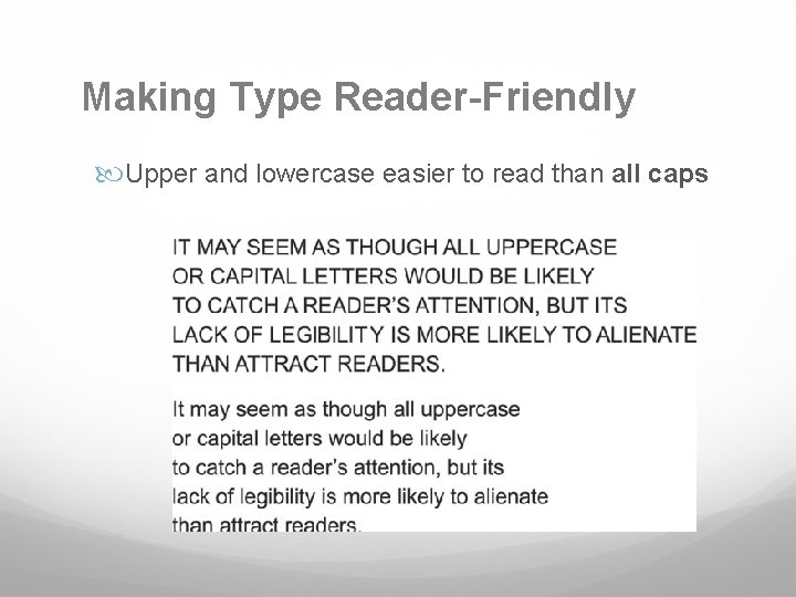
Making Type Reader-Friendly Upper and lowercase easier to read than all caps
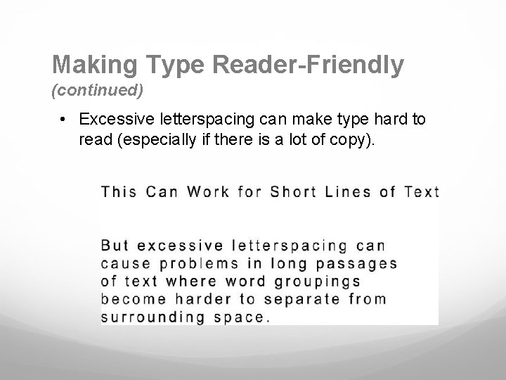
Making Type Reader-Friendly (continued) • Excessive letterspacing can make type hard to read (especially if there is a lot of copy).
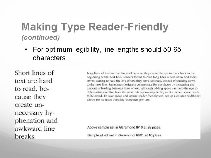
Making Type Reader-Friendly (continued) • For optimum legibility, line lengths should 50 -65 characters.
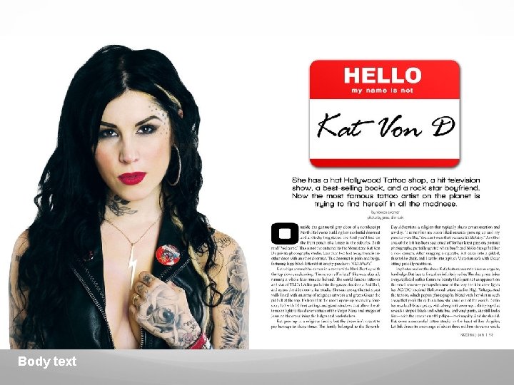
Ways of Categorizing Typefaces (continued) Text typefaces are used when there is a lot of text and when type needs to be legible. (used in body text) Body text

Ways of Categorizing Typeface (continued) Display typefaces are used when projecting attitude or mood (used in titling & expression) Display text
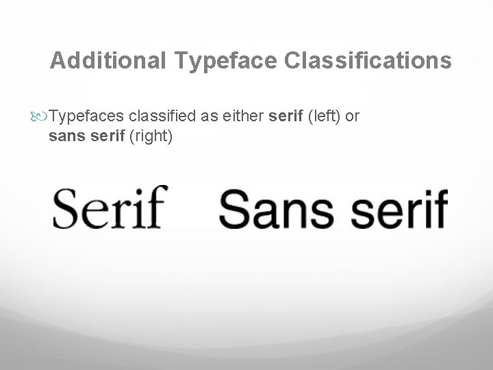
Additional Typeface Classifications Typefaces classified as either serif (left) or sans serif (right)

Using Type Expressively Typefaces can be used to express a broad range of moods and a time period.
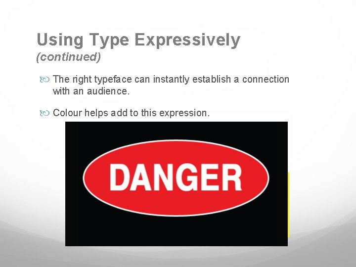
Using Type Expressively (continued) The right typeface can instantly establish a connection with an audience. Colour helps add to this expression.
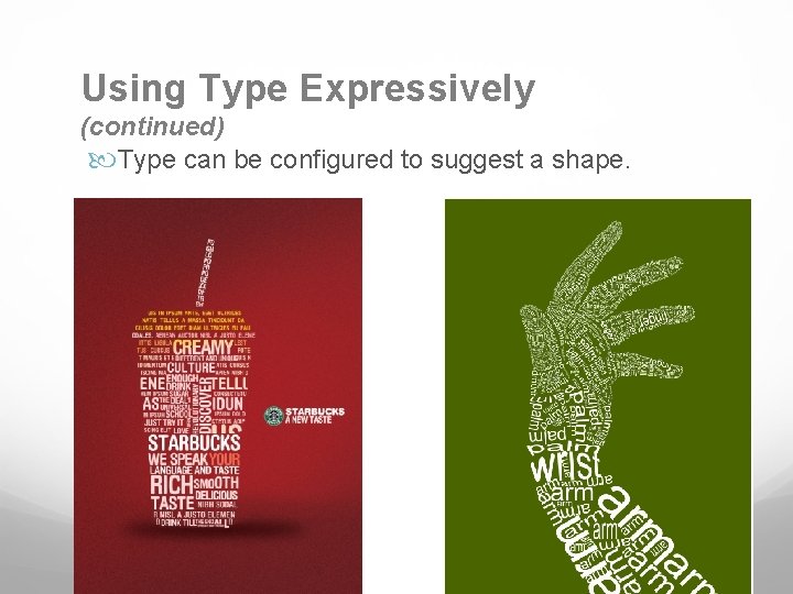
Using Type Expressively (continued) Type can be configured to suggest a shape.
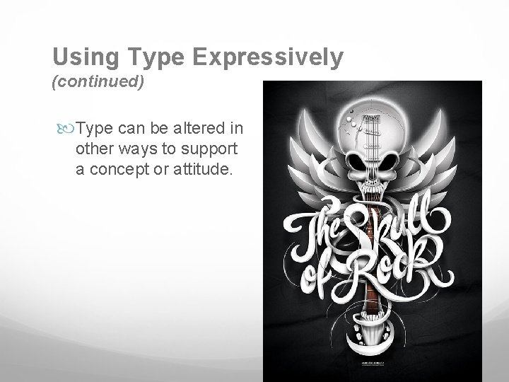
Using Type Expressively (continued) Type can be altered in other ways to support a concept or attitude.
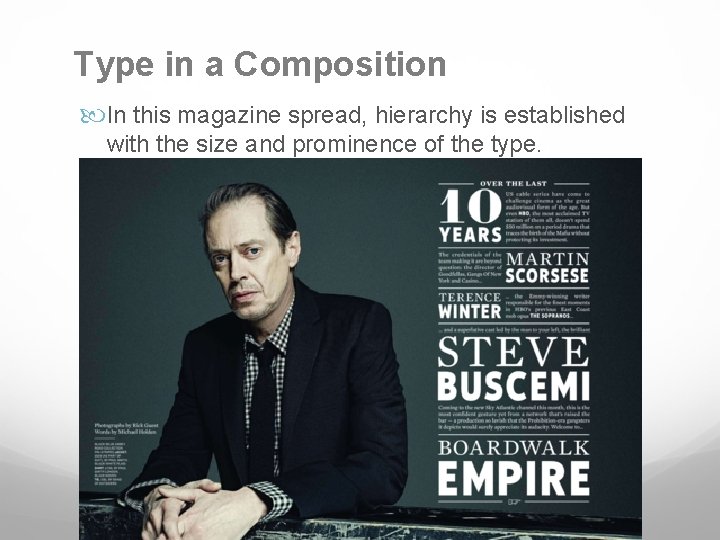
Type in a Composition In this magazine spread, hierarchy is established with the size and prominence of the type.
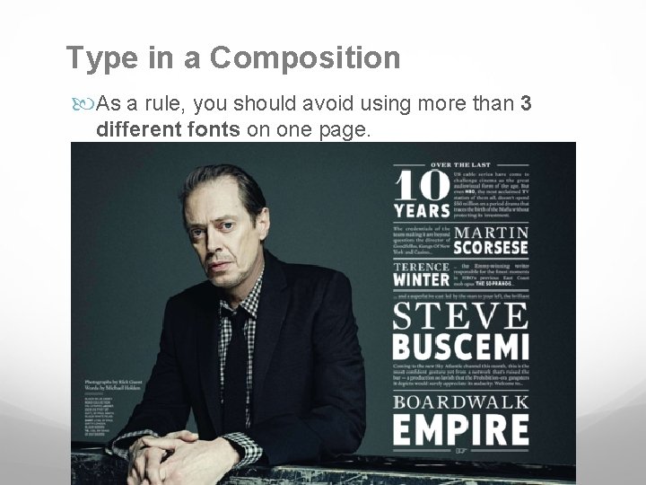
Type in a Composition As a rule, you should avoid using more than 3 different fonts on one page.
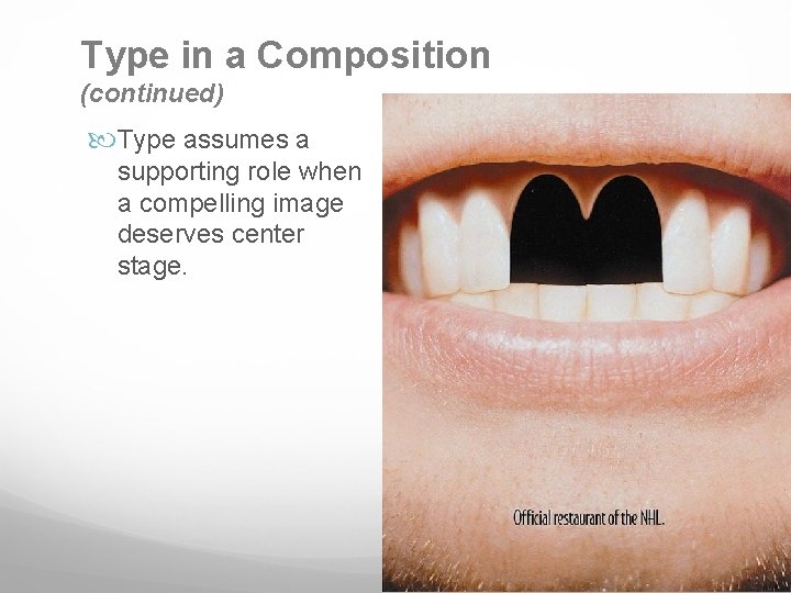
Type in a Composition (continued) Type assumes a supporting role when a compelling image deserves center stage.
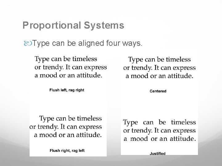
Proportional Systems Type can be aligned four ways.
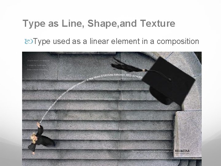
Type as Line, Shape, and Texture Type used as a linear element in a composition
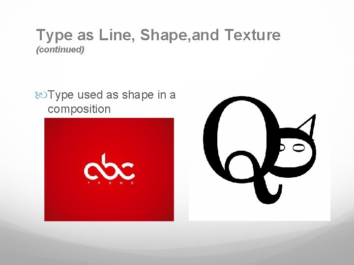
Type as Line, Shape, and Texture (continued) Type used as shape in a composition
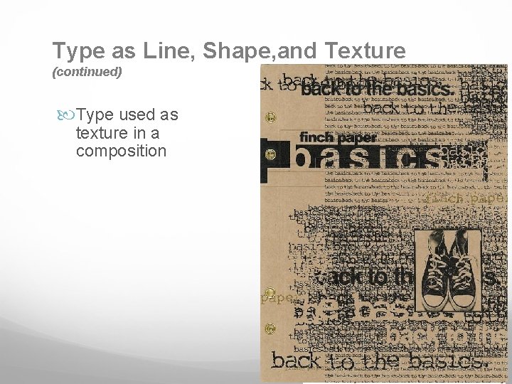
Type as Line, Shape, and Texture (continued) Type used as texture in a composition
SUMMARY Type's role in design is communicating content. Type can also function as a compositional element. Expressive typography can add emotional emphasis to a design's message. Decorative or hard-to-read typefaces should be used when few words are involved. Choose highly legible typefaces for large bodies of text. Type can function in a design composition as shape, line, or texture. Type can also serve as a unifying element in a composition.
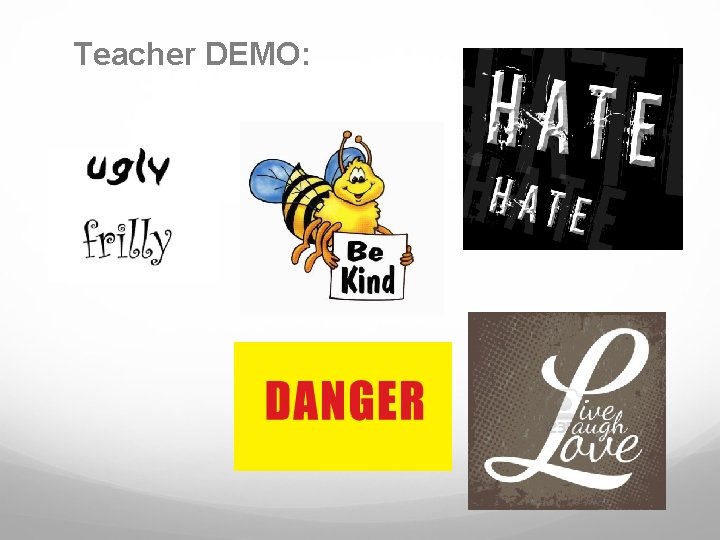
Teacher DEMO:
- Slides: 27