TYPOGRAPHY Cartographic Design for GIS Geog 340 Prof


- Slides: 45

TYPOGRAPHY Cartographic Design for GIS (Geog. 340) Prof. Hugh Howard American River College

INTRODUCTION to TYPOGRAPHY

TYPOGRAPHY • • • Type, or text, refers to the words that appear on maps Typography is the art or process of specifying, arranging, and designing type Well-designed type can make a map easier to understand more attractive

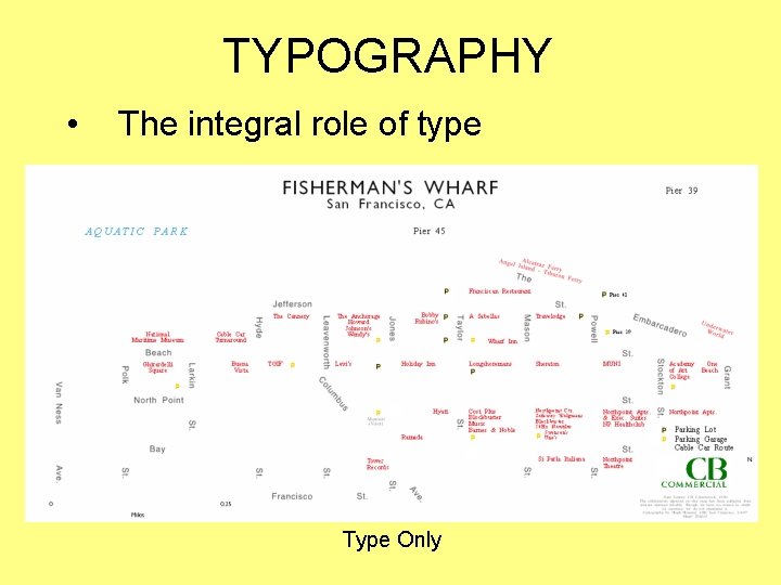
TYPOGRAPHY • Several map elements are composed partly of type, and others are composed entirely of type – Type can be considered a special symbol, or even a map element in its own right • Type plays in indispensable role in cartography – But is often taken for granted, or treated as an afterthought

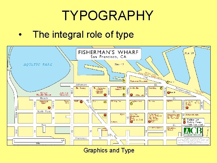
TYPOGRAPHY • The integral role of type Graphics and Type

TYPOGRAPHY • The integral role of type Type Only

TYPOGRAPHY • The integral role of type (cont. ) Graphics Only

TYPOGRAPHY • The rules and guidelines for the use of type in cartography are derived from general rules of typography – But have been modified over time to reflect the specific purposes of mapmaking – Fortunately, these rules and guidelines are relatively well defined

TYPOGRAPHY • Build a foundation of typographic skills by following the specific rules and guidelines presented here – Consider alternative approaches once you master these rules and guidelines – Always be prepared to explain or defend your typographical decisions

CHARACTERISTICS of TYPE

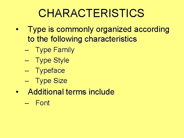
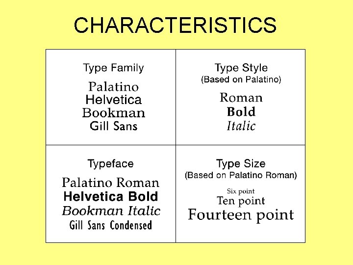
CHARACTERISTICS • Type is commonly organized according to the following characteristics – – • Type Family Type Style Typeface Type Size Additional terms include – Font

CHARACTERISTICS

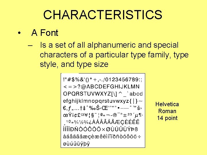
CHARACTERISTICS • A Font – Is a set of all alphanumeric and special characters of a particular type family, type style, and type size Helvetica Roman 14 point

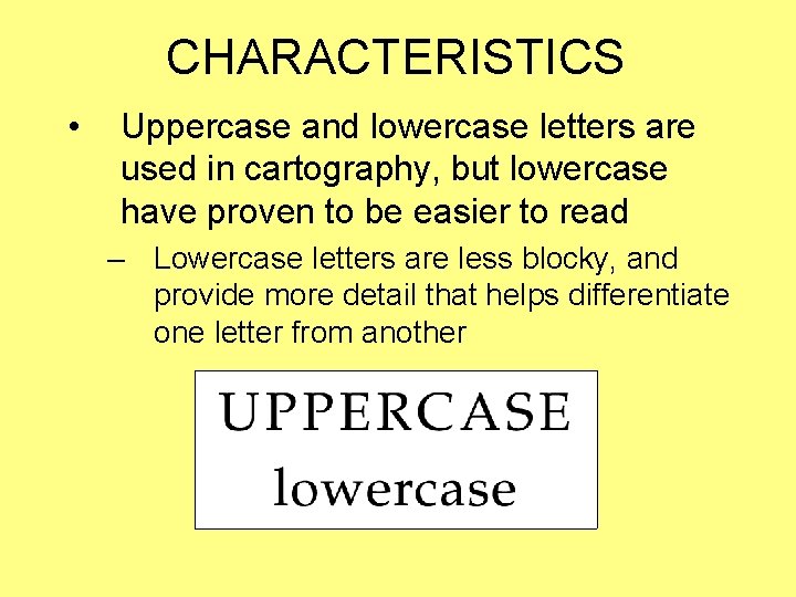
CHARACTERISTICS • Uppercase and lowercase letters are used in cartography, but lowercase have proven to be easier to read – Lowercase letters are less blocky, and provide more detail that helps differentiate one letter from another

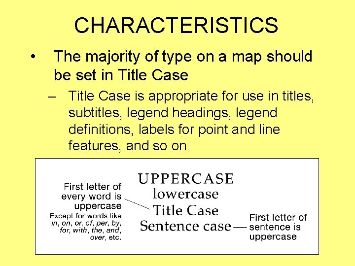
CHARACTERISTICS • The majority of type on a map should be set in Title Case – Title Case is appropriate for use in titles, subtitles, legend headings, legend definitions, labels for point and line features, and so on

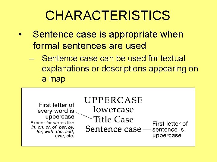
CHARACTERISTICS • Sentence case is appropriate when formal sentences are used – Sentence case can be used for textual explanations or descriptions appearing on a map

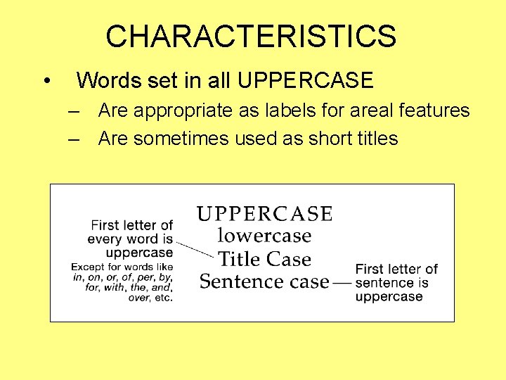
CHARACTERISTICS • Words set in all UPPERCASE – Are appropriate as labels for areal features – Are sometimes used as short titles

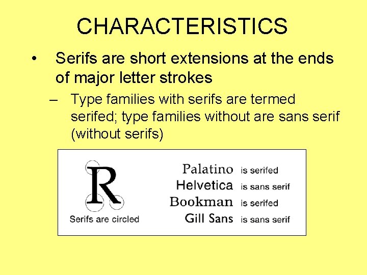
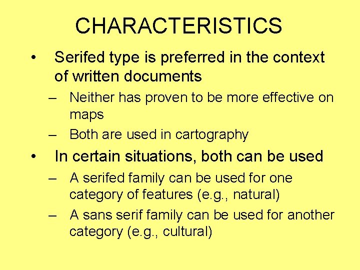
CHARACTERISTICS • Serifs are short extensions at the ends of major letter strokes – Type families with serifs are termed serifed; type families without are sans serif (without serifs)

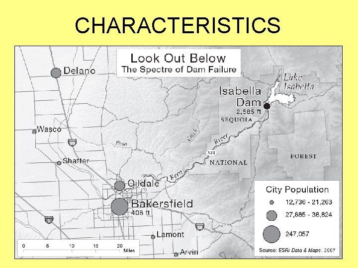
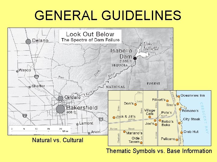
CHARACTERISTICS • Serifed type is preferred in the context of written documents – Neither has proven to be more effective on maps – Both are used in cartography • In certain situations, both can be used – A serifed family can be used for one category of features (e. g. , natural) – A sans serif family can be used for another category (e. g. , cultural)

CHARACTERISTICS

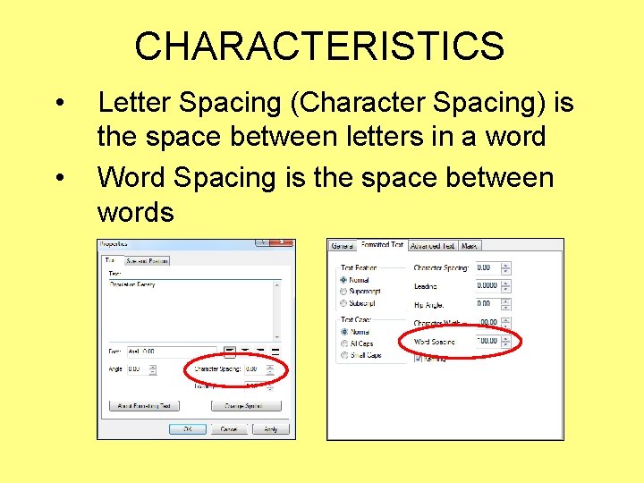
CHARACTERISTICS • • Letter Spacing (Character Spacing) is the space between letters in a word Word Spacing is the space between words

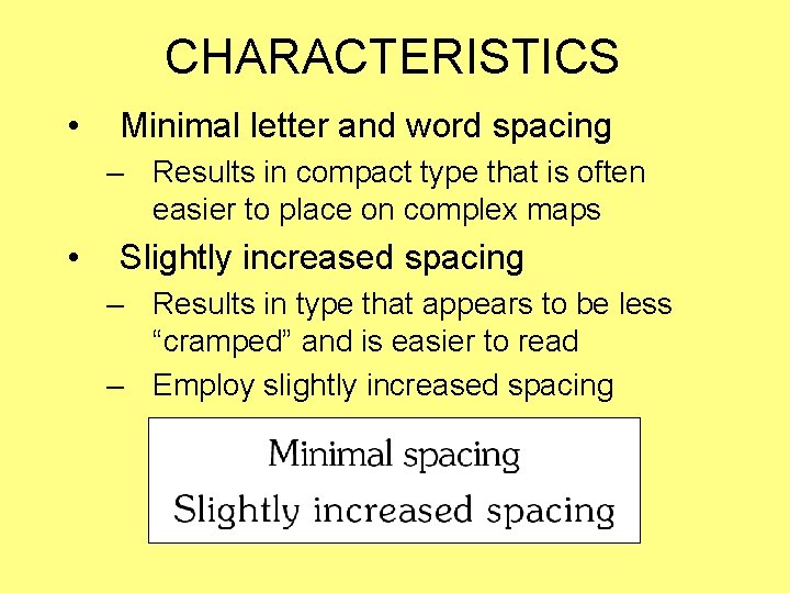
CHARACTERISTICS • Minimal letter and word spacing – Results in compact type that is often easier to place on complex maps • Slightly increased spacing – Results in type that appears to be less “cramped” and is easier to read – Employ slightly increased spacing

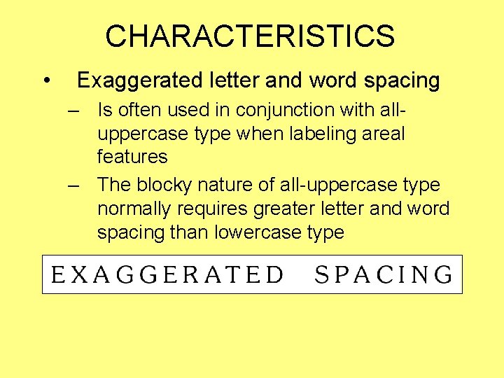
CHARACTERISTICS • Exaggerated letter and word spacing – Is often used in conjunction with alluppercase type when labeling areal features – The blocky nature of all-uppercase type normally requires greater letter and word spacing than lowercase type

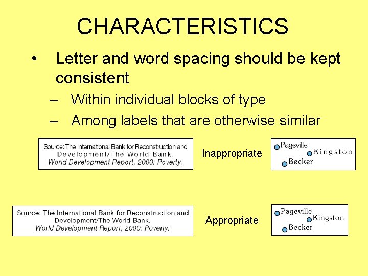
CHARACTERISTICS • Letter and word spacing should be kept consistent – Within individual blocks of type – Among labels that are otherwise similar Inappropriate Appropriate

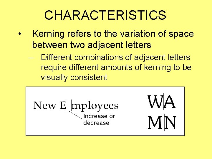
CHARACTERISTICS • Kerning refers to the variation of space between two adjacent letters – Different combinations of adjacent letters require different amounts of kerning to be visually consistent

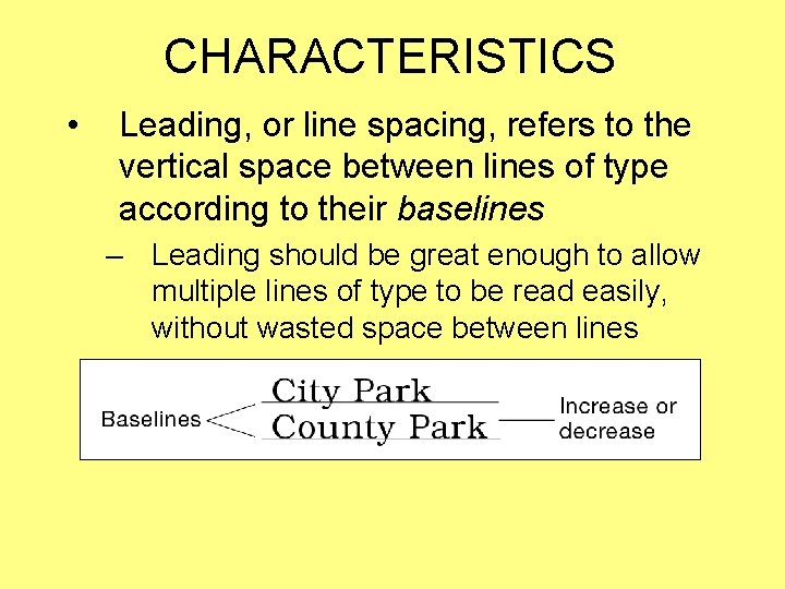
CHARACTERISTICS • Leading, or line spacing, refers to the vertical space between lines of type according to their baselines – Leading should be great enough to allow multiple lines of type to be read easily, without wasted space between lines

GENERAL TYPOGRAPHIC GUIDELINES

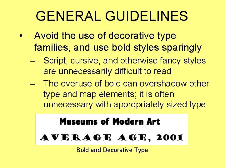
GENERAL GUIDELINES • Avoid the use of decorative type families, and use bold styles sparingly – Script, cursive, and otherwise fancy styles are unnecessarily difficult to read – The overuse of bold can overshadow other type and map elements; it is often unnecessary with appropriately sized type Bold and Decorative Type

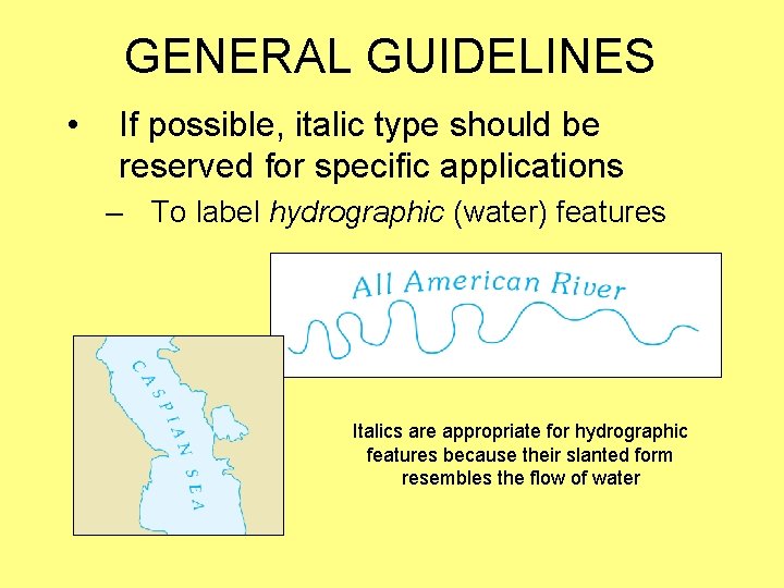
GENERAL GUIDELINES • If possible, italic type should be reserved for specific applications – To label hydrographic (water) features Italics are appropriate for hydrographic features because their slanted form resembles the flow of water

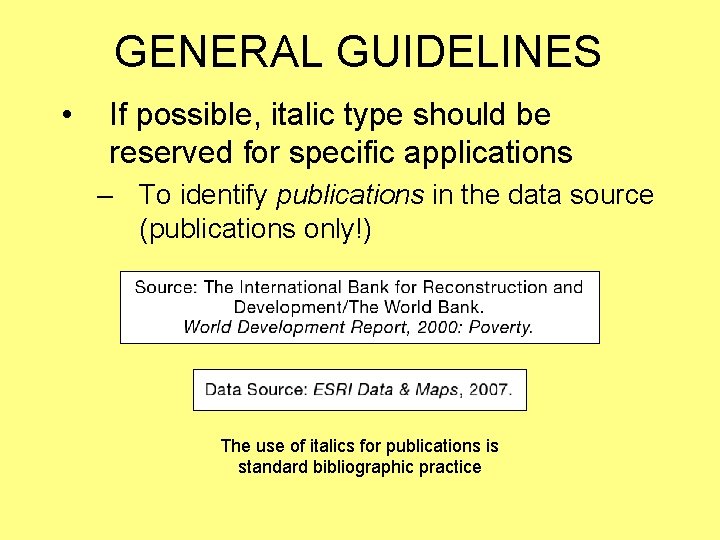
GENERAL GUIDELINES • If possible, italic type should be reserved for specific applications – To identify publications in the data source (publications only!) The use of italics for publications is standard bibliographic practice

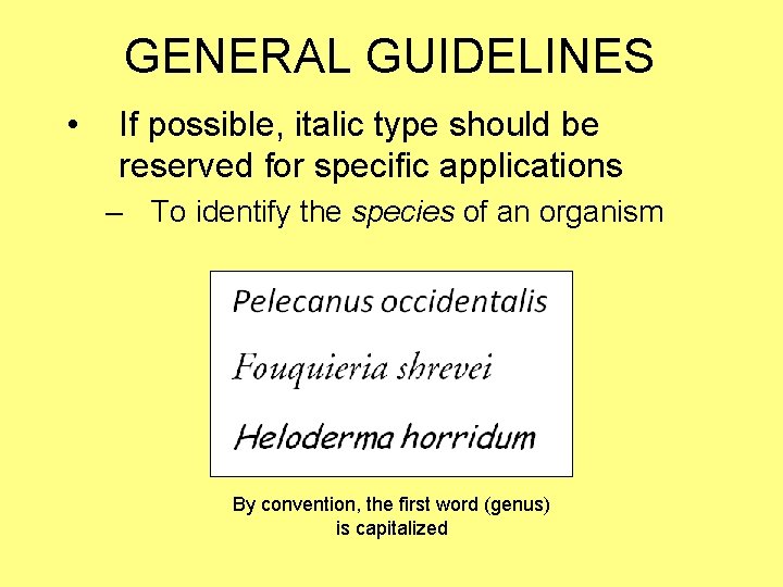
GENERAL GUIDELINES • If possible, italic type should be reserved for specific applications – To identify the species of an organism By convention, the first word (genus) is capitalized

GENERAL GUIDELINES • Avoid using more than two type families on a given map – Simpler maps can be limited to one – For consistency, all map elements should employ the same type family – If two type families are required, choose families that are distinctly different—one serifed and one sans serif, for example

GENERAL GUIDELINES Natural vs. Cultural Thematic Symbols vs. Base Information

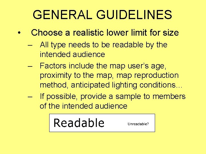
GENERAL GUIDELINES • Choose a realistic lower limit for size – All type needs to be readable by the intended audience – Factors include the map user’s age, proximity to the map, map reproduction method, anticipated lighting conditions… – If possible, provide a sample to members of the intended audience

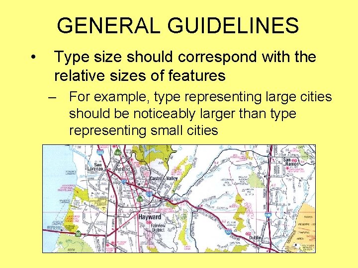
GENERAL GUIDELINES • Type size should correspond with the relative sizes of features – For example, type representing large cities should be noticeably larger than type representing small cities

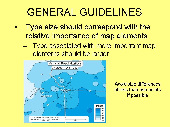
GENERAL GUIDELINES • Type size should correspond with the relative importance of map elements – Type associated with more important map elements should be larger Avoid size differences of less than two points if possible

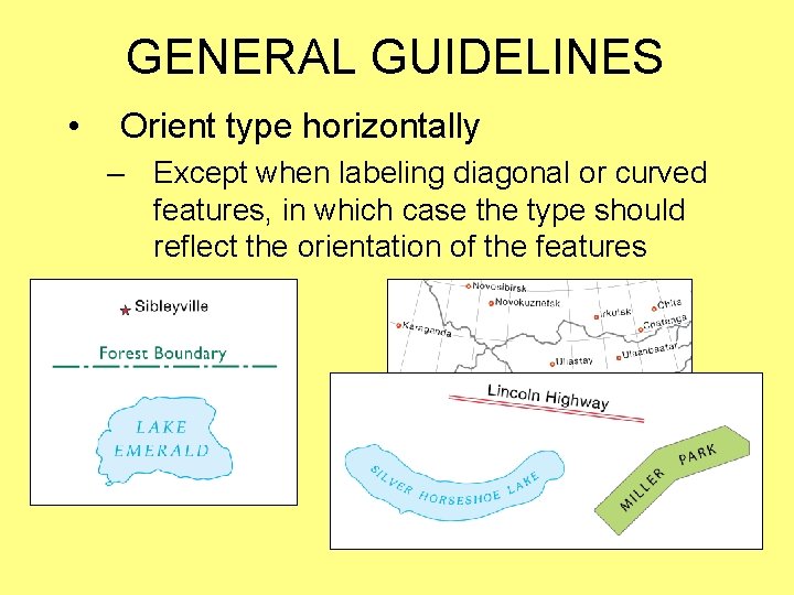
GENERAL GUIDELINES • Orient type horizontally – Except when labeling diagonal or curved features, in which case the type should reflect the orientation of the features

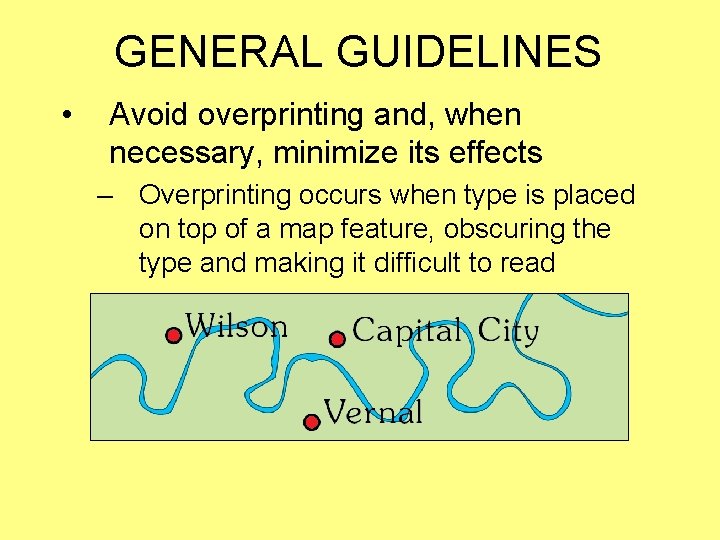
GENERAL GUIDELINES • Avoid overprinting and, when necessary, minimize its effects – Overprinting occurs when type is placed on top of a map feature, obscuring the type and making it difficult to read

GENERAL GUIDELINES • The effects of overprinting can be minimized through the use of – Masks – Halos – Callouts

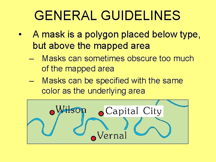
GENERAL GUIDELINES • A mask is a polygon placed below type, but above the mapped area – Masks can sometimes obscure too much of the mapped area – Masks can be specified with the same color as the underlying area

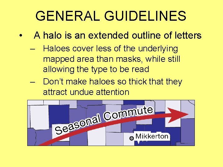
GENERAL GUIDELINES • A halo is an extended outline of letters – Haloes cover less of the underlying mapped area than masks, while still allowing the type to be read – Don’t make haloes so thick that they attract undue attention

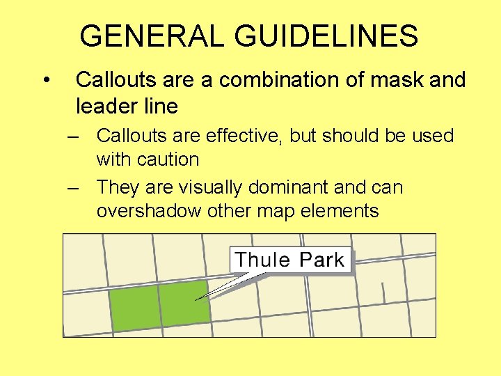
GENERAL GUIDELINES • Callouts are a combination of mask and leader line – Callouts are effective, but should be used with caution – They are visually dominant and can overshadow other map elements

GENERAL GUIDELINES • Critically evaluate and apply type specifications – Do not passively accept the default settings provided by software applications – Instead, consider the purpose of each unit of type in the context of the map, and apply type specifications accordingly

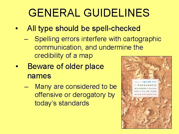
GENERAL GUIDELINES • All type should be spell-checked – Spelling errors interfere with cartographic communication, and undermine the credibility of a map • Beware of older place names – Many are considered to be offensive or derogatory by today’s standards

TYPOGRAPHY Cartographic Design for GIS (Geog. 340) Prof. Hugh Howard American River College