Type Motion The frame is the plane through


- Slides: 27

Type & Motion

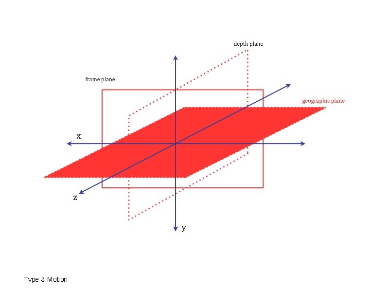
The frame is the plane through which the audience views the action. The x-axis is horizontal The y-axis is vertical z-axis is spatial Type & Motion

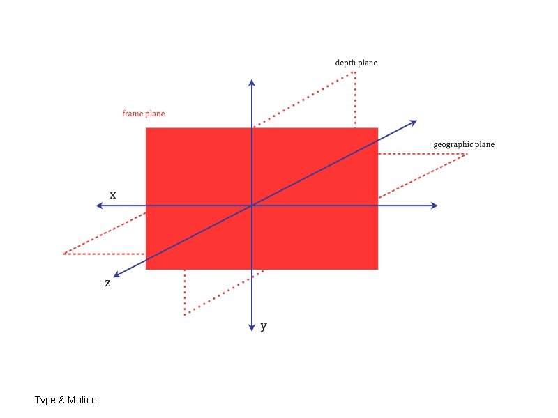
The frame is the plane through which the audience views the action. The x-axis is horizontal = frame plane The y-axis is vertical z-axis is spatial Type & Motion

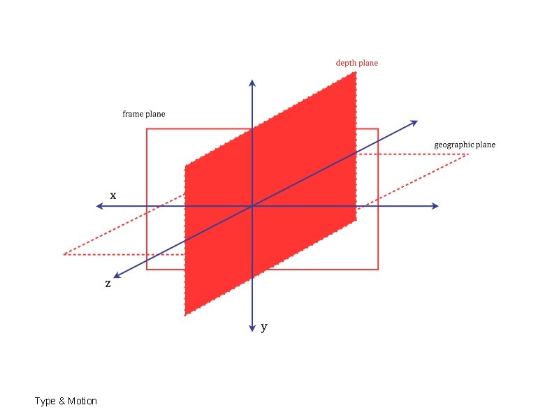
The frame is the plane through which the audience views the action. The x-axis is horizontal = frame plane The y-axis is vertical = the depth plane z-axis is spatial Type & Motion

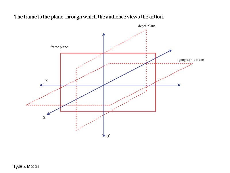
The frame is the plane through which the audience views the action. The x-axis is horizontal = frame plane The y-axis is vertical = the depth plane z-axis is spatial = geographic plane Type & Motion

The frame is the plane through which the audience views the action. Type & Motion

Type & Motion

Type & Motion

Type & Motion

Type & Motion

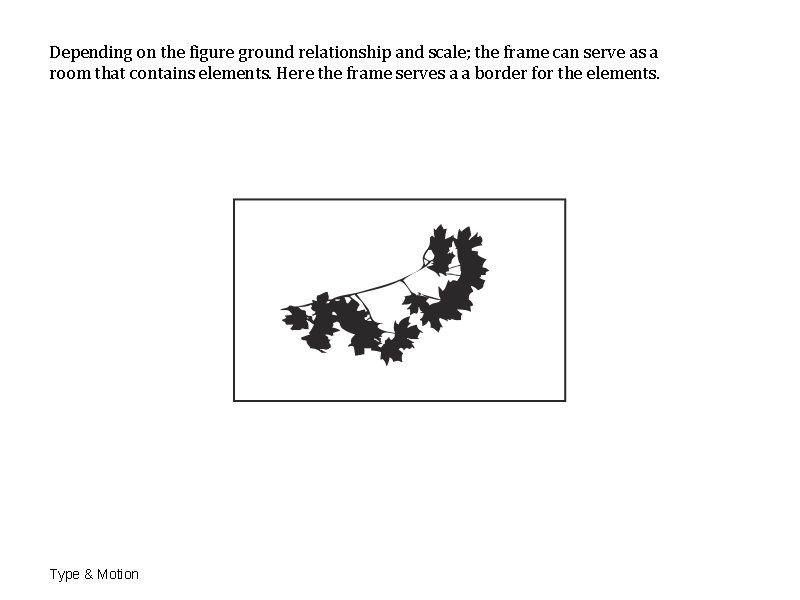
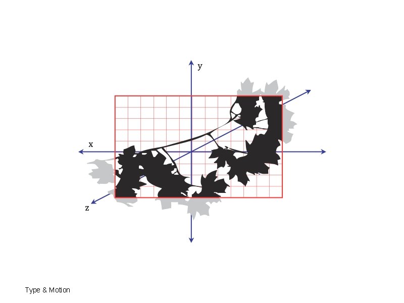
Depending on the figure ground relationship and scale; the frame can serve as a room that contains elements. Here the frame serves a a border for the elements. Type & Motion

Type & Motion

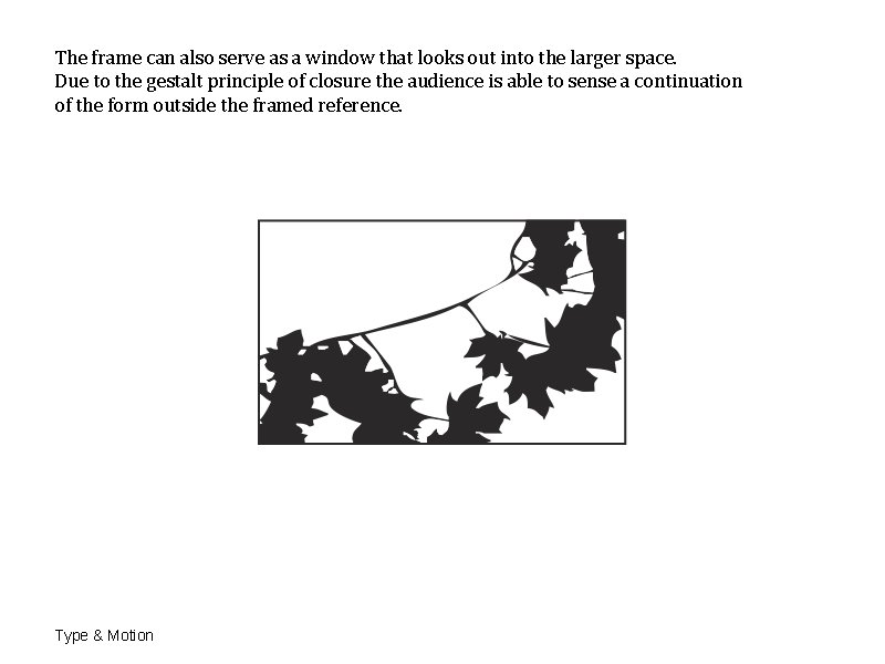
The frame can also serve as a window that looks out into the larger space. Due to the gestalt principle of closure the audience is able to sense a continuation of the form outside the framed reference. Type & Motion

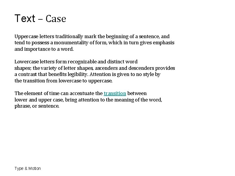
Text – Case Uppercase letters traditionally mark the beginning of a sentence, and tend to possess a monumentality of form, which in turn gives emphasis and importance to a word. Lowercase letters form recognizable and distinct word shapes; the variety of letter shapes, ascenders and descenders provides a contrast that benefits legibility. Attention is given to no style by the transition from lowercase to uppercase. The element of time can accentuate the transition between lower and upper case, bring attention to the meaning of the word, phrase, or sentence. Type & Motion

Text – Face The visual character of a typeface, which differentiates it from other typefaces, can give a word a particular personality. Altering typeface choice in rapid editing plays with the notion of style. Type & Motion

Text – Size Visual hierarchy is most easily achieved by altering the size of words and letters on the screen. The diminishing size of the words further emphasizes “nothingness, ” while the increase size of the word “style” makes a forceful statement. The relative size also affects the spatial relationship between letters and words. Type & Motion

Text – Weight The thickness of the stroke relative to the height determines the weight of the letter. Enhancing the meaning of nothing is achieved by the bolding the weight of the text around the word “nothing. ” It is further emphasized by the transition of the word “without” to extra bold. Type & Motion

Text – Supporting Shapes The use of rule lines can add dynamic and highly active relationships in motion-graphics. Diagonal lines and curved lines can also help to establish a visual hierarchy and rhythmic patterns of movement through out your design. The addition of symbols can create a lively interpretation of text and other dynamic activity. Similar to lines, shapes can add a dynamic and highly active relationships to the graphic sequence. Shapes can define and structure the composition space, and enhance the figure-ground relationship. Type & Motion

Text – Posture The type posture can also be altered by the transition of roman to italic form. Italic and oblique typefaces posses a kinetic quality because of their slant to the right. Type & Motion

Time–Motion Direction In static communication design, direction refers to the way the audience reads a composition. The letters are static, the reading eye moves. When we refer to the direction in dynamic–motion–graphics, we are also adding the literal definition of movement. Direction is the course or line of the movement. Direction can be straight ( horizontal, vertical, diagonal), curved, and spatial (advancing, receding). Type & Motion

Time–Motion Orientation is the directional position of the viewer in relation to the action. The position of the type to the viewer could be upright, inverted, angled. Type & Motion

Time–Motion Rotation is the movement around an anchor or centre point. this can occur with single or multiple elements with in the viewing frame. It can also occur with the entire viewing frame itself. Rotation can occur on a single point on the x-axis, resulting in a flat rotation or it can y-axis or z-axis resulting in a spatial rotation or rotating around all the axis resulting in a random feeling of rotation. Type & Motion

Time–Motion Proximity is the distance between elements in the viewing frame of activity. Proximity has the most relevance in situations where the elements must be read in specific sequence, such as letters and words in text. Proximity includes the distance between letters, words, and lines of type created by altering the kerning, tracking and leading relationship. Type & Motion

Time–Motion Proximity Sequential proximity ensures that the appearance if each word in the text appears in the exact, or a relatively close vicinity of the word that preceded it. The intent should be to allow the eye of the audience to follow a consistent path and create a visual flow. Words should not appear in random locations on the screen, as this makes it difficult for the eye to assemble the text, which causes disorientation and impairs legibility. This problem will increase as the physical size of the frame increase. Transitions can happen through the centre of the screen, through a single direction or flow from top to bottom or randomly in a clear path. Type & Motion

Time–Motion Grouping Related to the concept of proximity is grouping. A with proximity, grouping applies to both directional and transitional situations, bit it is concerned with the balance ( symmetrical or asymmetrical) and disposition (consonant and dissonant) of elements within , and outside, the space of the viewing frame. Symmetry implies correct proportion, comfort, and visual harmony. The frame consists of elements divided into equal parts or shape and size, and similar position of the point, line, or plane of division. Asymmetry creates a visual tension through contrast of foreground elements and background. Symmetrical Direction Asymmetrical Direction Symmetrical Transition Asymmetrical Transition Type & Motion

Time–Motion Grouping Consonant implies contraction, and a consonant disposition occurs when the disposition of elements if tightly arranged, or all the movement occurs within the frame. Disposition is the arrangement of graphic elements in relation to each other and the edge of the frame. In cinematic terms, an open frame is one in which activity takes place outside the frame and view of the audience —frame as window. A closed frame is one in which all of the activity is within the frame and view of the audience—frame as room. Type & Motion

Time–Motion Grouping Particular to motion graphics is the ability to alter the disposition over time. Elements entering from outside the frame in dissonant arrangement can maneuver themselves into a consonant composition, and vice versa. Dissonant implies expansion, and a dissonant disposition occurs when the activity of the elements breaks the boundaries of the frame. Moving: Dissonant —Consonant Moving: Consonant —Dissonant Type & Motion