
Type construction Stylescategories Serif Slab serif Sometimes ink
Type- construction

Styles/categories - Serif – Slab serif • Sometimes ink that would run over and it would puddle and bleed- serifs helped to hide these marks. • Serifs also make it easier to read, draws the eye in a continuous line, especially in larger texts
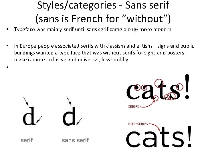
Styles/categories - Sans serif (sans is French for “without”) • Typeface was mainly serif until sans serif came along- more modern • In Europe people associated serifs with classism and elitism – signs and public buildings wanted a type face that was without serifs for signs and posters- make it more inclusive and universal, less snobby. •
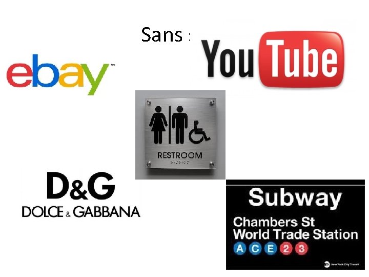
Sans serif

Baseline, Midline, x height, caps height • Baseline- imaginary horizontal line on which the bases of the letters sit • Midline- half the distance between baseline and cap height • X-height- the height of the lower-case letters, excluding ascenders and descenders • Caps height- the height of the upper-case letters
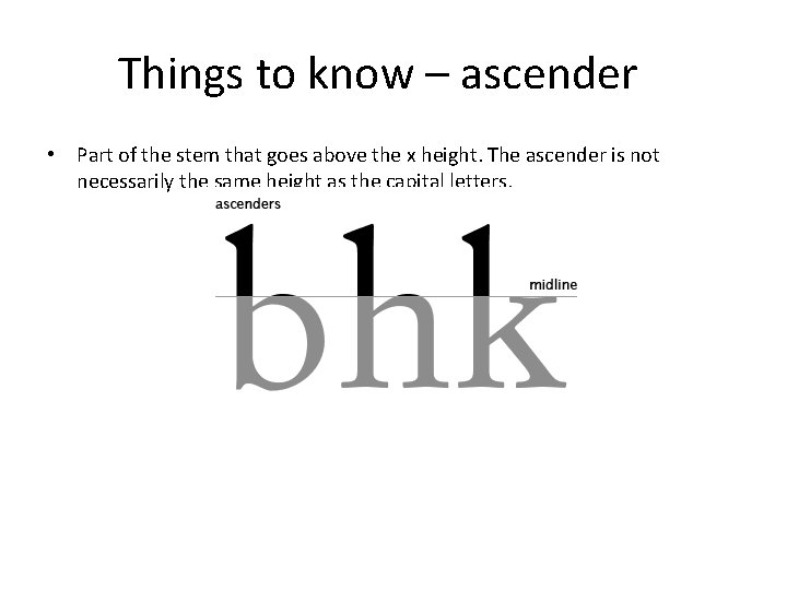
Things to know – ascender • Part of the stem that goes above the x height. The ascender is not necessarily the same height as the capital letters.
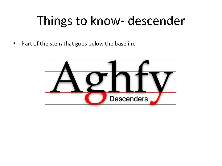
Things to know- descender • Part of the stem that goes below the baseline
• Stem- the main vertical stroke of a letter ( T ) • Apex- point at the top of a letter where two strokes or two stems meet ( A ) • Vertex- point at the bottom of a letter where two strokes or two stems meet ( M V ) • Arm- horizontal or oblique stroke from a stem (F Y) • Leg– downward stroke of a letter like ( R K ) • Shoulder- open curved stroke joining a stem to another part of a letter (n h)
Choosing a font • Serif vs sans serif • • http: //visual. ly/serif-vs-sans-final-battle
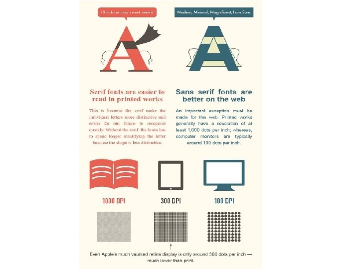
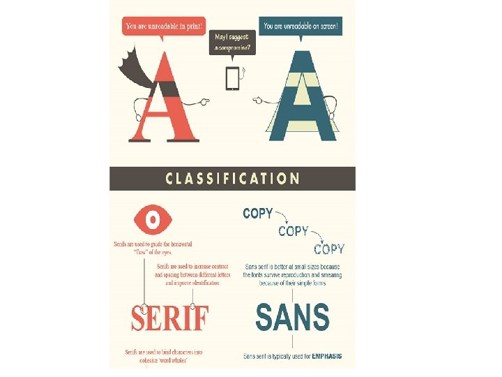
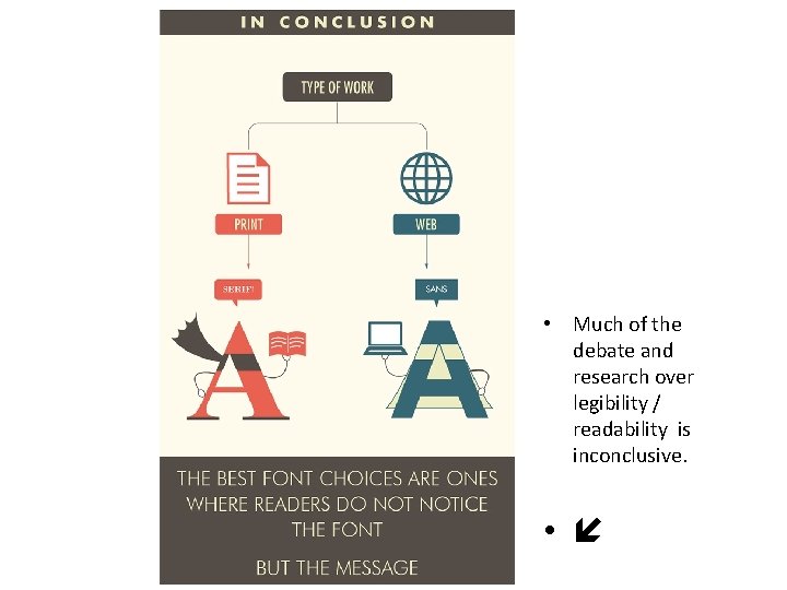
• Much of the debate and research over legibility / readability is inconclusive. •
- Slides: 13