Tutorial 4 Creating Special Effects with CSS Selector
- Slides: 33

Tutorial 4 Creating Special Effects with CSS

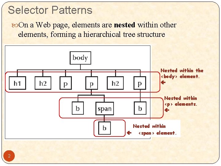
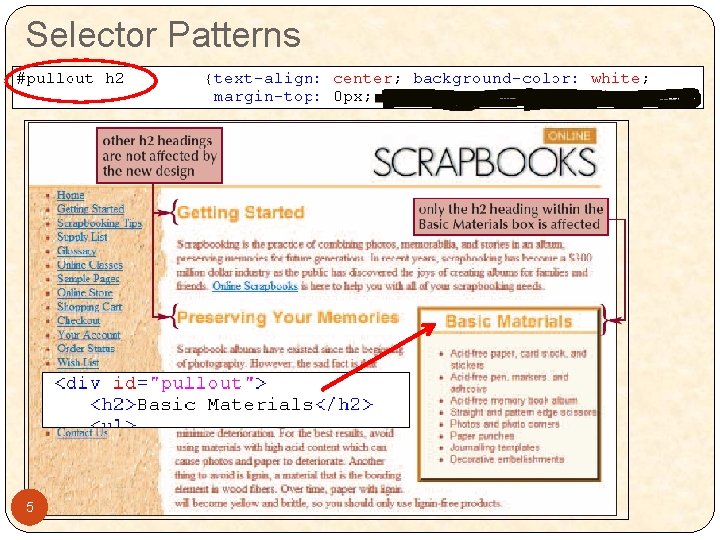
Selector Patterns On a Web page, elements are nested within other elements, forming a hierarchical tree structure Nested within the <body> element. Nested within <p> elements. Nested within <span> element. 2

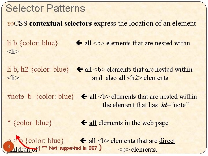
Selector Patterns CSS contextual selectors express the location of an element li b {color: blue} all <b> elements that are nested withn <li> li b, h 2 {color: blue} all <b> elements that are nested within <li> and also all <h 2> elements #note b {color: blue} all <b> elements that are nested within the element that has id=“note” * {color: blue} p > b {color: blue} all elements in the web page all <b> elements that are direct 3 children of ( ** Not supported in IE 7 ) <p> elements.

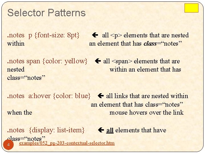
Selector Patterns. notes p {font-size: 8 pt} within all <p> elements that are nested an element that has class=“notes” . notes span {color: yellow} all <span> elements that are nested class=“notes” within an element that has . notes a: hover {color: blue} all links that are nested within when the . notes {display: list-item} class=“notes” 4 an element that has class=“notes” mouse hovers over the link all elements that have examples/052_pg-203 -contextual-selector. htm

Selector Patterns 5

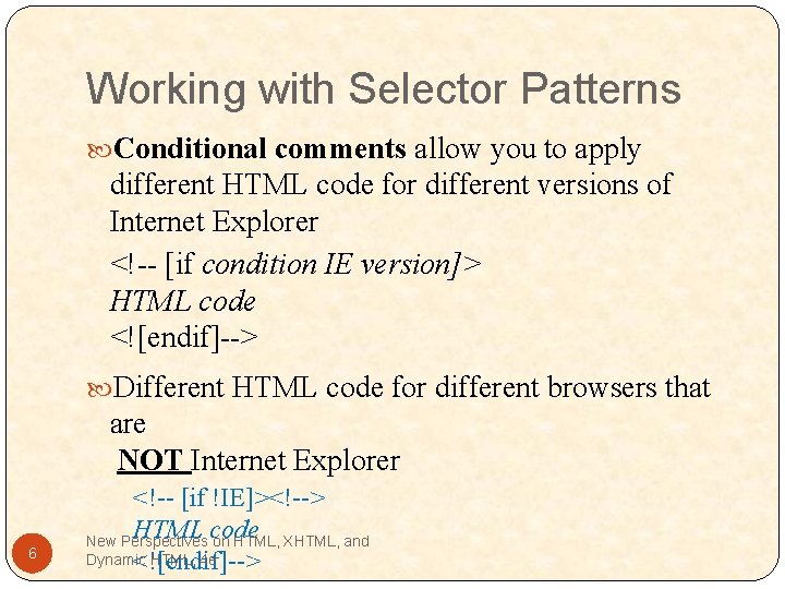
Working with Selector Patterns Conditional comments allow you to apply different HTML code for different versions of Internet Explorer <!-- [if condition IE version]> HTML code <![endif]--> Different HTML code for different browsers that are NOT Internet Explorer 6 <!-- [if !IE]><!--> HTML code New Perspectives on HTML, XHTML, and Dynamic HTML, 4 e <![endif]-->

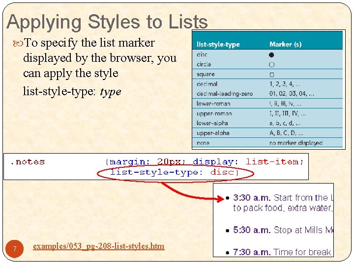
Applying Styles to Lists To specify the list marker displayed by the browser, you can apply the style list-style-type: type 7 examples/053_pg-208 -list-styles. htm

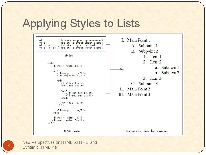
Applying Styles to Lists 8 New Perspectives on HTML, XHTML, and Dynamic HTML, 4 e

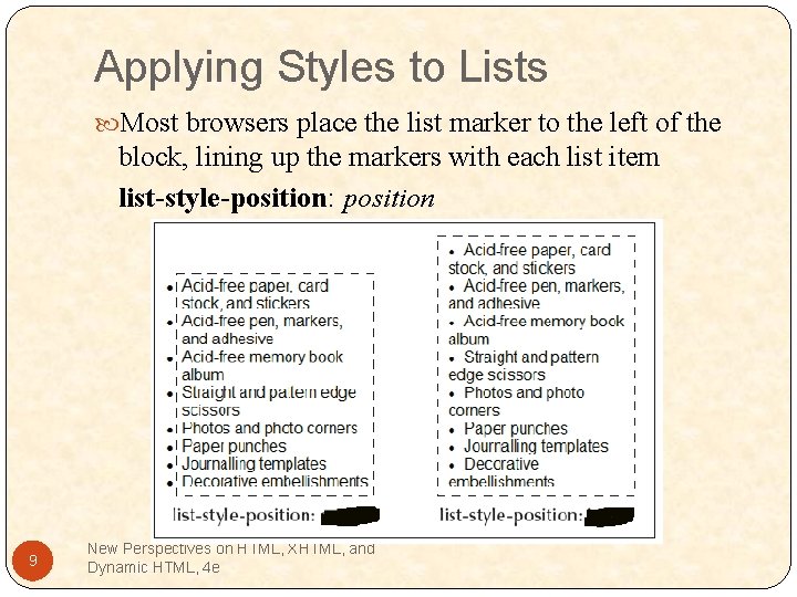
Applying Styles to Lists Most browsers place the list marker to the left of the block, lining up the markers with each list item list-style-position: position 9 New Perspectives on HTML, XHTML, and Dynamic HTML, 4 e

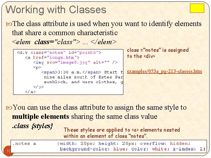
Working with Classes The class attribute is used when you want to identify elements that share a common characteristic <elem class="class">. . . </elem> class =“notes” is assigned to the <div> examples/053 a_pg-213 -classes. htm You can use the class attribute to assign the same style to multiple elements sharing the same class value. class {styles} These styles are applied to <a> elements nested within an element of class “notes”. 10

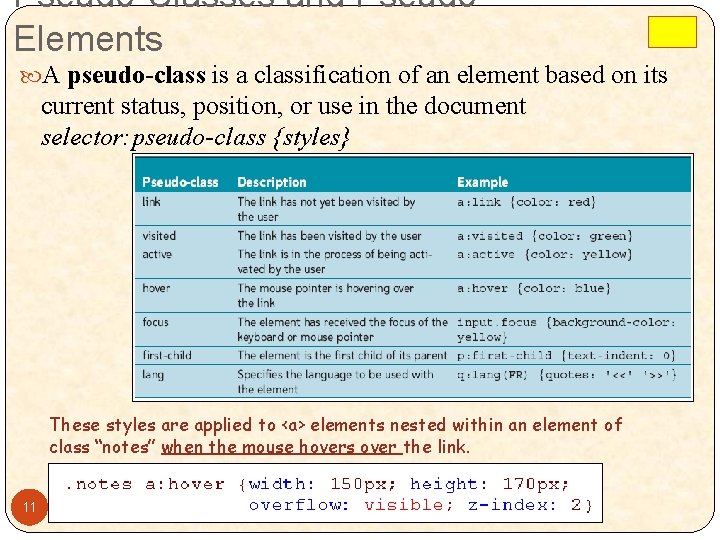
Pseudo-Classes and Pseudo. Elements A pseudo-class is a classification of an element based on its current status, position, or use in the document selector: pseudo-class {styles} These styles are applied to <a> elements nested within an element of class “notes” when the mouse hovers over the link. 11

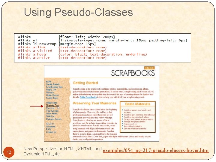
Using Pseudo-Classes 12 New Perspectives on HTML, XHTML, and Dynamic HTML, 4 e examples/054_pg-217 -pseudo-classes-hover. htm

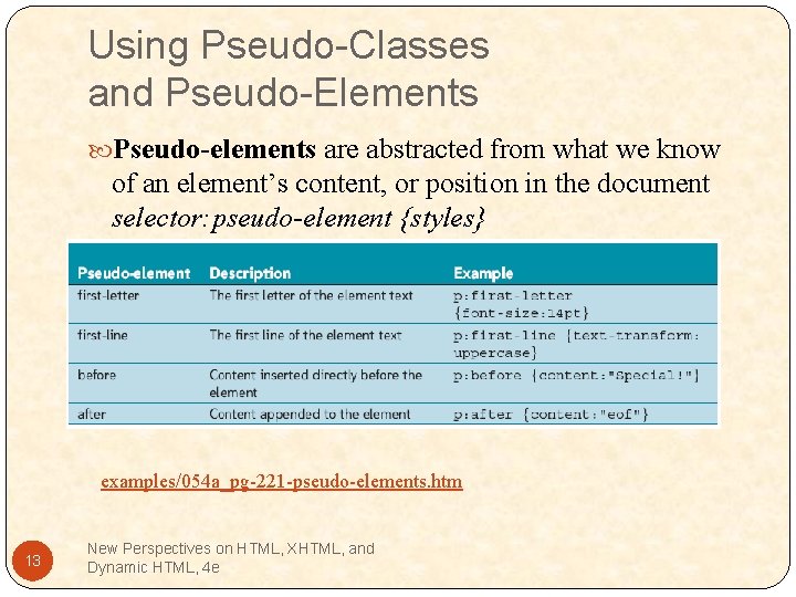
Using Pseudo-Classes and Pseudo-Elements Pseudo-elements are abstracted from what we know of an element’s content, or position in the document selector: pseudo-element {styles} examples/054 a_pg-221 -pseudo-elements. htm 13 New Perspectives on HTML, XHTML, and Dynamic HTML, 4 e

• Go to my Web site and download the files for Tutorial 4 • http: //www. kapple 01. com/ccm/web 2/home/web 2_labdata. html • Unzip the files into a work folder on your flash drive • Go to pg 199 in text book and start the in-chapter exercise. • Stop when you get to the end of the section on page 221 14 New Perspectives on HTML, XHTML, and Dynamic HTML, 4 e

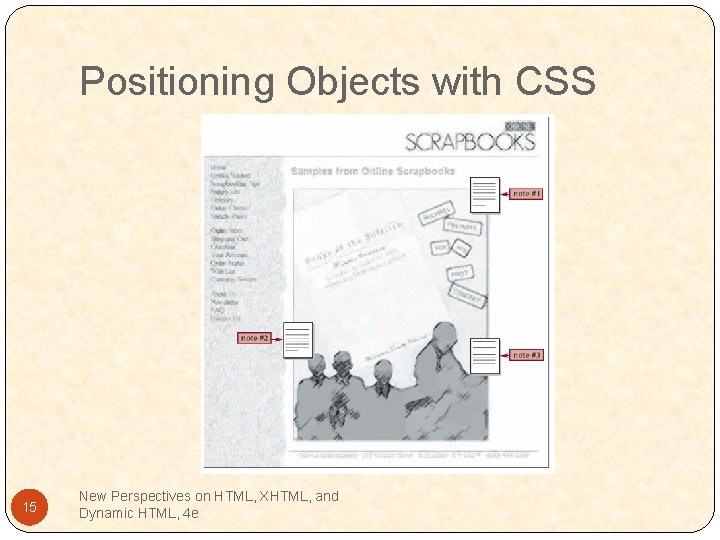
Positioning Objects with CSS 15 New Perspectives on HTML, XHTML, and Dynamic HTML, 4 e

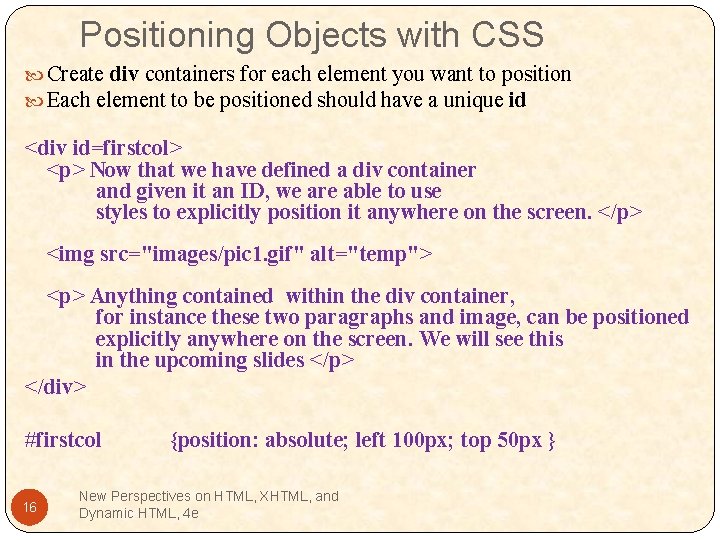
Positioning Objects with CSS Create div containers for each element you want to position Each element to be positioned should have a unique id <div id=firstcol> <p> Now that we have defined a div container and given it an ID, we are able to use styles to explicitly position it anywhere on the screen. </p> <img src="images/pic 1. gif" alt="temp"> <p> Anything contained within the div container, for instance these two paragraphs and image, can be positioned explicitly anywhere on the screen. We will see this in the upcoming slides </p> </div> #firstcol 16 {position: absolute; left 100 px; top 50 px } New Perspectives on HTML, XHTML, and Dynamic HTML, 4 e

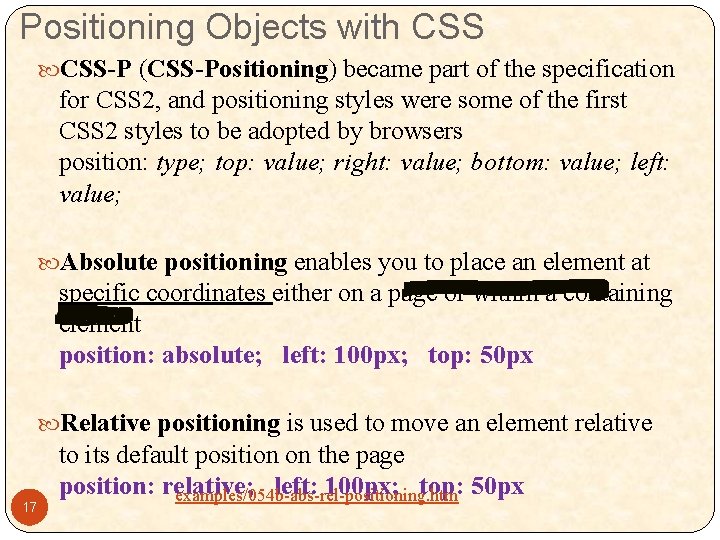
Positioning Objects with CSS-P (CSS-Positioning) became part of the specification for CSS 2, and positioning styles were some of the first CSS 2 styles to be adopted by browsers position: type; top: value; right: value; bottom: value; left: value; Absolute positioning enables you to place an element at specific coordinates either on a page or within a containing element position: absolute; left: 100 px; top: 50 px Relative positioning is used to move an element relative 17 to its default position on the page position: relative; left: 100 px; top: 50 px examples/054 b-abs-rel-positioning. htm

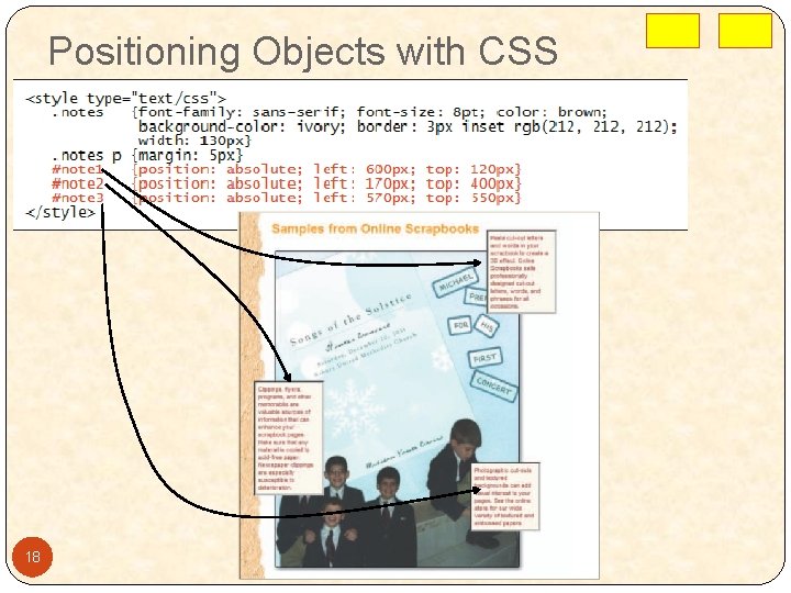
Positioning Objects with CSS 18

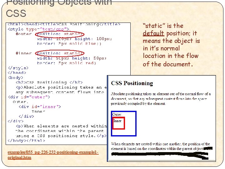
Positioning Objects with CSS “static” is the default position; it means the object is in it’s normal location in the flow of the document. examples/055_pg-226 -232 -positioning-example 1 original. htm

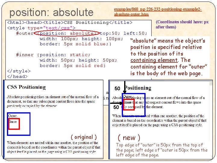
position: absolute examples/060_pg-226 -232 -positioning-example 2 absolute-outer. htm (Coordinates should have: px after them) “absolute” means the object’s position is specified relative to the position of its containing element. The containing element for “outer” is the body of the web page. 50 50 ( original ) 20 ( new ) Top edge of “outer” is 50 px from the top of the page; left edge of “outer is 50 px from the left edge of the page.

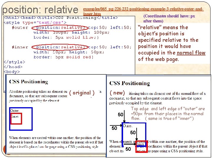
position: relative examples/065_pg-226 -232 -positioning-example-3 -relative-outer-andinner. htm (Coordinates should have: px after them) “relative” means the object’s position is specified relative to the position it would have occupied in the normal flow of the web page. ( original ) ( new) Top edge and left edge of “outer” are +50 px from their places in the normal flow. ( same is true of “inner” ) 50 50 21 50 50

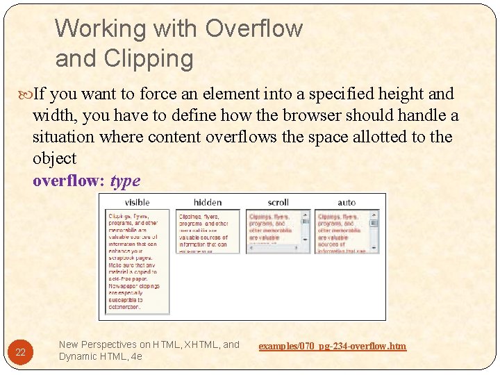
Working with Overflow and Clipping If you want to force an element into a specified height and width, you have to define how the browser should handle a situation where content overflows the space allotted to the object overflow: type 22 New Perspectives on HTML, XHTML, and Dynamic HTML, 4 e examples/070_pg-234 -overflow. htm

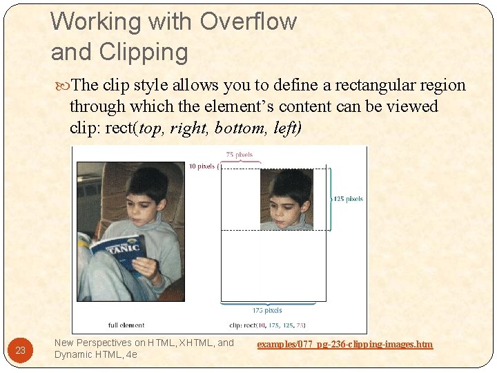
Working with Overflow and Clipping The clip style allows you to define a rectangular region through which the element’s content can be viewed clip: rect(top, right, bottom, left) 23 New Perspectives on HTML, XHTML, and Dynamic HTML, 4 e examples/077_pg-236 -clipping-images. htm

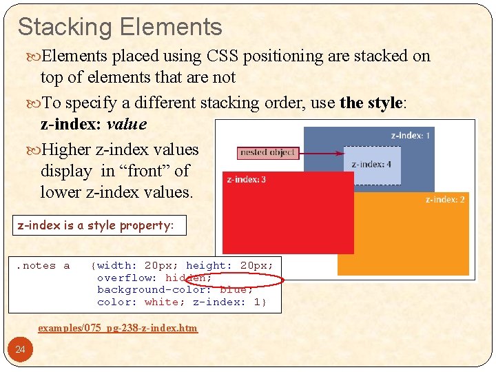
Stacking Elements placed using CSS positioning are stacked on top of elements that are not To specify a different stacking order, use the style: z-index: value Higher z-index values display in “front” of lower z-index values. z-index is a style property: examples/075_pg-238 -z-index. htm 24

• Go to pg 222 in text book and continue the in-chapter exercise. • Stop when you get to the end of the section on page 239 25 New Perspectives on HTML, XHTML, and Dynamic HTML, 4 e

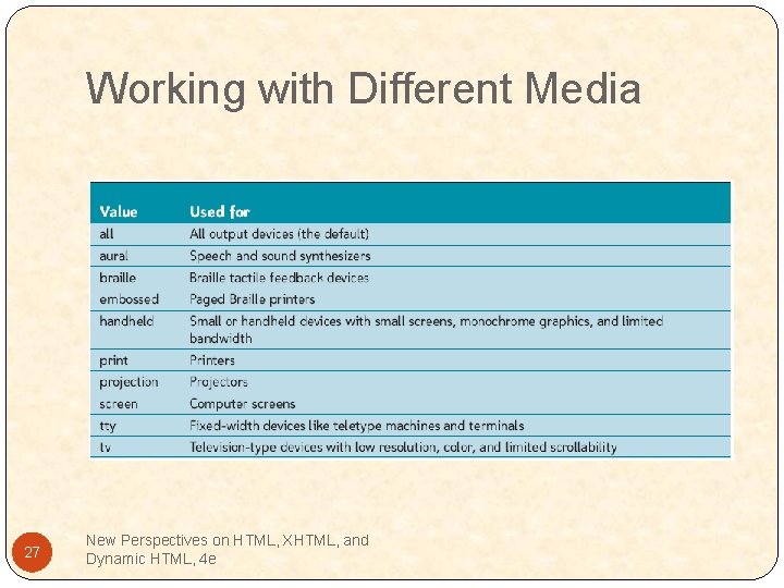
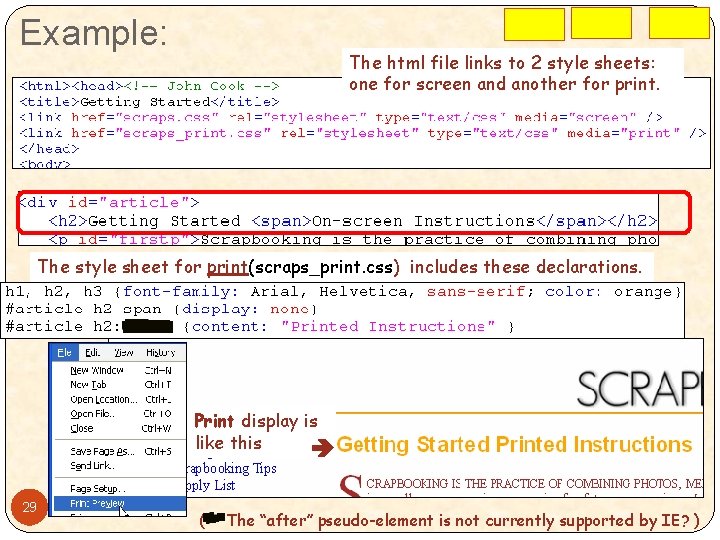
Working with Different Media By default, a style sheet is applied to all devices, and each device must determine how best to match the styles to its own requirements CSS 2 allows you to specify different styles for different Output devices with the media attribute in either the style element for embedded style sheets or the link element for external style sheets. <style type="text/css" media="type">. . . </style> or <link href="url" type="text/css" media="type". . . /> 26 New Perspectives on HTML, XHTML, and Dynamic HTML, 4 e

Working with Different Media 27 New Perspectives on HTML, XHTML, and Dynamic HTML, 4 e

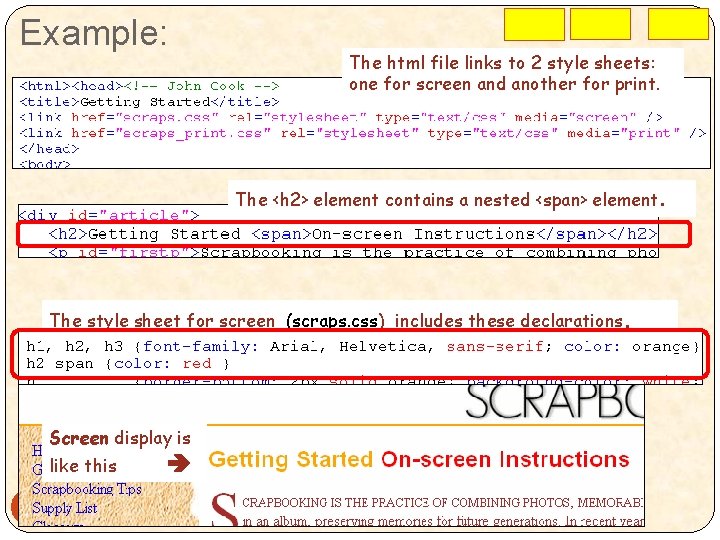
Example: The html file links to 2 style sheets: one for screen and another for print. The <h 2> element contains a nested <span> element. The style sheet for screen (scraps. css) includes these declarations. Screen display is like this 28

Example: The html file links to 2 style sheets: one for screen and another for print. The style sheet for print(scraps_print. css) includes these declarations. Print display is like this 29 (** The “after” pseudo-element is not currently supported by IE? )

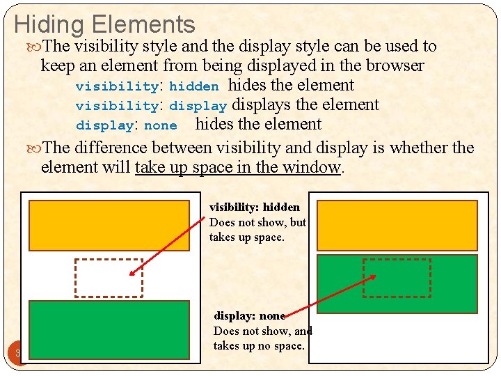
Hiding Elements The visibility style and the display style can be used to keep an element from being displayed in the browser visibility: hidden hides the element visibility: displays the element display: none hides the element The difference between visibility and display is whether the element will take up space in the window. visibility: hidden Does not show, but takes up space. 30 display: none Does not show, and takes up no space.

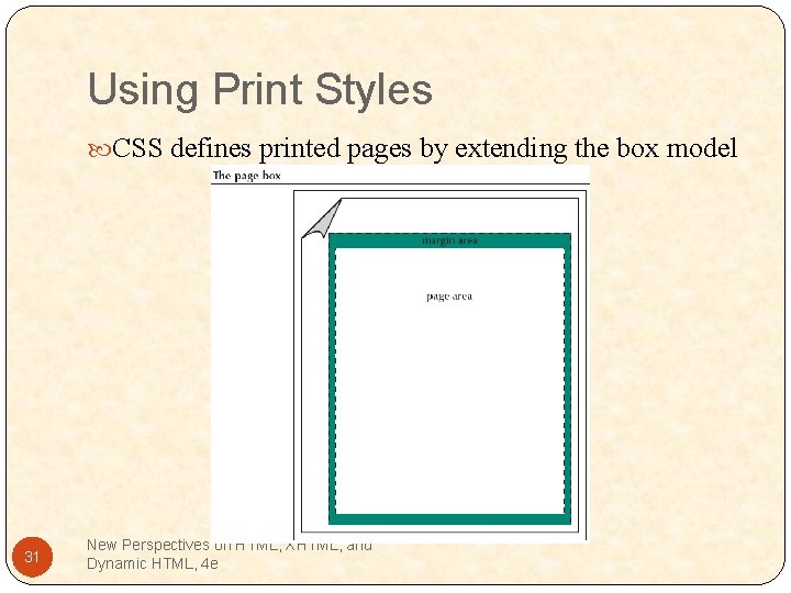
Using Print Styles CSS defines printed pages by extending the box model 31 New Perspectives on HTML, XHTML, and Dynamic HTML, 4 e

Using Print Styles The general rule to create and define a page box is: @page {styles} Printed media can vary in size and orientation The size style allows the Web author to define the default dimensions and orientation of the printed page size: width height orientation 32 New Perspectives on HTML, XHTML, and Dynamic HTML, 4 e

• Go to pg 239 in text book and continue work on the in-chapter exercise. 33 New Perspectives on HTML, XHTML, and Dynamic HTML, 4 e