Turning Data into Useful Information Joint Commission Resources
- Slides: 51

Turning Data into Useful Information © Joint Commission Resources, Inc. Data Display

Turning Data into Useful Information Data Display Objectives This presentation will help you to do the following: § Evaluate the effectiveness of various display methods and choose between them depending on your data display goals and needs. Data Display | Slide 2 © Joint Commission Resources, Inc. § Understand when and how to use overview displays, such as a balanced scorecard, dashboard summary, and performance matrix.

Turning Data into Useful Information Data Display Ways to Display Data Having random numbers or comments isn’t helpful if you can’t interpret them. Displaying data can help you interpret what you need to know about performance. Data Display | Slide 3 © Joint Commission Resources, Inc. There are many ways to display data, from a basic comparison chart to graphs that allow for a more detailed analysis. The analysis of the data you want to do will help determine the appropriate display method.

Turning Data into Useful Information Data Display Box Plots What Are They? One of the most basic ways to display data is the box plot. Box plots are used to identify patterns and help you decide if you need a more detailed analysis. They are also useful to compare sets of data quickly and to summarize a detailed analysis when you need to present your results. Data Display | Slide 4 © Joint Commission Resources, Inc. However, if you need to investigate a problem or determine why or how something is occurring, this format does not provide that level of detail.

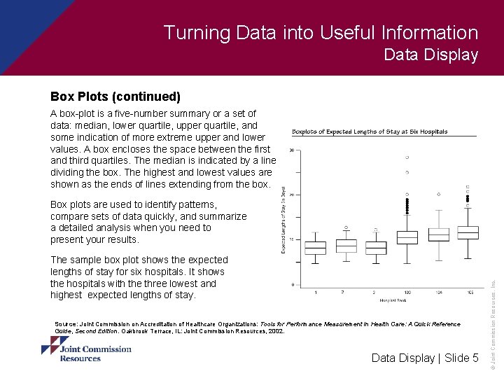
Turning Data into Useful Information Data Display Box Plots (continued) A box-plot is a five-number summary or a set of data: median, lower quartile, upper quartile, and some indication of more extreme upper and lower values. A box encloses the space between the first and third quartiles. The median is indicated by a line dividing the box. The highest and lowest values are shown as the ends of lines extending from the box. The sample box plot shows the expected lengths of stay for six hospitals. It shows the hospitals with the three lowest and highest expected lengths of stay. Source: Joint Commission on Accreditation of Healthcare Organizations: Tools for Performance Measurement in Health Care: A Quick Reference Guide, Second Edition. Oakbrook Terrace, IL: Joint Commission Resources, 2002. Data Display | Slide 5 © Joint Commission Resources, Inc. Box plots are used to identify patterns, compare sets of data quickly, and summarize a detailed analysis when you need to present your results.

Turning Data into Useful Information Data Display Box Plots (continued) What are two situations you can think of where you might use, or have used, a box plot? What your colleagues said: “Monitoring medical record documentation completeness helps me make sure that we are using resources responsibly and managing care appropriately. ” “I watch wait times for outpatient procedures. I know my community values innovative and responsible use of resources, and spending too long on a procedure doesn’t meet their needs. ” Data Display | Slide 6 © Joint Commission Resources, Inc. “I like to eliminate as much unneeded or redundant tests conducted on patients as possible. ”

Turning Data into Useful Information Data Display Comparison Charts What Are They? A comparison chart is another easy tool to display data, but it is more sophisticated than a box plot. Comparison charts allow you to compare two or more groups of data. For example, you can compare your organization’s performance against other organizations. To use comparison charts effectively, consider these questions: § How does performance compare against the norm over time? § If there are performance outliers, do they indicate unusual success or a need for improvement? If so, what can be learned from these outliers? Data Display | Slide 7 © Joint Commission Resources, Inc. § Is a plan in place to investigate both positive and negative outliers?

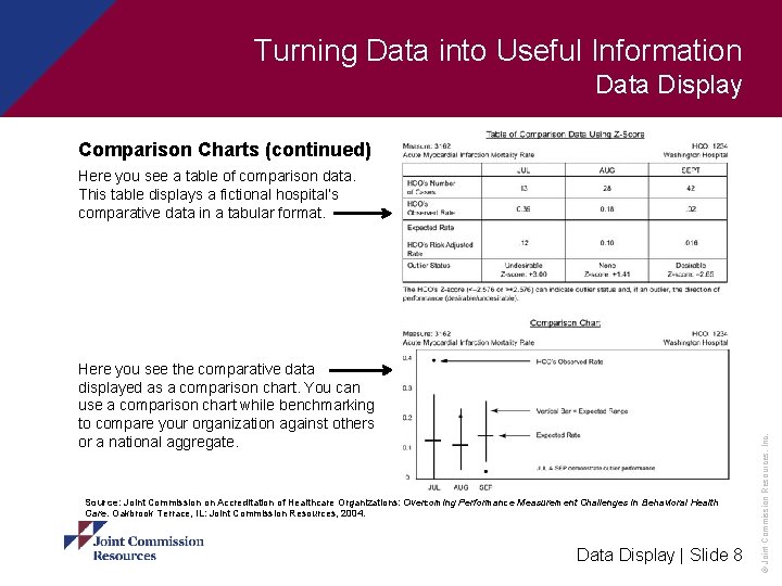
Turning Data into Useful Information Data Display Comparison Charts (continued) Here you see the comparative data displayed as a comparison chart. You can use a comparison chart while benchmarking to compare your organization against others or a national aggregate. Source: Joint Commission on Accreditation of Healthcare Organizations: Overcoming Performance Measurement Challenges in Behavioral Health Care. Oakbrook Terrace, IL: Joint Commission Resources, 2004. Data Display | Slide 8 © Joint Commission Resources, Inc. Here you see a table of comparison data. This table displays a fictional hospital’s comparative data in a tabular format.

Turning Data into Useful Information Data Display Self-Check Comparison charts are more sophisticated than box plots in that they allow you to: A. Examine causation B. Determine statistical correlation C. View two or more sets of data D. Determine whether a distribution is normal Data Display | Slide 9 © Joint Commission Resources, Inc. See the next slide to check your answer.

Turning Data into Useful Information Data Display Self-Check Answer: C Data Display | Slide 10 © Joint Commission Resources, Inc. A box plot allows you to identify patterns and determine whether further analysis is needed, while a comparison chart allows you to compare two or more groups of data, which is a more sophisticated analysis technique.

Turning Data into Useful Information Data Display Sophisticated Displays: Do More with your Data Box plots and comparison charts are popular and easy to use. However, for a more complicated or detailed analysis of data, you can use a variety of sophisticated displays. Data Display | Slide 11 © Joint Commission Resources, Inc. Compare and contrast the options on the following pages to see what is the best option to use for your data display and analysis needs.

Turning Data into Useful Information Data Display Sophisticated Displays: Do More with your Data (continued) Histogram What is it? A histogram is a simple statistical tool that lists the steps or sequence of events in a process to help guide and plan improvement activities. When to use it § To evaluate a process at a specific moment in time § When a process has a wide variety of possible data points Data Display | Slide 12 © Joint Commission Resources, Inc. § When there is a large data sample

Turning Data into Useful Information Data Display Sophisticated Displays: Do More with your Data (continued) Histogram—Benefits and Drawbacks Benefits § Reveals if the distribution in a process is normal § Shows areas that are probable causes of variation Drawbacks § Not applicable to processes with only two possible outcomes § Needs a large data set Data Display | Slide 13 © Joint Commission Resources, Inc. § Cannot give information on cause and effect

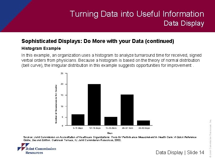
Turning Data into Useful Information Data Display Sophisticated Displays: Do More with your Data (continued) Histogram Example Source: Joint Commission on Accreditation of Healthcare Organizations: Tools for Performance Measurement in Health Care: A Quick Reference Guide, Second Edition. Oakbrook Terrace, IL: Joint Commission Resources, 2002. Data Display | Slide 14 © Joint Commission Resources, Inc. In this example, an organization uses a histogram to analyze turnaround time for received, signed verbal orders from physicians. Because a histogram is based on theory of normal distribution (bell curve), the irregular distribution in this example suggests opportunities for improvement.

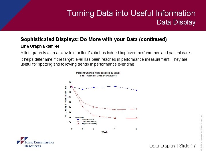
Turning Data into Useful Information Data Display Sophisticated Displays: Do More with your Data (continued) Line Graph What is it? A line graph is a simple tool that shows basic trends in a process over time, where data points are plotted by time on the x-axis and the increments of measurement on the y-axis. When to use it § Before and after an improvement is made to show performance trends and monitor the level and consistency of improvement Data Display | Slide 15 © Joint Commission Resources, Inc. § To spot trends in a process

Turning Data into Useful Information Data Display Sophisticated Displays: Do More with your Data (continued) Line Graph—Benefits and Drawbacks Benefits § Easy to create § Good for quick analysis with the most current information available Drawbacks § Not very sensitive for sophisticated analysis § Does not predict performance (like a control chart does) Data Display | Slide 16 © Joint Commission Resources, Inc. § Over interpretation of up-and-down patterns that may simply be normal variation and should not be “tampered with”

Turning Data into Useful Information Data Display Sophisticated Displays: Do More with your Data (continued) Line Graph Example A line graph is a great way to monitor if a fix has indeed improved performance and patient care. Data Display | Slide 17 © Joint Commission Resources, Inc. It helps determine if the target level has been reached in performance measurement. They are useful for spotting and following trends in performance over time.

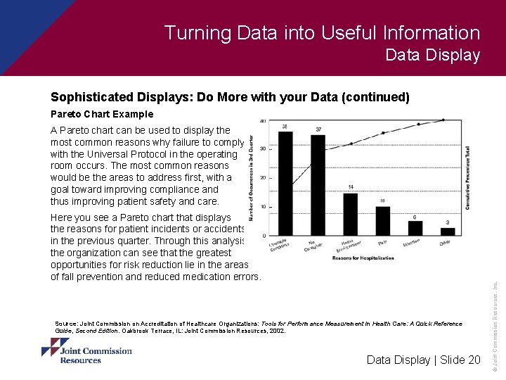
Turning Data into Useful Information Data Display Sophisticated Displays: Do More with your Data (continued) Pareto Chart What is it? A Pareto chart is an analysis tool that helps categorize occurrences and focuses on those that are most important and happen most frequently. When to use it § To find causes of an issue § To setting priorities for intervention Data Display | Slide 18 © Joint Commission Resources, Inc. § To rank causes or events to identify most critical issues

Turning Data into Useful Information Data Display Sophisticated Displays: Do More with your Data (continued) Pareto Chart—Benefits and Drawbacks Benefits § Good for analysis and planning § Reveals the important causes of an issue § Easy to construct and use Drawbacks § Not applicable to issues with a single cause Data Display | Slide 19 © Joint Commission Resources, Inc. § May be time consuming to identify and quantify the causes

Turning Data into Useful Information Data Display Sophisticated Displays: Do More with your Data (continued) Pareto Chart Example Here you see a Pareto chart that displays the reasons for patient incidents or accidents in the previous quarter. Through this analysis, the organization can see that the greatest opportunities for risk reduction lie in the areas of fall prevention and reduced medication errors. Source: Joint Commission on Accreditation of Healthcare Organizations: Tools for Performance Measurement in Health Care: A Quick Reference Guide, Second Edition. Oakbrook Terrace, IL: Joint Commission Resources, 2002. Data Display | Slide 20 © Joint Commission Resources, Inc. A Pareto chart can be used to display the most common reasons why failure to comply with the Universal Protocol in the operating room occurs. The most common reasons would be the areas to address first, with a goal toward improving compliance and thus improving patient safety and care.

Turning Data into Useful Information Data Display Sophisticated Displays: Do More with your Data (continued) Run Chart What is it? A run chart is a chart that plots data points over time to see patterns and trends for a specific period. When to use it § To determine if performance is static or changing § To see if the performance change is for the better or worse Data Display | Slide 21 © Joint Commission Resources, Inc. § To determine if analysis is required that is more complicated than a graph

Turning Data into Useful Information Data Display Sophisticated Displays: Do More with your Data (continued) Run Chart—Benefits and Drawbacks Benefits § Can indicate common or special cause variation § Quicker and easier to construct than a control chart Drawbacks Data Display | Slide 22 © Joint Commission Resources, Inc. § Is not as sensitive as a control chart to diagnose outlier data

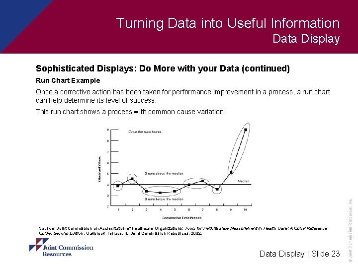
Turning Data into Useful Information Data Display Sophisticated Displays: Do More with your Data (continued) Run Chart Example Once a corrective action has been taken for performance improvement in a process, a run chart can help determine its level of success. Source: Joint Commission on Accreditation of Healthcare Organizations: Tools for Performance Measurement in Health Care: A Quick Reference Guide, Second Edition. Oakbrook Terrace, IL: Joint Commission Resources, 2002. Data Display | Slide 23 © Joint Commission Resources, Inc. This run chart shows a process with common cause variation.

Turning Data into Useful Information Data Display Sophisticated Displays: Do More with your Data (continued) Scatter Diagram What is it? A scatter diagram is a graph designed to show statistical correlation, not necessarily cause and effect, between two variables. When to use it Data Display | Slide 24 © Joint Commission Resources, Inc. § To help find possible relationships between process, outcome, and performance variables

Turning Data into Useful Information Data Display Sophisticated Displays: Do More with your Data (continued) Scatter Diagram—Benefits and Drawbacks Benefits § Allows for quick, easy, and conclusive analysis § Provides information to determine if further investigation is required Drawbacks § Requires a large data set Data Display | Slide 25 © Joint Commission Resources, Inc. § Indicates a relationship but not causation

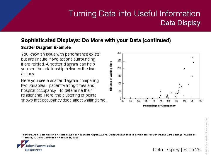
Turning Data into Useful Information Data Display Sophisticated Displays: Do More with your Data (continued) Scatter Diagram Example You know an issue with performance exists but are unsure if two actions surrounding it are related. A scatter diagram can help you see the relationship between the two actions. Source: Joint Commission on Accreditation of Healthcare Organizations: Using Performance Improvement Tools in Health Care Settings. Oakbrook Terrace, IL: Joint Commission Resources, 2006. Data Display | Slide 26 © Joint Commission Resources, Inc. Here you see a scatter diagram comparing two variables—patient waiting times and hospital occupancy—to determine their relationship. Here, the clustering of points shows that occupancy does affect waiting time.

Turning Data into Useful Information Data Display Advanced Displays Some tools allow for more in-depth analysis of the data. They provide a deeper level of analysis than what we saw earlier and often require you to gather more data to make an accurate analysis. With the level of analysis these tools provide, you can develop your performance improvement plan and turn the data into actions. Data Display | Slide 27 © Joint Commission Resources, Inc. These tools also help make your presentations of the data to staff and board members more powerful.

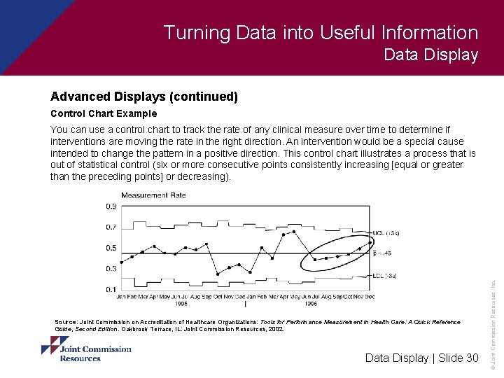
Turning Data into Useful Information Data Display Advanced Displays (continued) Control Chart What is it? A control chart is a chart designed to show upper and lower control limits to help determine a variation in a process. When to use it § To identify if a process is functioning in a predictable manner Data Display | Slide 28 © Joint Commission Resources, Inc. § To determine if variation is due to common or special causes

Turning Data into Useful Information Data Display Advanced Displays (continued) Control Chart—Benefits and Drawbacks Benefits § Used to detect variation, suggest solutions, and monitor performance § More sensitive than line graphs at identifying variation § Useful to study trends or patterns in performance over time Drawbacks § More difficult and time-consuming to construct than line graphs Data Display | Slide 29 © Joint Commission Resources, Inc. § Needs a good working knowledge of statistics

Turning Data into Useful Information Data Display Advanced Displays (continued) Control Chart Example Source: Joint Commission on Accreditation of Healthcare Organizations: Tools for Performance Measurement in Health Care: A Quick Reference Guide, Second Edition. Oakbrook Terrace, IL: Joint Commission Resources, 2002. Data Display | Slide 30 © Joint Commission Resources, Inc. You can use a control chart to track the rate of any clinical measure over time to determine if interventions are moving the rate in the right direction. An intervention would be a special cause intended to change the pattern in a positive direction. This control chart illustrates a process that is out of statistical control (six or more consecutive points consistently increasing [equal or greater than the preceding points] or decreasing).

Turning Data into Useful Information Data Display Advanced Displays (continued) Radar Chart What is it? A radar chart is a two-dimensional chart, of three or more quantitative variables represented on axes starting from the same point, that graphically shows the size of gaps among five to ten organizational performance areas. When to use it § To benchmark multiple areas § To relate actual performance to average and ideal performance Data Display | Slide 31 © Joint Commission Resources, Inc. § To display the important categories of performance and make visible concentrations of strengths and weaknesses

Turning Data into Useful Information Data Display Advanced Displays (continued) Radar Chart—Benefits and Drawbacks Benefits § Presents data simply and concisely § Indicates common or special cause variation Drawbacks § Requires significant preparation and analysis to construct Data Display | Slide 32 © Joint Commission Resources, Inc. § Requires setting target performance ranges and it can be easy to set targets low

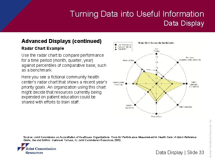
Turning Data into Useful Information Data Display Advanced Displays (continued) Radar Chart Example Use the radar chart to compare performance for a time period (month, quarter, year) against percentiles of comparative base, such as a benchmark. Source: Joint Commission on Accreditation of Healthcare Organizations: Tools for Performance Measurement in Health Care: A Quick Reference Guide, Second Edition. Oakbrook Terrace, IL: Joint Commission Resources, 2002. Data Display | Slide 33 © Joint Commission Resources, Inc. Here you see a fictional community health center’s radar chart that shows a recent year’s priority goals. An organization using this chart might decide that resources currently being expended on patient education could be shared with efforts to train staff.

Turning Data into Useful Information Data Display Advanced Displays (continued) Stratum Chart What is it? A stratum chart is a multilayered line graph that displays cumulative data to look for changes over time. When to use it § To break down an overall total into separate components tracked over time Data Display | Slide 34 © Joint Commission Resources, Inc. § To show cumulative data over time and in relation to subsets

Turning Data into Useful Information Data Display Advanced Displays (continued) Stratum Chart—Benefits and Drawbacks Benefits § Easy to interpret § Gives a clear picture of how the different components relate to each other and the whole § Good to see fluctuations over time in both total process and each of its components. Drawbacks § Can only be used with discrete layers of data § No overlapping of categories Data Display | Slide 35 © Joint Commission Resources, Inc. § Should not be used for analyzing small sample groups

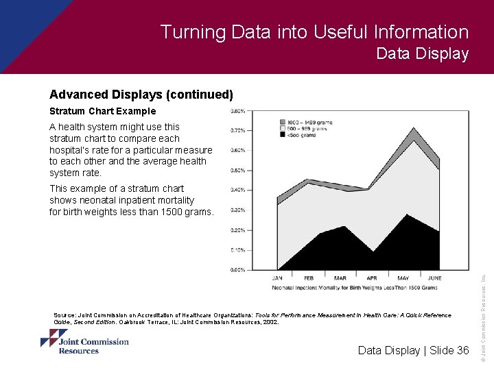
Turning Data into Useful Information Data Display Advanced Displays (continued) Stratum Chart Example A health system might use this stratum chart to compare each hospital’s rate for a particular measure to each other and the average health system rate. Source: Joint Commission on Accreditation of Healthcare Organizations: Tools for Performance Measurement in Health Care: A Quick Reference Guide, Second Edition. Oakbrook Terrace, IL: Joint Commission Resources, 2002. Data Display | Slide 36 © Joint Commission Resources, Inc. This example of a stratum chart shows neonatal inpatient mortality for birth weights less than 1500 grams.

Turning Data into Useful Information Data Display Overview Displays Some tools are useful to analyze your data, while others are good at providing a snapshot of where you were, where you are, and where you want to go. Data Display | Slide 37 © Joint Commission Resources, Inc. The next set of tools allow you to compare and present the data in a clear and simple way but only after you have analyzed it using one of the tools you have already learned about.

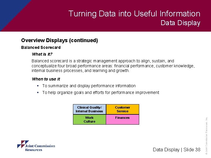
Turning Data into Useful Information Data Display Overview Displays (continued) Balanced Scorecard What is it? Balanced scorecard is a strategic management approach to align, sustain, and conceptualize four broad performance areas: financial performance, customer knowledge, internal business processes, and learning and growth. When to use it § To summarize and display performance information Clinical Quality/ Internal Business Customer Service Work Culture Finances Data Display | Slide 38 © Joint Commission Resources, Inc. § To help organize goals and efforts for performance improvement

Turning Data into Useful Information Data Display Overview Displays (continued) Balanced Scorecard—Benefits and Drawbacks Benefits § Adaptable to any type of organization § Useful for planning from the top down § A way to conceptualize and organize goals and efforts Drawbacks § Not useful for detailed analysis or investigation of problems Data Display | Slide 39 © Joint Commission Resources, Inc. § It is more a summary of investigation than a method of investigation

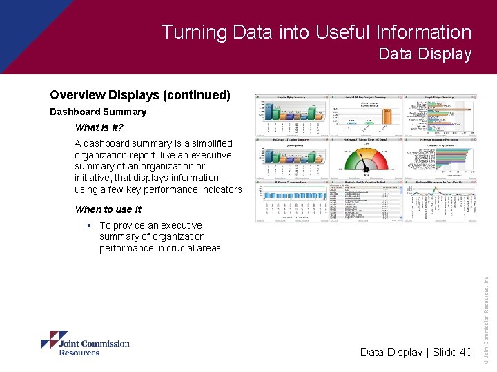
Turning Data into Useful Information Data Display Overview Displays (continued) Dashboard Summary What is it? A dashboard summary is a simplified organization report, like an executive summary of an organization or initiative, that displays information using a few key performance indicators. When to use it Data Display | Slide 40 © Joint Commission Resources, Inc. § To provide an executive summary of organization performance in crucial areas

Turning Data into Useful Information Data Display Overview Displays (continued) Dashboard Summary—Benefits and Drawbacks Benefits § Condensed, at-a-glance summary § Provides vital measures together so overall picture is apparent Drawbacks § Lacks detail Data Display | Slide 41 © Joint Commission Resources, Inc. § Does not really measure performance but presents the results of performance measurement

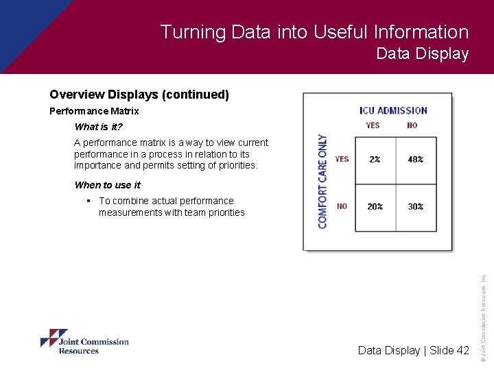
Turning Data into Useful Information Data Display Overview Displays (continued) Performance Matrix What is it? A performance matrix is a way to view current performance in a process in relation to its importance and permits setting of priorities. When to use it Data Display | Slide 42 © Joint Commission Resources, Inc. § To combine actual performance measurements with team priorities

Turning Data into Useful Information Data Display Overview Displays (continued) Performance Matrix—Benefits and Drawbacks Benefits § Brings together objective and subjective factors in setting priorities § Helps a team look at a group of problems that has been identified and determine which problem should be tackled first Drawbacks § Training needed to avoid conflict because subject to organization politics Data Display | Slide 43 © Joint Commission Resources, Inc. § As it draws on team members’ subjective feelings, subjectivity could be an issue

Turning Data into Useful Information Data Display Conclusion You have completed the content for this presentation. Using the skills presented, you should now be able to: § Evaluate the effectiveness of various display methods and choose between them depending on your data display goals and needs Data Display | Slide 44 © Joint Commission Resources, Inc. § Understand when and how to use overview displays, such as a balanced scorecard, dashboard summary, and performance matrix

Turning Data into Useful Information Data Display Lesson Resource Data Display | Slide 45 © Joint Commission Resources, Inc. Turning Data into Useful Information, a Joint Commission Resources, Inc. web-based lesson copyright 2009. All rights reserved.

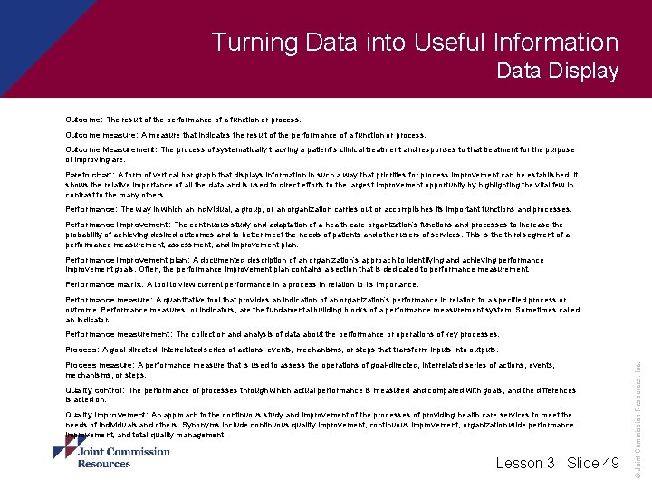
Turning Data into Useful Information Data Display Terminology Analysis: The process of interpreting data and transforming it into information. Assess: To transform data into information by analyzing it. Assessment: The systematic collection and review of patient-specific data. Assessment of performance data examines performance over time and in comparison to other referents. Balanced Scorecard: A strategic management approach that helps align and sustain performance in financial matters, customer knowledge, internal business practices, and learning and growth. Benchmarking: Continuous measurement of a process, product, or service compared to those of the toughest competitor, to those considered industry leaders, or to similar activities in the organization to find and implement ways to improve it. This is one of the foundations of both total quality management and continuous quality improvement. Internal benchmarking occurs when similar processes within an organization are compared. Competitive benchmarking occurs when an organization’s processes are compared with best practices within the industry. Functional benchmarking refers to benchmarking a similar function or process, such as scheduling, in another industry. Best practices: Clinical, scientific, or professional practices that are recognized by a majority of professionals in a particular field. These practices are typically evidence based and consensus driven. Box plot: A five-number summary or a set of data. A box encloses the space between the first and third quartiles. The median is indicated by a line dividing the box. The highest and lowest values are shown as the ends of lines extending from the box. Checklist: A form for gathering data that records whether a specific action has been performed. Common cause variation: Variation in a process that is due to the process itself and is produced by interactions of variables of that process. Common cause variation is inherent in all process. It can be altered only by changing the process. Comparison chart: A graph that compares two or more separate groups of data. Control chart: A graphic display of data in the order that they occur with statistically determined upper and lower limits of expected common cause variation. It is used to identify special causes of variation, monitor a process for maintenance, and determine whether process changes have had the desired effect. Data Display | Slide 46 © Joint Commission Resources, Inc. Check sheet: A simple tool that shows how often an event or condition occurs, it is used to record data that answer objective statements requiring a simple yes/no response.

Turning Data into Useful Information Data Display Control limit: In statistics, an expected limit of common-cause variation, sometimes referred to as either an upper or lower limit. Variation beyond a control limit is evidence that special causes are affecting a process. Control limits are calculated from process data and are not to be confused with engineering specifications or tolerance limits. Control limits are typically plotted on a control chart. Criteria: Expected levels of achievement or specifications against which performance or quality may be compared Dashboard summary: A simplified organization report like an executive summary or an organization or initiative. It is based on the dashboard of a car that shows at a glance the areas that are doing well and which areas present problems. Data: Uninterrupted measurements, facts, or clinical observations collected during an assessment activity. Data may be numeric or quantitative. It can also be non-numeric or qualitative, reflecting the “lived experience” of the population of interest. Data integrity: In the context of data security, the protection of data from accidental or unauthorized intentional changes. Data collection: The act or process of capturing raw or primary data from a single source or a number of sources. Also called data gathering. Data collection plan: A carefully considered, documented plan that covers what, how, when, and where specifics of data collection. It is based on the goals stated and measures chosen. Data element: A discrete piece of data, such as a patient birth date or principal diagnosis. Data point: The representation of a value for a set of observations or measurements at a specific time interval. Data sources: The primary source document used for data collection. The developer may choose to standardize the data sources used for data collection across organizations, or may allow data to be collected from several sources at the participating organizations’ discretion. Double jeopardy: A deteriorating performance situation when expectations are raised and results deteriorate that often needs to be improved. Effectiveness: The degree to which the care is provided in the correct manner, given the current state of knowledge, to achieve the desired or projected outcome for the patient. Efficacy: The degree to which the care of the patient has been shown to accomplish the desired or projected outcome. Data Display | Slide 47 © Joint Commission Resources, Inc. Drill down: Questions that can help organizations assess where there is a problem with a process or area of service and effectively uses data to find solutions to the problem.

Turning Data into Useful Information Data Display Efficiency: The relationship between the outcomes and the resources used to deliver patient care. Failure, Mode, and Effects Analysis: A systematic way of examining a design prospectively for possible ways in which failure can occur. It assumes that no matter how knowledgeable or careful people are, errors will occur in some situations and may even be likely to occur. Feedback: Performance measurement systems regularly provide summary reports on data quality to the health care organization leadership to stimulate self-monitoring and improvement in data quality. Focus: The activity or area on which the measure centers attention. Histogram: A graphic display, using a bar graph, of the frequency distribution of a variable. Indicator: A measure used to determine, of time, an organization’s performance of functions, processes, and outcomes. Information: Knowledge gained from study, investigation, or instruction. Internal standards: Performance measurement systems have pre-specified data quality standards tailored for individual performance measures. These standards address the entire process by which the data are collected, stored, and transmitted by participating health care organizations. Depending on the source of data, the standards may emphasize different sets of issues as specified: administrative data-coding accuracy and consistency, missing data, data conversion error; clinical/case record-based data-presence, accuracy, timeliness, legibility, authentication, sampling method, data entry and abstract; and survey-based data-sampling method, sampling error, response rate. Line graph: A tool that shows basic trends in process over time. Data points are plotted by time or sequence on the horizontal axis and the increments of measurement on the vertical axis and then connected with a line. Mean: A measure of central tendency for a continuous variable measure. The mean is the sum of the values divided by the number of observations. Measure: To collect quantifiable data about a function or process. Median: The value in a group of ranked observations that divides the data into two equal parts. Mode: In statistics, a measure of central tendency of a collection of data consisting of the measurement of the data set that occurs most often. Data Display | Slide 48 © Joint Commission Resources, Inc. Measurement: The systematic process of data collection, repeated over time or at a single point in time.

Turning Data into Useful Information Data Display Outcome: The result of the performance of a function or process. Outcome measure: A measure that indicates the result of the performance of a function or process. Outcome Measurement: The process of systematically tracking a patient’s clinical treatment and responses to that treatment for the purpose of improving are. Pareto chart: A form of vertical bar graph that displays information in such a way that priorities for process improvement can be established. It shows the relative importance of all the data and is used to direct efforts to the largest improvement opportunity by highlighting the vital few in contrast to the many others. Performance: The way in which an individual, a group, or an organization carries out or accomplishes its important functions and processes. Performance improvement: The continuous study and adaptation of a health care organization’s functions and processes to increase the probability of achieving desired outcomes and to better meet the needs of patients and other users of services. This is the third segment of a performance measurement, assessment, and improvement plan. Performance improvement plan: A documented description of an organization’s approach to identifying and achieving performance improvement goals. Often, the performance improvement plan contains a section that is dedicated to performance measurement. Performance matrix: A tool to view current performance in a process in relation to its importance. Performance measure: A quantitative tool that provides an indication of an organization’s performance in relation to a specified process or outcome. Performance measures, or indicators, are the fundamental building blocks of a performance measurement system. Sometimes called an indicator. Performance measurement: The collection and analysis of data about the performance or operations of key processes. Process measure: A performance measure that is used to assess the operations of goal-directed, interrelated series of actions, events, mechanisms, or steps. Quality control: The performance of processes through which actual performance is measured and compared with goals, and the differences is acted on. Quality improvement: An approach to the continuous study and improvement of the processes of providing health care services to meet the needs of individuals and others. Synonyms include continuous quality improvement, continuous improvement, organization wide performance improvement, and total quality management. Lesson 3 | Slide 49 © Joint Commission Resources, Inc. Process: A goal-directed, interrelated series of actions, events, mechanisms, or steps that transform inputs into outputs.

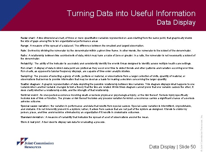
Turning Data into Useful Information Data Display Radar chart: A two-dimensional chart, of three or more quantitative variables represented on axes starting from the same point, that graphically shows the size of gaps among five to ten organizational performance areas Range: A measure of the spread of a data set. The difference between the smallest and largest observation. Rate: Derived by dividing the numerator by the denominator within a given time frame. In other words, the numerator is the subset of the denominator. Ratio: A relationship between two counted sets of data, which may have a value of zero or greater. In a ratio, the numerator is not necessarily a subset of the denominator. Reliability: The ability of the indicator to accurately and consistently identify the events it was designed to identify across multiple health care settings. Run chart: A display of data in which data point are plotted as they occur over time to detect trends and other patterns and variation occurring over time. Run charts, as opposed to tabular frequency displays, are capable of time-order analytic studies. Sampling: The process of selecting a group of units, portions or material, or observations from a larger collection of units, quantity of material, or observations that serves to provide information that may be used as a basis for making a decision concerning the larger quantity. Scatter diagram: A graphic representation of data depicting the possible relationship between two variables. This diagram displays what happens to one variable when another variable changes to test a theory that the two are related. While times diagram cannot prove that one variable causes the other, it does clarify whether a relationship exists, and the strength of that relationship. Sentinel event: An unexpected occurrence involving death or serious physical or psychological injury, or the risk thereof. Serious injury specifically includes loss of limb or function. The phrase or risk thereof includes any process variation for which a recurrence carries a significant chance of a serious adverse outcome. Standard deviation: A measure of variability that indicates the spread of a set of observations around the mean. Stem & leaf plot: A tool used to display raw data for evaluating a process. Data Display | Slide 50 © Joint Commission Resources, Inc. Special cause variation: the variation in performance and data that results from special causes. Special cause variation is intermittent, unpredictable, and unstable. It is not inherently present in a system; rather, it arises from causes that are not part of the system as designed. It tends to cluster by person, place, and time and should be eliminated by an organization if it results in undesirable outcomes.

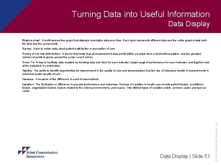
Turning Data into Useful Information Data Display Stratum chart: A multi-layered line graph that displays cumulative data over time. Each layer represents different data and the entire graph shows both the total and the components. Survey: A tool to obtain data about patient satisfaction or perception of care. Theory of normal distribution: A theory that holds that all measurement data points within a sample form a symmetrical pattern, and the greatest number of points is group around the center (a bell curve). Three T’s: A way to facilitate data analysis by trending data over time for each indicator; target range of performance for each indicator; and together look at the indicators in combination. Validity: The ability to identify opportunities for improvement in the quality of care and demonstration that the use of indicators results in improvements in outcomes and/or quality of care. Variance: A measure of the difference in a set of observations. Data Display | Slide 51 © Joint Commission Resources, Inc. Variation: The fluctuation or difference in process performance and outcomes. Sources of variation in health care include patient factors, practitioner factors, organization factors, factors related to the external environment, and chance. Two distinct types of variation exists: common cause and special cause.