Topic 3 Statistical tables Graphical display of statistial

Topic 3. Statistical tables. Graphical display of statistiсal data 1. Statistical tables 2. The concept of statistical graphs and their requirements

1. Statistical tables Two types of statistical presentation of data – numerical and graphical. For more rational and scientific presentation of the results of summary and grouping use STATISTICAL TABLES. Tables consist of a statistical subject and a predicate. In a logical sense, the statistical table is considered as a "STATISTICAL SENTENCE", in which the subject is the object of study, and the predicate is the system of indicators that characterizes the object.
 designing the layout of the")
Building a statistical table consists of two stages: 1) designing the layout of the table; 2) filling in the layout of the statistical table with statistics.

1. Designing the layout of the table – is a combination of horizontal rows and vertical graphs, at the intersection of which cells are formed, from which the left and top are intended for headings - the list of constituents of the subject and the system of indicators of the predicate, the rest - for numerical data.
 by type")
Table 1 Comparative characteristics of statistical surveys of industrial production (goods, services) by type and main economic indicators of short-term industry statistics Ways of statistical survey The criterion for comparison Industrial production (goods, services) by type Main economic indicators of shortterm industry statistics 1 2 3 The purpose of the survey Obtaining data on the production of industrial products by type by defined nomenclature and the residues of produced finished goods at the warehouses of the manufacturing enterprises Obtaining data on the volume of industrial production sold and the volume of new orders for production of manufacturing industry

Statistical tables are drawn up according to certain rules: 1. If the units are different, they are given in the names of the graph. 2. All data in the same graph are given with equal accuracy. 3. The table may contain notes to individual columns or cells. 4. The objects of the subject and the attributes of the predicate must be placed in a certain logical sequence. 5. The columns of a predicate are numbered if the table occupies several pages. 6. The names of graphs sometimes give a way of calculating the indicator. For example, the name of column 3 shows "gr. 2/gr. 1". 7. The table should not have unfilled cells. Therefore, if there is no information about the size (prevalence) of the phenomenon, three dots (. . . ) are put in the cell, the absence of the phenomenon is indicated by a dash (-), the number 0. 0 is set in cases of small magnitude when the number in this cell is outside accuracy taken in the table. The “x” mark is placed when the cell is not filled.

2. The concept of statistical graphs and their requirements A statistical graph is a special kind of visual representation and generalization of data on social phenomena and processes with the help of geometric images, drawings or schematic maps and explanatory signatures to them.

The main requirements for statistical graphs are as follows: 1. The graph should accurately reflect the source data contained in the source of information or taken directly from life, best suited to the content and logical nature of the indicators being displayed. 2. The graph should be clear and understandable, easy to read, attract and hold attention, and where possible be artistically designed. 3. The statistical polynomials on the graph are indicated by different colors or different patterns (solid line, dotted, etc. ). The names of the lines are either next to them (can be indicated by an arrow) or in a separate box in the form of symbols. 4. When performing color graphics, it is important to have a good combination of colors (without unnecessary color) and, if possible, to color the displayed objects with their respective colors. 5. It is not necessary to place more than two or three polynomials in one coordinate system, as well as to indicate on the graph details that can be dispensed with (extra figures on scales, line names, etc. ).
 graphs of")
There are the following types of graphs: In content or purpose: 1) graphs of comparison in space; 2) graphs of relative ratios (structures, dynamics); 3) graphs of variation series; 4) Graphs of location by territory; 5) graphs of related quantities. With method of construction: 1) diagrams (comparison, structural, dynamics); 2) statistical maps (card charts: simple comparison, spatial displacement graphs, isolines; cartograms: background, point). By the nature of the graphic image: 1) point; 2) linear; 3) planar (columnar, ribbon, square, circular, sectoral, figured); 4) three-dimensional.

Bar Diagram: Lists the categories and presents the percent or count of individuals who fall in each category. Treatment Group Total Frequency Structure Percent (%) 1 15 (15/60)=0. 25 25. 0 2 25 (25/60)=0. 333 41. 7 3 20 (20/60)=0. 417 33. 3 60 1. 00 100

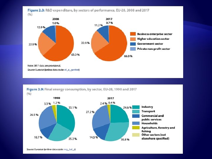
Pie Chart: Lists the categories and presents the percent or count of individuals who fall in each category. Treatment Group Frequency 1 15 (15/60)=0. 25 25. 0 2 25 (25/60)=0. 333 41. 7 3 20 (20/60)=0. 417 33. 3 60 1. 00 100 Total Structure Percent (%)

Histogram: A histogram is an accurate representation the distribution of numerical data. . of

Distribution of industrial output by main activities in 2010, % 1. Extractive industry 2. Manufacture of food, beverage and tobacco 3. Light industry 4. Production of coke, refined products 5. Chemical and petrochemical industry 6. Metallurgical production and production of finished metal products 7. Mechanical Engineering 8. Production and distribution of electricity, gas and water 9. Others
- Slides: 41