Tog First Principles CSE 491 091807 The Principles

- Slides: 46

Tog: First Principles CSE 491 09/18/07

The Principles 1. 2. 3. 4. 5. 6. 7. 8. Anticipation Autonomy Color Blindness Consistency Defaults Efficiency of the User Explorable Interfaces Fitt’s Law

The Principles, cont’d 9. Human-Interface Objects 10. Latency Reduction 11. Learnability 12. Limit Tradeoffs 13. Metaphors 14. Protect the User's Work 15. Readability 16. Track State 17. Visible Interfaces

Effective interfaces w are visually apparent and forgiving, instilling in their users a sense of control. Users quickly see the breadth of their options, grasp how to achieve their goals, and do their work. w do not concern the user with the inner workings of the system. Work is carefully and continuously saved, with full option for the user to undo any activity at any time.

Effective Applications w perform a maximum of work, while requiring a minimum of information from users.

Anticipation w Applications should attempt to anticipate the user’s wants and needs. Do not expect users to search for or gather information or evoke necessary tools. Bring to the user all the information and tools needed for each step of the process.

Autonomy w Allow the user to be in control w Provide info they need to do so w Use status mechanisms to keep users aware and informed. w Keep status information up to date and within easy view, accurate w Bad example: trash can that always looks full w Good example: search field icon that changes color and appearance to indicate search is in progress, completed with too many matches, too few matches, or just enough.

Color Blindness w When using color, also use clear, secondary cues to convey the information w Some w/out color monitors w About 10% of human males, some females, some form of color blindness. w Cones sensitive to red, green, and blue. n n n Faulty red -> protanopia. Faulty green-> deuteranopia. Faulty blue (rare) -> tritanopia.

Color blindness, cont’d w Secondary cues can consist of anything from the subtlety of gray scale differentiation to having a different graphic or different text label associated with each color presented.

Consistency w Levels, in order of importance: 1. 2. 3. 4. 5. 6. 7. Interpretation of user behavior Invisible structures. Small visible structures (appearance, then location) The overall "look" of a single application or service--splash screens, design elements. A suite of products. In-house consistency. Platform-consistency.

Also note: w Inconsistency: It is just as important to be visually inconsistent when things must act differently as it is to be visually consistent when things act the same. w Avoid uniformity. Make objects consistent with their behavior. Make objects that act differently look different. w The most important consistency is consistency with user expectations. w The only way to ascertain user expectations is to do user testing. No amount of study and debate will substitute.

Defaults w should be easy to "blow away: " Fields containing defaults should come up selected, so users can replace the default contents with new material quickly and easily. w Defaults should be "intelligent" and responsive. w Do not use the word "default" in an application or service. Replace with "Standard, " "Use Customary Settings, " "Restore Initial Settings, " or some other more specific terms describing what will actually happen.

Efficiency of the User w Look at the user's productivity, not the computer's. Example: Which of the following takes less time? Heating water in a microwave for one minute and ten seconds or heating it for one minute and eleven seconds?

Performance? w w Machine view: one minute and ten seconds User view: one minute and eleven seconds Why? In the first case, the user must press the one key twice, then visually locate the zero key, move the finger into place over it, and press it once. In the second case, the user just presses the same key–the one key–three times. It typically takes more than one second to acquire the zero key. Hence, the water is heated faster when it is "cooked" longer.

In addition …. w Seeking out different key takes time AND itrequires high level cognitive processing. w While processing, the main task (cooking their meal) must be set aside. The longer it is set aside, the longer it will take to reacquire it. w the user who uses repeating digits for microwave cooking faces fewer decisions. . . Doesn’t bother figuring 2: 10 or 2: 23 -- They do a fast estimate and, given the variability of water content and bacon thickness, end up with as likely a successful result with a lot less dickering up front, again increasing human efficiency.

User efficiency, cont’d w Keep the user occupied w Labor is typically the highest business expense w Maximize overall efficiency – not just IT dept.

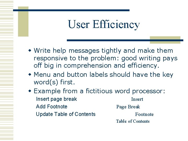
User Efficiency w Write help messages tightly and make them responsive to the problem: good writing pays off big in comprehension and efficiency. w Menu and button labels should have the key word(s) first. w Example from a fictitious word processor: Insert page break Add Footnote Update Table of Contents Insert Page Break Footnote Table of Contents

Example, explained w First example, with its leading words, is actually more informative and more accurate: l one does not "insert" a footnote if it is to be placed after all the other footnotes. And one does not insert a table of contents if there is already a table of contents there. Instead, one updates it. w Second example more efficient in timetrials. Why? l the extra information the first example offers does not outweigh the advantage of being able to scan only the first word in each menu item to find the specific menu item you are after

Explorable Interfaces w “Give users well-marked roads and landmarks, then let them shift into fourwheel drive. ” w Don’t trap users into a single path through a service, but do offer them a line of least resistance. w Lets the new user and the user who just wants to get the job done in the quickest way possible and "no-brainer" way through w Still enables those who want to explore and play what-if a means to wander farther afield.

Explorable Interfaces w “Sometimes, however, you have to provide deep ruts. ” w More naïve users -> more directed UI. A single-use application for accomplishing an unknown task requires a far more directive interface than a habitual-use interface for experts. w Offer users stable perceptual cues for a sense of "home. " - enable fast navigation, users feel more secure

Explorable Interfaces w Make Actions reversible w People explore in ways beyond navigation. Sometimes they want to find out what would happen if they carried out some potentially dangerous action. Sometimes they don’t want to find out, but they do anyway by accident. w Always allow "Undo. " – avoids the “Are you really, really sure? " dialogs boxes w Studies show: people in a hazardous environment make no more mistakes than people in a supportive and visually obvious environment, but they worked much slower and more carefully to avoid making errors.

Explorable Interfaces w Always allow a way out. w Users should never feel trapped. They should have a clear path out. w However, make it easier to stay in. w Early software tended to make it difficult to leave. With the advent of the web, we've seen the advent of software that makes it difficult to stay. w If you are working with complex transactions using a standard web browser, turn off the menu bar and all of the other irrelevant options, then supply our own landmarks and options.

Fitt’s Law w The time to acquire a target is a function of the distance to and size of the target. w dictates that Mac pull-down menu acquisition should be about five times faster than Windows menu acquisition, and this is proven out. w dictates that the Windows task bar will often get in people's way, and this is proven out. w indicates that the most quickly accessed targets on any computer display are the four corners of the screen, because of their pinning action, and yet they seem to be avoided at all costs by designers.

Fitt’s Law w Use large objects for important functions (Big buttons are faster). w Use the pinning actions of the sides, bottom, top, and corners of your display: A single-row toolbar with tool icons that "bleed" into the edges of the display will be many times faster than a double row of icons with a carefully-applied one-pixel non-clickable edge along the side of the display

Human Interface Objects w Examples: folders, documents, and the trashcan. w appear in the user's environment and may or may not map directly to an object-oriented object. w can be seen, heard, touched, or otherwise perceived.

Human interface objects Visual - quite familiar Audio/touch - less familiar. Auditory icons (Gaver, also Mynatt). Human-interface objects have a standard way of interacting. w Human-interface objects have standard resulting behaviors. w Human-interface objects should be understandable, self-consistent, and stable. w w

Latency Reduction w Wherever possible, use multi-threading to push latency into the background. w Latency can often be hidden from users through multi-tasking techniques, letting them continue with their work while transmission and computation take place in the background. w Reduce the user’s experience of latency.

Latency Reduction w Acknowledge all button clicks by visual or aural feedback within 50 milliseconds. w Display an hourglass for any action that will take from 1/2 to 2 seconds. w Animate the hourglass so they know the system hasn't died. w Display a message indicating the potential length of the wait for any action that will take longer than 2 seconds. w Communicate the actual length through an animated progress indicator. w Offer engaging text messages to keep users informed and entertained while they are waiting for long processes, such as server saves, to be completed.

Latency Reduction w Make the client system beep and give a large visual indication upon return from lengthy (>10 seconds) processes, so that users know when to return to using the system. w Trap multiple clicks of the same button or object. Because the Internet is slow, people tend to press the same button repeatedly, causing things to be even slower. w Make it faster w Eliminate any element of the application that is not helping. Be ruthless.

Learnability w Ideally, no learning curve: users walk up to product for the first time and achieve instant mastery. w In practice, all applications and services display a learning curve.

Learnability w Limit the Trade-Offs w Usability and learnability are not mutually exclusive. First, decide which is the most important; then attack both with vigor. Ease of learning automatically coming at the expense of ease of use is a myth.

Use of Metaphors w Choose metaphors well. Goal: choose metaphors that enable users to instantly grasp the finest details of the conceptual model. w Good metaphors are stories, creating visible pictures in the mind. w Bring metaphors alive by appealing to people’s perceptions–sight, sound, touch, and kinesthesia–as well as triggering their memories.

Metaphors, continued w Metaphors usually evoke the familiar, but often add a new twist. w Example: Windows 95 has an object called a briefcase. Like a real-world briefcase, its purpose is to help make electronic documents more portable. It does so, however, not by acting as a transport mechanism, but as a synchronizer: Documents in the desktop briefcase and the briefcase held on portable media are updated automatically when the portable media is inserted in the machine.

Protect User’s Work w Ensure that users never lose their work as a result of error on their part, the vagaries of Internet transmission, or any other reason other than the completely unavoidable, such as sudden loss of power to the client computer.

Readability w Text that must be read should have high contrast. Favor black text on white or pale yellow backgrounds. Avoid gray backgrounds. w Use font sizes that are large enough to be readable on standard monitors. Favor particularly large characters for the actual data you intend to display, as opposed to labels and instructions. w Even more important for numbers. Pay particular attention to the needs of older people. w Presbyopia, the condition of hardened, less flexible lenses, coupled with reduced light transmission into the eye, affects most people over age 45. Do not trust your young eyes to make size and contrast decisions.

Readability, revisited w Text that must be read should have high contrast. Favor black text on white or pale yellow backgrounds. Avoid gray backgrounds. w Use font sizes that are large enough to be readable on standard monitors. Favor particularly large characters for the actual data you intend to display, as opposed to labels and instructions.

Readability w Even more important for numbers. w Pay particular attention to the needs of older people. w Presbyopia, the condition of hardened, less flexible lenses, coupled with reduced light transmission into the eye, affects most people over age 45. Do not trust your young eyes to make size and contrast decisions.

Track State w Many browser-based products exist in a stateless environment. Thus, need to track state. May need to know: w Whether this is the first time the user has been in the system w Where the user is going w Where the user has been during this session w Where the user was when they left off in the last session w & more…

Track State w … and make good use of that info … w State information should be held in a cookie on the client machine during a session with a transaction service, then stored on the server when they log off. w Users should be able to log off at work, go home, and take up exactly where they left off. w Good examples: w Physicians On Line w Turbo. Tax Online

Visible Navigation w Avoid invisible navigation. w Most users can’t/won’t build elaborate mental maps and will become lost or tired if expected to do so. w World Wide Web is an invisible navigation space. w In your applications, reduce navigation to a minimum and make that navigation that is left clear and natural.

Visible Navigation w Present the illusion that users are always in the same place, with the work brought to them. w Eliminates the need for maps and other navigational aids w Offers users a greater sense of mastery and autonomy. w As with the inherent statelessness of the web (see Track State, above), our job is not to accept blindly what the architects have given us, but to add the layers of capability and protection that users want and need. That the web's navigation is inherently invisible is a challenge, not an inevitability

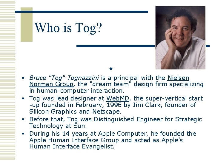
Who is Tog? w w Bruce "Tog" Tognazzini is a principal with the Nielsen Norman Group, the "dream team" design firm specializing in human-computer interaction. w Tog was lead designer at Web. MD, the super-vertical start -up founded in February, 1996 by Jim Clark, founder of Silicon Graphics and Netscape. w Before that, Tog was Distinguished Engineer for Strategic Technology at Sun. w During his 14 years at Apple Computer, he founded the Apple Human Interface Group and acted as Apple's Human Interface Evangelist.

w Tog has published two books, Tog On Interface and Tog On Software Design, both from Addison Wesley, and is currently publishing the free webzine, "Ask. Tog. " w Consultant for : w • 4 th Dimension • A. D. A. M. • Adobe • Aldus • Ameritrade • Apple Computer, Inc. • Ashlar • AT&T • Becton-Dickenson • BBC • Boing • Connections • Enerlogic • General Electric • Generic CAD • Global Perspectives • Gold Disk • Great Plains • Hewlett-Packard • In Control • Inforum • Interactive Software • Interleaf • Intuit • Kaiser Permanente • Kodak • Learningways • Letraset • Lotus • Mac. Mapp • Mapinfo • Mediagenic • Microsoft • Muse • Occam Systems • OCR Systems • On. Technology • One. Big. Table • Page. Maker • Pastel • Polaroid • Prodigy • Proxima • Saphire Design Systems • Schlumberger • Sculpt 3 D • Sensornet • Silicon Beach Software • SPSS • Summit Strategies Co. • Symantec Ullyses • Time Arts • TRW • Visi. Corp • Wingz • Word Perfect • Wordperfect • Xerox

More on Tog w Speaker, Lecturer, and Teacher w Tog is a sought-after speaker. He has delivered keynote addresses at dozens of conferences and conventions around the world, including Siebold, Agenda, and Unix Expo (in America and Europe). Guest lecturer at universities such as MIT, Stanford, University of California, Moscow State University, University of Zurich, the University of Rome, and Georgia Tech (Distinguished Lecturer Series). He has designed and presented tutorials for many organizations and universities, including the UIE User Interface conferences, Computer-Human Interaction. Conference of the Association for Computing Machinery, Rice University, and the University of Texas.

More on Tog He is the author of Tog on Software Design, and. Tog on Interface, both from Addison Wesley, as well as co-author and contributing author of numerous other books. Tog has also published dozens of papers and articles on computer design. He has produced short films and experimental videos, including a short film, "Beach Dreams, " picked up by Home Box Office in 1978. Appeared on several PBS TV shows and documentaries. Created key clips for opening sequence for "The Computer Chronicles. " Wrote and was on-screen performer in "World. Builder, " the Apple human interface video on Principles of Macintosh Design. Co-authored, -directed, -executive produced Starfire, a 15 minute film prototype of a future Sun interface. Acted as creative consultant and on-screen talent for a 1996 BBC special on user-centered design, "Computing, an Object. Oriented Approach. "

Tog …. w Expert Witness w He acted as expert witness on human-computer interaction in CAD/CAM applications in Ashlar Inc. v. SDRC and Diehl Graphsoft. w Inventor w Tog has 35 patents in the areas of aviation, radar, eyetracking, flat panel display information presentation, GPS, portable calendaring, etc. To view currently issued USA patents, click here.