Tips for Effective Power Point Presentations A Speakers
- Slides: 20

Tips for Effective Power. Point Presentations A Speaker’s Guide to the 2018 National Conference on Ending Family and Youth Homelessness

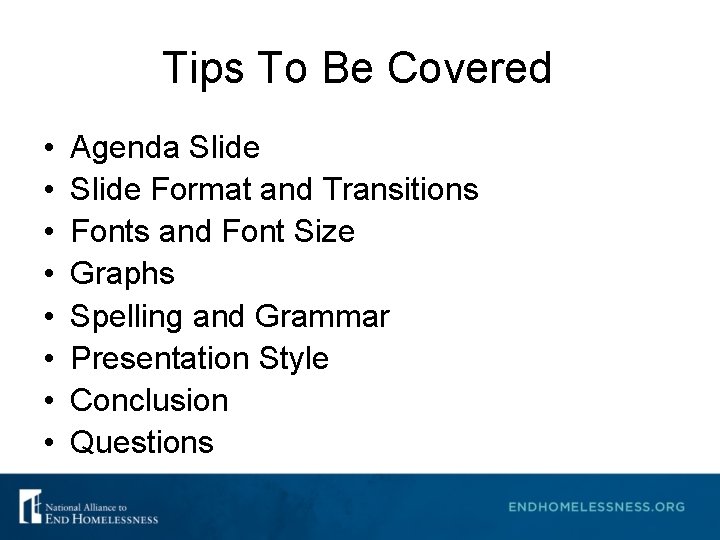
Tips To Be Covered • • Agenda Slide Format and Transitions Fonts and Font Size Graphs Spelling and Grammar Presentation Style Conclusion Questions

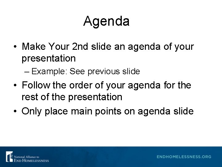
Agenda • Make Your 2 nd slide an agenda of your presentation – Example: See previous slide • Follow the order of your agenda for the rest of the presentation • Only place main points on agenda slide

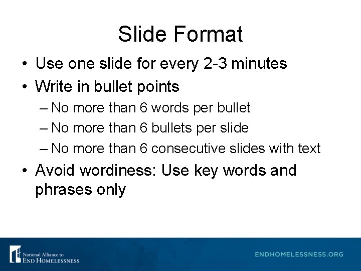
Slide Format • Use one slide for every 2 -3 minutes • Write in bullet points – No more than 6 words per bullet – No more than 6 bullets per slide – No more than 6 consecutive slides with text • Avoid wordiness: Use key words and phrases only

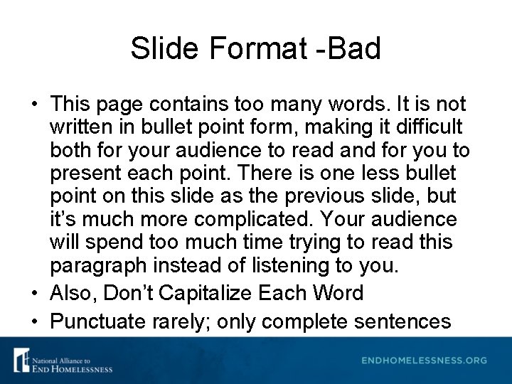
Slide Format -Bad • This page contains too many words. It is not written in bullet point form, making it difficult both for your audience to read and for you to present each point. There is one less bullet point on this slide as the previous slide, but it’s much more complicated. Your audience will spend too much time trying to read this paragraph instead of listening to you. • Also, Don’t Capitalize Each Word • Punctuate rarely; only complete sentences

Slide Transition and Animation. Bad • Stay away from distracting animation • Don’t overdo any animation or transitions you choose to use • Be consistent with the animation that you use

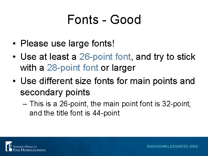
Fonts - Good • Please use large fonts! • Use at least a 26 -point font, and try to stick with a 28 -point font or larger • Use different size fonts for main points and secondary points – This is a 26 -point, the main point font is 32 -point, and the title font is 44 -point

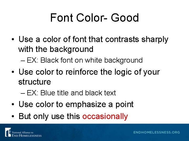
Font Color- Good • Use a color of font that contrasts sharply with the background – EX: Black font on white background • Use color to reinforce the logic of your structure – EX: Blue title and black text • Use color to emphasize a point • But only use this occasionally

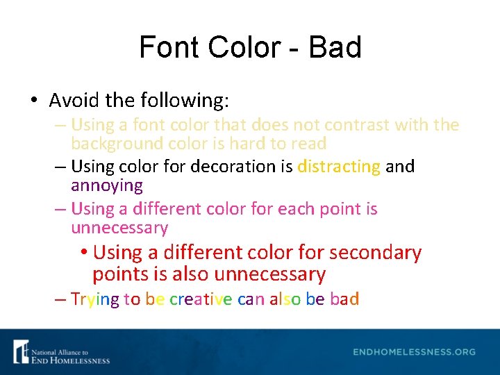
Font Color - Bad • Avoid the following: – Using a font color that does not contrast with the background color is hard to read – Using color for decoration is distracting and annoying – Using a different color for each point is unnecessary • Using a different color for secondary points is also unnecessary – Trying to be creative can also be bad

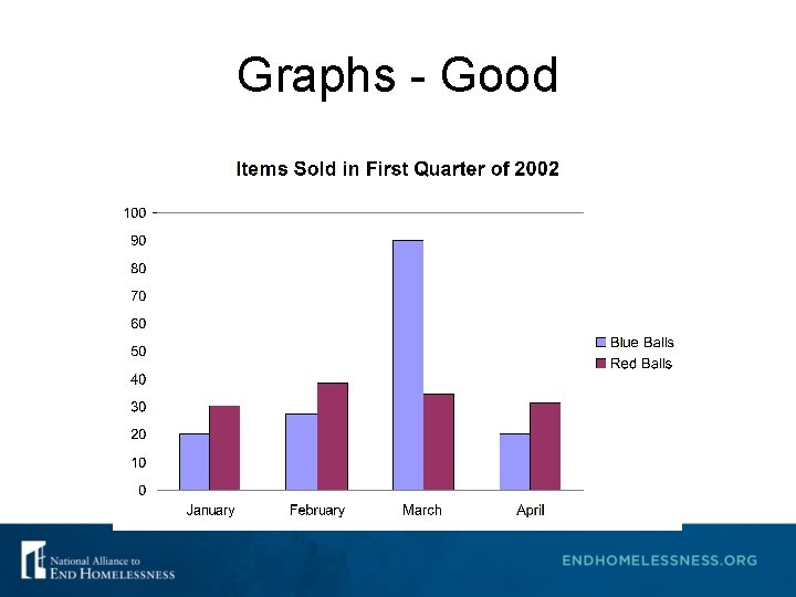
Graphs - Good • Use graphs rather than just charts and words – Data in graphs are easier to comprehend and retain than raw data – Trends are easier to visualize in graph form • Always title your graphs

Graphs - Good

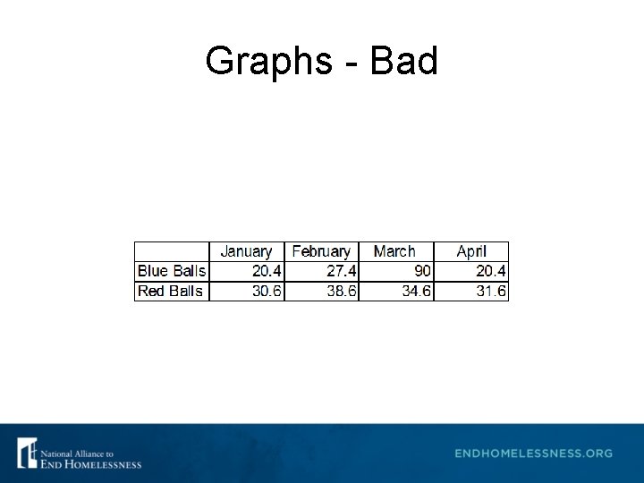
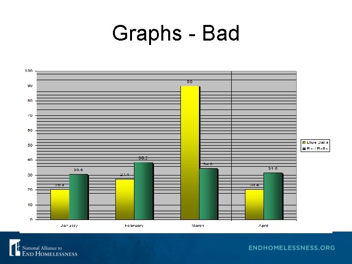
Graphs - Bad

Graphs - Bad

Graphs - Bad • Problems with the Bad Graph – Minor gridlines are unnecessary – Font is too small – Colors are illogical – Title is missing – Shading is distracting

Spelling and Grammar • Proof your slides for: – Speling mistakes – The use of of repeated words – Grammatical errors you might have make – Correct spelling but wrong word (you/your; won/one; your/you’re) – Avoid A&A (that’s short for acronyms and abbreviations) • Have someone else check your presentation!

Presentation Style • Use slides as discussion starters, but keep from reading them – Slides should support your presentation – Use photos, graphics, charts, graphs, bullet points, and minimal text to help support your presentation points • Stand when you present • Use the microphone when available • Remain in your allotted time

Conclusion • Use an effective and strong closing – Your audience is likely to remember your last words • Use a conclusion slide – Summarize the main points of your presentation – Suggest future avenues of research

Questions? • End presentation with a simple question slide – Invites audience to ask questions and avoids ending a presentation abruptly

Additional Information • All presentation information or handouts must be submitted to the Alliance by Wednesday, February 21, 2018 at kkenney@naeh. org • Use a blank slide to end the show or include your contact information, like the one that follows…. .

Thank You • If you have further questions, please contact: Katie Kenney at kkenney@naeh. org.