Time Series Lecture 6 Outlines Terminology and User
![Four Sets of Data Anscombe's Quartet, American Statistician, 27 [February 1973], 17 -21) comprises Four Sets of Data Anscombe's Quartet, American Statistician, 27 [February 1973], 17 -21) comprises](https://slidetodoc.com/presentation_image_h2/b0d24d450955991fcb66e9bf9e81f588/image-13.jpg)
- Slides: 60

Time Series Lecture 6

Outlines Terminology and User Tasks for time series Limit of Statistics Parameters Examples by Tableau Examples of other tools Design Principles and High Dimensionality Challenge 1. 2. 3. 4. 5. Objectives 1. 2. 3. Examination of a number of case studies Learn from some of the different visualization ideas that have been created Can you generalize these techniques into classes or categories?

1. Time Series Data �Fundamental chronological component to the data set �Random sample of 4000 graphics from 15 of world’ s newspapers and magazines from 74 -80 found that 75% of graphics published were time series �Tufte, Vol. 1

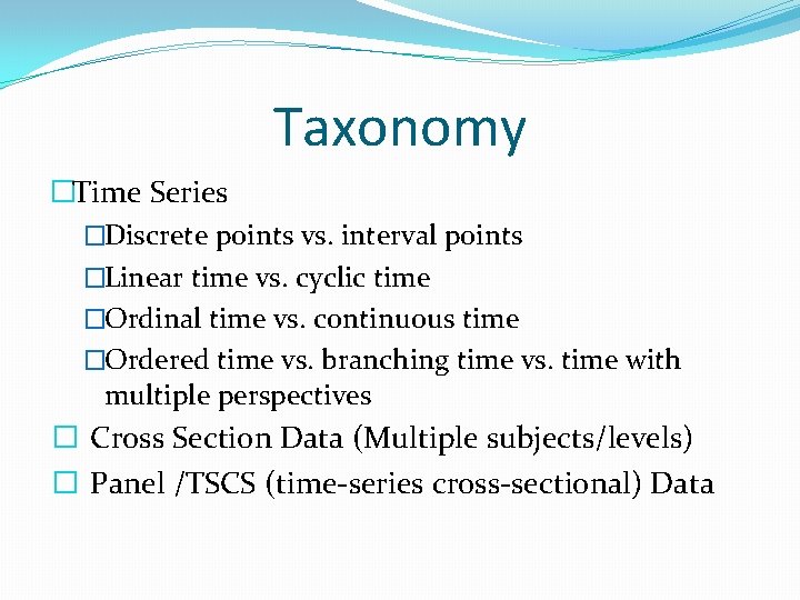
Taxonomy �Time Series �Discrete points vs. interval points �Linear time vs. cyclic time �Ordinal time vs. continuous time �Ordered time vs. branching time vs. time with multiple perspectives � Cross Section Data (Multiple subjects/levels) � Panel /TSCS (time-series cross-sectional) Data

1. Terminology �Data Sets �Each data case is likely an event of some kind e. g. sunspot activity, baseball games, medicines taken, cities visited, stock prices, etc. �One of the variables can be the date and time of the event �Other Data Attribute � Prices �Trade volume

1. Meta Level �Consider multiple stocks being examined �Is each stock a data case, or is a price on a particular day a case, with the stock name as one of the other variables? �Confusion between data entity and data cases �Answers to time series data for multiple stocks or call 410 K, Mutual fund profile �Data entity �Data Cases �Data attributes

1. Data Exploration Vs. Data Mining �Data mining domain has techniques for algorithmically examining time series data, looking for patterns, etc. �Good when objective is known a priori �But what if not? �Which questions should I be asking? �Info. Vis and data exploration better for that

1. Applications �Autocorrelation analysis to examine Serial Dependence �Spectral Analysis to examine cyclic behavior which need not be related to seasonality �For example, sun spot activity varies over 11 year cycles �Other common examples include celestial phenomena, weather patterns, neural activity, commodity prices, and economic activity. �Separation into components representing trend, seasonality, slow and fast variation, and cyclical irregularity

1. User tasks for time series �What kinds of questions do people ask about time series data? �Examples �When was something greatest/least? �Is there a pattern? �Are two series similar? �Do any of the series match a pattern? �Do some events have causal relationships? �Provide simpler, faster access to the series

1. Other Tasks �Does data element exist at time t ? �When does a data element exist? �How long does a data element exist? �How often does a data element occur? �How fast are data elements changing? �In what order do data elements appear? �Do data elements exist together? �Answer all these questions about stock price

1. Fundamental Tradeoff �Is the visualization time-dependent, i. e. , changing over time (beyond just being interactive) �Static Shows history, multiple perspectives, allows comparison �Dynamic (animation) Gives feel for process & changes over time, has more space to work with

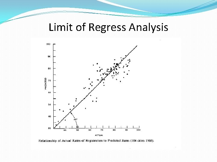
Limit of Regress Analysis
![Four Sets of Data Anscombes Quartet American Statistician 27 February 1973 17 21 comprises Four Sets of Data Anscombe's Quartet, American Statistician, 27 [February 1973], 17 -21) comprises](https://slidetodoc.com/presentation_image_h2/b0d24d450955991fcb66e9bf9e81f588/image-13.jpg)
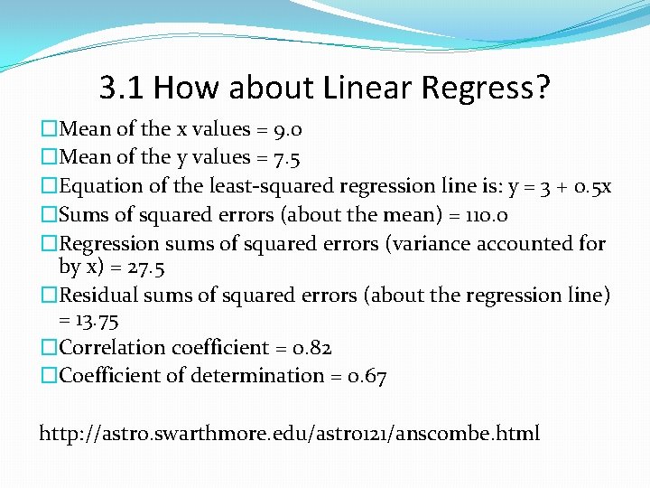
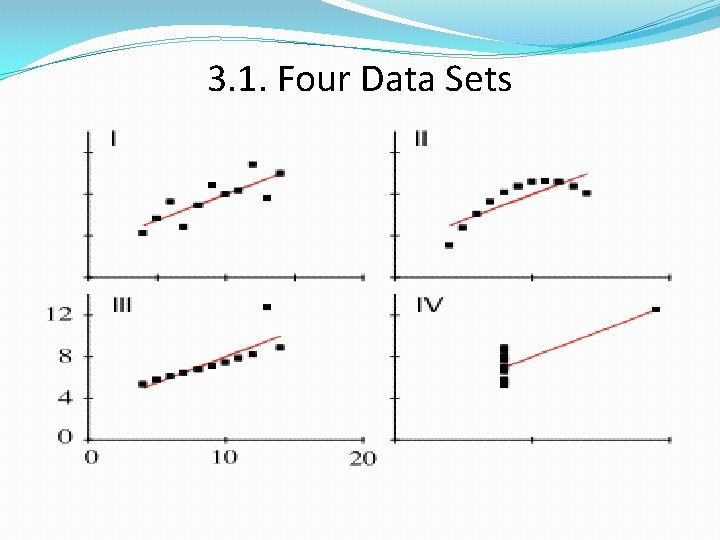
Four Sets of Data Anscombe's Quartet, American Statistician, 27 [February 1973], 17 -21) comprises 4 data sets of 11 points each: I x II y x IV y x y 10 8. 04 10 9. 14 10 7. 46 8 6. 58 8 6. 95 8 8. 14 8 6. 77 8 5. 76 13 7. 58 13 8. 74 13 12. 74 8 7. 71 9 8. 81 9 8. 77 9 7. 11 8 8. 84 11 8. 33 11 9. 26 11 7. 81 8 8. 47 14 9. 96 14 8. 10 14 8. 84 8 7. 04 6 7. 24 6 6. 13 6 6. 08 8 5. 25 4 4. 26 4 3. 10 4 5. 39 19 12. 50 12 10. 84 12 9. 13 12 8. 15 8 5. 56 7 4. 82 7 7. 26 7 6. 42 8 7. 91 5 5. 68 5 4. 74 5 5. 73 8 6. 89

3. 1 How about Linear Regress? �Mean of the x values = 9. 0 �Mean of the y values = 7. 5 �Equation of the least-squared regression line is: y = 3 + 0. 5 x �Sums of squared errors (about the mean) = 110. 0 �Regression sums of squared errors (variance accounted for by x) = 27. 5 �Residual sums of squared errors (about the regression line) = 13. 75 �Correlation coefficient = 0. 82 �Coefficient of determination = 0. 67 http: //astro. swarthmore. edu/astro 121/anscombe. html

3. 1. Four Data Sets

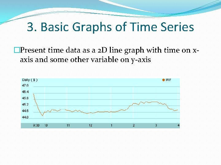
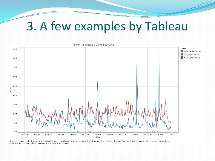
3. Basic Graphs of Time Series �Present time data as a 2 D line graph with time on xaxis and some other variable on y-axis

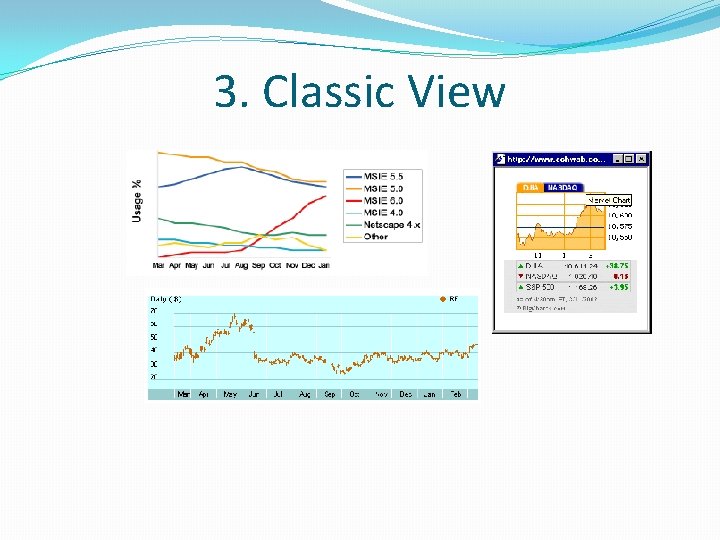
3. Classic View

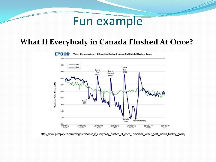
Fun example What If Everybody in Canada Flushed At Once?

3. A few examples by Tableau

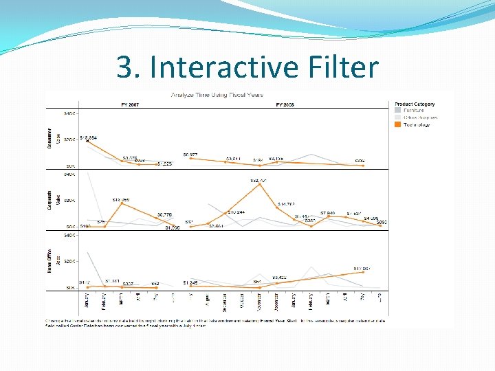
3. Interactive Filter

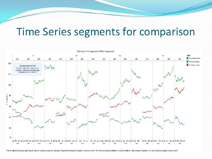
Time Series segments for comparison

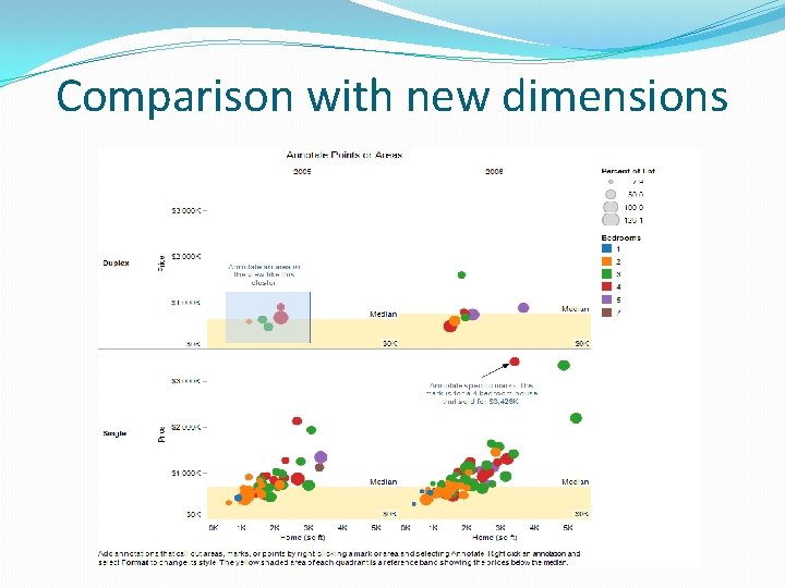
Comparison with new dimensions

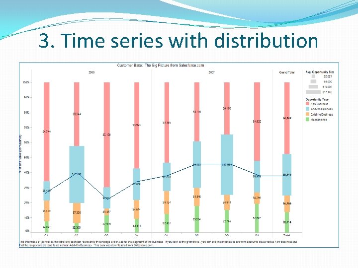
3. Time series with distribution

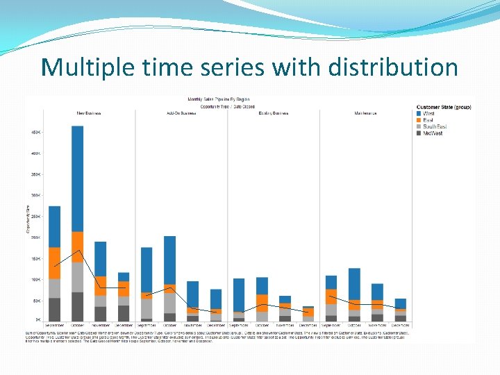
Multiple time series with distribution

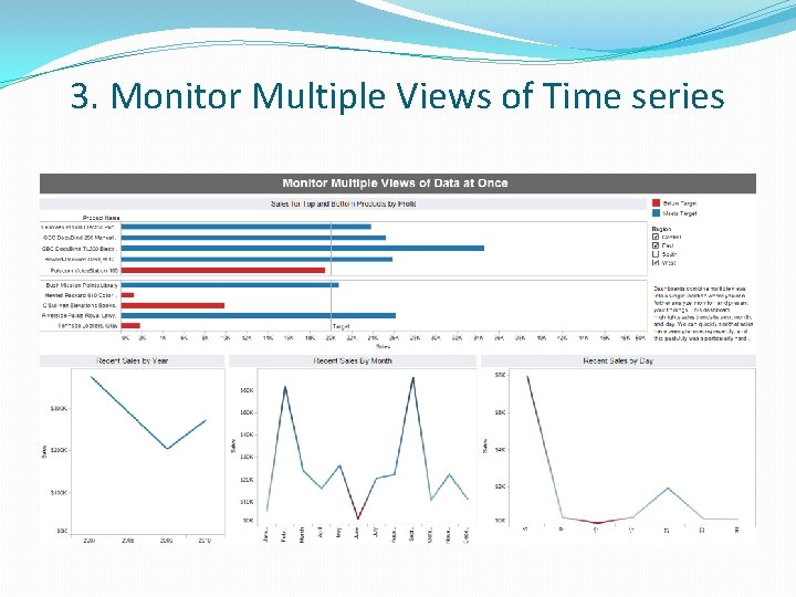
3. Monitor Multiple Views of Time series

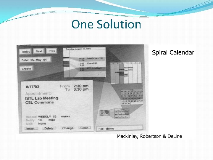
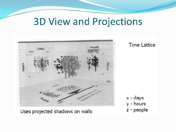
4. Other tools, Example 1 �Calendar visualization �Present series of events in context of calendar �Task �Put together complete story �Garner information for decision-making �Notice trends �Gain an overview of the events to grasp the big picture

One Solution

3 D View and Projections

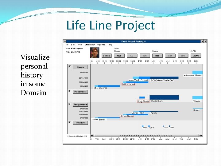
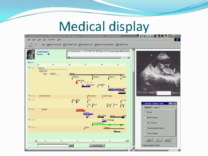
Example 2 �Personal histories �Consider a chronological series of events in someone’s life �Present an overview of the events �Examples � Medical history � Educational background � Criminal history �Tasks �Put together complete story �Gather information for decision-making �Notice trends �Gain an overview of the events to grasp the big picture

Life Line Project Visualize personal history in some Domain

Medical display

Interaction Features �Different colors for different event types �Line thickness can correspond to another variable �Interaction: Clicking on an event produces more details �Certainly could also incorporate some dynamic query capabilities

Benefit and Challenges �Benefit �Reduce chances of missing information �Facilitate spotting trends or anomalies �Streamline access to details �Remain simple and tailorable to various applications �Challenges �Scalability �Can multiple records be visualized in parallel (well)?

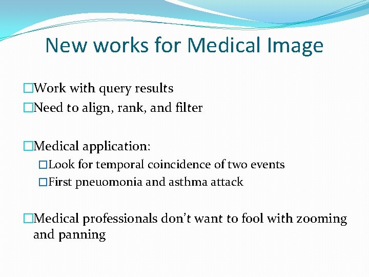
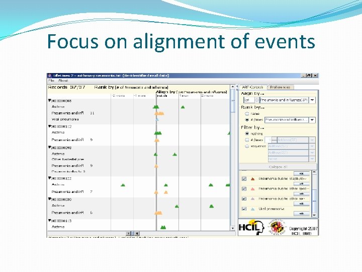
New works for Medical Image �Work with query results �Need to align, rank, and filter �Medical application: �Look for temporal coincidence of two events �First pneuomonia and asthma attack �Medical professionals don’t want to fool with zooming and panning

Focus on alignment of events

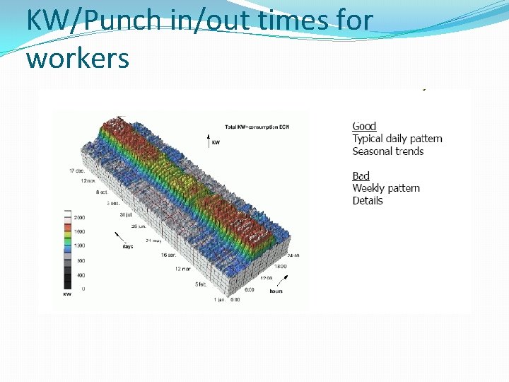
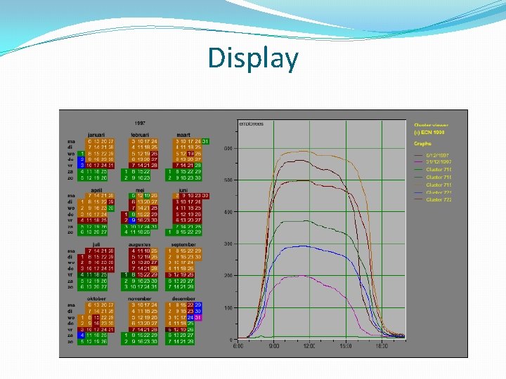
Example 3 �Understand patterns of presence/events over time �Focus: People’s presence/movements in some space �Situation: �Workers punch in and punch out of a factory �Want to understand the presence patterns over a calendar year � Alternate: Power plant electricity usage over a year

KW/Punch in/out times for workers

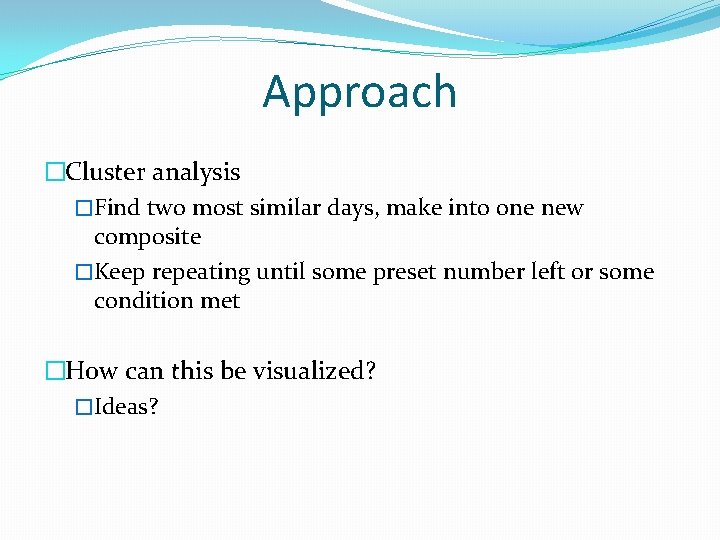
Approach �Cluster analysis �Find two most similar days, make into one new composite �Keep repeating until some preset number left or some condition met �How can this be visualized? �Ideas?

Display

Characteristics �Cluster Analysis �Unique types of days (individual or cluster) get their own color �Contextually placed in calendar and line graph for it is shown �Stop clustering when a threshold met or at a predetermined number of clusters Interactive �Click on day, see its graph �Select a day, see similar ones �Add/remove clusters

Insight from the analysis �Traditional office hours followed �Most employees present in late morning �Fewer people are present on summer Fridays �Just a few people work holidays �When the holidays occurred �School vacations occurred May 3 -11, Oct 11 -19, Dec 2131 �Many people take off day after holiday �Many people leave at 4 pm on December 5

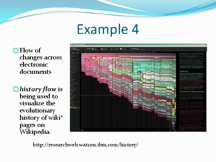
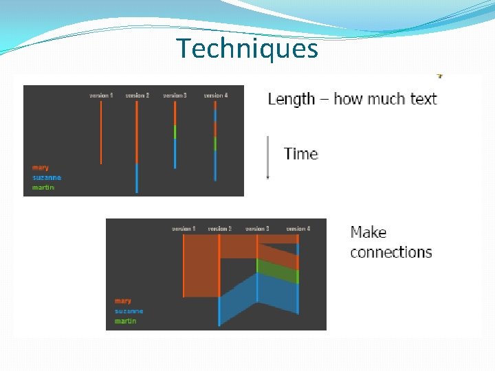
Example 4 �Flow of changes across electronic documents �history flow is being used to visualize the evolutionary history of wiki* pages on Wikipedia. http: //researchweb. watson. ibm. com/history/

Techniques

What can be found? �Understanding the frequency and timing of vandalism for wiki sites. �Analyzing the overall stability � in size and content for assessing the reliability of group-authored web sites. �Have a solid understanding of the relationship between various factors. � e. g. , how does anonymity affect the likelihood of vandalism? � Are page sections that survive many edits more likely to be high quality? �The Visualizations above are suggestive, �Need to be verified through statistical analysis.

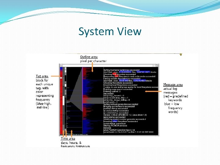
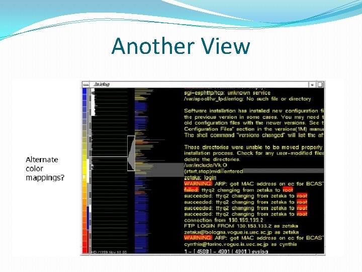
Example 5 �Computer system logs �Potentially huge amount of data �Tedious to examine the text �Looking for unusual circumstances, patterns, etc. �Mie. Log �System to help computer systems administrators examine log files �Interesting characteristics

System View

Another View

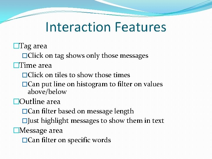
Interaction Features �Tag area �Click on tag shows only those messages �Time area �Click on tiles to show those times �Can put line on histogram to filter on values above/below �Outline area �Can filter based on message length �Just highlight messages to show them in text �Message area �Can filter on specific words

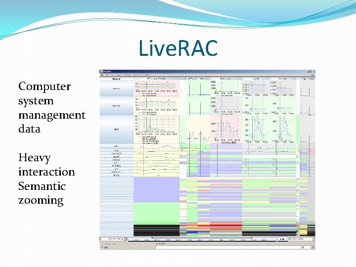
Example 6 �Very large scale temporal log data �Show more context of what else was going on at that time �Likely have to abstract some then �Allow several different levels of detail at once �Allow drill-down for details �Domain: Computer systems management

Live. RAC Computer system management data Heavy interaction Semantic zooming

5. Design Principles �Show familiar visual representations whenever possible �Provide side-by-side comparisons of small multiple views �Spatial position is strongest visual cue �Multiple views are more effective when coordinated through explicit linking �Avoid abrupt visual change �Follow Shneiderman ’s mantra �User actions should receive immediate visual feedback �Assertion: Showing several levels of detail simultaneously provides useful high information density in context

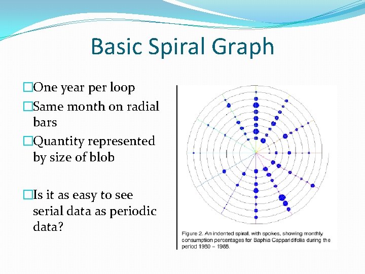
Periodic Data �Serial, periodic data �Data with chronological aspect, but repeats and follows a pattern over time �How might one visualize that? �Using Spirals �Standard x-y timeline or tabular display is problematic for periodic data �It has endpoints � Use spiral to help display data �One loop corresponds to one period

Basic Spiral Graph �One year per loop �Same month on radial bars �Quantity represented by size of blob �Is it as easy to see serial data as periodic data?

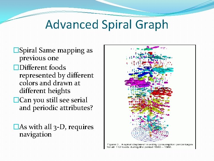
Advanced Spiral Graph �Spiral Same mapping as previous one �Different foods represented by different colors and drawn at different heights �Can you still see serial and periodic attributes? �As with all 3 -D, requires navigation

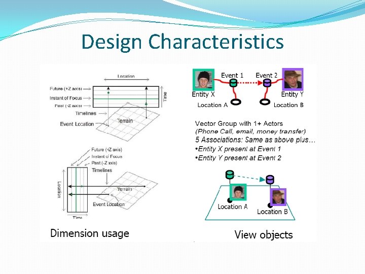
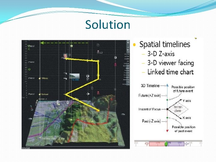
Example 1, Geo-temporal data �How about events in time and place? �� Many applications of this problem �Represent place by 2 D plane (or maybe 3 D topography) �Use 3 rd dimension to encode time �Object types: �� Entities (people or things) �� Locations (geospatial or conceptual) �� Events (occurrences or discovered facts)

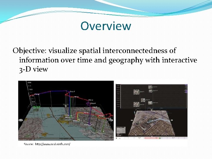
Overview Objective: visualize spatial interconnectedness of information over time and geography with interactive 3 -D view

Design Characteristics

Solution

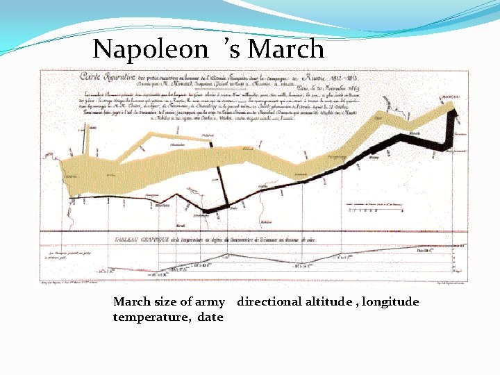
Napoleon ’s March size of army directional altitude , longitude temperature, date

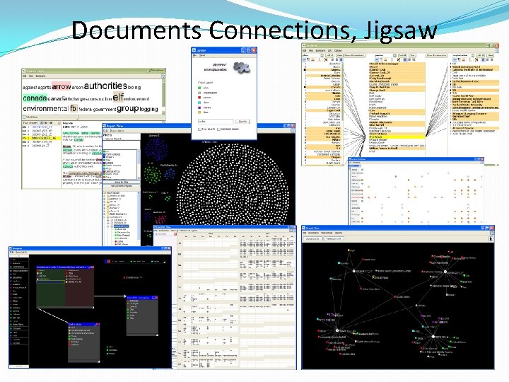
Documents Connections, Jigsaw