Thesis Summary PPT Guideline Thesis Title Student Name
- Slides: 12

Thesis Summary PPT Guideline Thesis Title Student Name, Advisor Sungkyunkwan Univ. Department of Electrical and Computer Engineering. Personal Affiliation(LAB)

Outline • • • Background Page setup Fonts and colors General guideline for good slides Text and figures 2

Background • Preliminary Defence – about 5 Slides • Main Defence – about 10 Slides • PPT slides must include Outline, Introduction or Background(or Related works), his own works and conclusion 3

Page setup • Take 5 mm for top, bottom, right and left margins. • All pages should be in horizontal (landscape) format, not vertical. • No logos are permitted except on the title page. • Put page number in the bottom center. 4

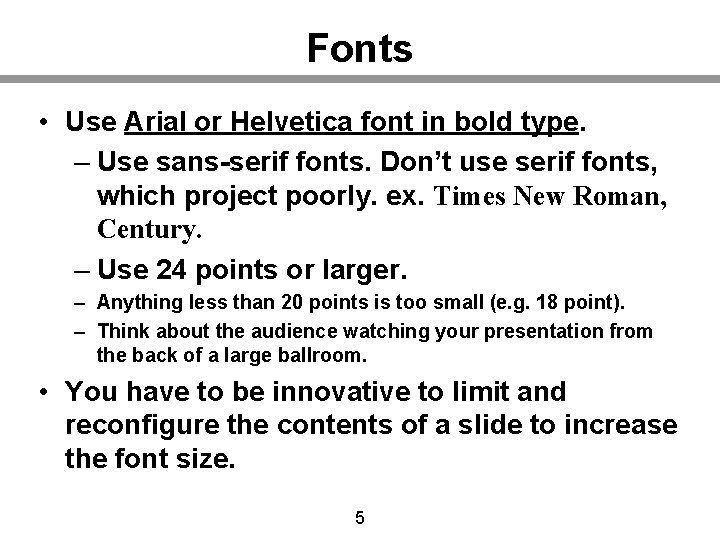
Fonts • Use Arial or Helvetica font in bold type. – Use sans-serif fonts. Don’t use serif fonts, which project poorly. ex. Times New Roman, Century. – Use 24 points or larger. – Anything less than 20 points is too small (e. g. 18 point). – Think about the audience watching your presentation from the back of a large ballroom. • You have to be innovative to limit and reconfigure the contents of a slide to increase the font size. 5

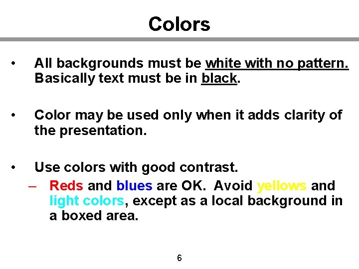
Colors • All backgrounds must be white with no pattern. Basically text must be in black. • Color may be used only when it adds clarity of the presentation. • Use colors with good contrast. – Reds and blues are OK. Avoid yellows and light colors, except as a local background in a boxed area. 6

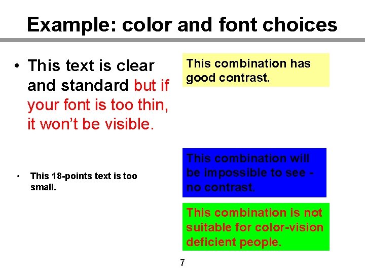
Example: color and font choices • This text is clear and standard but if your font is too thin, it won’t be visible. • This combination has good contrast. This combination will be impossible to see no contrast. This 18 -points text is too small. This combination is not suitable for color-vision deficient people. 7

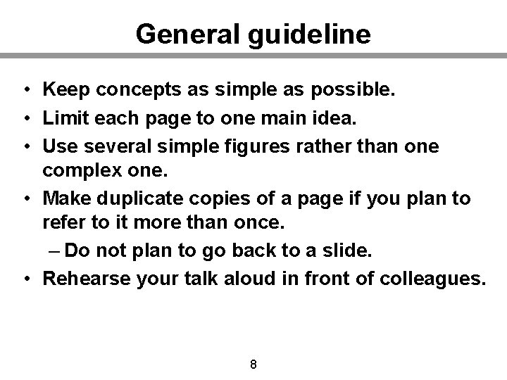
General guideline • Keep concepts as simple as possible. • Limit each page to one main idea. • Use several simple figures rather than one complex one. • Make duplicate copies of a page if you plan to refer to it more than once. – Do not plan to go back to a slide. • Rehearse your talk aloud in front of colleagues. 8

Text slides • Don’t use a lengthy sentence. Use a short phrase and a simple sentence. – Explain with sentences verbally but don’t write the sentences on a slide. • If possible, use no more than 8 lines of text per page. 9

Graphs and figures • Use a minimum line width of 2 points for all lines in drawings. • Fonts embedded in figures should also comply with a guideline for text. • Often, graphical data imported from other programs will have small fonts & thin lines. – Completely redraw if you can’t fix this. 10

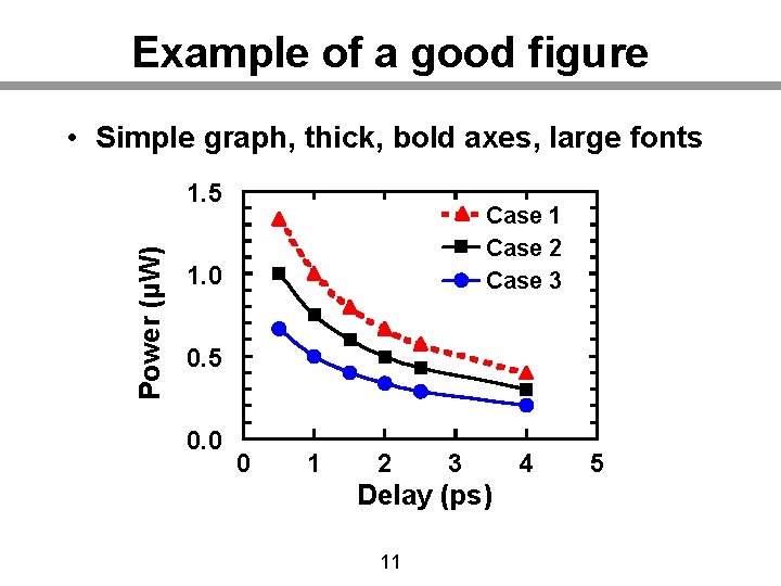
Example of a good figure • Simple graph, thick, bold axes, large fonts Power (µW) 1. 5 Case 1 Case 2 Case 3 1. 0 0. 5 0. 0 0 1 2 3 Delay (ps) 11 4 5

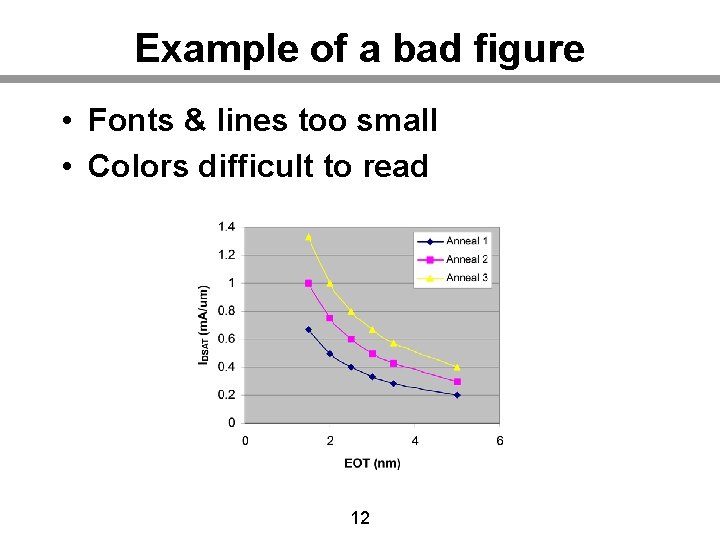
Example of a bad figure • Fonts & lines too small • Colors difficult to read 12